Tired of the ongoing, unfulfilling search for the holy trinity of underwear (comfortable, sustainable and sexy), Nala decided to take things into their own hands. They had the product expertise and they knew what they stood for, they just needed an identity that looked as good as their offering felt and championed the vibrance and diversity of the audience they serve.
- Verbal identity •
- Visual identity •
- Art direction
Featured In
What's all this then?
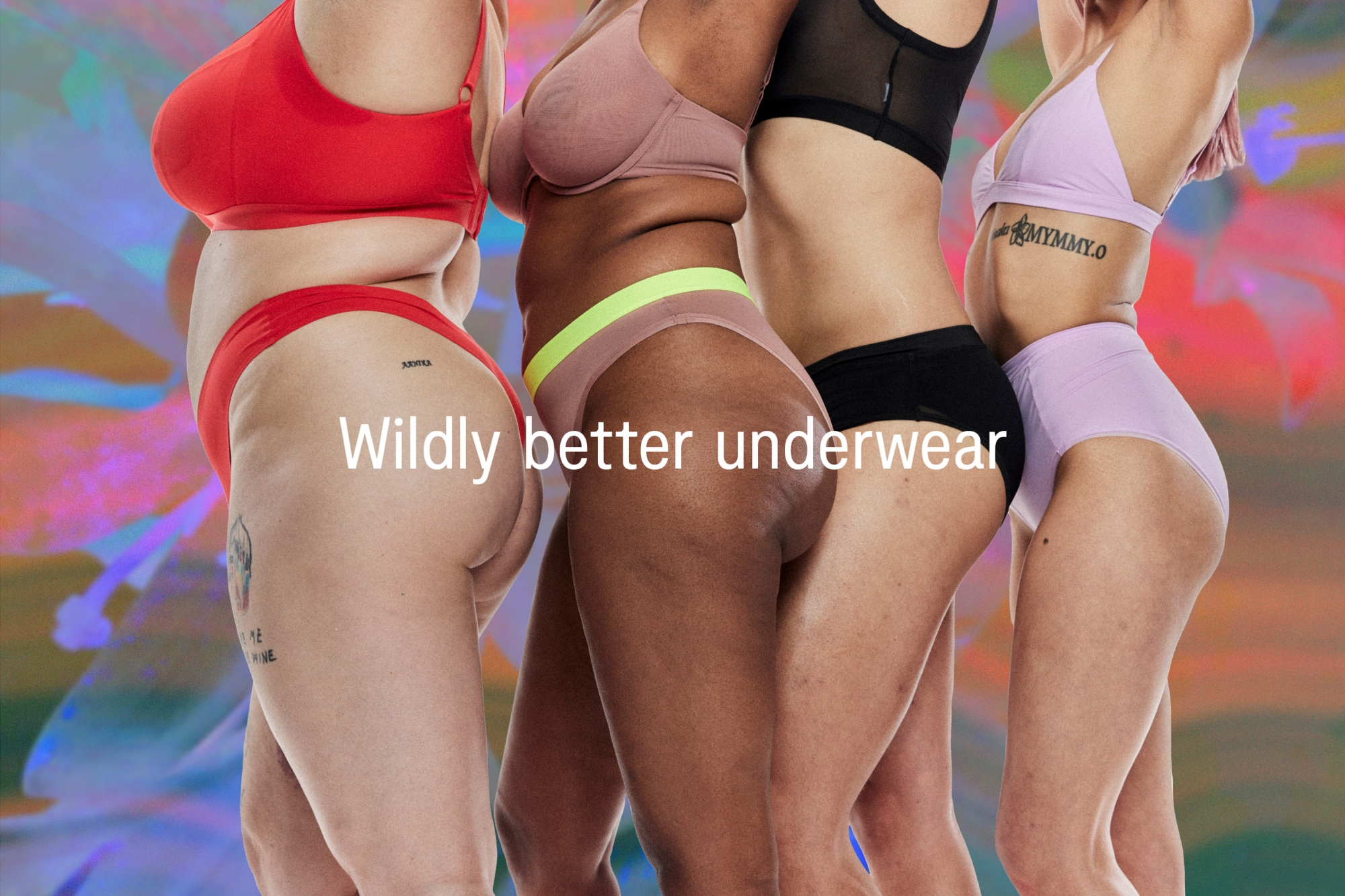
Nala is an Australia-based brand making wildly better underwear. Bored by what was out there and of being told they need to look a certain way to be sexy, the founders decided to turn the industry on its head. No more sacrificing comfort for fit, restrictive size ranges or paying way too much for clothes that don’t cost the planet — they make bold, comfortable, sustainability-focused products that empower their audience to look, feel and do good.
Any insights?
At some point someone decided that sustainability meant dull designs. While there were underwear brands out there making products that do good by the planet, they were largely all in the same palette. Earthy tones? For an eco-focused brand? Groundbreaking. The underwear industry also has a long history of perpetuating unrealistic body standards and, again, while some brands have made huge steps toward a more inclusive industry, none were flaunting it loudly, proudly and truly celebrating the diversity of the body.
And what seems to be the problem?
Nala is a rich and vibrant terrain, a space that celebrates people’s bodies, experiences, emotions and self-expression. They needed an identity that not only stood out against the drab designs of the sustainability space it was playing in but also held its own against the underwear heavyweights. The brand also needed the ability to evolve and shift between our ever-changing identities — to capture the uniqueness of an individual yet reflect the beauty and diversity of the collective.
So how did you go about it?
We began with the concept of “all of you”, an idea that encapsulates the freedom and confidence that comes from wild and radical acceptance of self and by society — to feel how you feel, move how you want and look how you look.
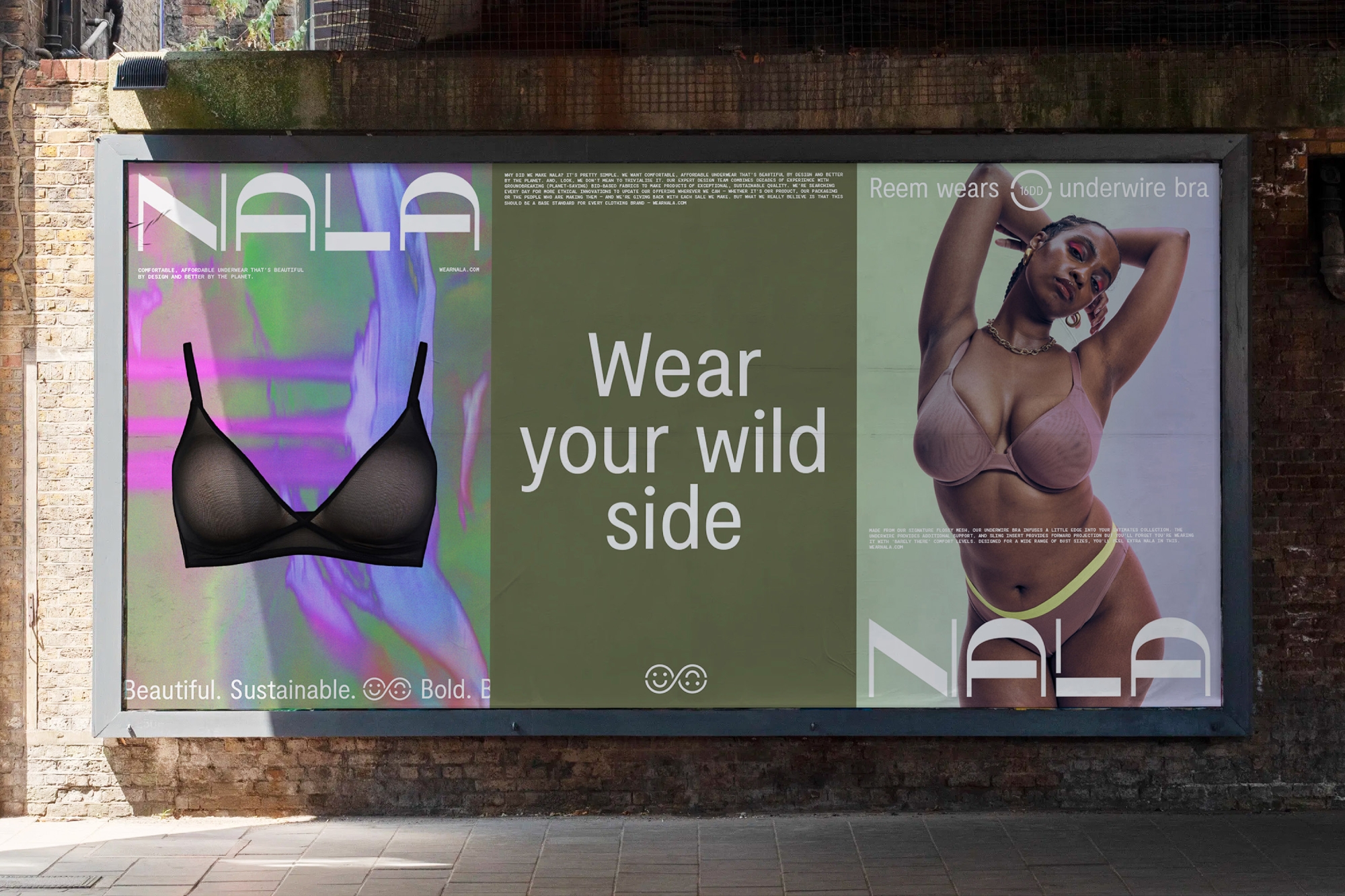
Marking a new territory in the industry
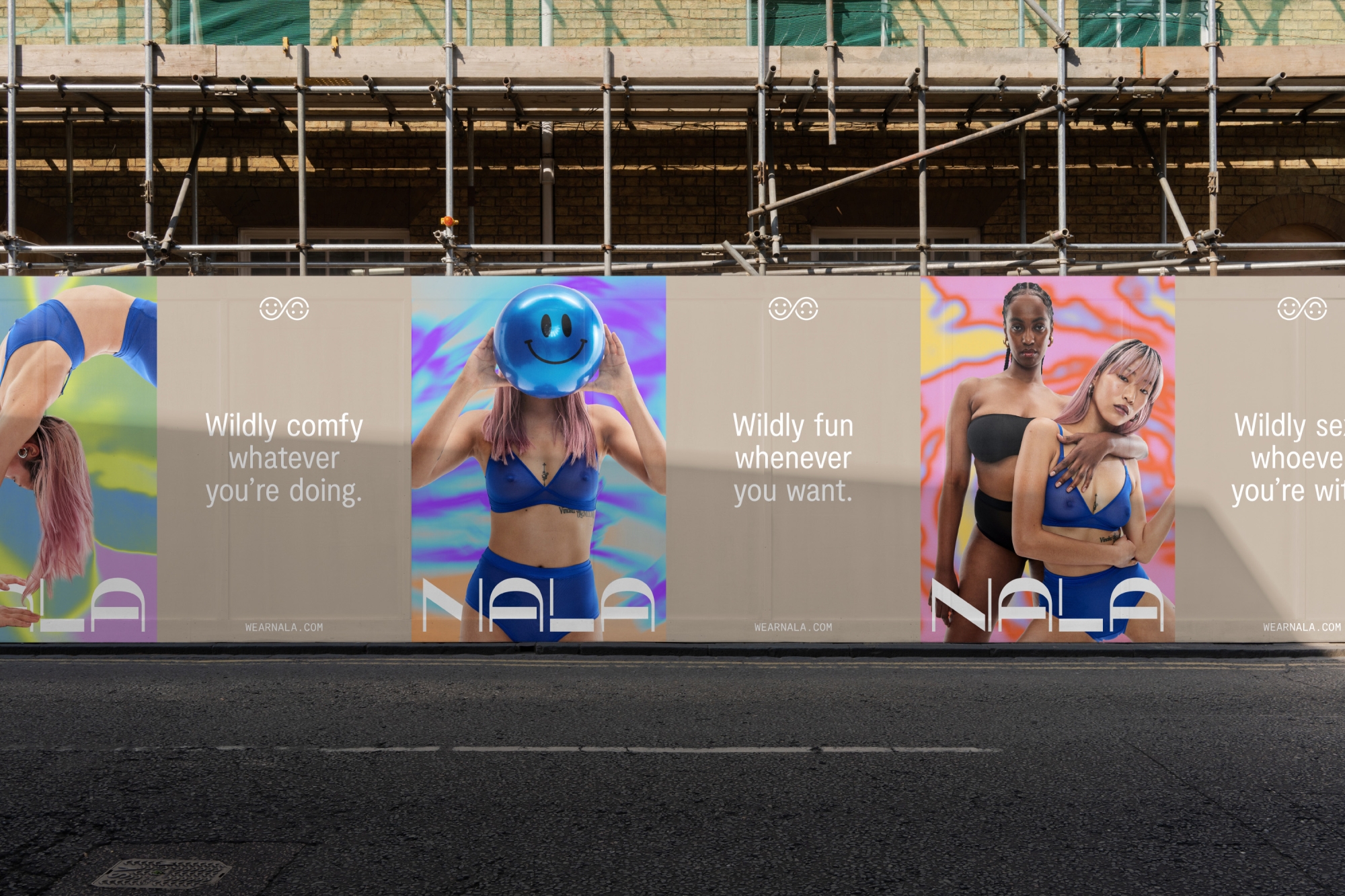
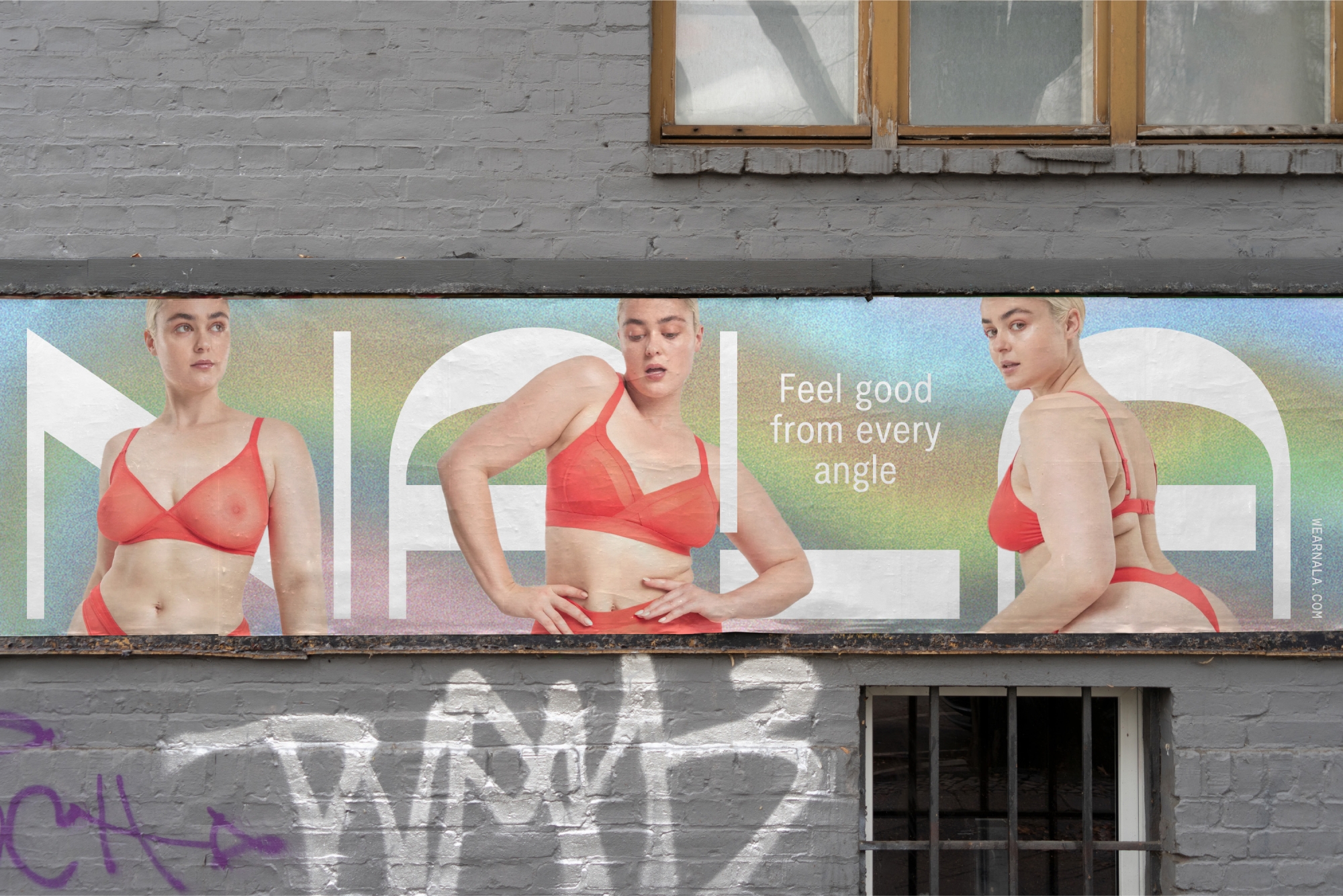
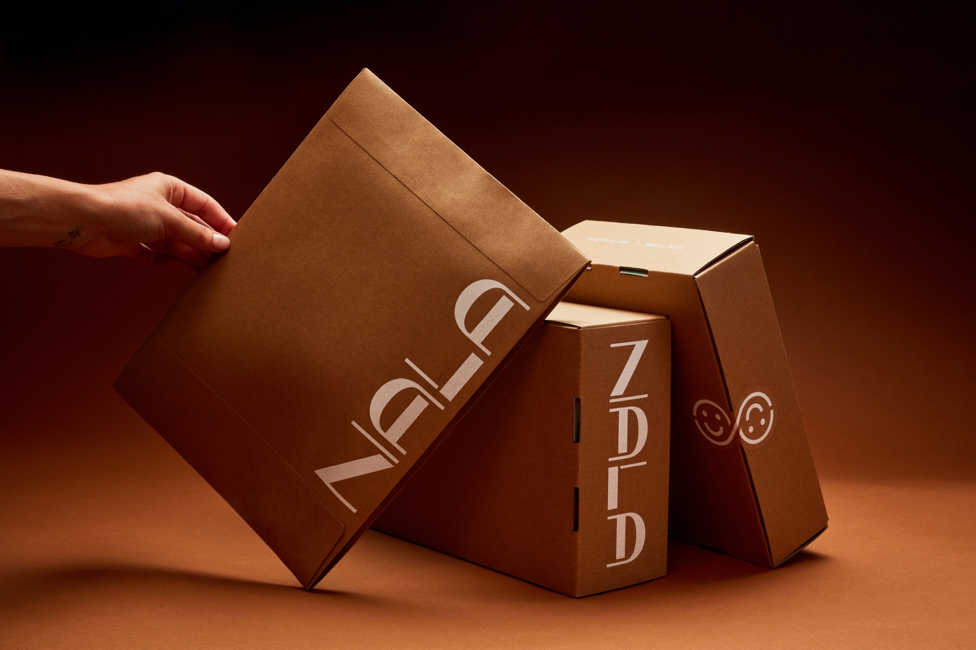
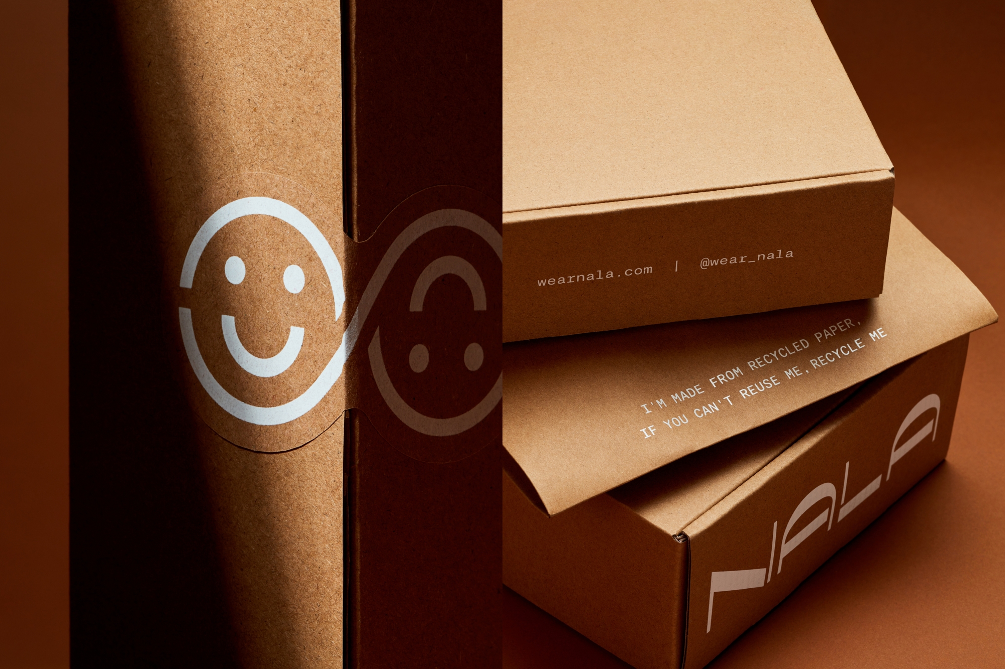
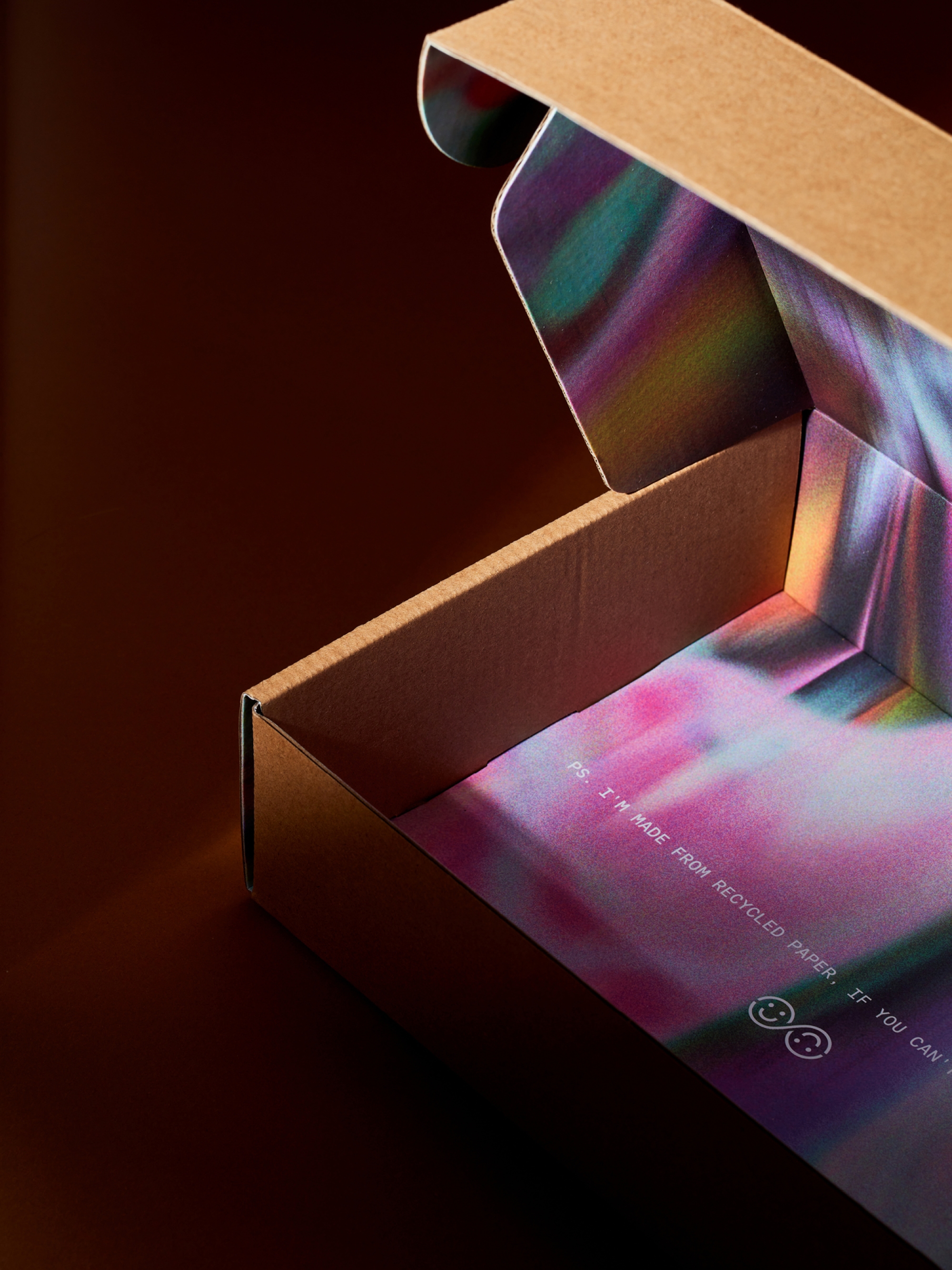
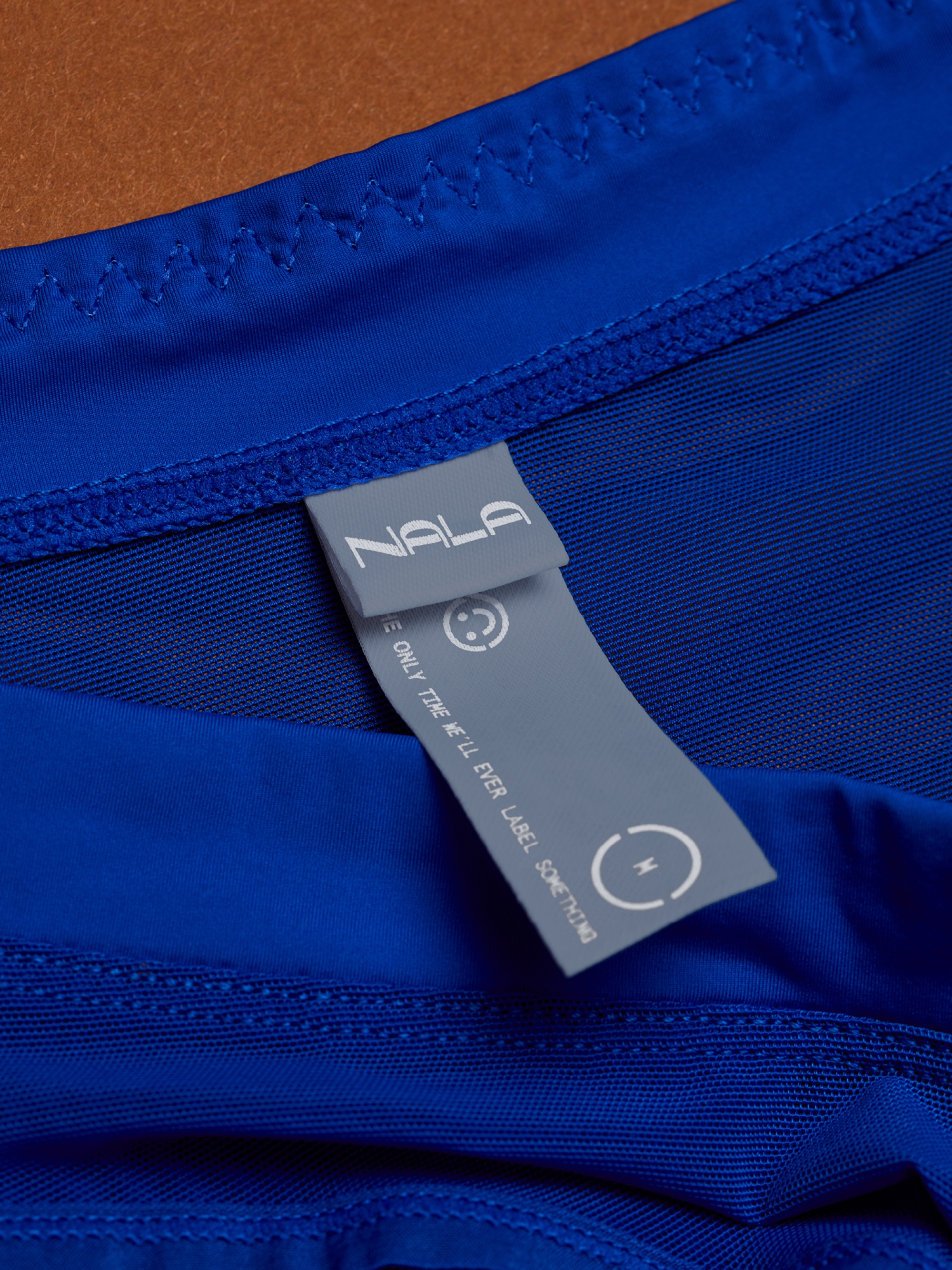
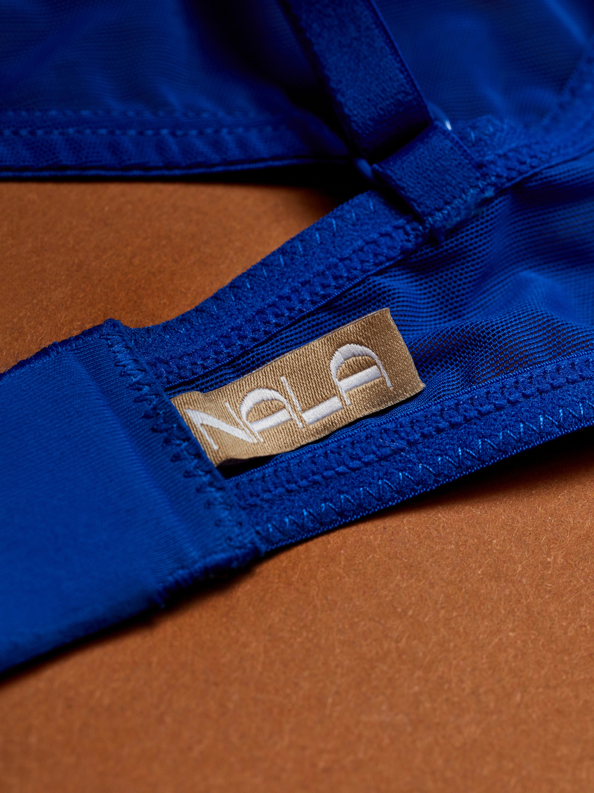
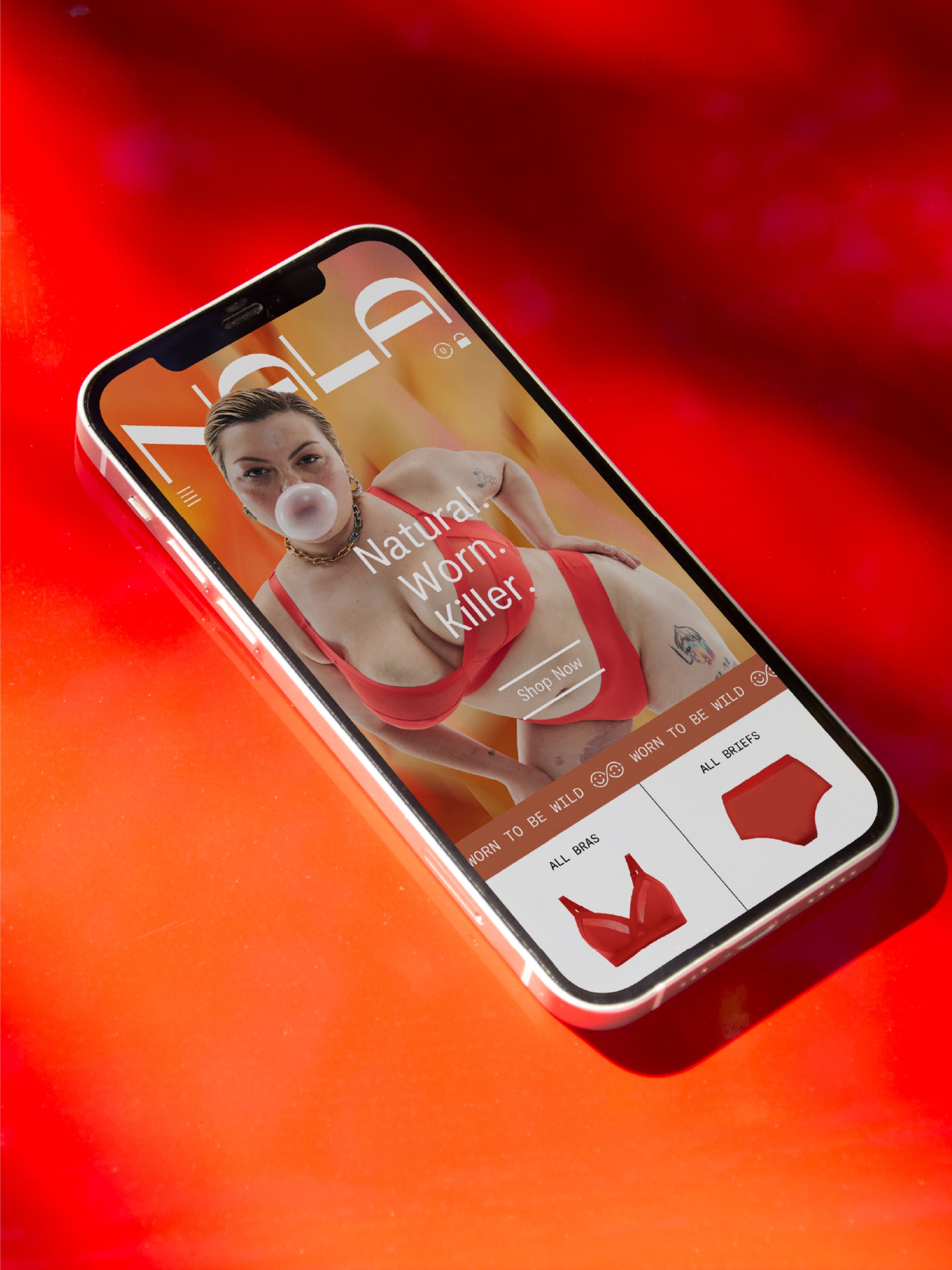
The wordmark challenges cultural, dichotomous norms and instead embraces fluidity. It’s both hard and soft, simple yet detailed and separate in parts but united in form. It’s unapologetically bold and unafraid to stand out in the category. Its supporting brandmark, the infinite smiley, brings in the brand’s environmental focus — a nod to the circular nature of the business and their commitment to giving back, as well as a universal expression of comfort and happiness. It sits comfortably with the wordmark, again showing how two uniquely individual pieces can form a greater collective.
Breaking the boring sustainability pattern
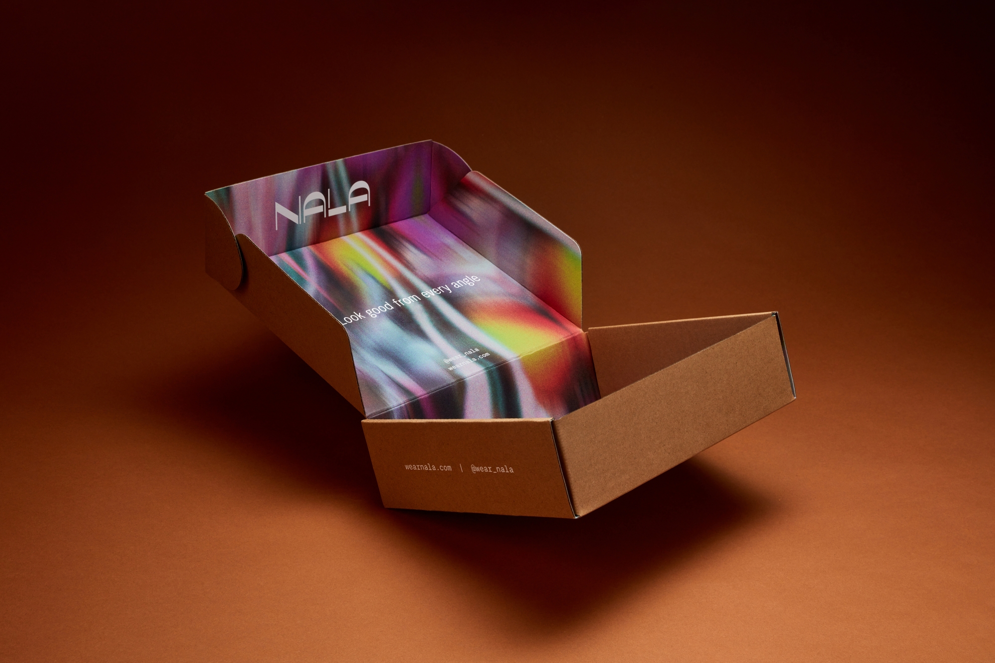
Unique patterns form a rich and ownable component of the visual language. Made from natural and organic imagery (flowers, clouds, raindrops, water ripples), they create interesting, hyper-coloured expressions that stand out against a neutral colour palette and reflect the moods and identities of the brand’s customers. They give the brand a cohesive yet ever-changing asset that can scale into product and evolve seasonally and thematically, as well as be animated for digital.
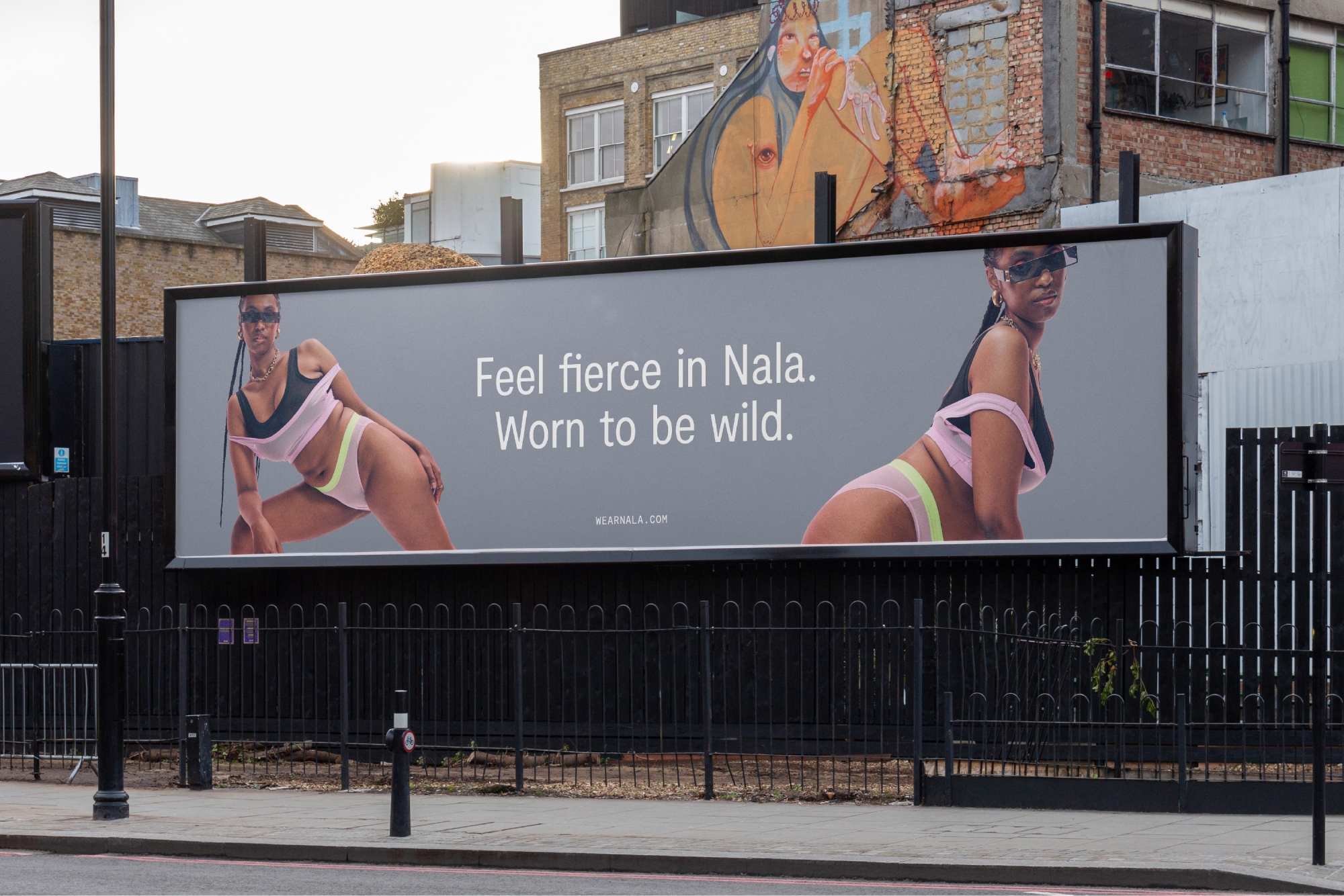
Fiercely confident and honest art direction
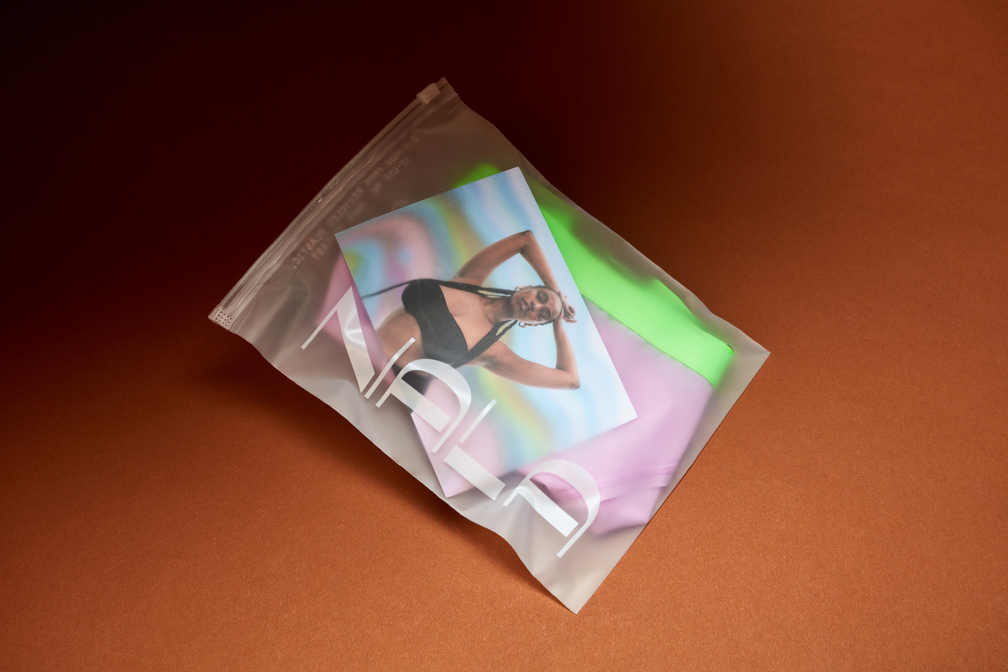
Considered art direction is always important but, for a brand that truly wanted to walk the walk when it came to inclusivity, it was paramount. We handed over stylistic guidelines that would ensure Nala’s essence was encapsulated in all their photoshoots. Models needed to reflect the Nala community and beyond — showcasing diversity in body, gender, ethnicity and expression. Throughout the styling, expressions and poses, we encouraged fierce confidence — an embodiment of the brand’s mantra that it’s worn to be wild. And, of course, we wanted to highlight raw beauty — no retouching, all honesty, full acceptance.
Helping Nala find its roar
Nala has a lot to talk about so finding the right voice was integral. There’s a lot of technical scope to their design and innovative fabrics, so we needed to find a way to communicate that was both informative but palatable. It was also essential to strike the balance between unapologetic confidence and radical inclusivity, making sure as many people as possible feel seen, heard and empowered. Once again working with copywriter Cat Wall, we developed a verbal identity and suite of messaging that hits those key points while adding some fun into the fundamental shifts that Nala is making in the industry.
The right type for all types
The brand uses simple and reliable typefaces to offset the beautiful visual rebellion of the photography and patterns. The primary typeface is Moderat — its low-stroke contrast and subtle detail providing a timeless quality suited for body text and large headlines. It pairs perfectly with Moderat Mono, whose technical flair and tactility sings as the brand’s accent font.
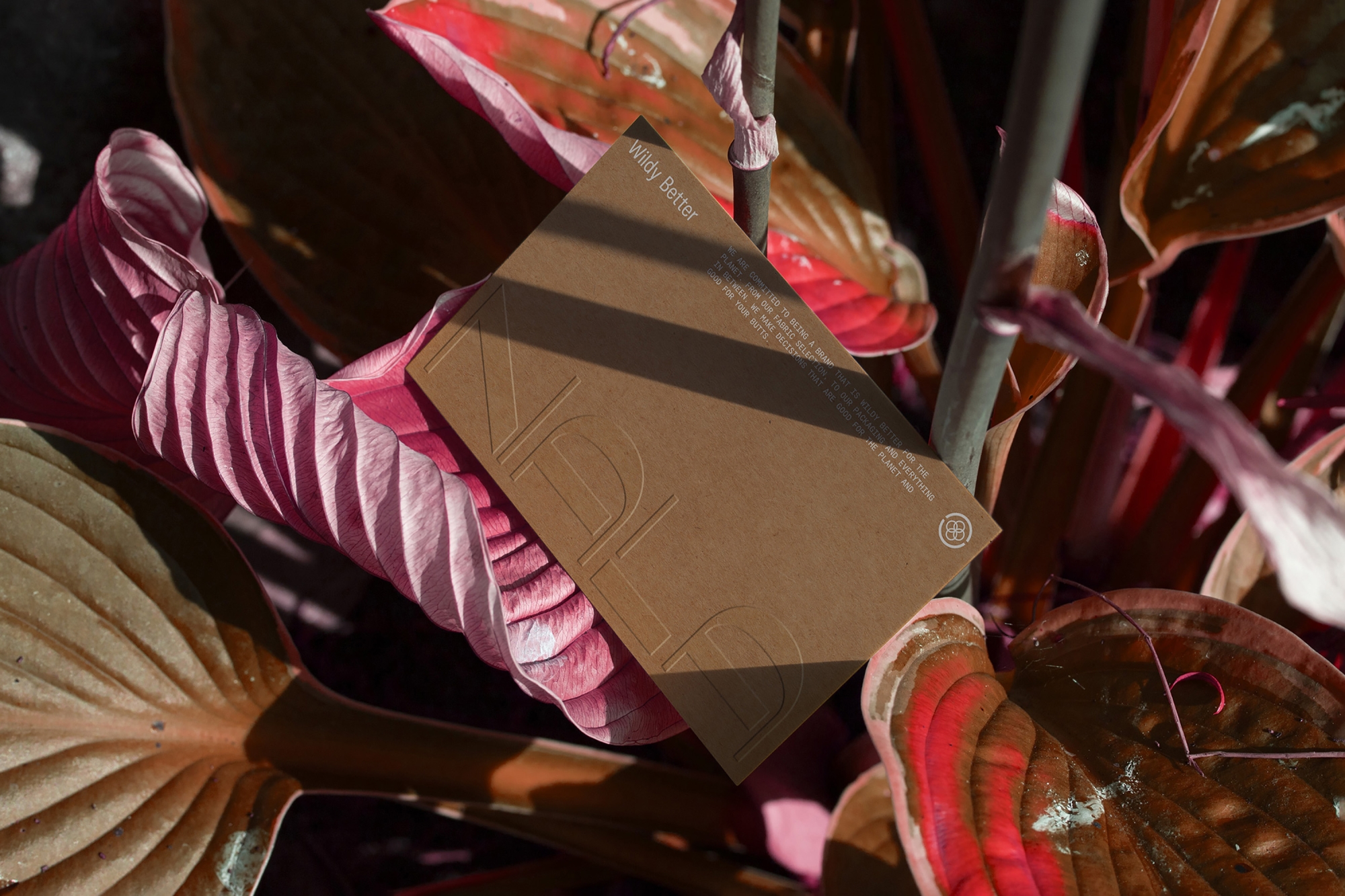
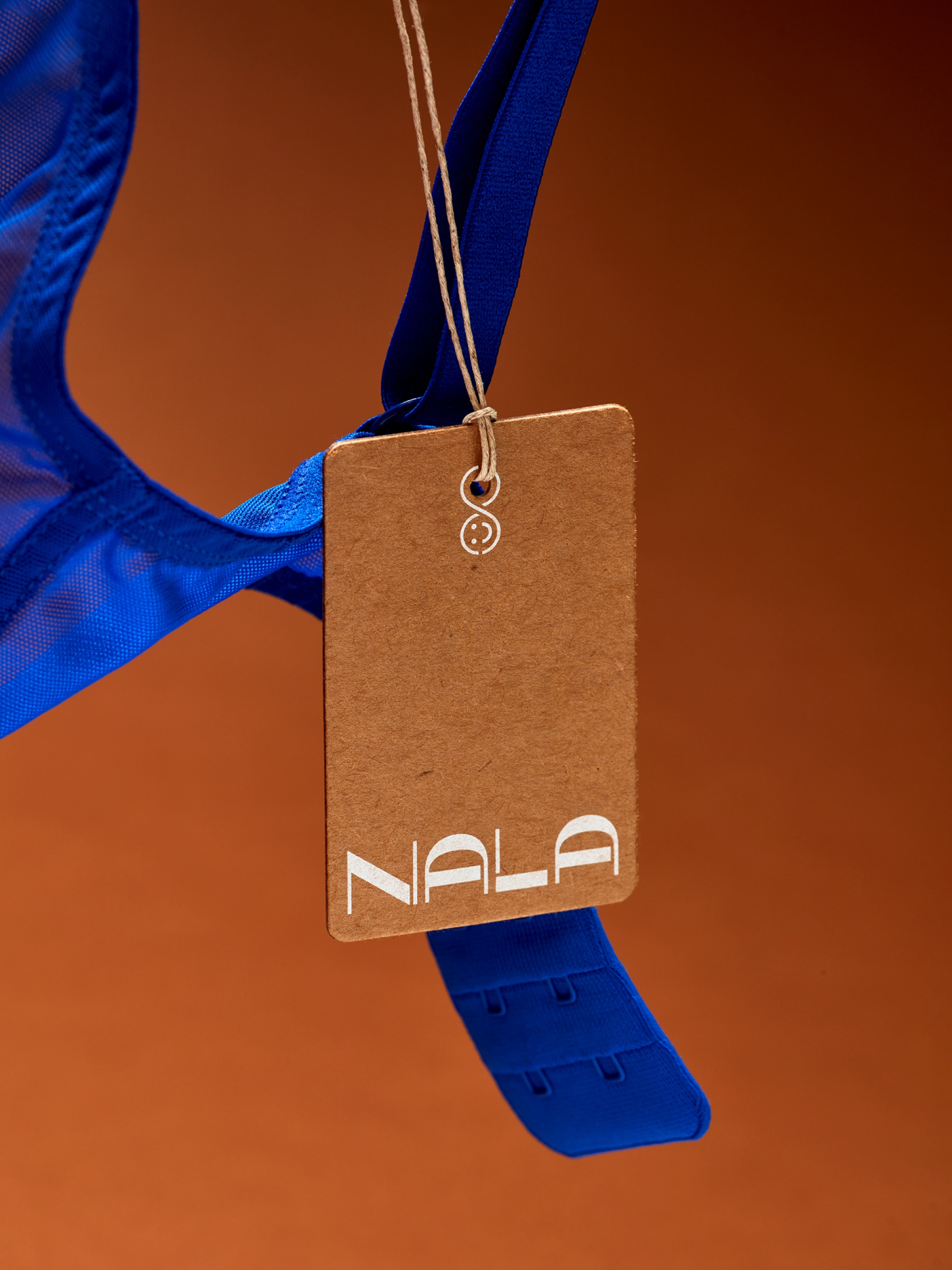
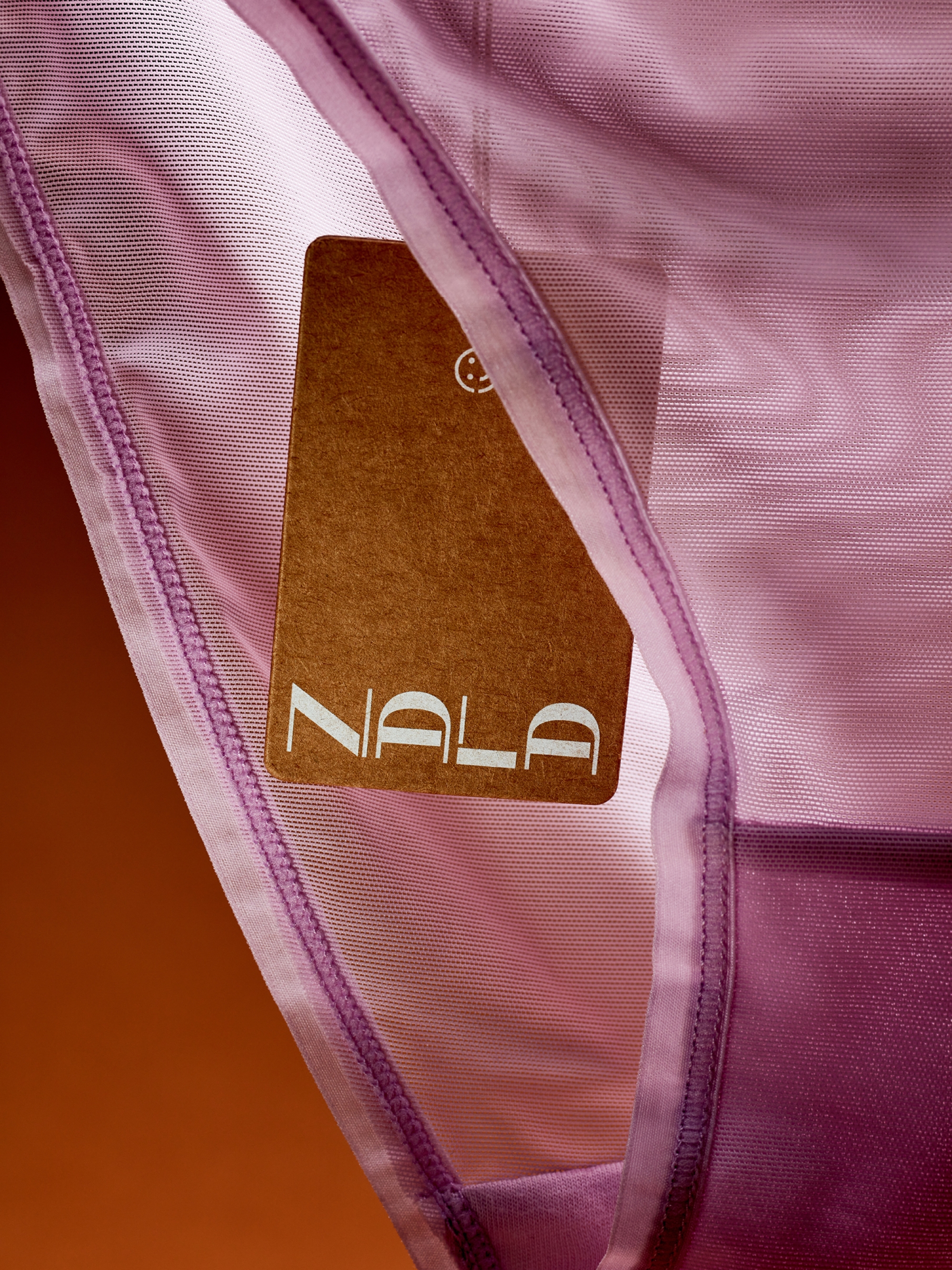
Packaging for a brand that hates labels
The challenge with packaging was getting the most impact on unboxing while minimising waste. In line with their environmental focus, kraft and recycled paper made for an appropriate choice for packaging materials and we brought in the brand’s signature patterns for moments of surprise and accent. Wherever possible, we printed directly onto products to eliminate unnecessary tags.
And the end result?
Nala launched at the end of 2022 and entered the world with a roar. We’re proud to have helped build a brand that genuinely stands up for what it believes in and to have played a role in ensuring its identity is reflective of its values. The flexibility of the design system means the messaging, the people and the products exist in and amongst each other — separate pieces combining to create an eclectic yet cohesive whole, much like the people they represent. Nala has made the underwear industry more inclusive for more people and we can’t wait to see what they do next.
Model imagery courtesy of Nala
Collaborators
- Brand Writer • Cat Wall
- Video • Alt House
- Hair and Makeup • Shella Martin
- Styling • Carlos Mangubat
- Photographer • Liane Hurvitz
- Art Direction • Ainsley Hutchence
Flaus
Bringing a world of flossibility to life