From naming right through to their outdoor launch campaign, we worked with the crew from Australian Radio Network’s The Edge 96.1 to help them rebuild their brand into CADA from the ground up. This set the tempo for their launch as an Australian youth media and entertainment enterprise. Now live across multi-platforms, they’re serving up all things inclusive, exclusive and adjacent to Hip Hop and R&B music and culture.
- Brand strategy •
- Naming •
- Verbal Identity •
- Visual Identity •
- Brand writing •
- Art direction •
- Motion •
- Campaign creative •
- Brand guidelines
Featured In
What's all this then
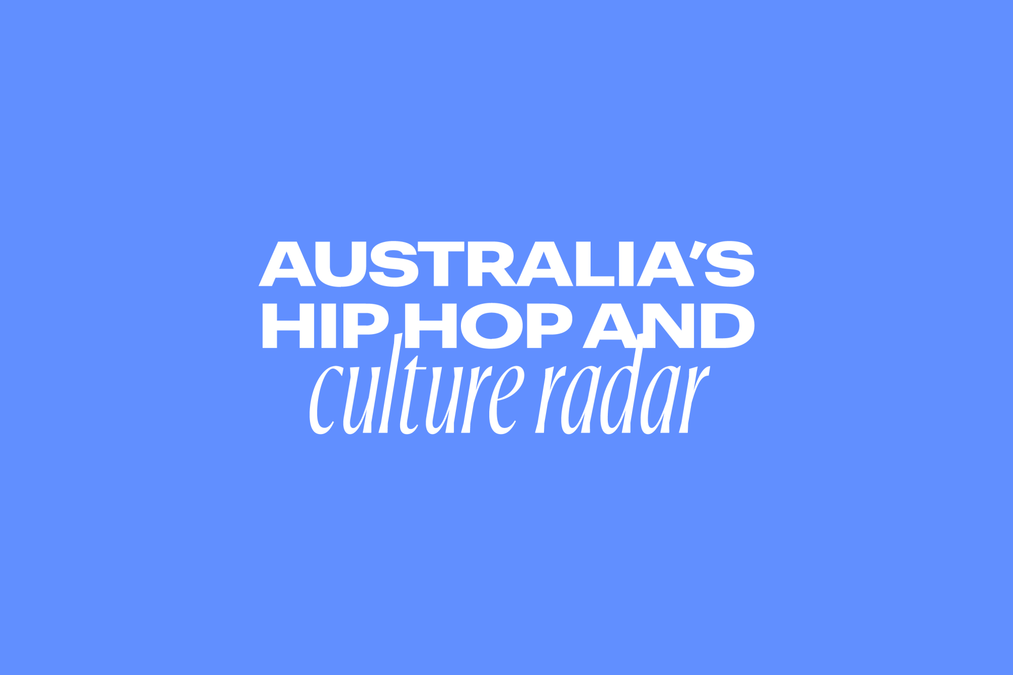
CADA is Australia’s home of Hip Hop and R&B. They’re a multi-platform youth media and entertainment brand that was born from a desire to challenge traditional radio tropes and truly champion inclusivity, diversity and the Australian community that lives and breathes Hip Hop, R&B and everything around it.
Any insights?
The commercial radio category is typically noisy and crass, fronted by a swathe of white, ageing hosts with clear political leanings. When it comes to the youth entertainment space, there’s not a lot out there that actually serves and reflects its audience and, when your community of listeners are largely working class and often ethnically diverse, representation is paramount. It was crucial to CADA to give a platform to those within the Hip Hop and R&B community and, in turn, allow their listeners to feel seen, heard and inspired.
And what seems to be the problem?
Although an already-established R&B and Hip Hop radio station, to become the community-focused youth channel they truly wanted to be, they needed a complete brand overhaul. With all new programs, hosting talent and a focal shift to one of diverse and culturally-credible content, CADA asked us to help them change the perception of what a commercial radio platform can be.
So how'd you go about it?
Working with the talent at Untangld, we began with strategy, forming the brand idea of “Closer To Culture”. This gave us the leaping-off point for the visual identity — the concept of CADA as more than just a place for music, but a curator of culture. Culture courses through every segment, every event, everything CADA talks about. It ebbs and flows each minute and day — a fluid and constant pulse of the latest, the relevant, the interesting, the talked about.
Giving the youth a voice
A key part of the rebrand was a new name and it was a particularly challenging brief. We worked with copywriter Cat Wall to come up with something that not only sounded good on air but was ownable in a number of trademark classes to ensure longevity and opportunity for the brand. Born from the idea of cadence, CADA reflects the brand’s role in setting the tempo for Hip Hop and R&B in Australia and its drive to ensure its listeners never miss a beat.
While the name is bold, short and snappy, the verbal identity needed to be able to sit back and let the hosting talent shine. Stepping away from the loud and boastful tone we’ve come to expect from radio, CADA’s voice strikes a balance between upbeat, inclusive and sincere, sitting seamlessly among its community of listeners.
Anchoring the brand with a bold logo
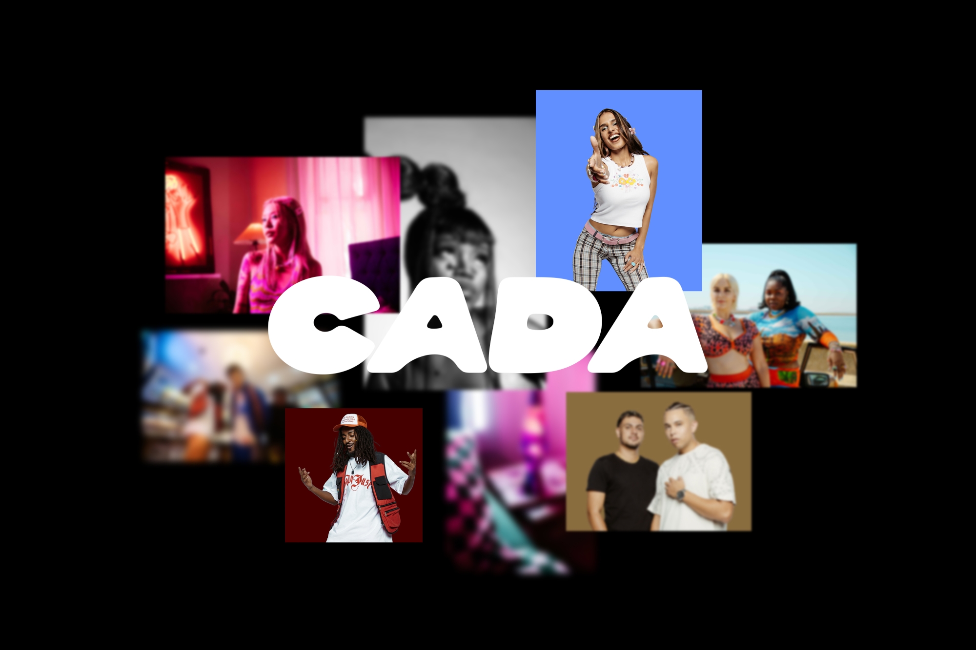
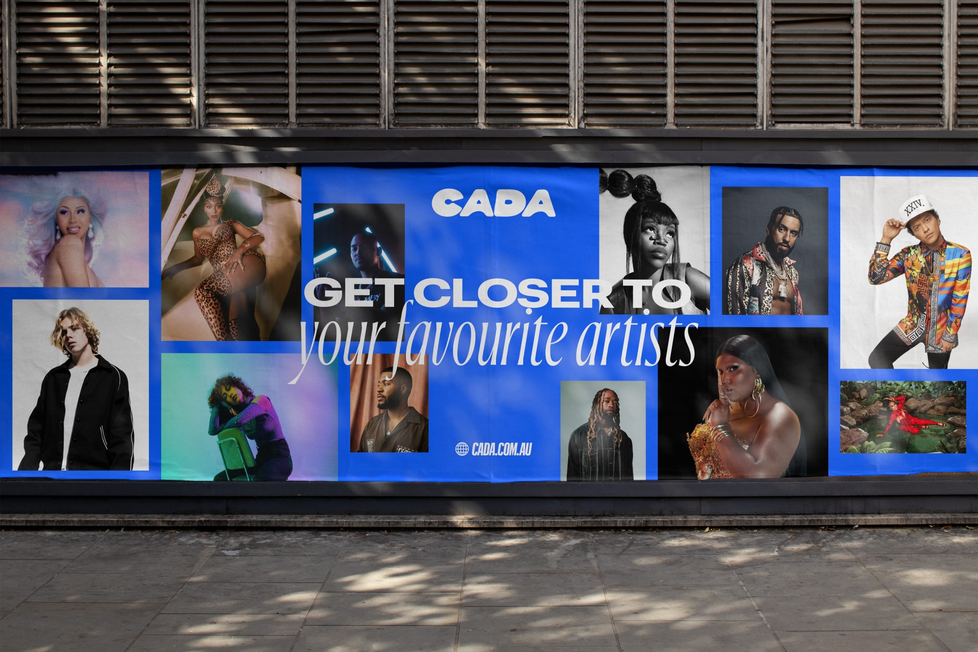
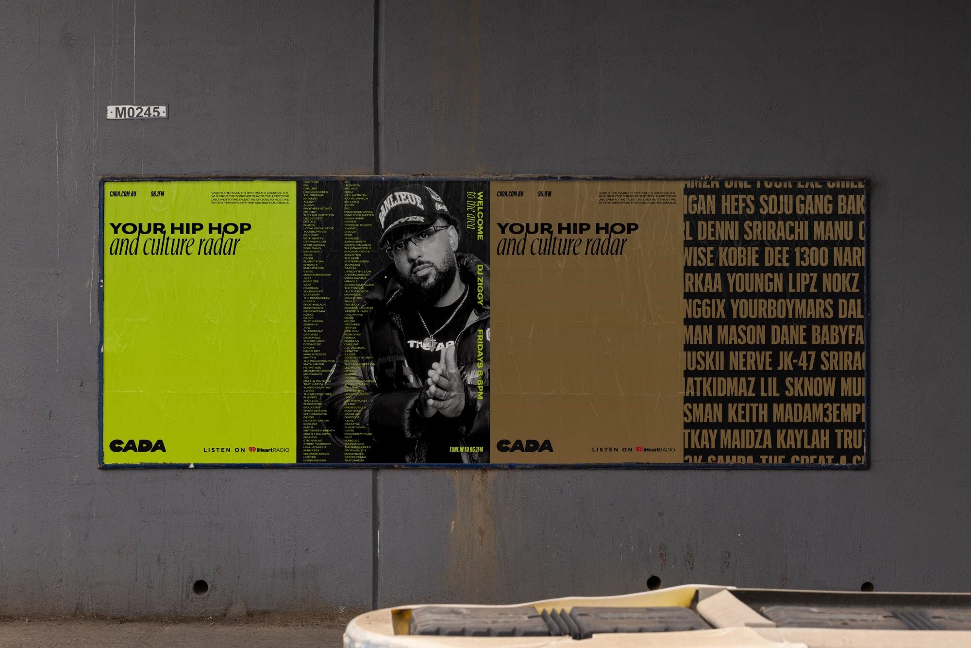
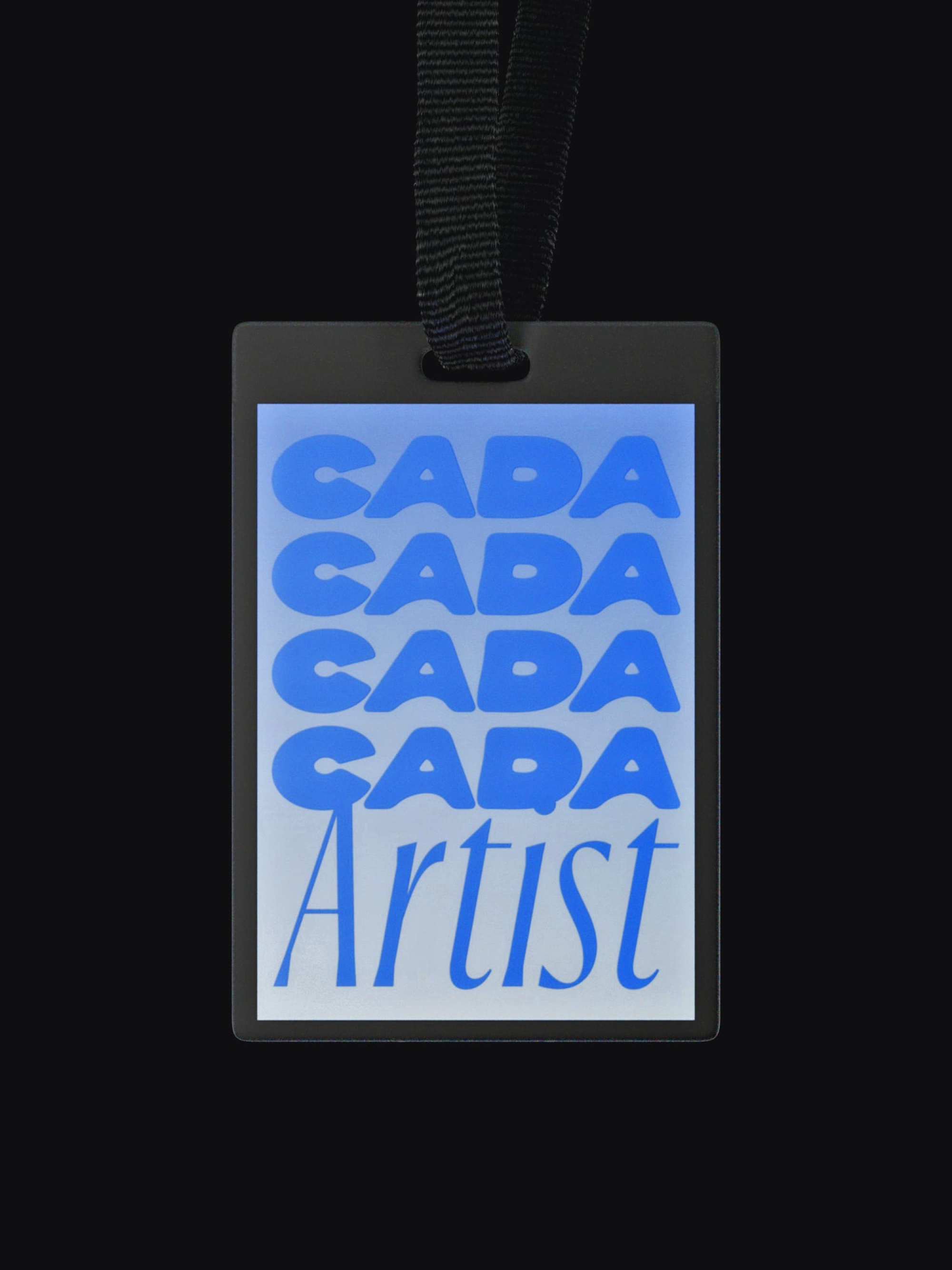
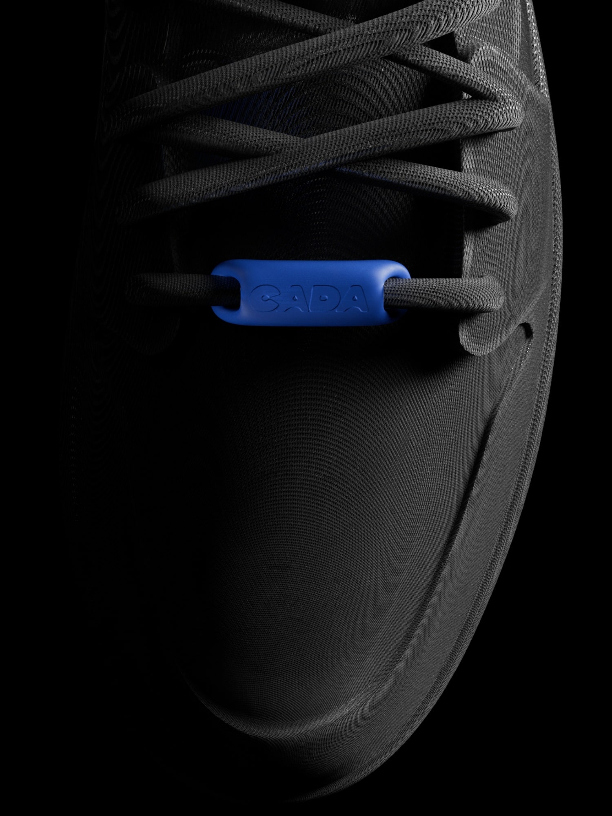
The logotype is the heart of the visual identity. It’s both soft and strong, allowing it to stretch from Pop to Hip Hop. It came from the idea that CADA is a melting pot of culture, with its rounded corners mimicking a literal melted feel. For those who look closely, the mark is also a slightly abstract vinyl record — a nod to the rich history behind the music they play.
With CADA’s role as a content creator, the logo needed to work across multiple media streams. From podcasts to music videos to festivals and sponsorships, we created a system that matched the flexibility of the multi-faceted business behind it. Coupled with striking typography, it stands out in a sea of dated competitors, holds its own next to partners and sits comfortably on every platform.
A pop (and Hip Hop) of type and colour
The type system was designed to straddle the line between Pop and Hip Hop, showcasing versatility and ensuring it didn’t isolate any of the platform’s listeners. We used Commercial Type’s Graphik as the primary typeface, its multiple weights and widths giving us the flexibility and cohesion we needed. While the boldness of Graphik grounds the brand, Commercial Type’s Ayer complements it, producing a distinctive and highly-ownable combo.
Given the vast and varied content CADA produces, the colour palette needed to be broad and flexible. While generally bright and energetic, it’s easily suited to suit Hip Hop and Rap, using gradients interchangeably with solid colour to add an extra level of adaptability.
An intentionally eclectic art direction
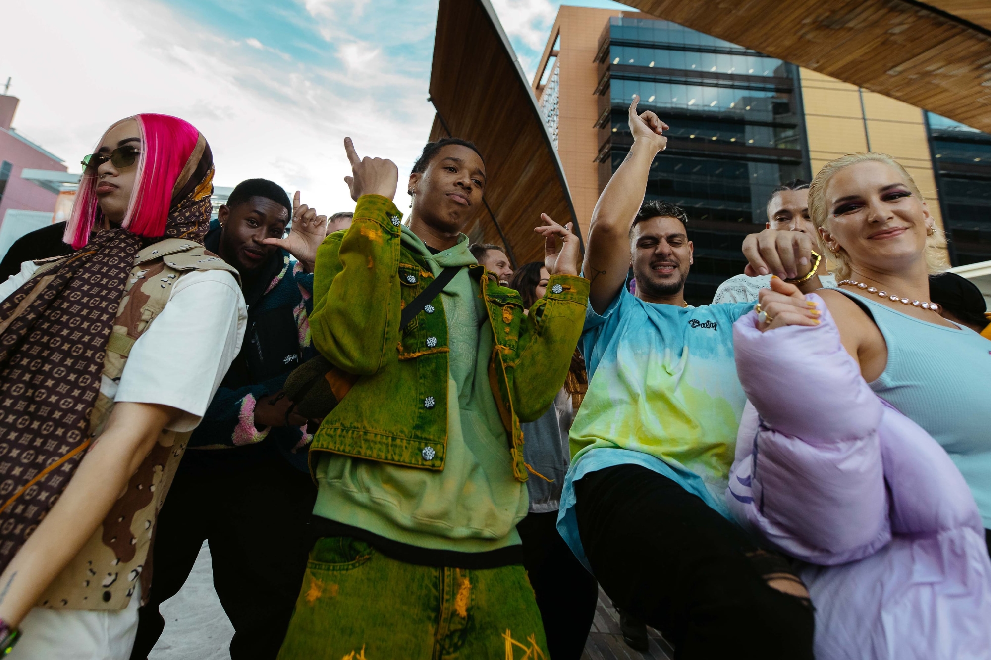
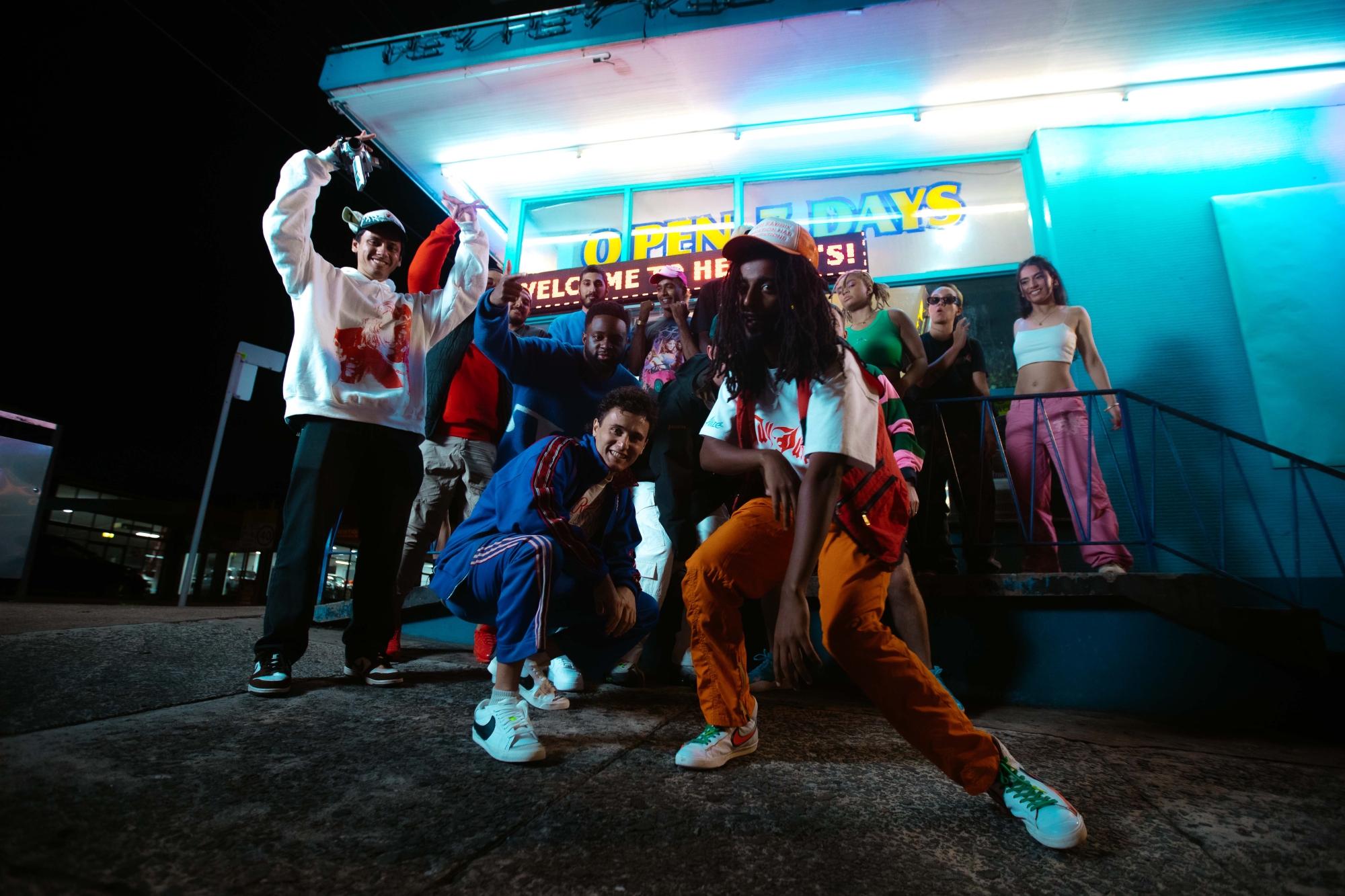
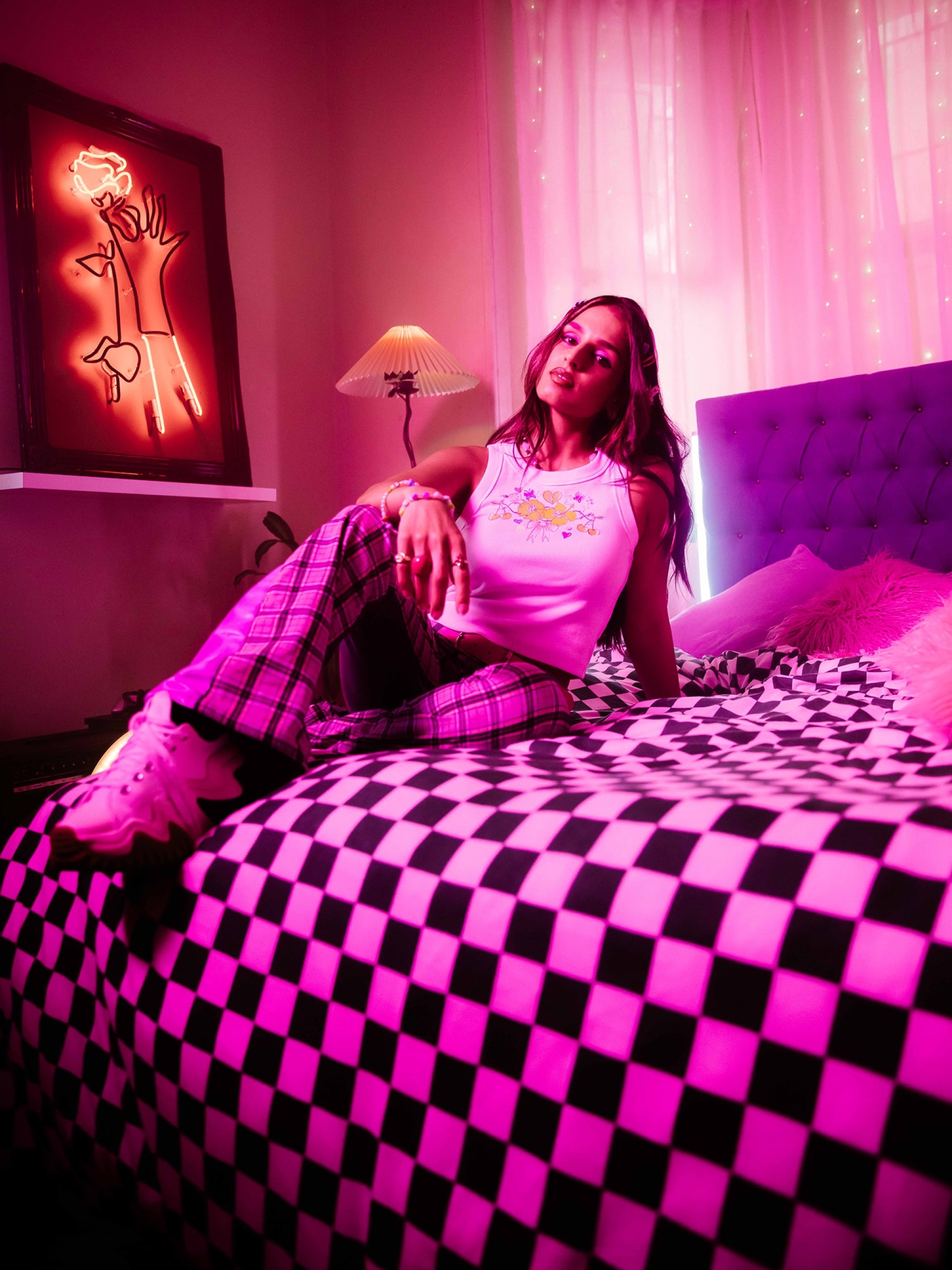
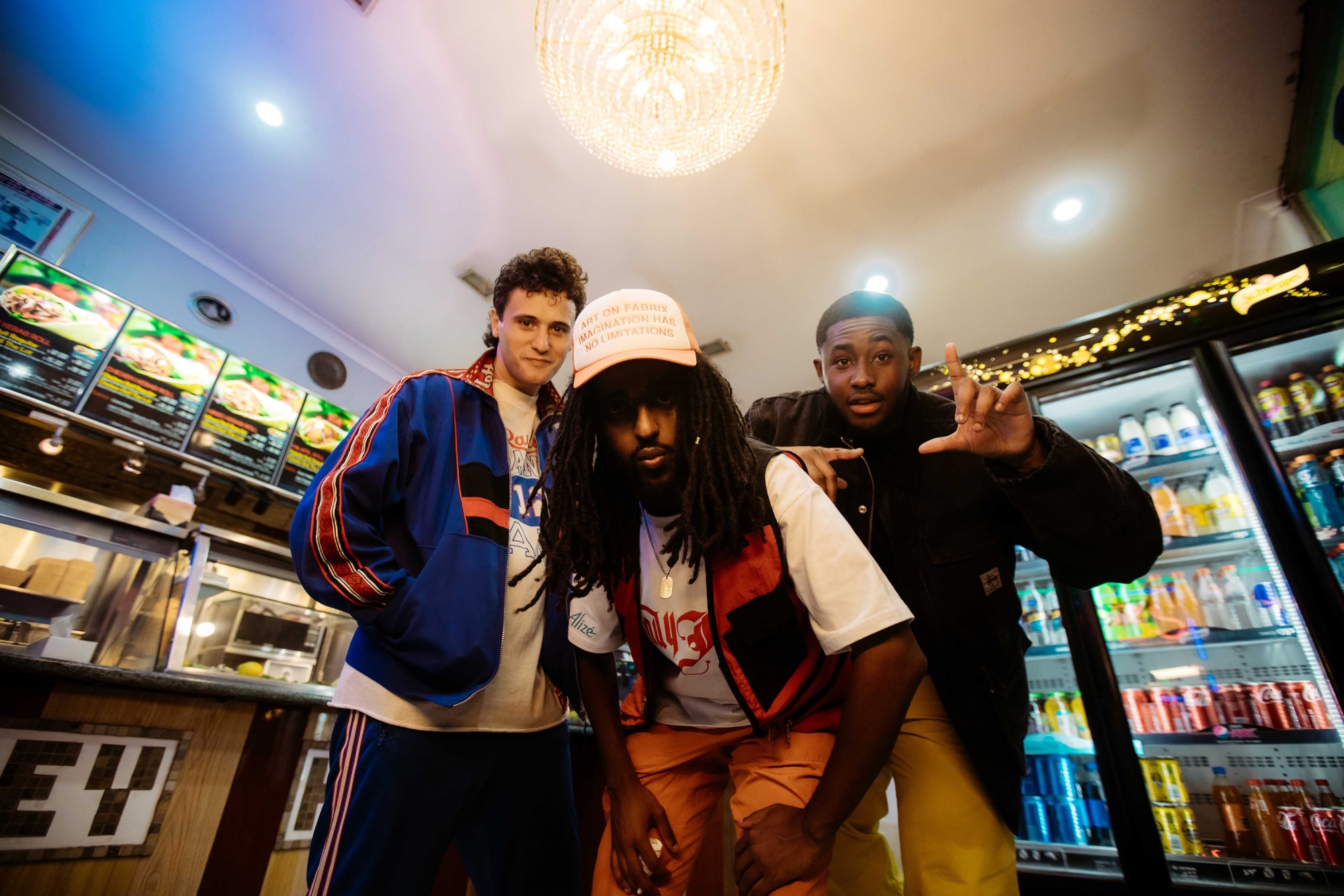
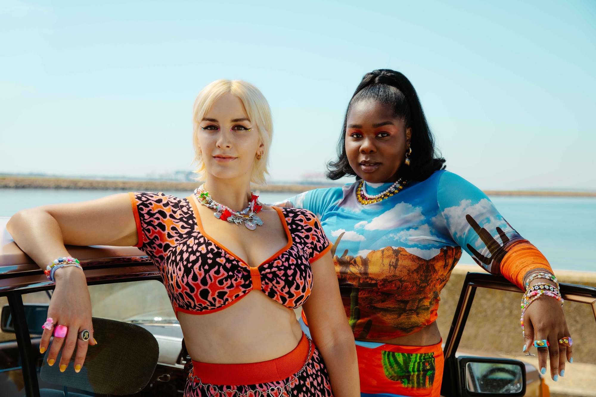
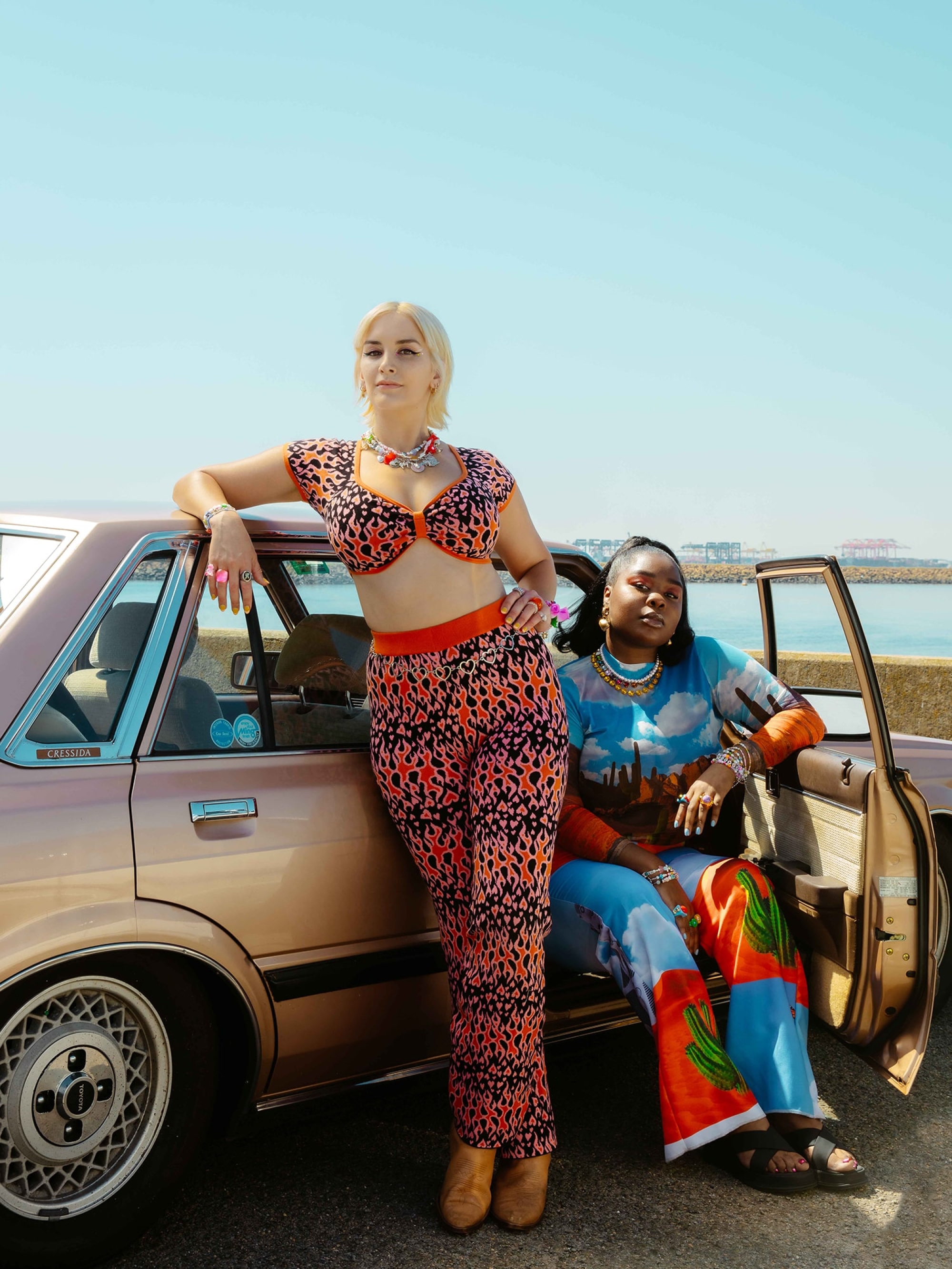
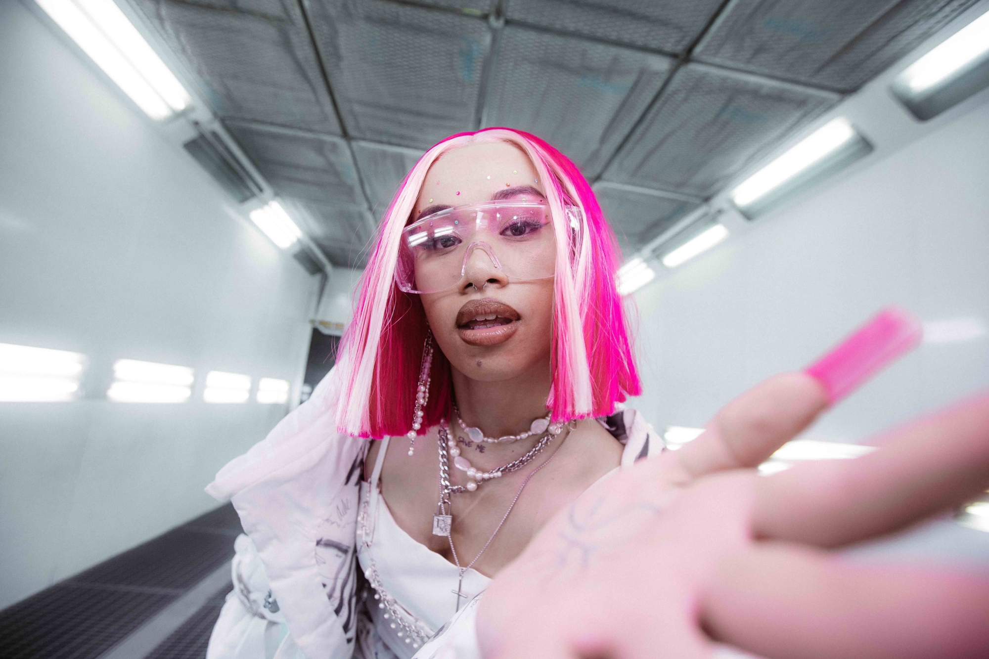
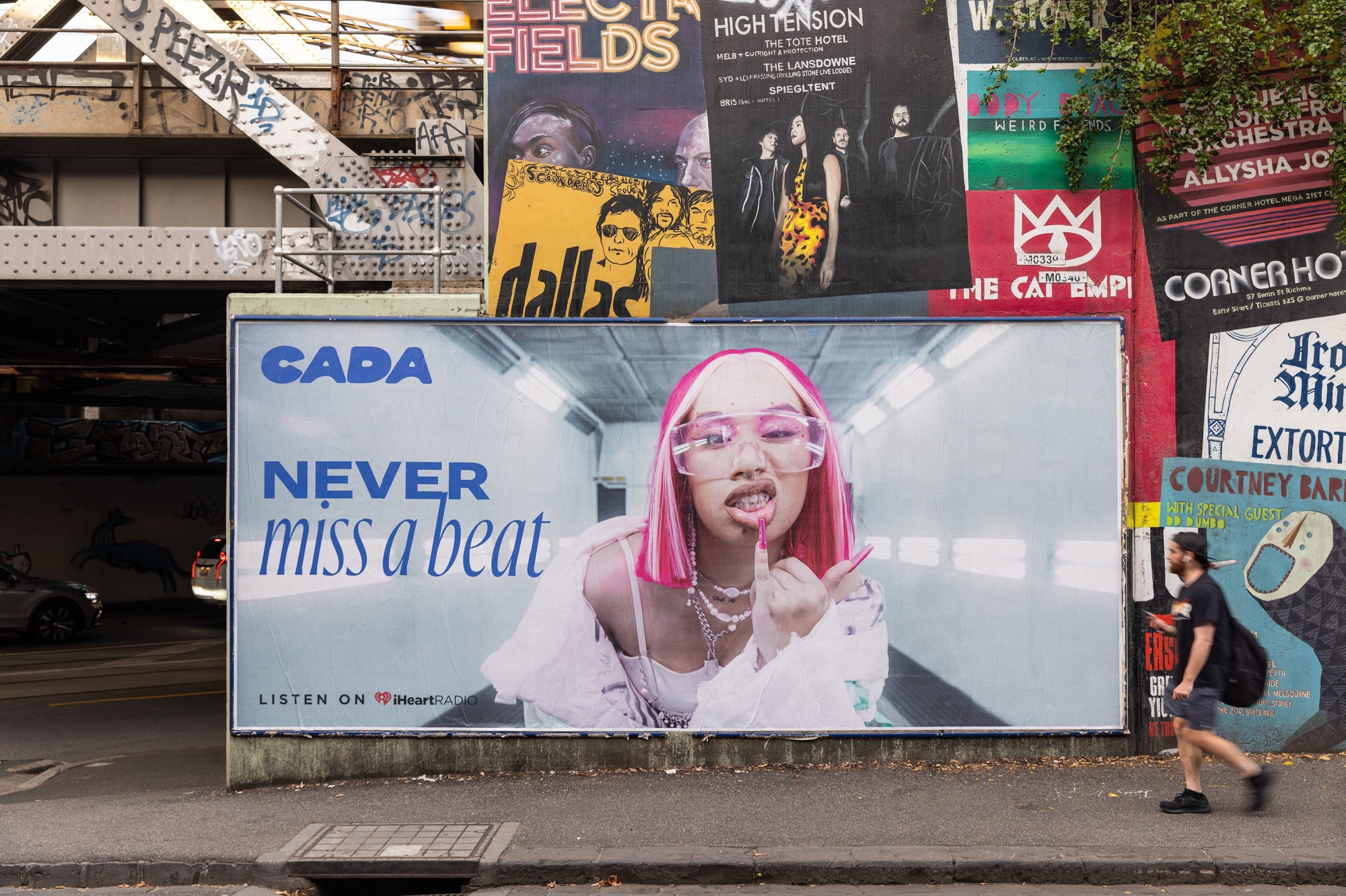
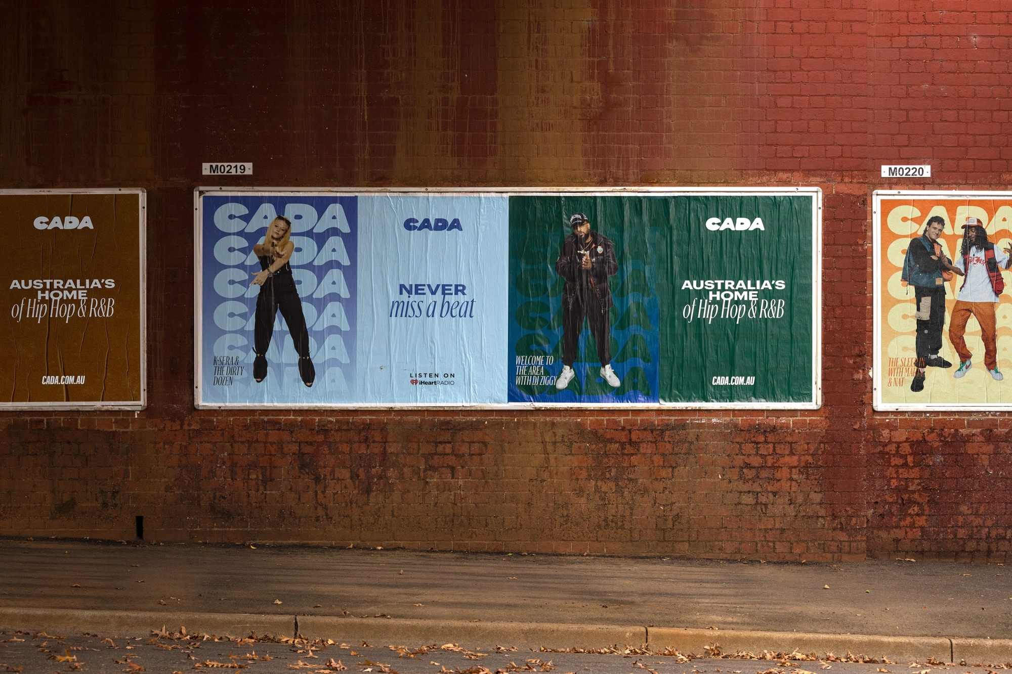
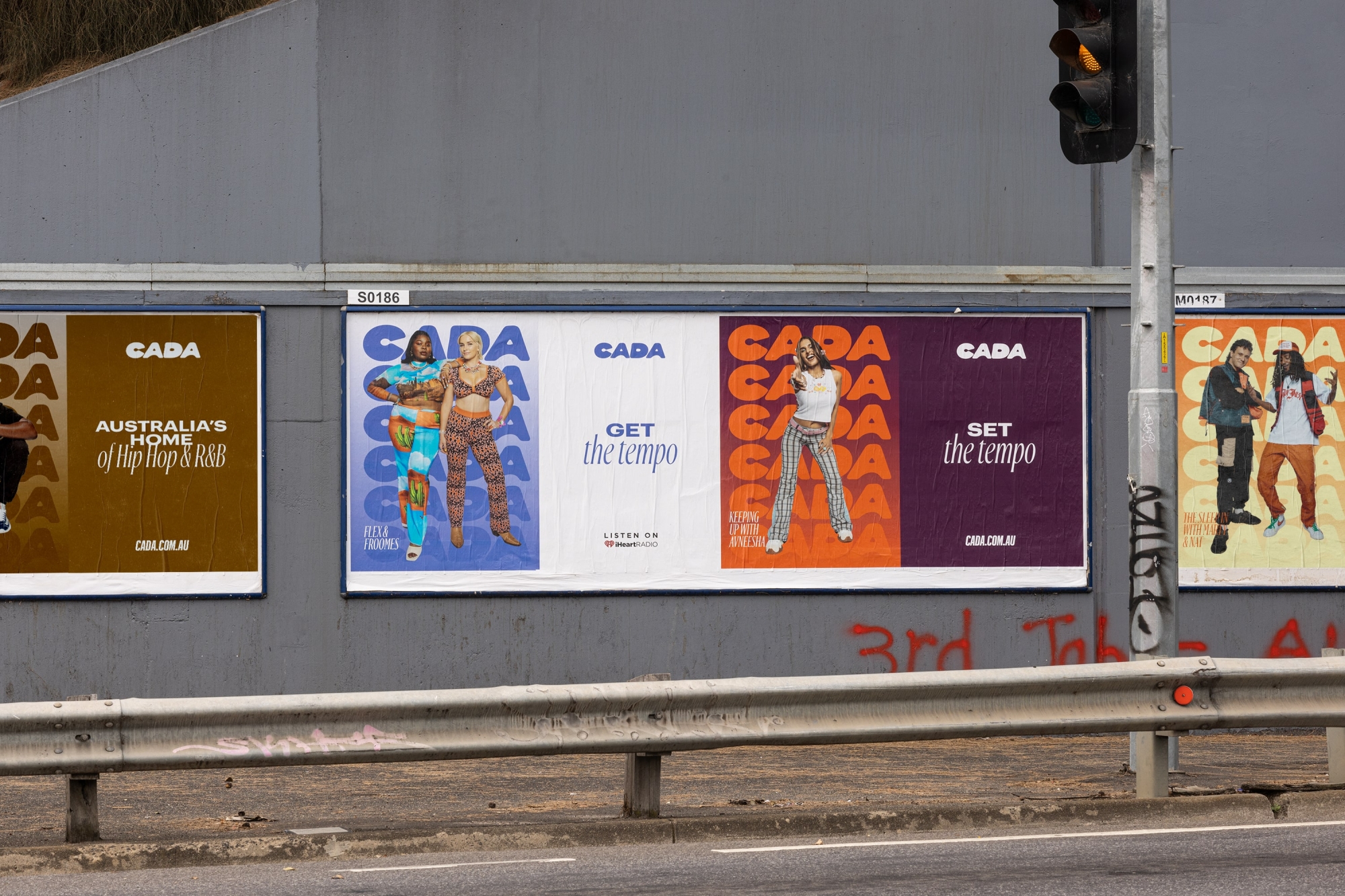
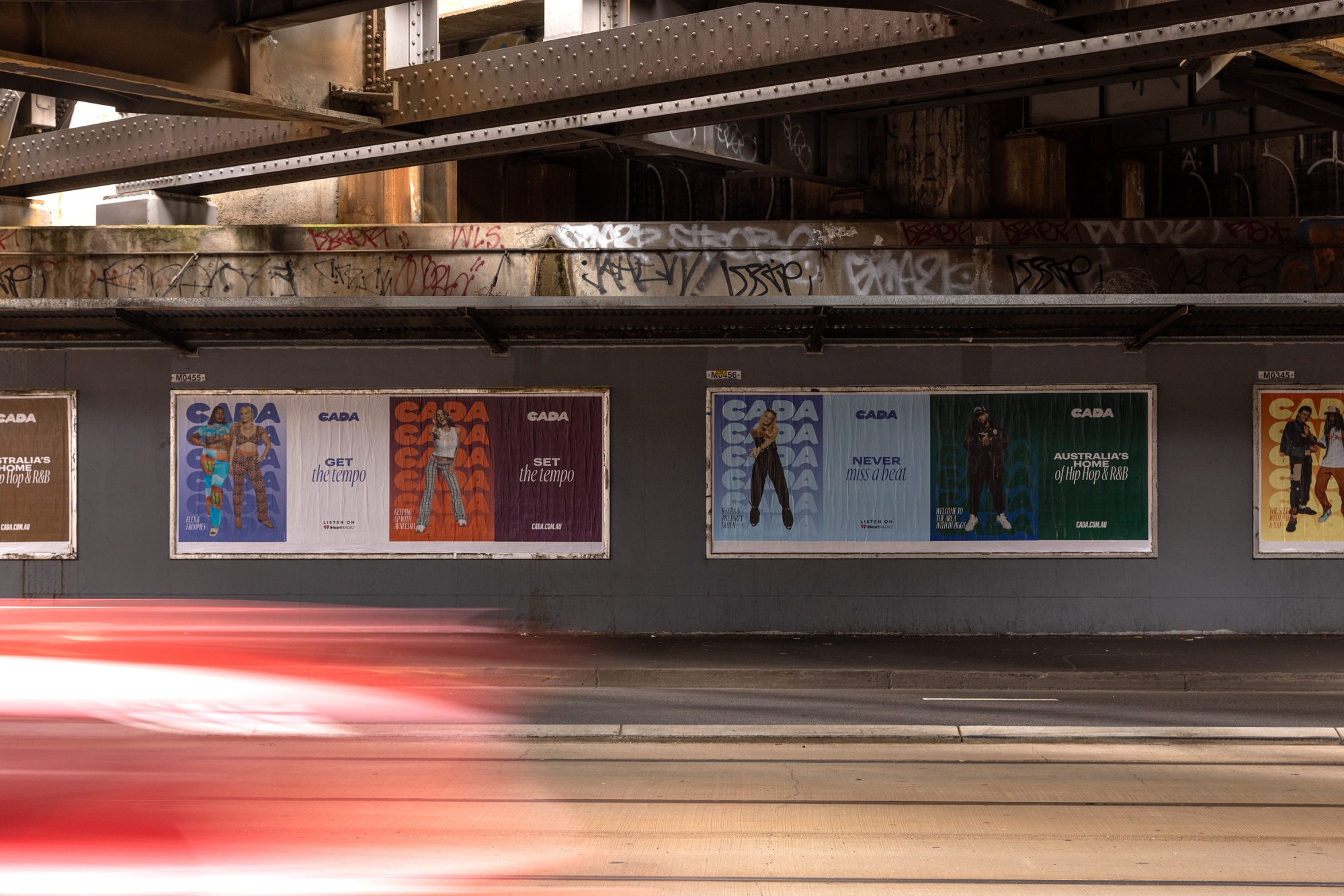
Culture moves and shifts — it’s always evolving, taking different elements from different people, movements and subcultures. As a curator of it, CADA is open to different worlds and experiences, collecting the latest and most interesting things that are happening in the Hip Hop and R&B space. For this reason, our art direction is deliberately eclectic, stretching from artist-supplied photography to album covers, 3D illustrations, deep-etched images and icons — the brand can do and be whatever it needs to. It’s an idea that courses through everything CADA do — with every show host encouraged to bring their own vibe to the brand and not feel restricted.
Shot by Billy Zammit, the photography style is fun, striking and exciting. It brings a vibrance to the brand and celebrates the talent, fans and people who bring it all together. Our illustration style also channels this energy. From 3D to custom emojis, the openness of its direction leaves CADA open to collaborations with all kinds of creatives who can bring the brand to life in their own way.

Literally bringing you closer to culture
The motion and design system centres on the idea that CADA curates what you want, bringing the best of culture, Hip Hop, R&B and everything around it front and centre. Images and content are layered and gathered in the Z-space, with a new piece of culture coming into focus as it comes closer to the viewer. By using depth and focal blur, we can let a central element command attention while flanking it with character and fun. Footage and stills can be worked into the system interchangeably to create dynamic interactions and transitions that allow the brand to grow and shift into different categories.
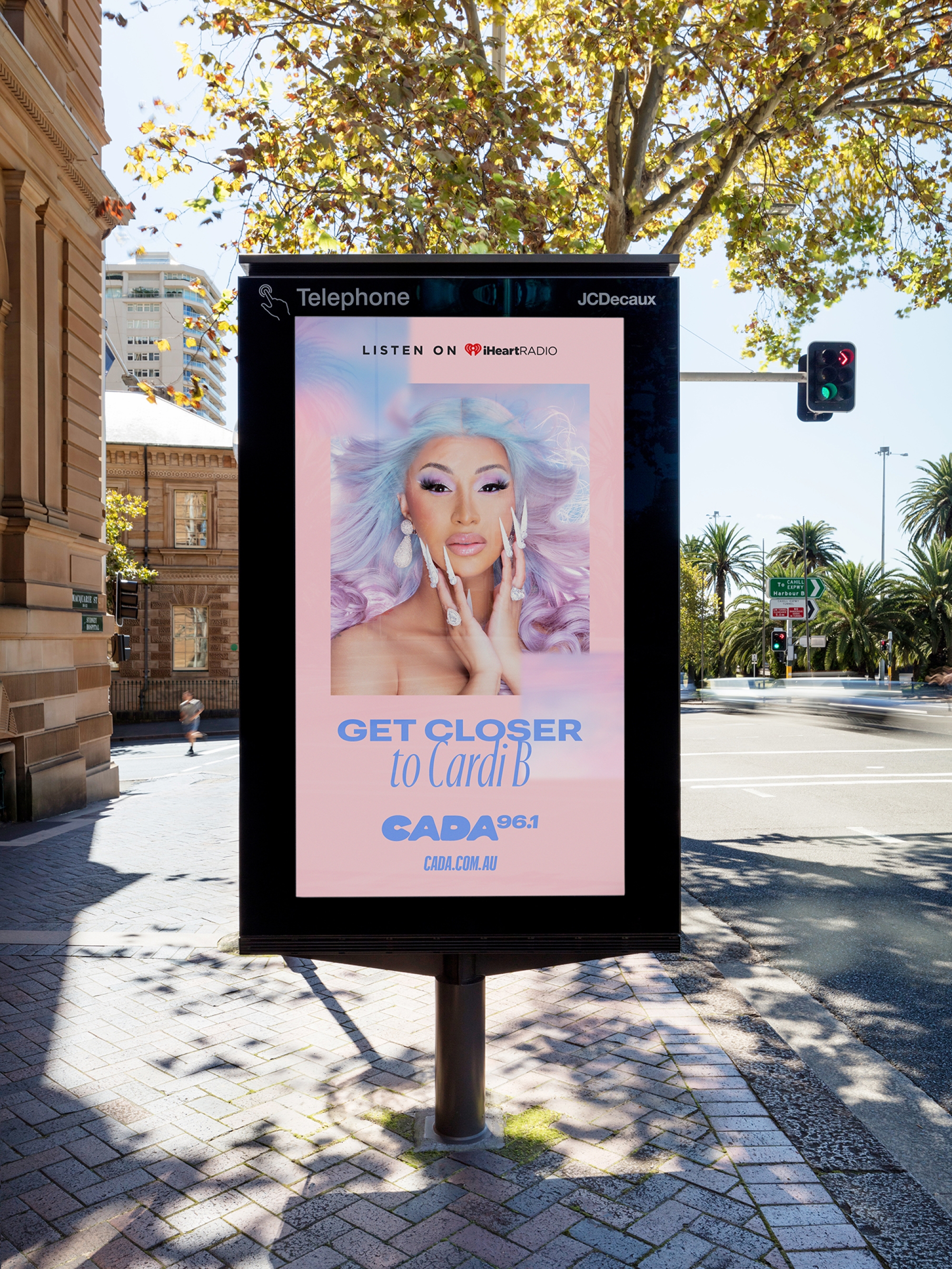

There to suit every moment and mood
Flexibility and scale were integral to the brand system and its simplicity allows it to move from outdoor to social to digital seamlessly. This was first put to test in the brand reveal, where we worked with CADA to showcase their new name, logo and talent in an awareness campaign across the streets and several social applications.
And the end result?
Though still in its infancy, CADA is well and truly making its mark across Australia as a refreshingly in-touch and inclusive platform that’s always on the pulse of culture. From a deeply layered and considered design system to a name that’s literally been written across the skies, it was a privilege to be part of building a brand that truly represents the bold, vibrant diversity and energy of Australia’s young Hip Hop and R&B scene.
Collaborators
- Brand Strategy • Untangld
- Photography • Billy Zammit
- Brand Film • Production • Entropico
- Brand Writer • Cat Wall
- Artist Imagery • Sony / Warner / Universal
Colour Mill
A vibrant rebrand for incredible, edible colour.