Off the back of some incredible crowdfunding success that saw them rise to the top 1% of all Indiegogo campaigns (ever!) Flaus asked us to set the vibe for the world’s first planet-friendly electric flosser. Never one to turn down a toothsome opportunity, we dove in from strategy right through to social media to help bring life to the brand that’s opening up a whole new world of oral healthcare.
- Brand strategy •
- Verbal Identity •
- Visual Identity •
- Brand writing •
- Packaging design •
- Art direction •
- Photography •
- Illustration •
- 3D renders •
- Motion •
- Website design & build •
- Brand guidelines
Awards


What's all this then?
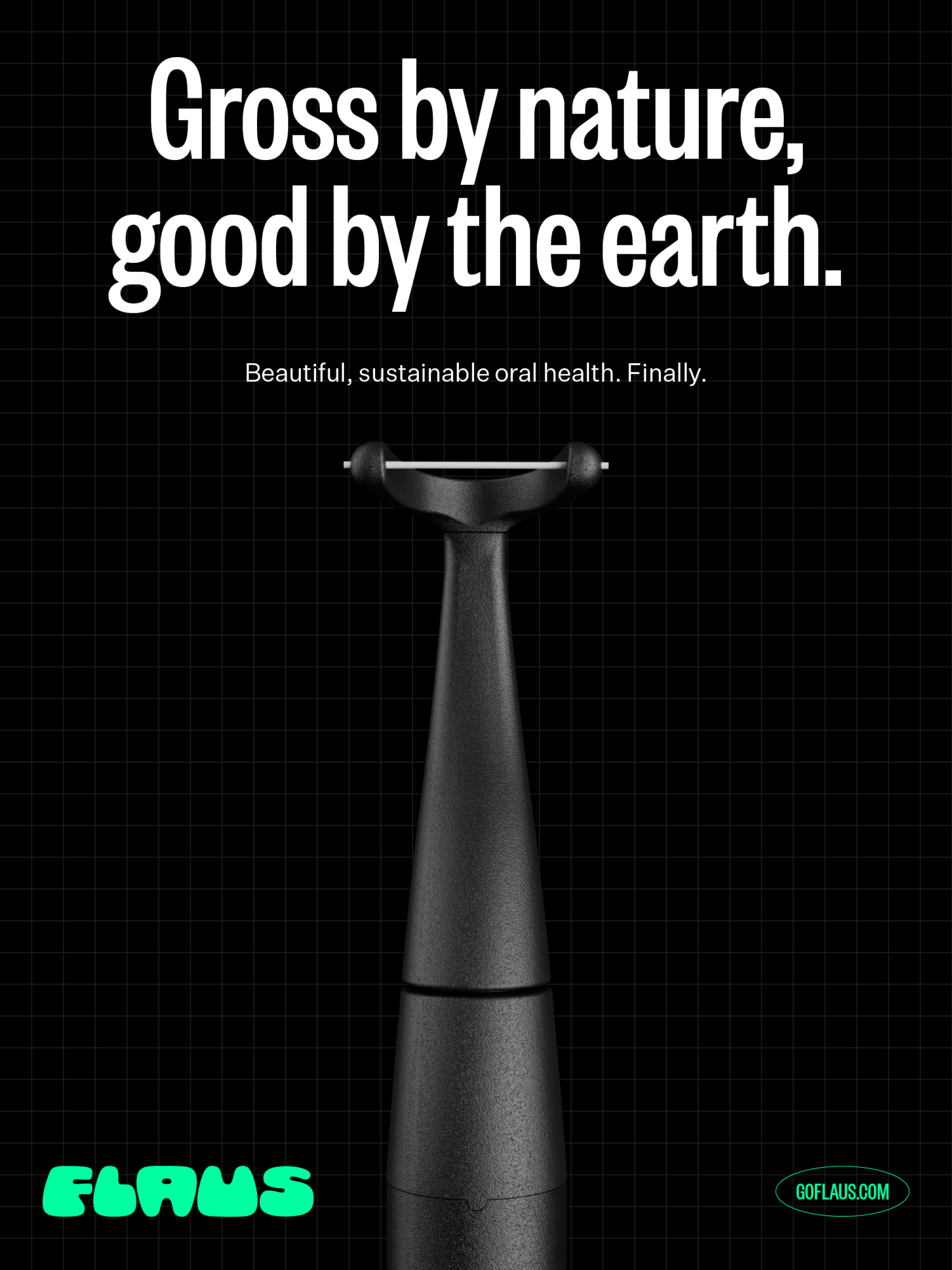
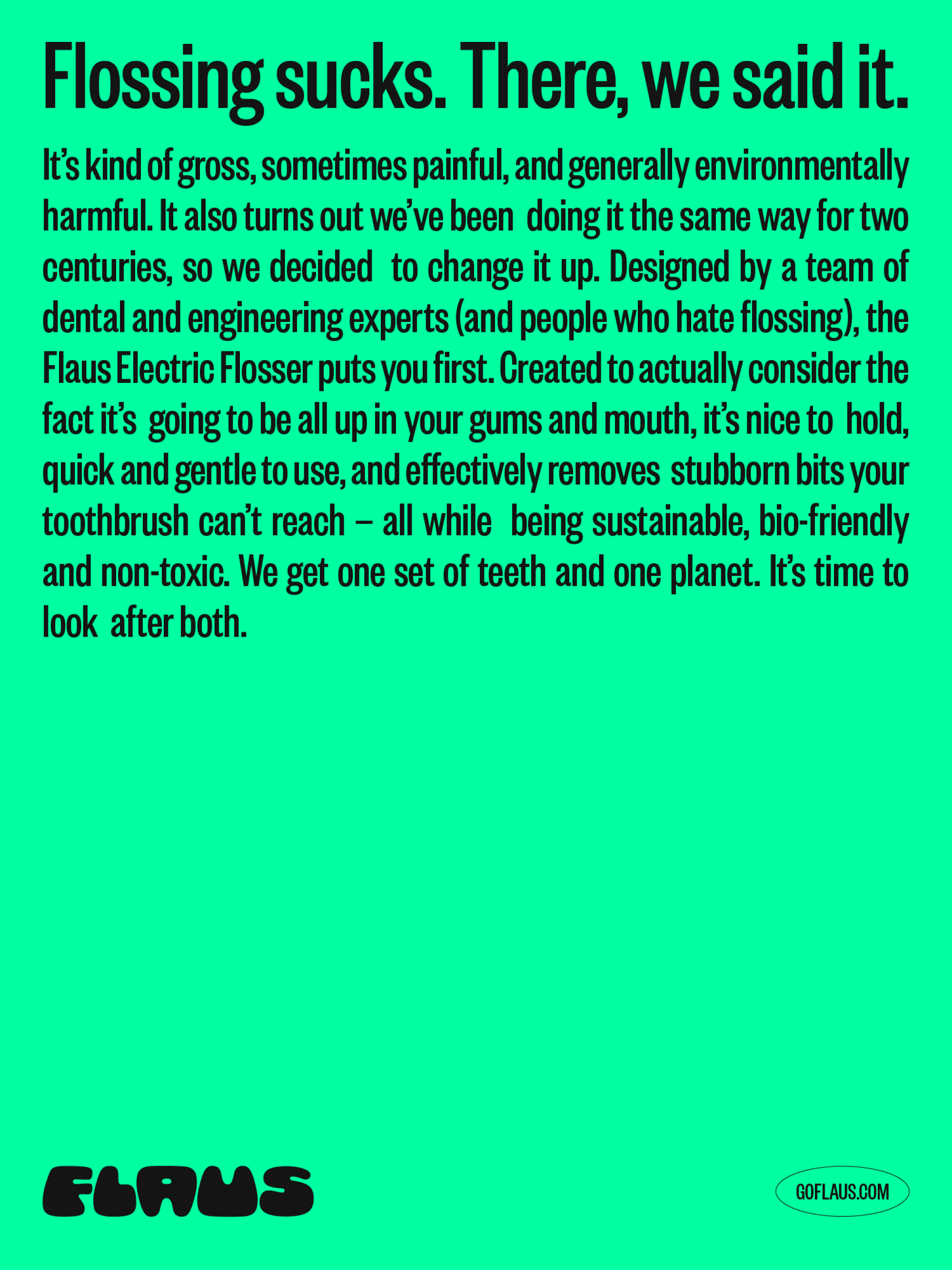
Flossing sucks. It’s boring, kinda gross, sometimes painful and a process that hasn’t changed in the two centuries since its invention. Wanting to bring some enjoyment to an everyday chore and do right by the planet along the way, Flaus is reimagining the oral healthcare space, starting with the world’s first planet-friendly electric flosser.
Any insights?
Invented in 1819, dental floss and the way we use it has remained mostly unchanged. That fact is mind-boggling in itself but perhaps the most perplexing fact about this bathroom staple is that nearly all of the floss ever used still exists. It’s an environmental nightmare.
In recent years we’ve also seen a huge shift in purchasing behaviour when it comes to oral hygiene products, as the category rapidly embraces the growing trends seen in tech and wellness. Things like toothbrushes, toothpastes and flosses have pivoted from perfunctory health products to essential beauty items.
And what seems to be the problem?
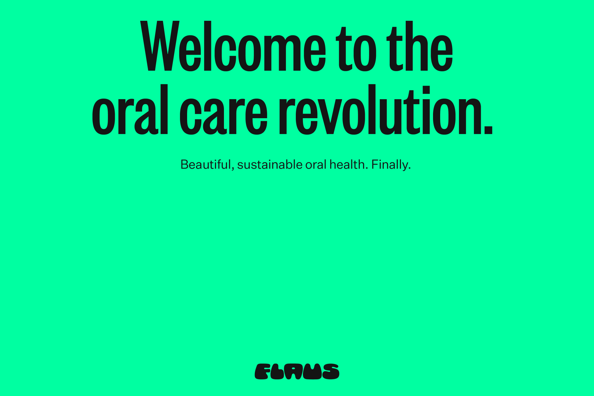
Flaus wanted to create a brand that brought flossing into the 21st century but also rose above the swathe of superficial and “trendy” millennial brands emerging as part of the oral beauty boom. Part of this meant bringing their environmental ethos to the front without falling into stale “eco” tropes or the blur of brands saying the same meaningless things. We have one set of teeth and one planet and Flaus’ mission is to look after both.
So how'd you go about it?
Partnering with our pals at Untangld, we worked toward a strategy that would help us truly own the uniqueness of Flaus’ offering. With the proposition of inventing a better future for people with teeth as our launchpad, the seed of Planet Flaus was planted — a place to relish in a better future of ingenious, human-centred design that does good by you and the earth. Think holo-calls and hoverboards, flying cars and electric flossers — a world where everything is made sustainably, form is function and life is better for everyone.
Down to Flaus
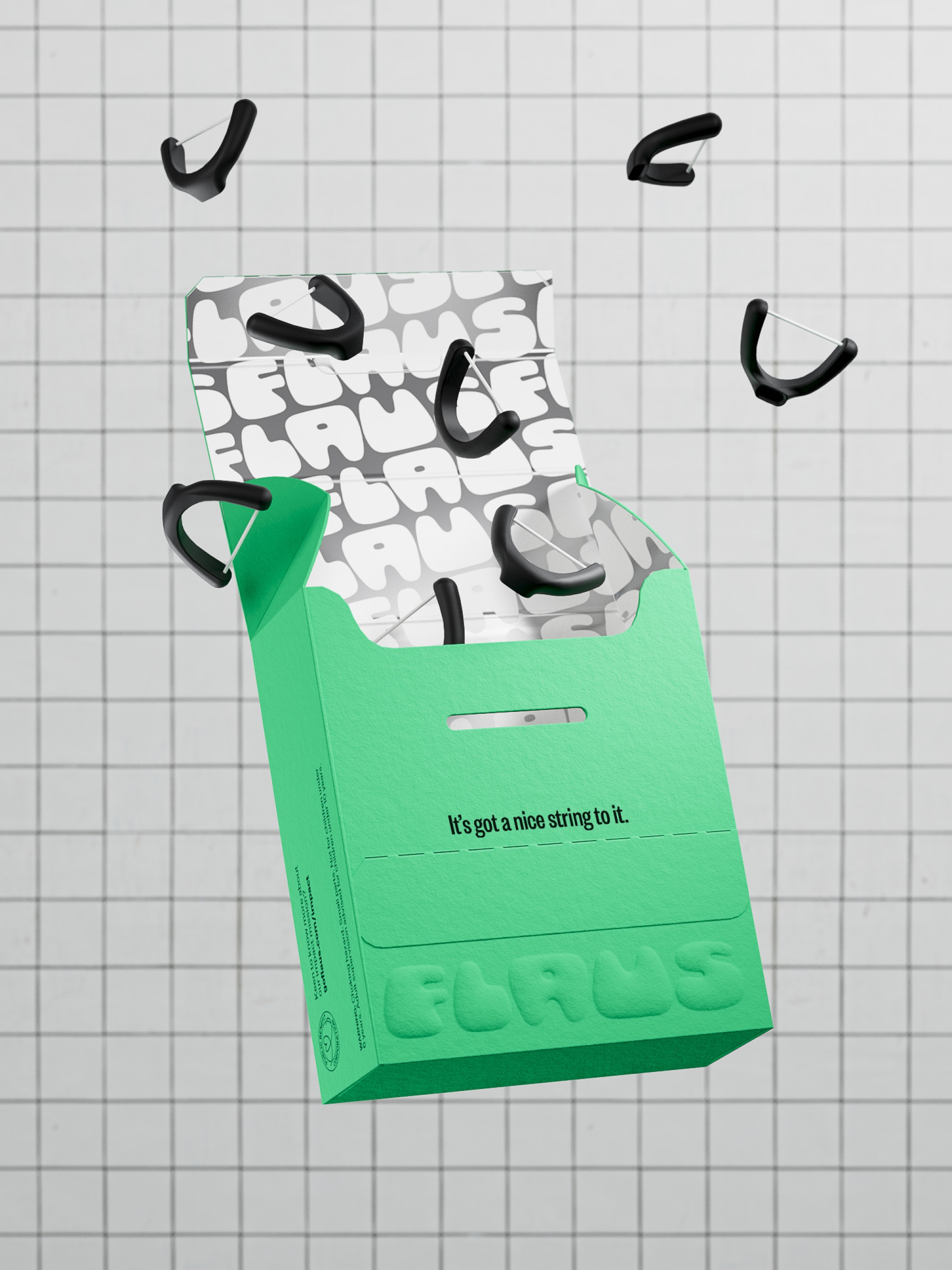
In need of a verbal identity that truly spoke to Flaus’ disruption to the industry, we worked with copywriter Cat Wall to create a tone of voice that’s packed full of bold personality and unafraid to tell it like it is. At odds with the outdated, dull and dry perception of dental hygiene products, it’s rich in rebellion and cheek while still inviting readers into the aspirational world of flossibility that exists on Planet Flaus. From brand lines to packaging to the web content whipped up by writer Amy Scott, it’s a far cry from the copy we’ve come to expect from the space.
A retro logo for the brand of tomorrow
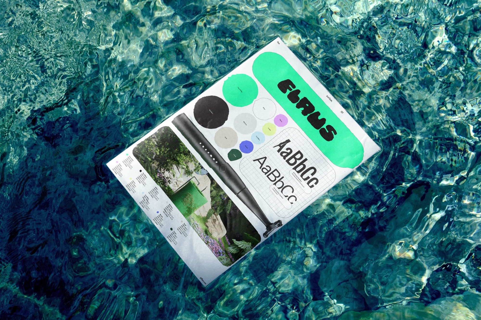
Heavily influenced by the retro-futuristic brand direction, the logo is a customised quip on CHEE from Ohno Type Co, with both the A and the U taking the shape of teeth. Its chubby, expressive character challenges the category norms of clean, sans serif and subtle typefaces, signifying the brand’s distinct difference in the oral beauty space.
Our headline typeface, Founders Grotesk X-Condensed was chosen to represent the brand’s first product — tall and lean, it demands attention and trust while retaining a softness and creating balance with the fun of the brandmark. It sits alongside the Untitled Sans workhorse and both typefaces are used across every touchpoint of the brand identity.
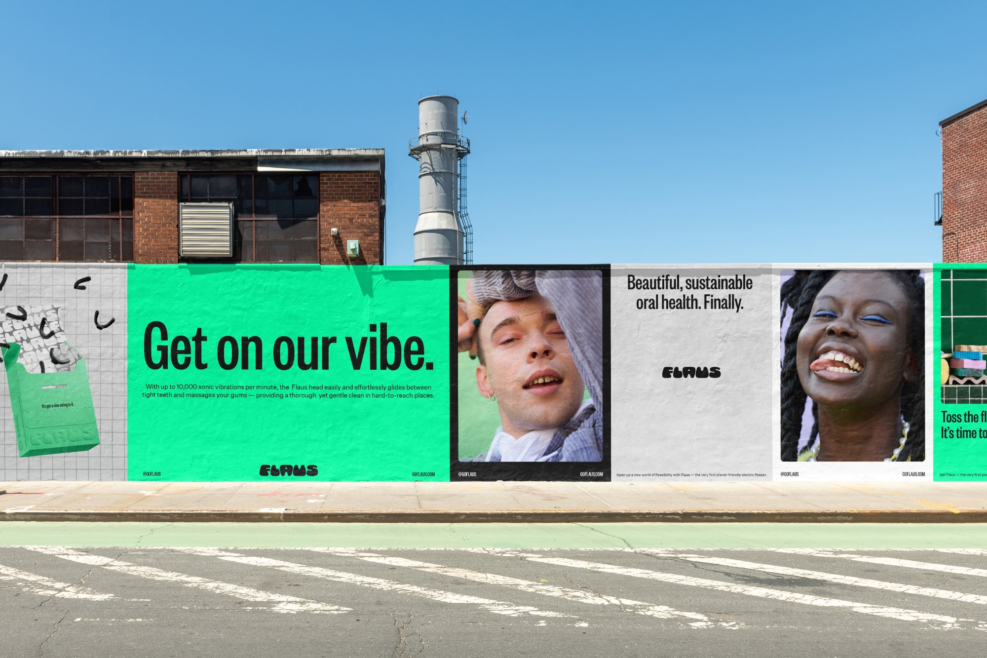
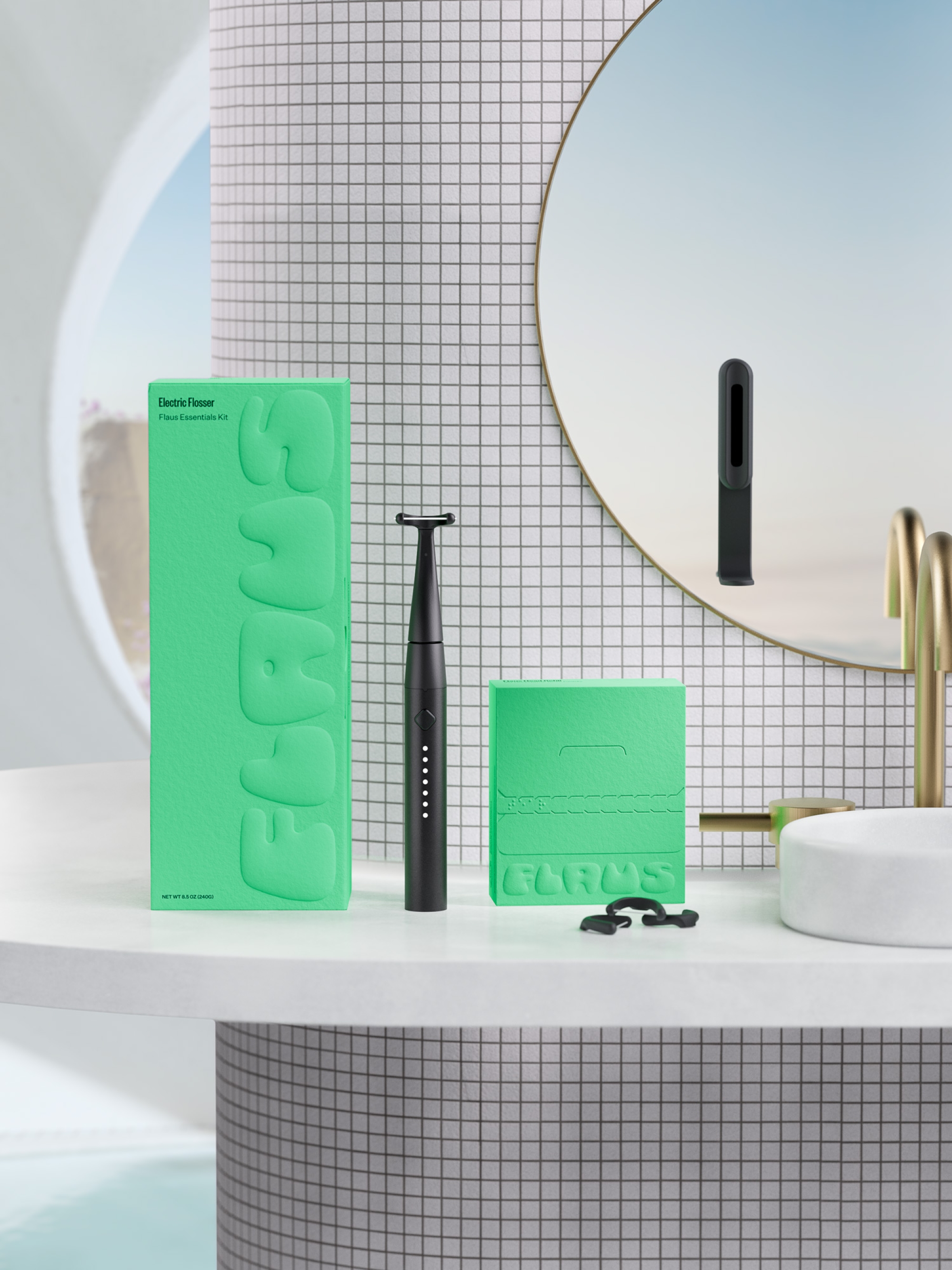
Keeping it clean and green with the colour palette
Amongst a core palette of black, white and neutrals is the brand’s distinctive neon green, picked to not only feel futuristic but to emphasise the environmental mission of the Flaus team. There’s also an extended set of bright colours that are used throughout social and certain digital applications, helping the brand to stretch across every application and audience.
A system of portals and patterns
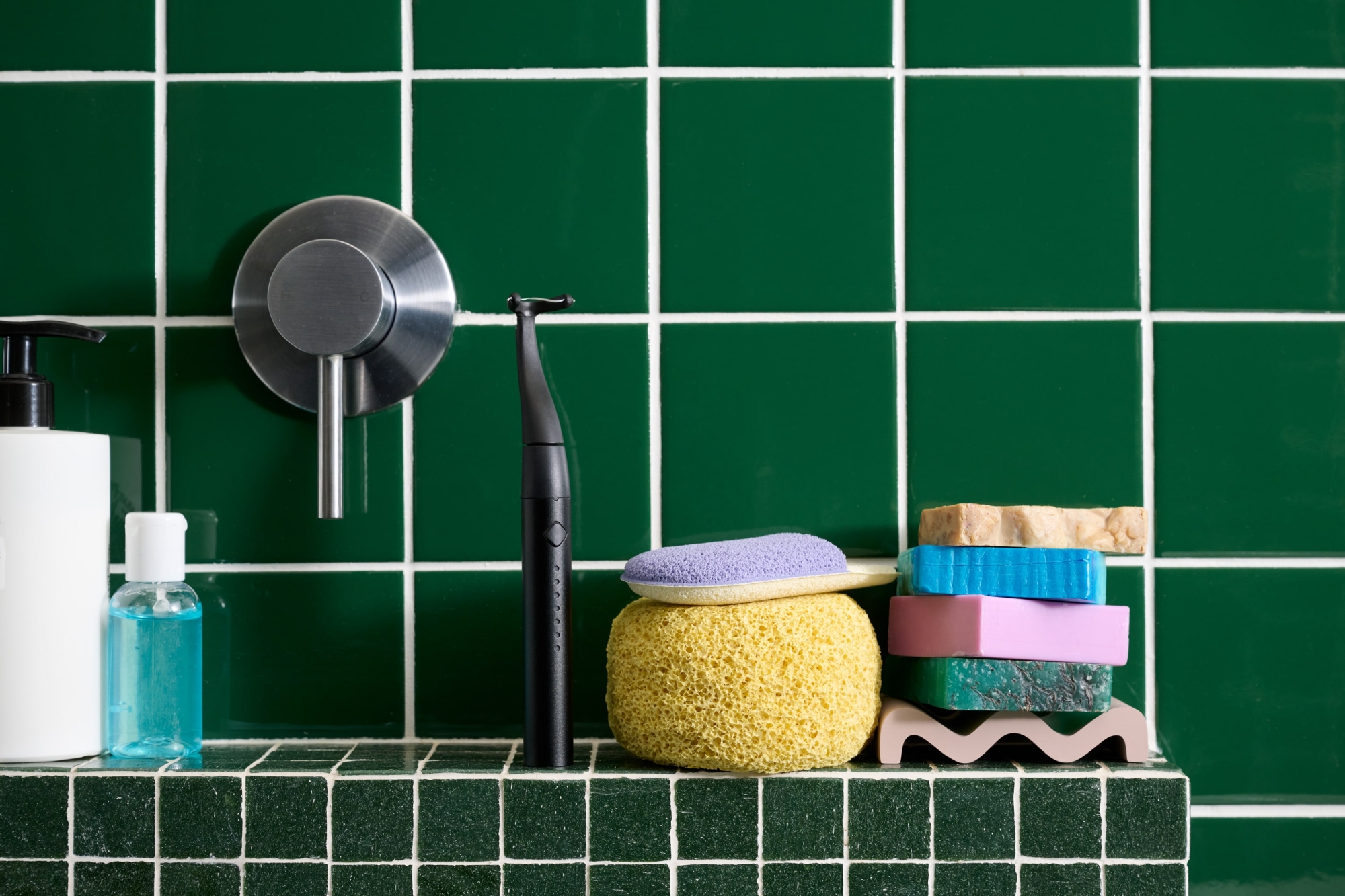
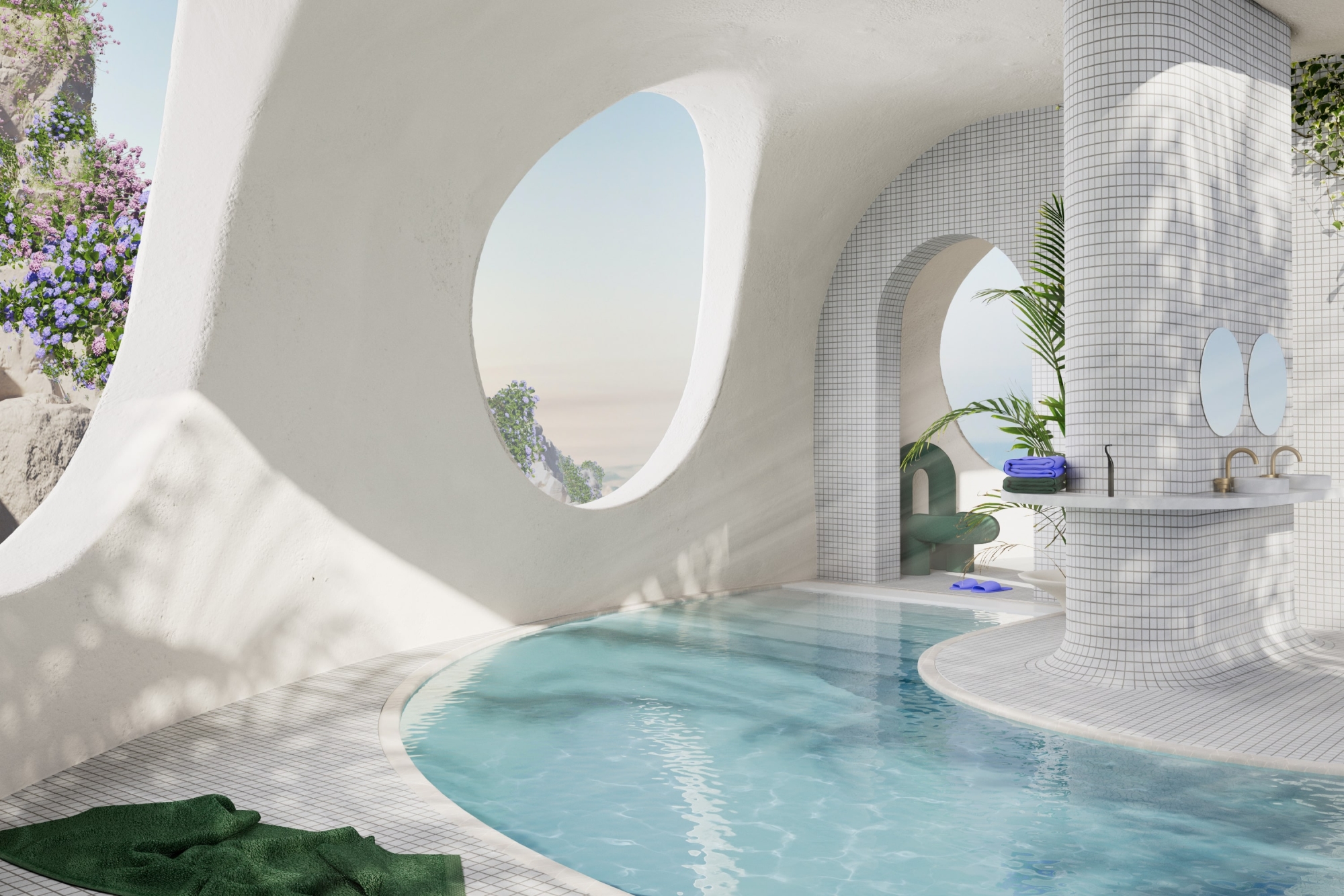
The design system is brought to life through portals — a set of geometric shapes that serve as containers for imagery and 3D illustration. Each portal is an entrance to a new world and allows the visual identity to reflect different customer categories and key brand offerings like sustainability, revolutionary product and human-centred design. A suite of patterns provides additional flexibility to the system. Inspired by the Photoshop transparency grid, they represent a blank slate and a new way of approaching oral healthcare and are also a subtle nod to bathroom tiles, giving the viewer context for the product.
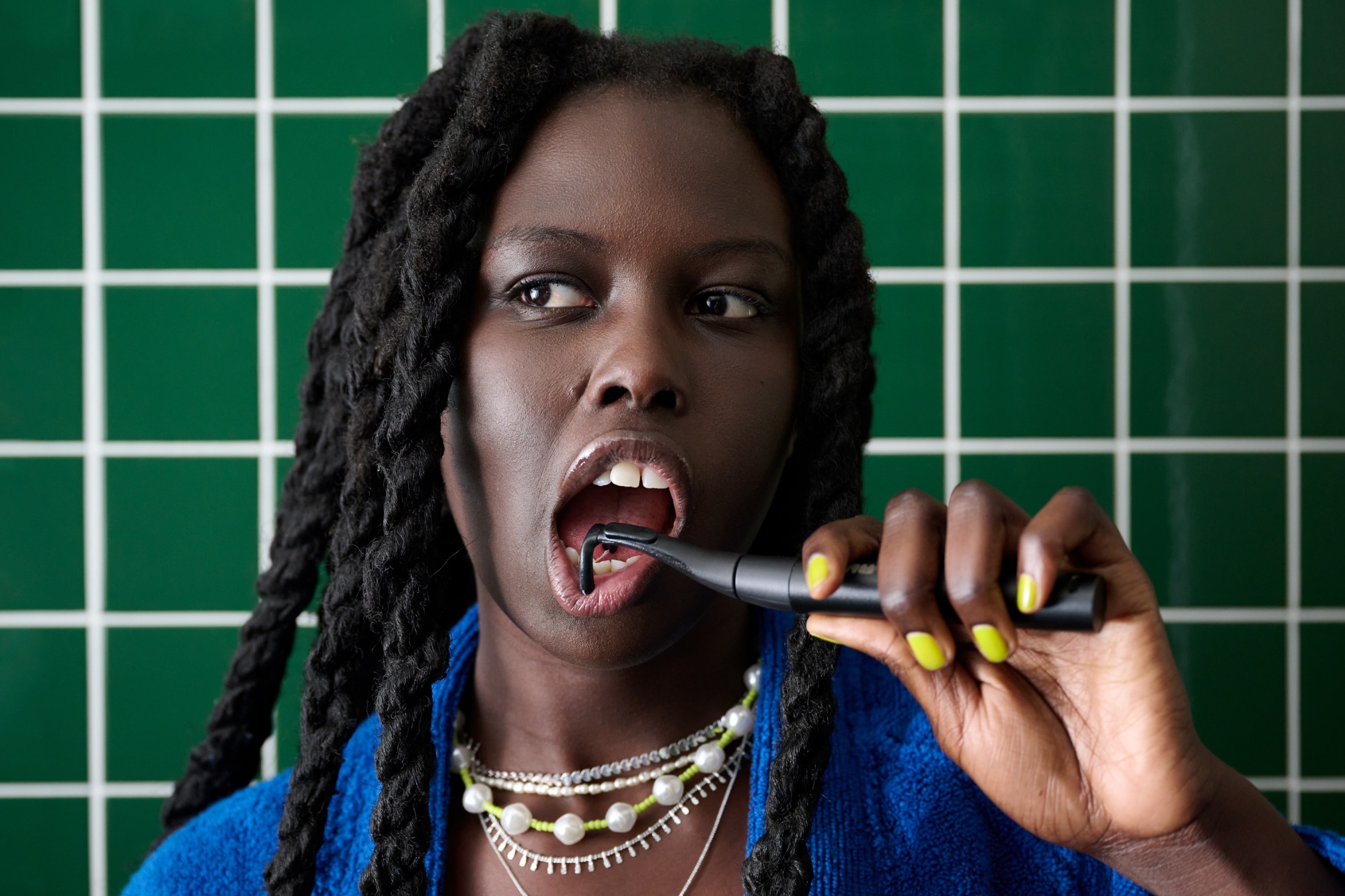
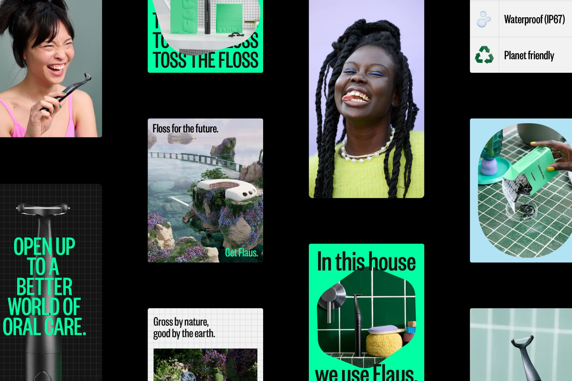
Perfect imperfections to the front
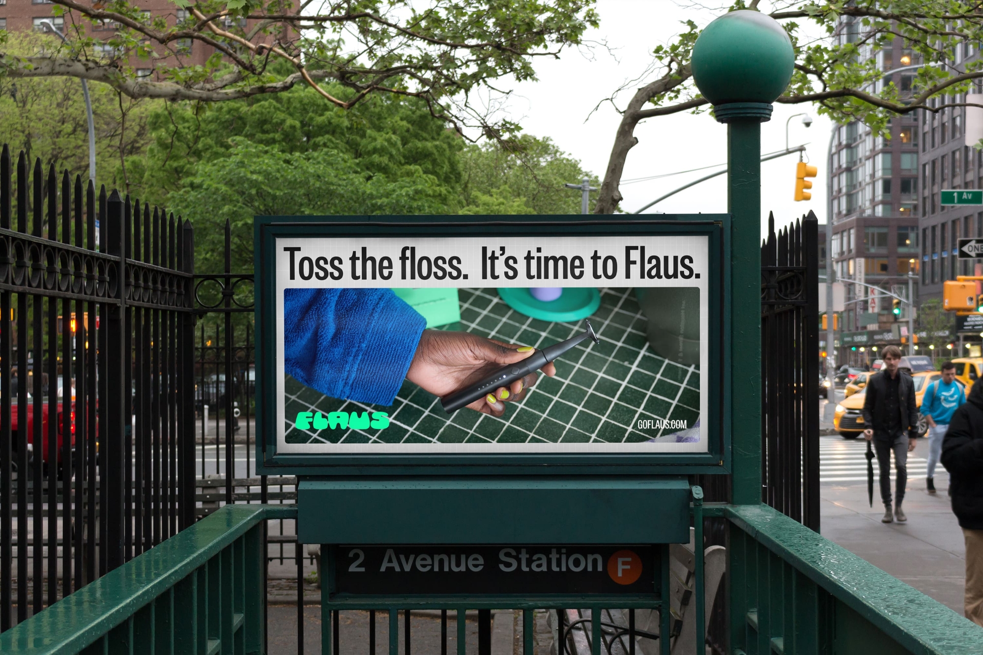
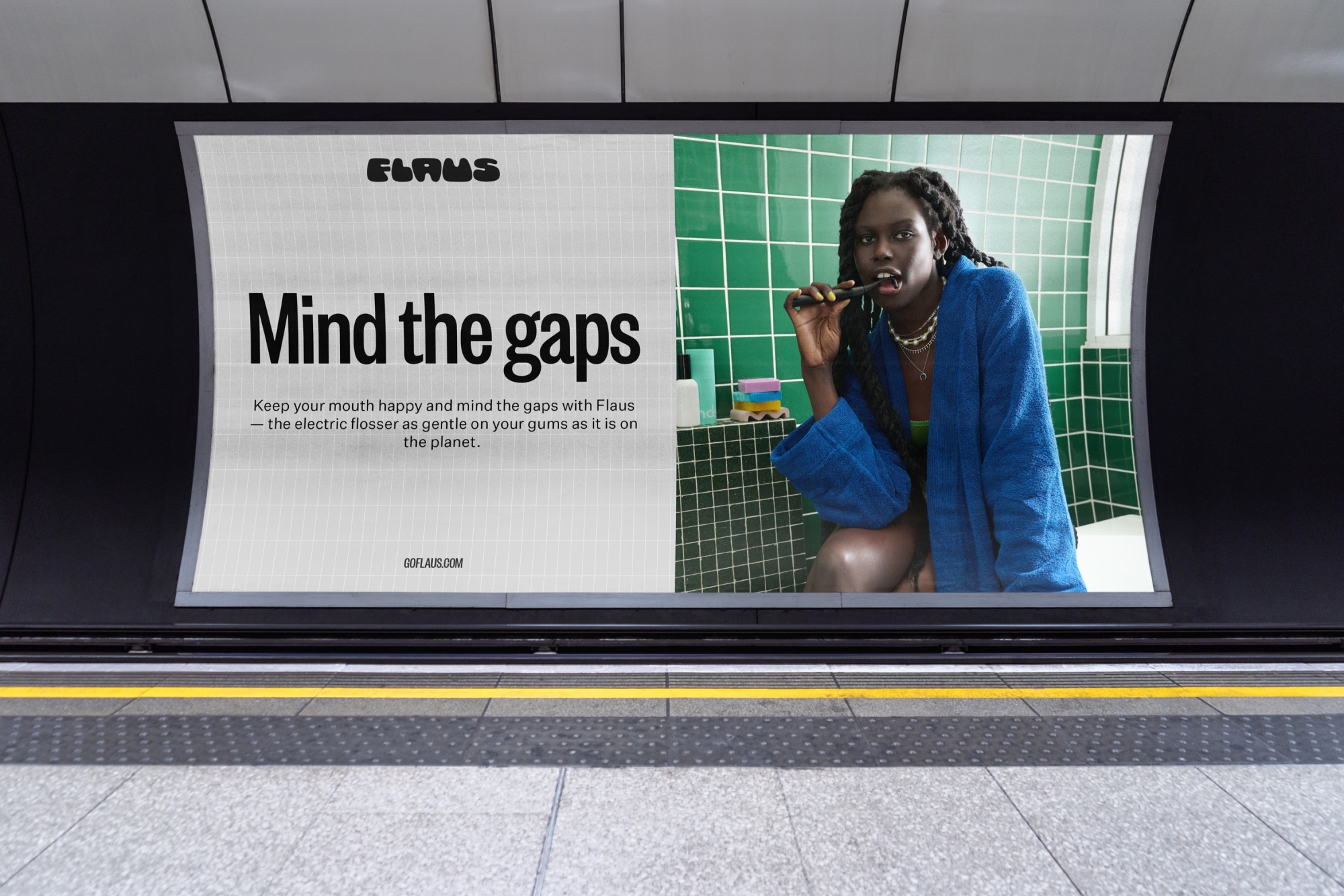
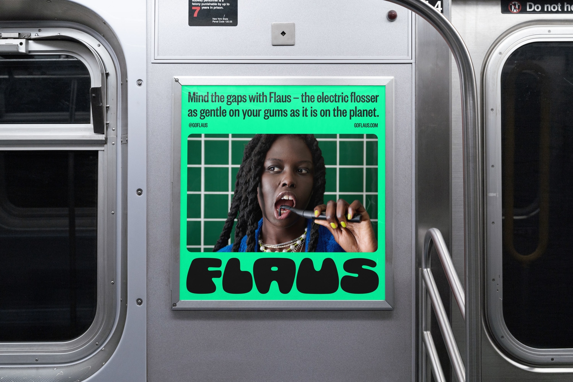
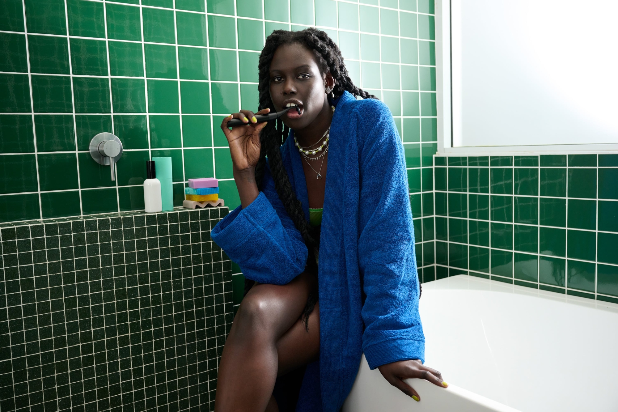
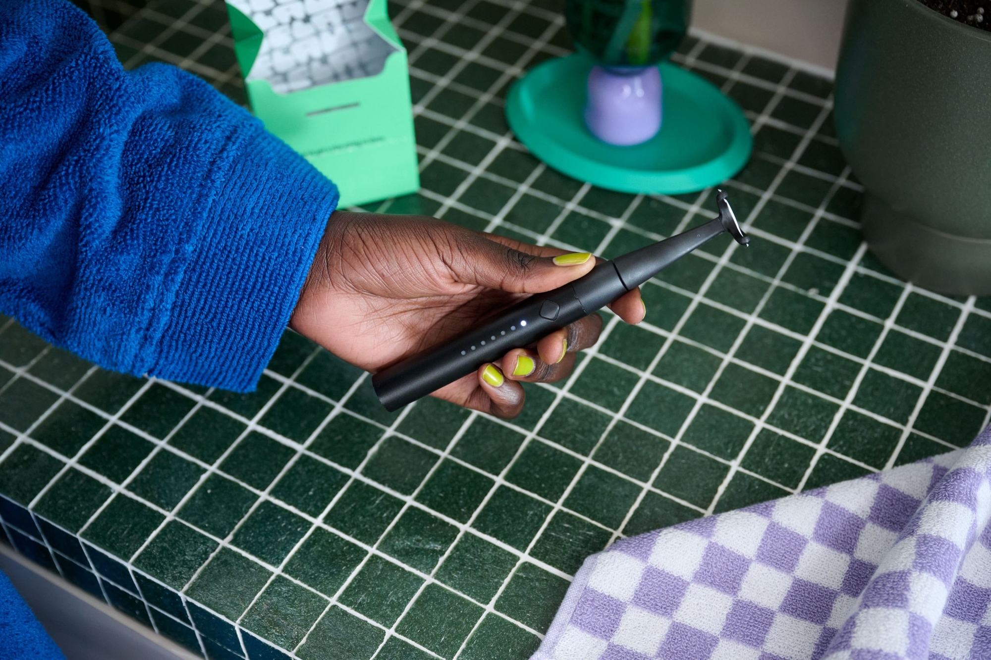
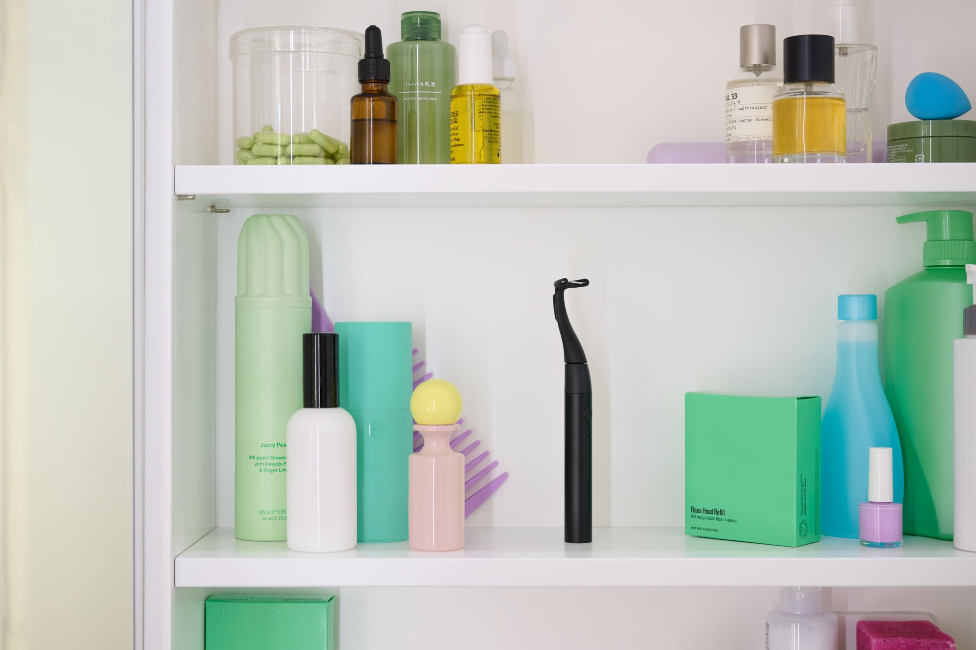
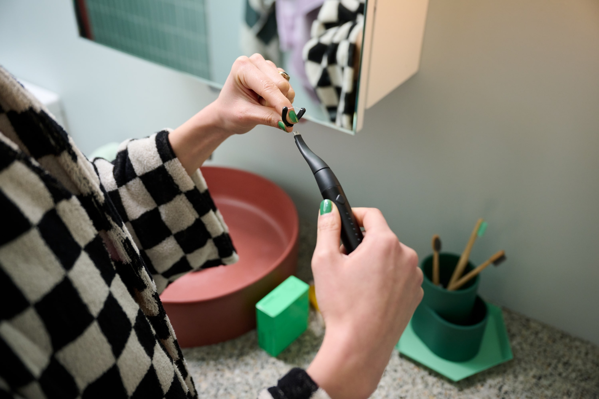
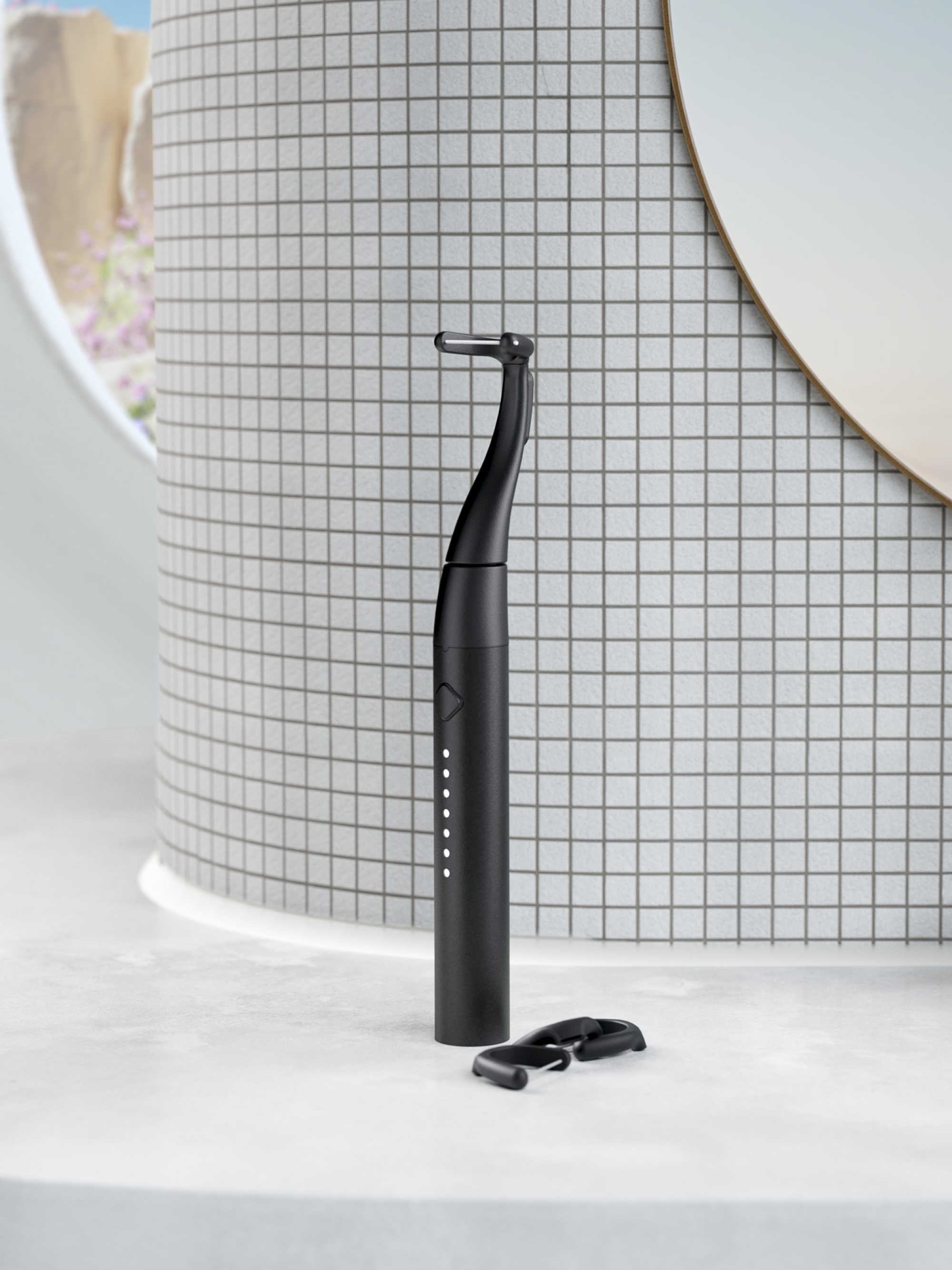
The majority of flossing and dental hygiene brands use the same style of photography — overly airbrushed people, alone in the bathroom, showing off their perfect teeth. They’re clinical, removed from reality and perpetuate the idea that only straight, paper-white teeth constitute a healthy mouth. Flaus is here to prove otherwise and, to do so, they needed their photography to showcase it. On a mission to celebrate perfect imperfections, all sorts of smiles and how Flaus fits into different lifestyles to turn flossing from a chore to a treat, we got to work. Styled by Chloe Wilson and dressed by Oriana De Luca, the direction is fun, bright and taken from interesting angles in multiple bathrooms. With Tobias Rowles behind the lens, we highlighted the functionality and benefits of the product, from its waterproof nature to how it recharges to how it mounts easily on your mirror.


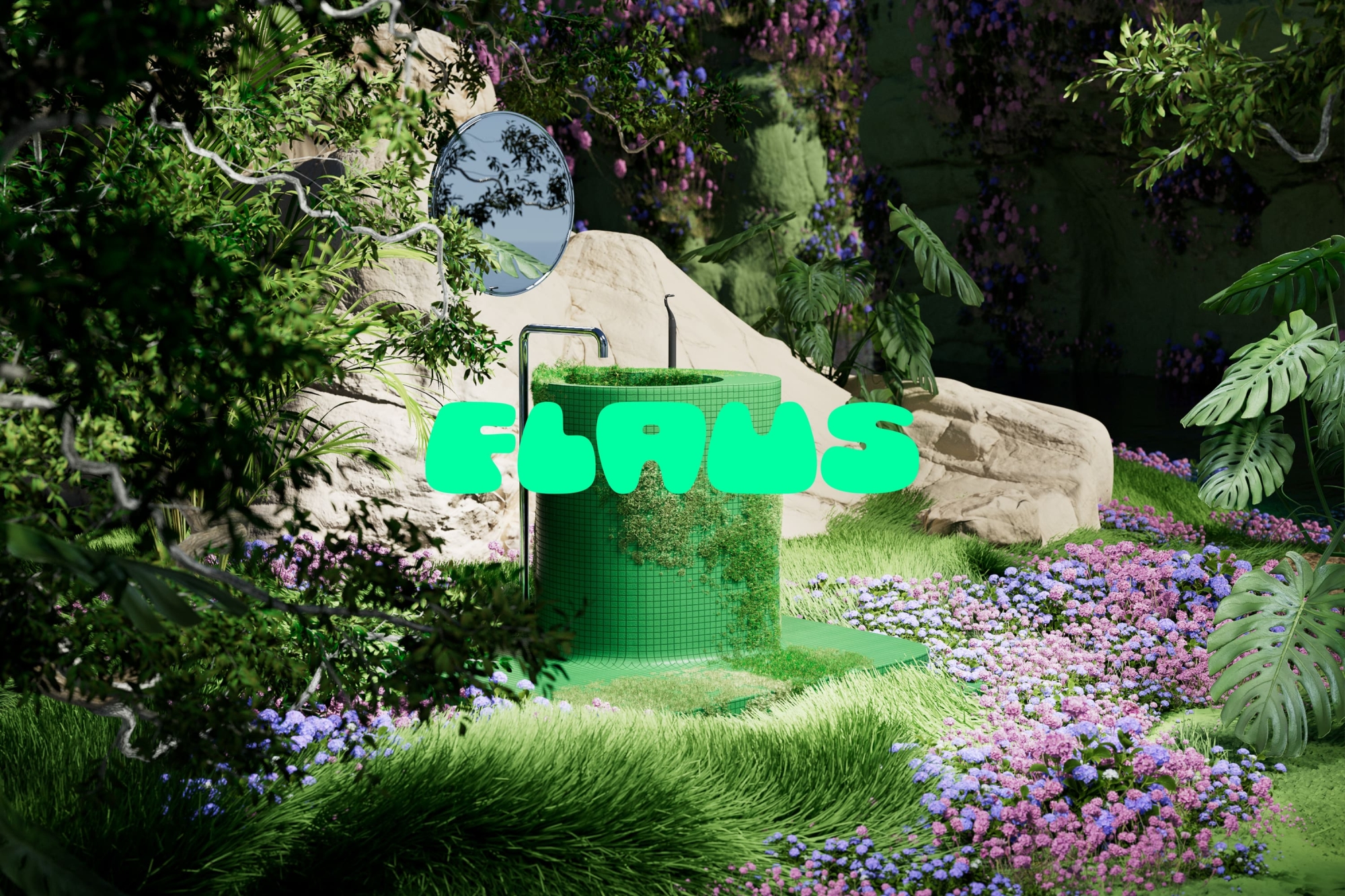
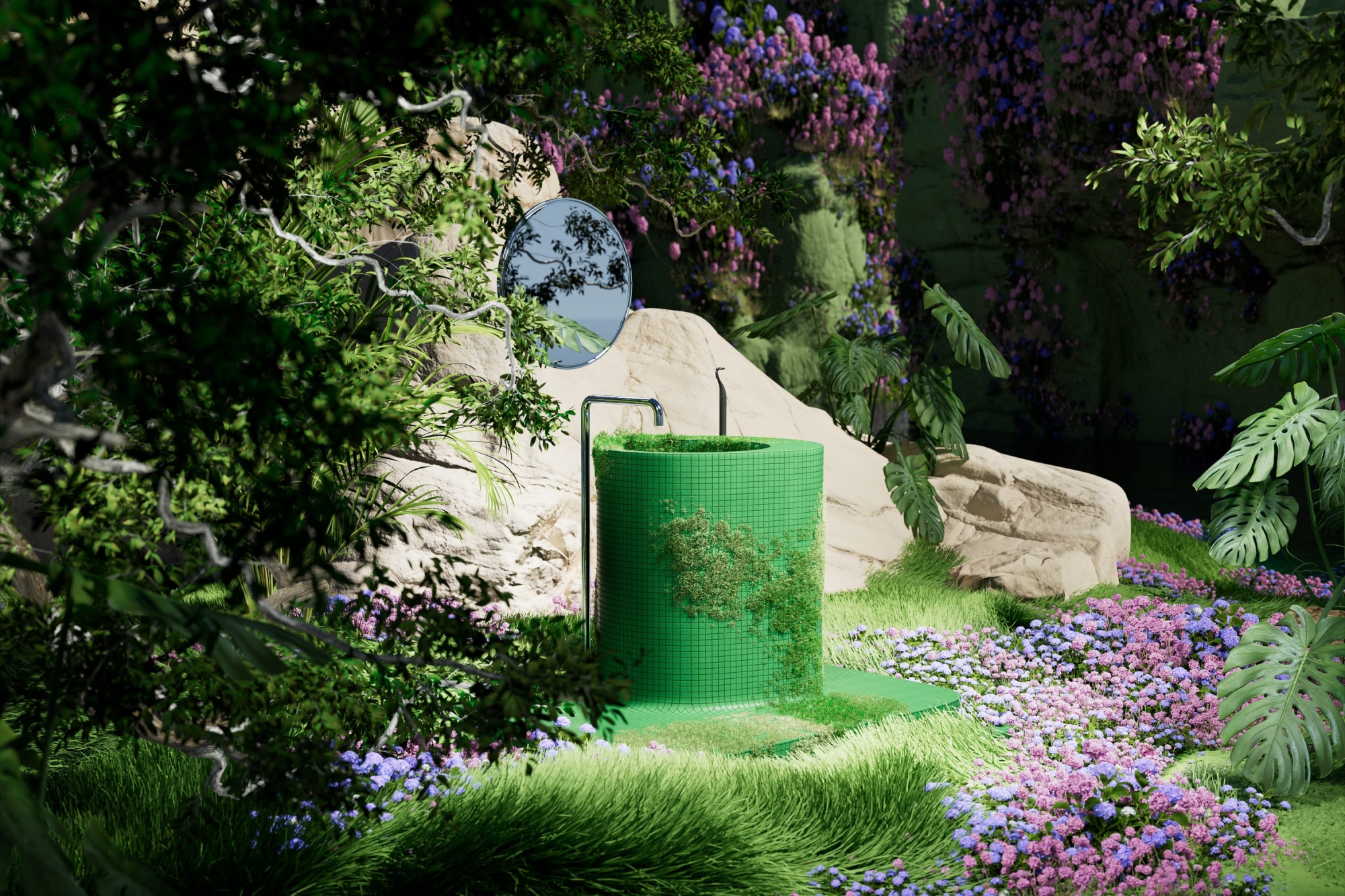
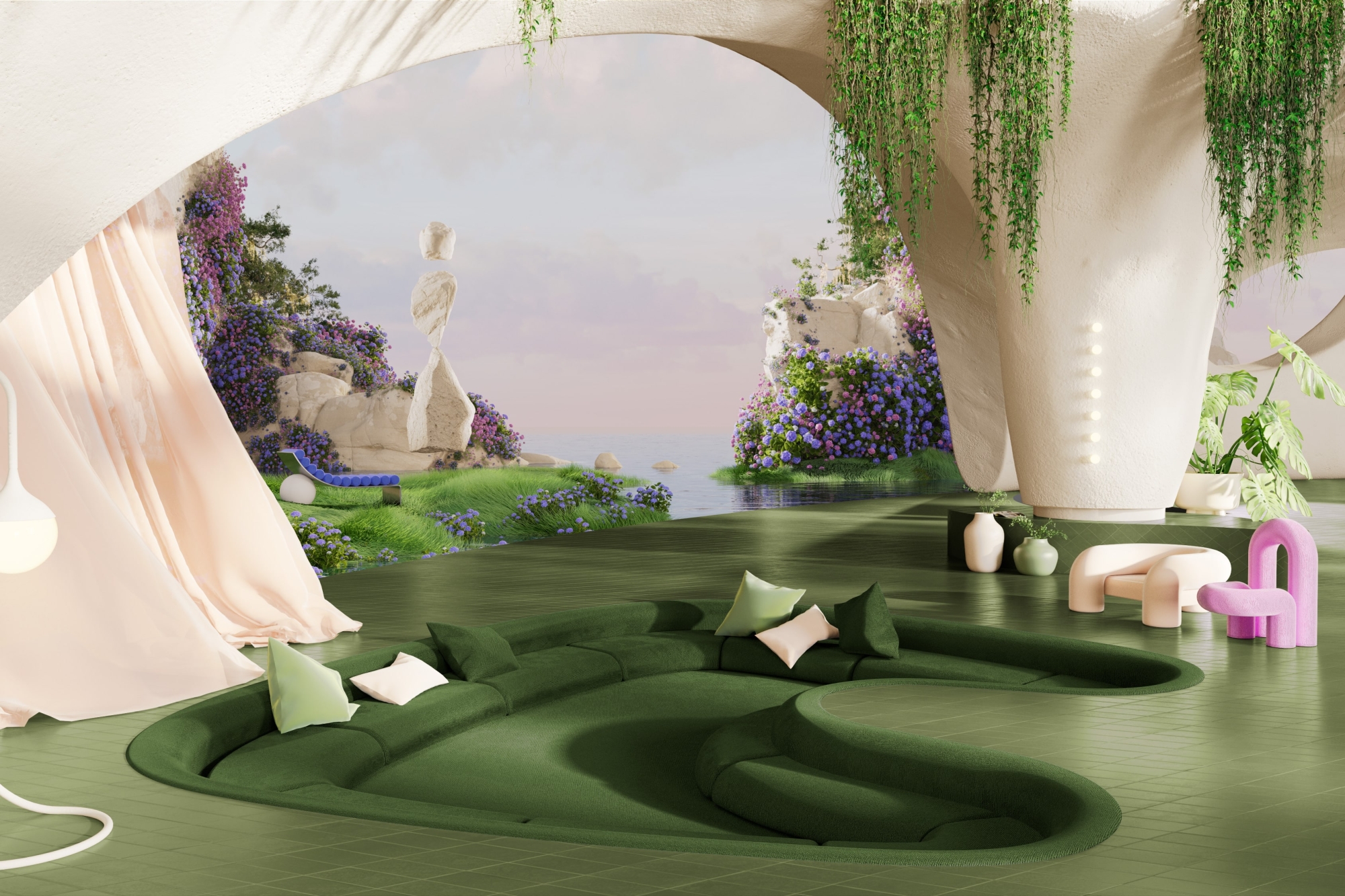
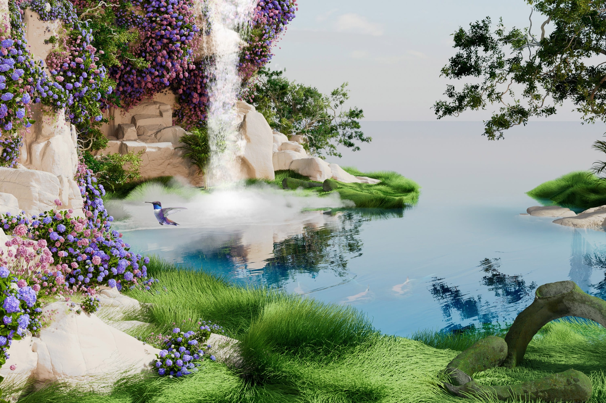
From imagination to realisation with 3D illustration
To bring our vision for Planet Flaus from our brains into existence, it was going to take some other-worldly talent. Enter 3D artist Mitchell Eaton. Intertwining the visual elements with the brand values, together we created five scenes to set the tone for Flaus customers. Flaus Islands is home. It details the brand’s desire to reinvent oral care, taking elements of the electric flosser and turning them into urban structures — the floss head HQ, the magnetic mirror mount monorail. Flaus HQ represents their vision for human-centred design, again taking cues from the product. Flaus Labs demonstrates the brand’s dedication to science, research and development and Flaus Gardens shows their commitment to a sustainable, greener future. This is extended through Flaus Falls, where elements like the floss heads can be seen degrading in the foreground. Bundled together with a set of product renders, the stunning, imaginative illustration suite was complete.
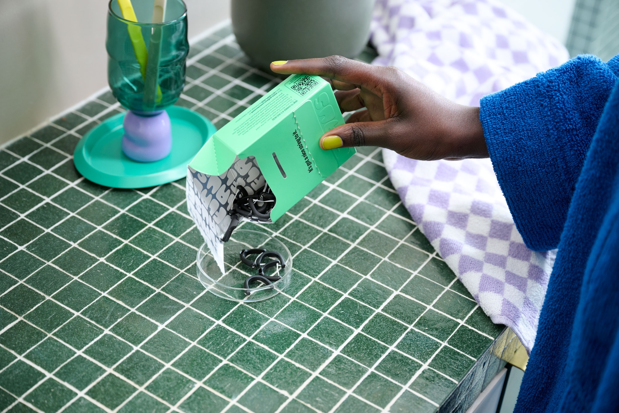
Considered packaging for the customer and the planet
As a DTC company, the packaging design was paramount and we wanted to create an unboxing experience that would encompass every element of the brand — futuristic, sustainable, human. In collaboration with our structural packaging partner Think, we came up with a modular box that would house the Flaus Starter Kit — the flossing device, 90 floss heads, peripherals and booklets. The design securely holds all elements in place in a small, light box, without the need for an additional mailer bag, reducing the overall carbon impact from shipping. The design is both fun and functional — premium and technical, yet filled with delightful moments that reflect Flaus’ vibrant personality.
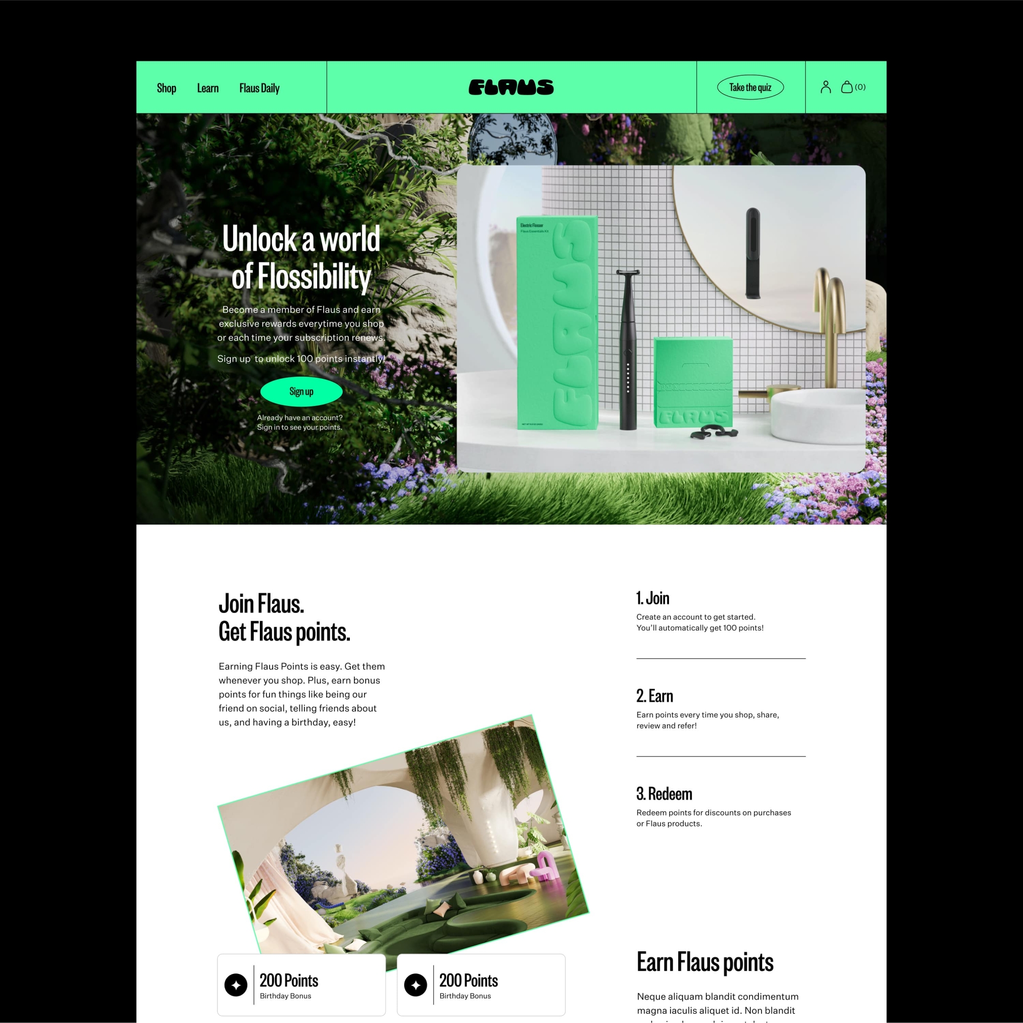
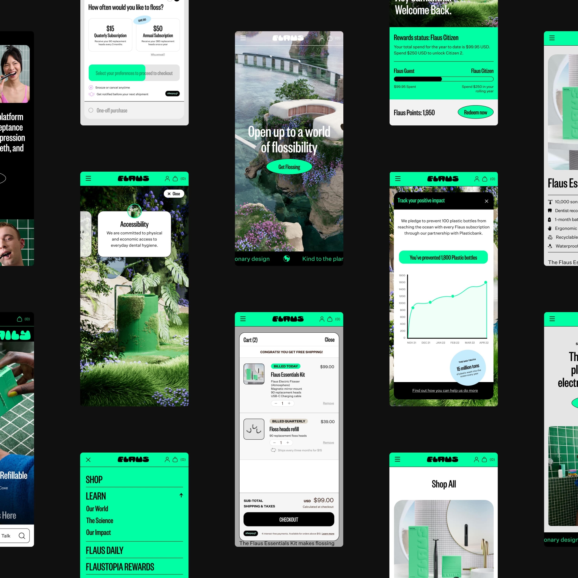
An other-worldly online experience
A crucial touchpoint for the brand, Flaus’ digital experience needed to take its customers into the future with something that stood out from the typical DTC healthcare brand. As part of the strategy process with Untangld, we developed clear goals for a reward program platform. We took the project from wireframes through to final design, ensuring the brand idea would translate seamlessly across every element.
And the end result?
Having created the world’s first planet-friendly electric flosser, Flaus was always going to change the future of the oral health space and now they’ve got a brand to match. The flexible design system and irreverent tone of voice come together across myriad assets to change the perception of the industry and challenge people’s expectations of what an oral beauty brand can be. With Flaus’ future products already in development, we can’t wait to watch them continue making the impossible flossible.
Collaborators
- Brand Strategy • Untangld
- Brand Writer • Cat Wall
- Brand Writer • Amy Scott
- 3D Illustration • Mitchell Eaton
- Photography • Tobias Rowles
- Prop Stylist • Case Study Prop Stylist • Chloe Wilson
- Wardrobe Stylist • Oriana De Luca
- Website Development • Ten Two
- Packaging Solution • Think Packaging
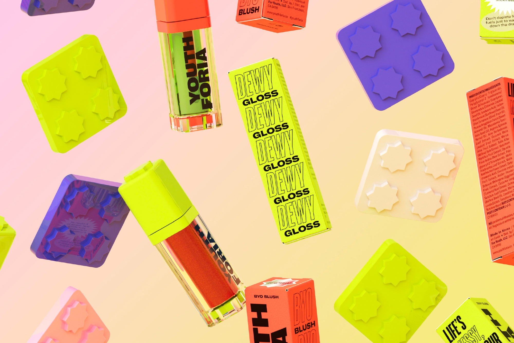
Youthforia
A beauty brand without the boring bits.