In a country with deplorable climate targets, in the midst of a global environmental crisis, Future Super believe that Australians’ superannuation is their collective superpower — we just need to know how to use it. In collaboration with their creative team, we built a rebrand that shines light on the ways we can harness the power of our super to make a meaningful difference.
- Verbal Identity •
- Visual Identity •
- Brand writing •
- Art direction •
- Motion art direction
Awards


Featured In
What's all this then?
Though relatively young in Australia’s superannuation space, Future Super have been making ripples from the beginning. With their no-apologies approach to putting the planet first, they pride themselves on not just investing responsibly and sustainably but investing for impact. And they’re transparent about it too — they put potential investments through a strict screening process, which means Future Super can promise its customers that their future isn’t invested in things like gambling, child labour, tobacco, or contributing to the carbon footprint.
Any Insights?
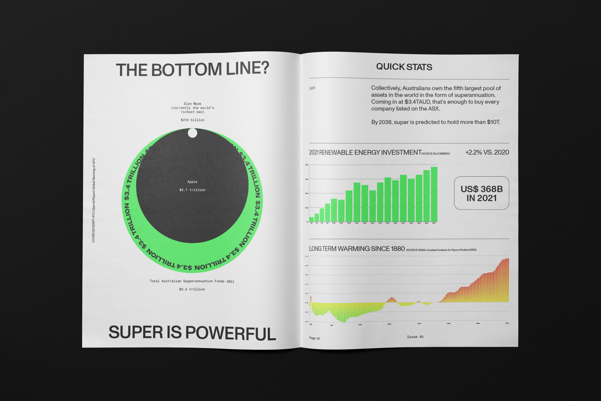
The influence of fossil fuel money in Australia is everywhere — from sport to politics to pension funds, it’s the fourth largest pool of assets in the world. After decades of it feeding into the country’s economy and a lack of action by the government in the face of an undeniable climate emergency, an increasing number of Australians are feeling helpless and hungry for change.
And what seems to be the problem?
Putting their belief in people power into play, Future Super asked us to work with them to not just push beyond the realm of expectation of what a superannuation company can look and sound like, but to reframe superannuation from a means for merely saving for the future to a way in which people can actually save the future.
So how'd you go about it?
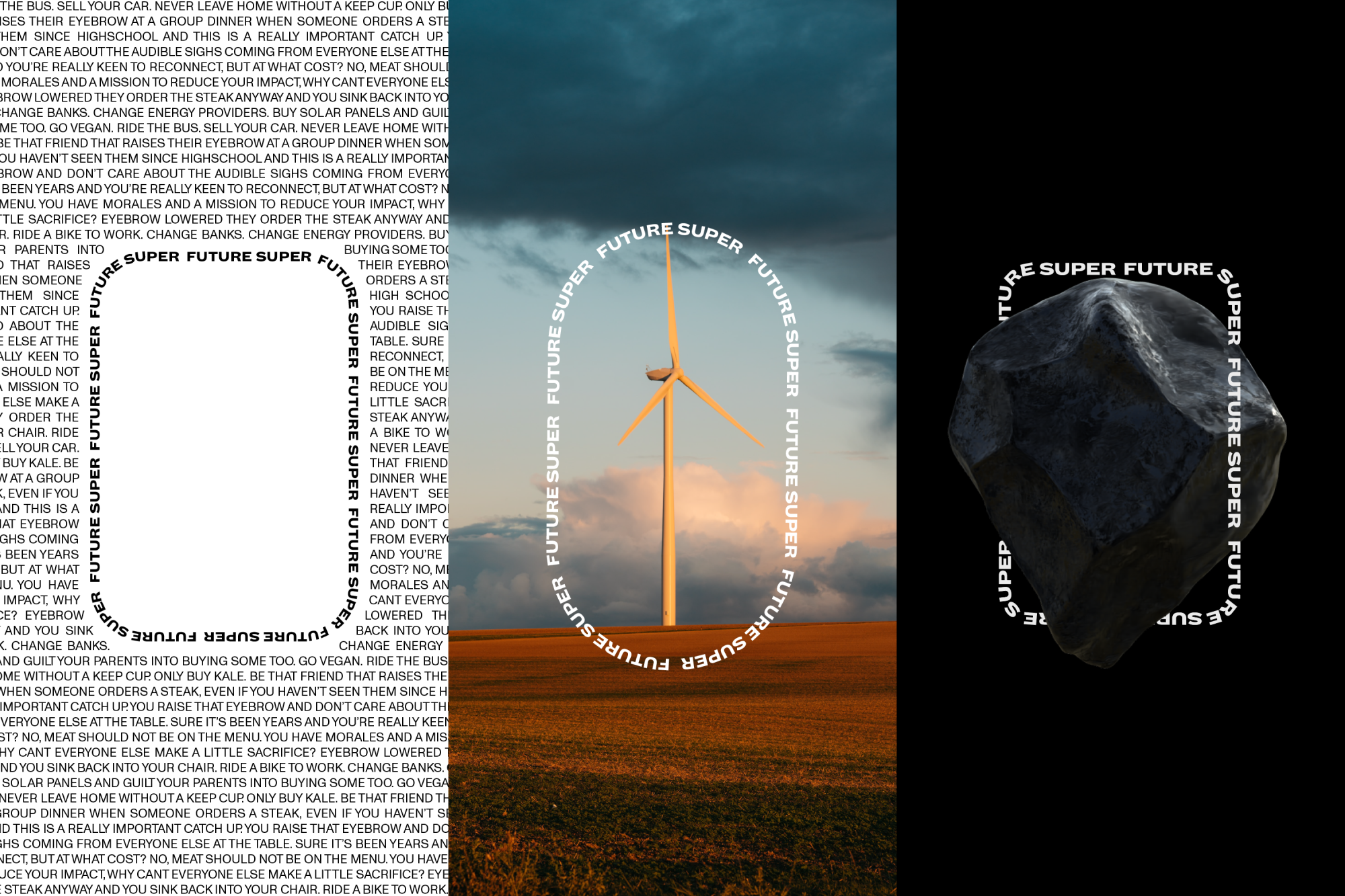
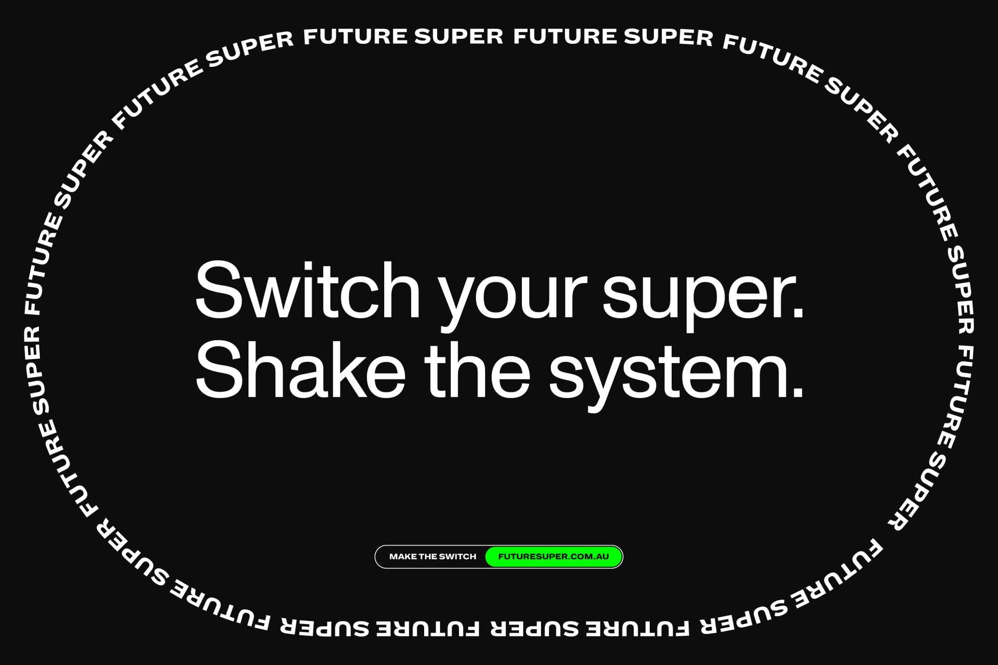
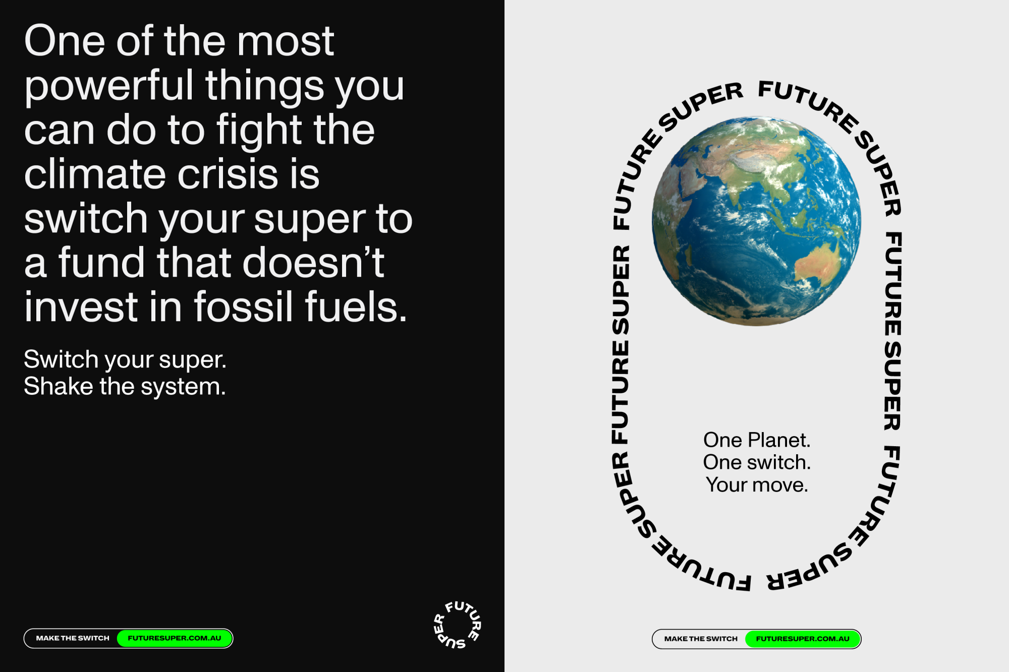
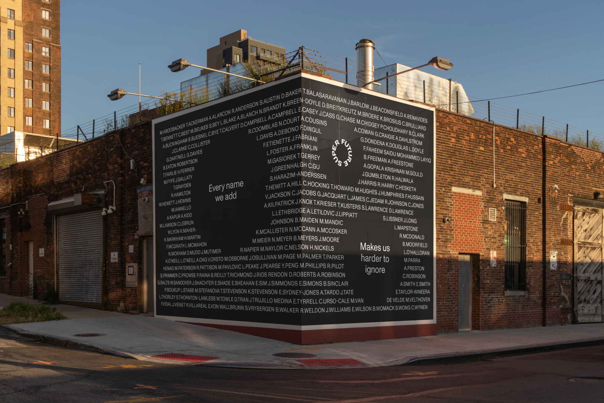
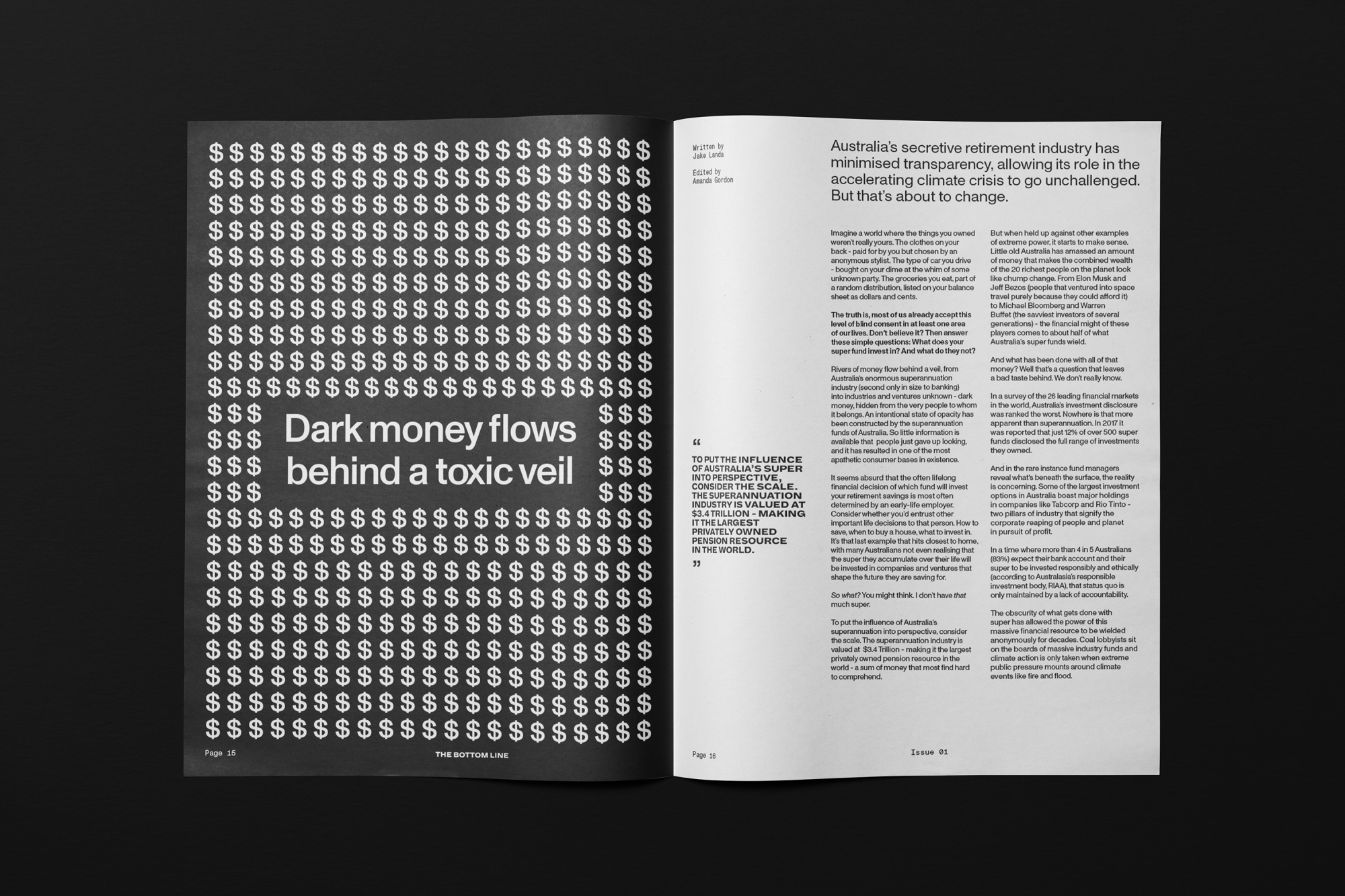
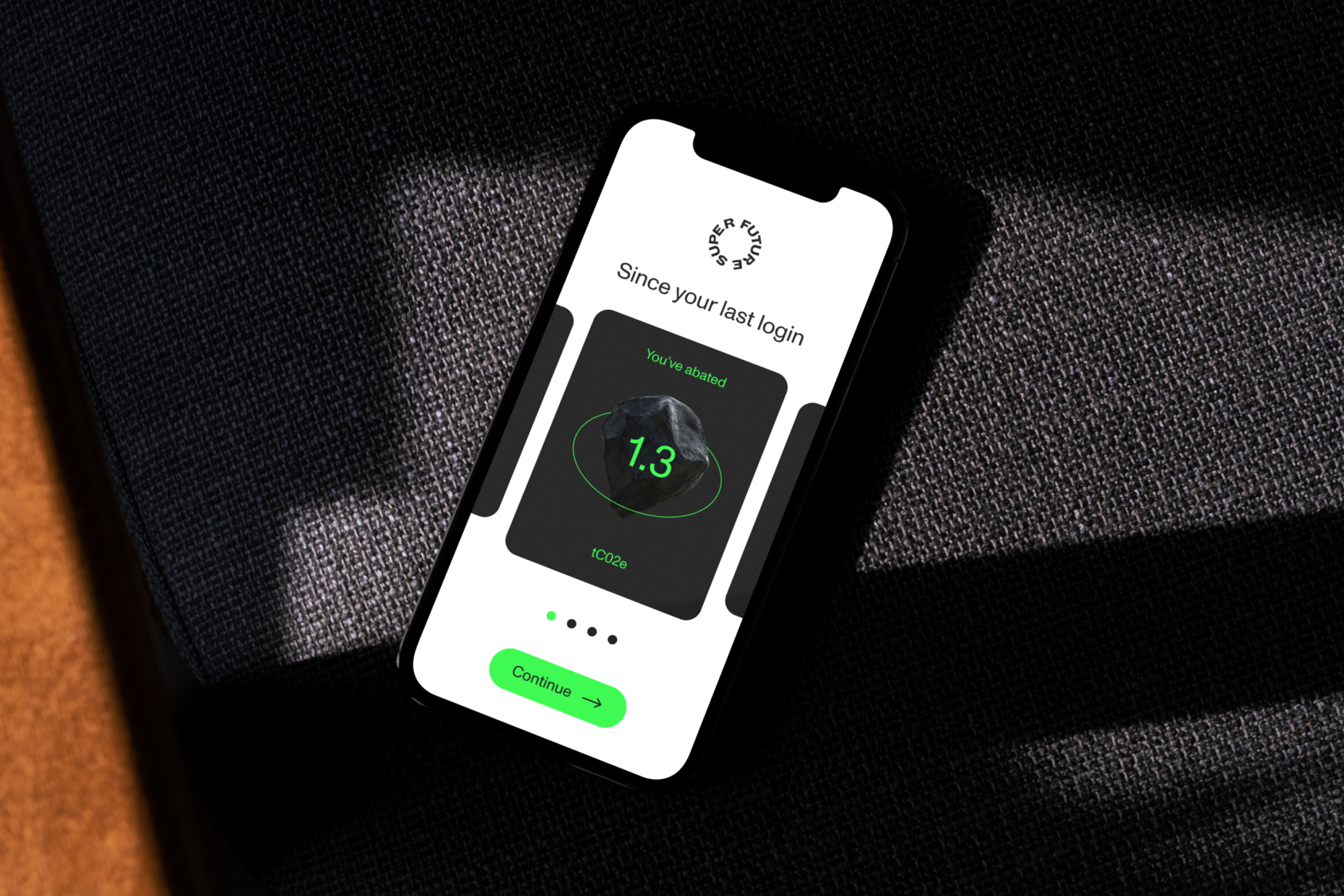
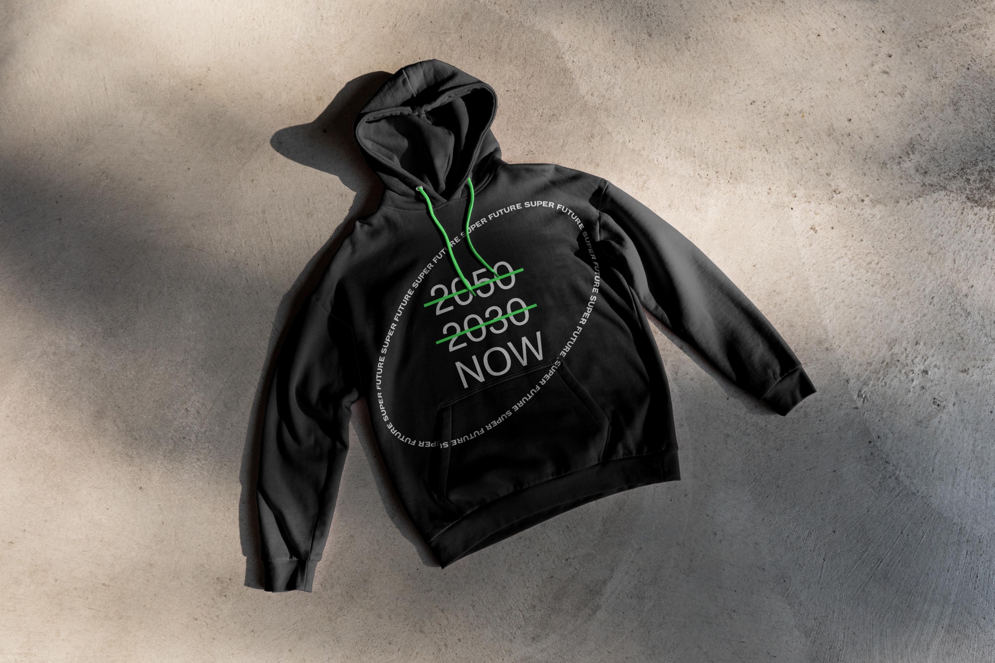
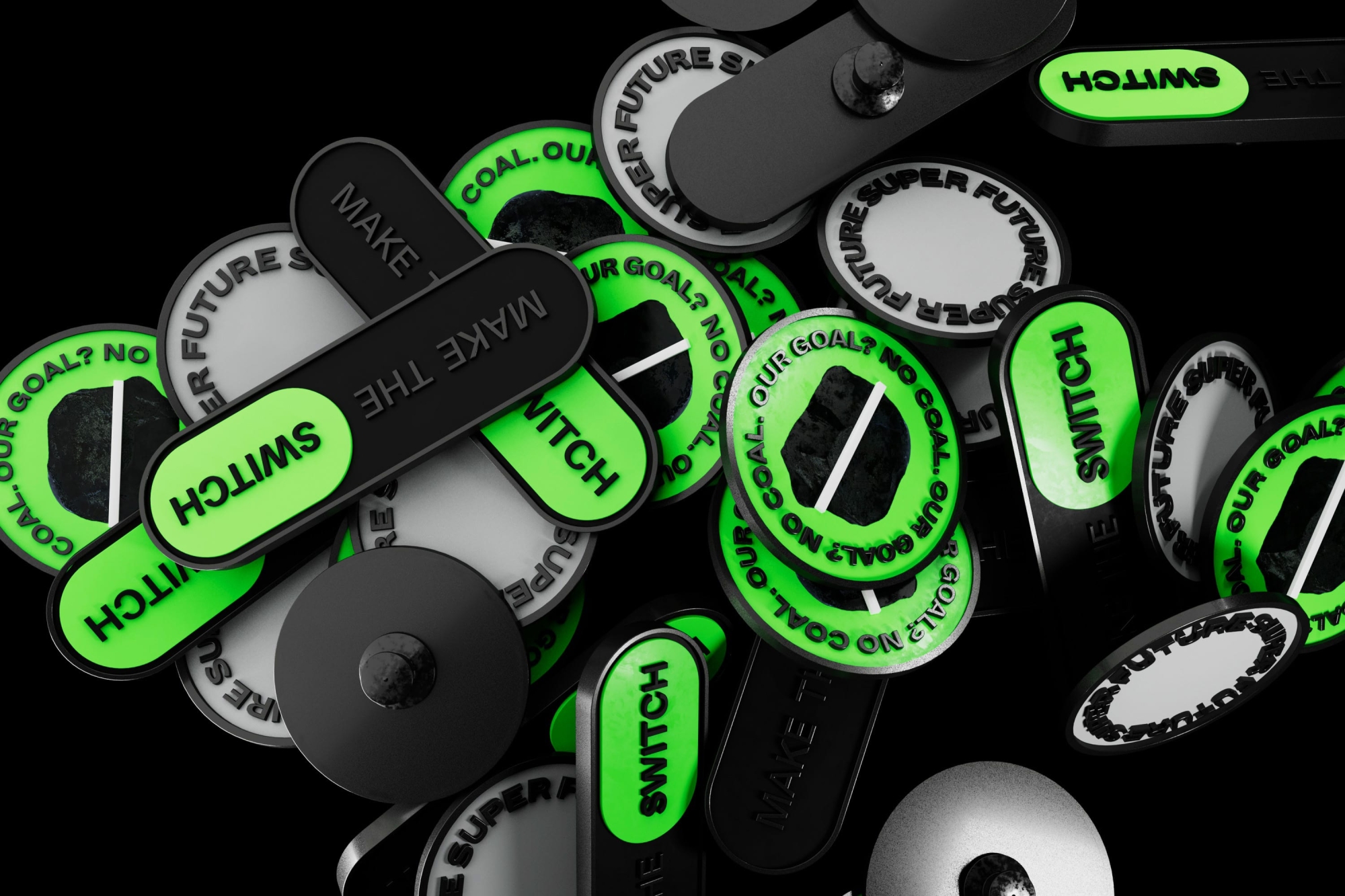
In a traditionally vague and murky industry, Future Super strives to create transparency. Using this idea of shining a spotlight on both the (deliberate) lack of clarity most funds provide and the power our super can have, we began with a logo. Well, many logos, really. Designed for motion and interaction, the mark is responsive — there’s no limit to its number of iterations. It adapts and flexes, shifting size and shape to suit where it sits and do what it needs to, from small format digital applications to expansive billboards to the 3D space. At any touchpoint, it anchors the design system and serves as an infinitely flexible tool to push away unnecessary noise and put what needs to be said front and centre.
A system made to scale
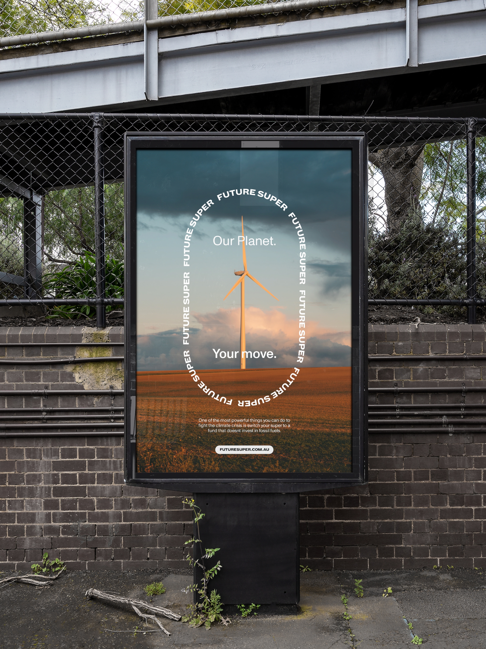
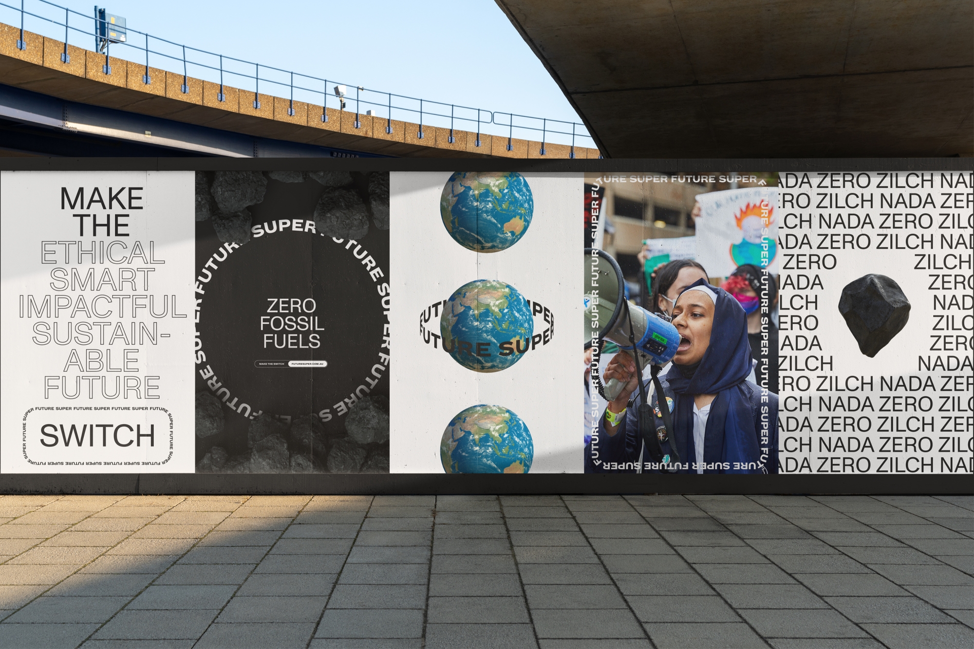
In much the same way, the design system as a whole takes flexibility and responsiveness beyond just the logo to create even more visual impact. Building on the idea of bringing light to key communications, we created a set of layout and motion principles that would guide the brand. It can push, uncover, frame and give perspective to the content and works seamlessly across every pillar of brand communications. As a direct response to the stock-image-saturated world of super, images are only ever used to support messages — never as filler.
Creating clarity
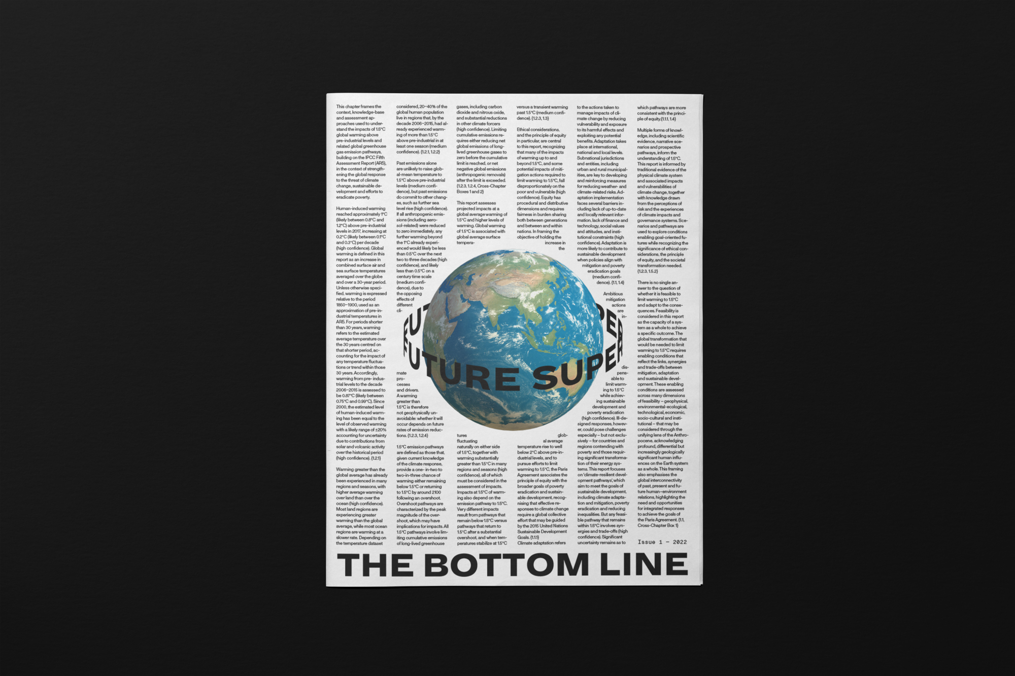
In fact, the design system is almost entirely type-based. While their competitors have their customers wading through information that’s almost impossible for the every-person to decipher, Future Super champions clear communication and focuses on delivering a message and it was important that the new brand reflects that. Crucial to this was a clear tone of voice. Working with brand writer Cat Wall, we established a verbal identity that cuts through the industry jargon to help customers actually understand how super works and what their money does. It’s unapologetically honest and unafraid to state the facts on fossil fuels, carbon emissions and superannuation funds and empowers its audience to do the same.

Art imitates climate inaction
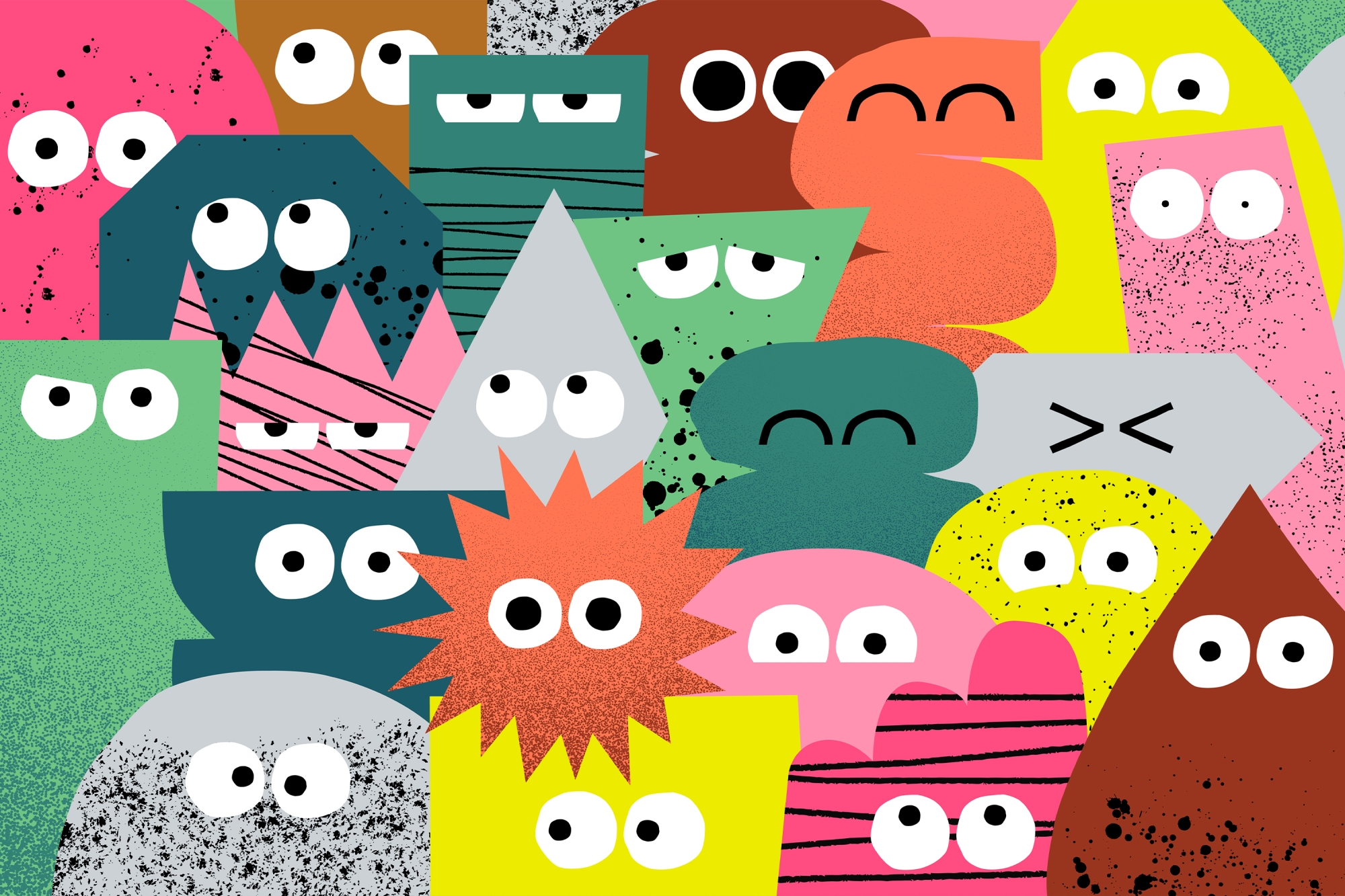
Though intentionally minimally used throughout the brand system, photography and illustration are still an essential tool. While 3D illustrations give the brand additional flexibility, every photo is real — mostly editorial, with no retouching or adjustments. This direction is particularly important as it allows Future Super to keep communications and campaigns timely and culturally relevant, responding quickly to current affairs and harnessing them to effectively further their fight against the climate crisis.
Framing typography in a different way
DIA brings its bold and confident character to the logo and, though used sparingly across the rest of the system, also lends additional expression to the brand, extending across headings within type frames and pullout text.
The matter-of-fact and Swiss-like nature of Monument Grotesk as our core typeface makes for an effective and striking contrast with its DIA counterpart. It’s highly robust, comes in multiple styles and weights (useful for a brand with so many copy-driven touchpoints) and includes tabulated figures, fractions and a full set of mathematical operators, which makes sense for a company that deals in numbers.
Designed to be digital from the get-go
As an online business, building the brand to thrive in digital was essential. We worked with their internal team to craft a digital toolkit that translates the brand system to be functional, clear and easy-to-navigate for the user while still driving a deeper emotional connection. Guidance around the use of icons, illustration and art direction also fed in — again, establishing the balance between their power as a tool without taking away from key messages.


A human focus in a sterile industry
Once again bucking industry trends, Future Super wants to build a community that takes superannuation from a movement of money to a movement of people. They don’t just do this through complete transparency across their investments, screening process and reports, but go as far to open up their ad space to their customers — allowing everyday people to voice their concerns on climate change and show that individuals, working together, can really make a difference.

And the end result?
Future Super believes in the power of people and the collaborative creative process for this project was testament to that. They brought together a team of people wanting to use design to shake the system and shine a light on dishonesty and deceit. Working side-by-side, we built a bold and robust brand that not only stands out in a stale industry but helps to make a genuinely positive impact on the future — for both people and the planet.
Collaborators
- Brand Design • Brand Strategy • Campaign • Digital Design • Future Super
- Brand Writer • Cat Wall
- Brand Writer • Jake Landa (Future Super)
- Motion Design • Nick Fontaine
- Motion Design • Alex Barnet
- Motion Design • Oliver Bussel
Monkey Baa Theatre Company
A theatre company with genuine character.