The world of wine is historically stuffy, elitist and overwhelming. So when Good Pair Days, a digital-first monthly wine service, asked us to communicate their simple (and exceptional) offering in a playful, relatable way, we knew it’d be a tricky task. A visual and verbal overhaul, app and outdoor campaign later, and we just may have managed to deliver a full-bodied rebrand that opens up wine discovery to everyone.
- Naming •
- Verbal Identity •
- Visual Identity •
- Brand writing •
- Packaging design •
- Structural packaging design •
- Illustration •
- Art direction •
- Photography •
- Icon system •
- Website design •
- App design •
- Campaign creative
Awards


Featured In
What’s all this then?
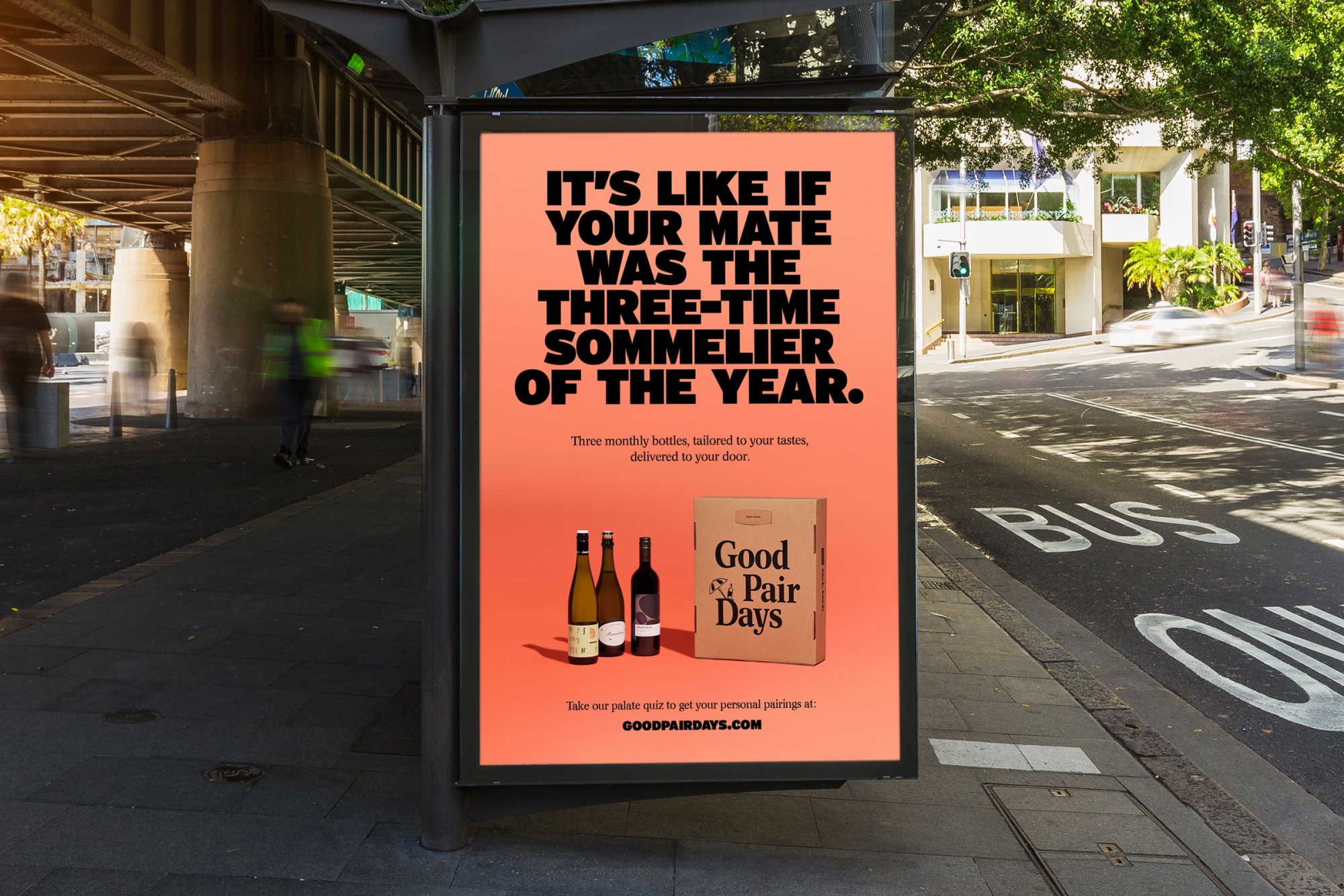
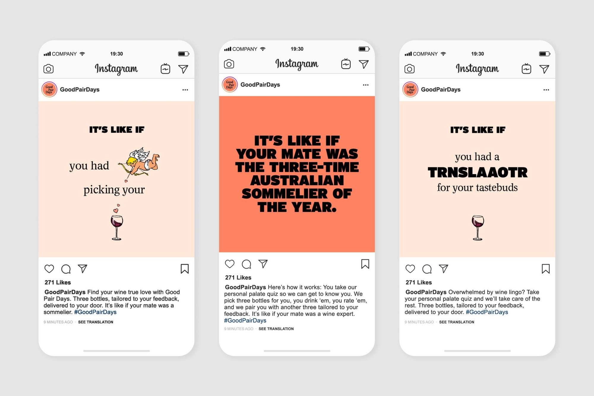
Good Pair Days is a digital-first, direct-to-consumer monthly wine service. After just three years in the market, their down-to-earth tone, simple offering and quality of product — curated by co-founder and three-time Australian sommelier of the year Banjo Harris Plane — has earned them a dedicated community of customers.
Any insights?
Specialising in product discovery and tailoring, they couple expert curation with tech-based personalisation to pair their customers with the perfect wines for their palates, which makes them the most advanced wine retailer in the market. It’s a key selling point that most people didn’t know.
And what seems to be the problem?
On the cusp of expansion, they approached us as The Wine Gallery. Proclaimed “the Netflix of wine” by Vogue, their name wasn’t living up to the accolade. It was too literal, too generic, too noisy on social media. It didn’t reflect their fun and inclusive spirit.
Equally, their brand felt inconsistent, cutesy and unownable. It needed to be elevated — playful, but mature. It served them when they were a small start up, but their rapid growth called for an overhaul to help differentiate them within a traditionally stuffy and elitist market.
So how’d you go about it?
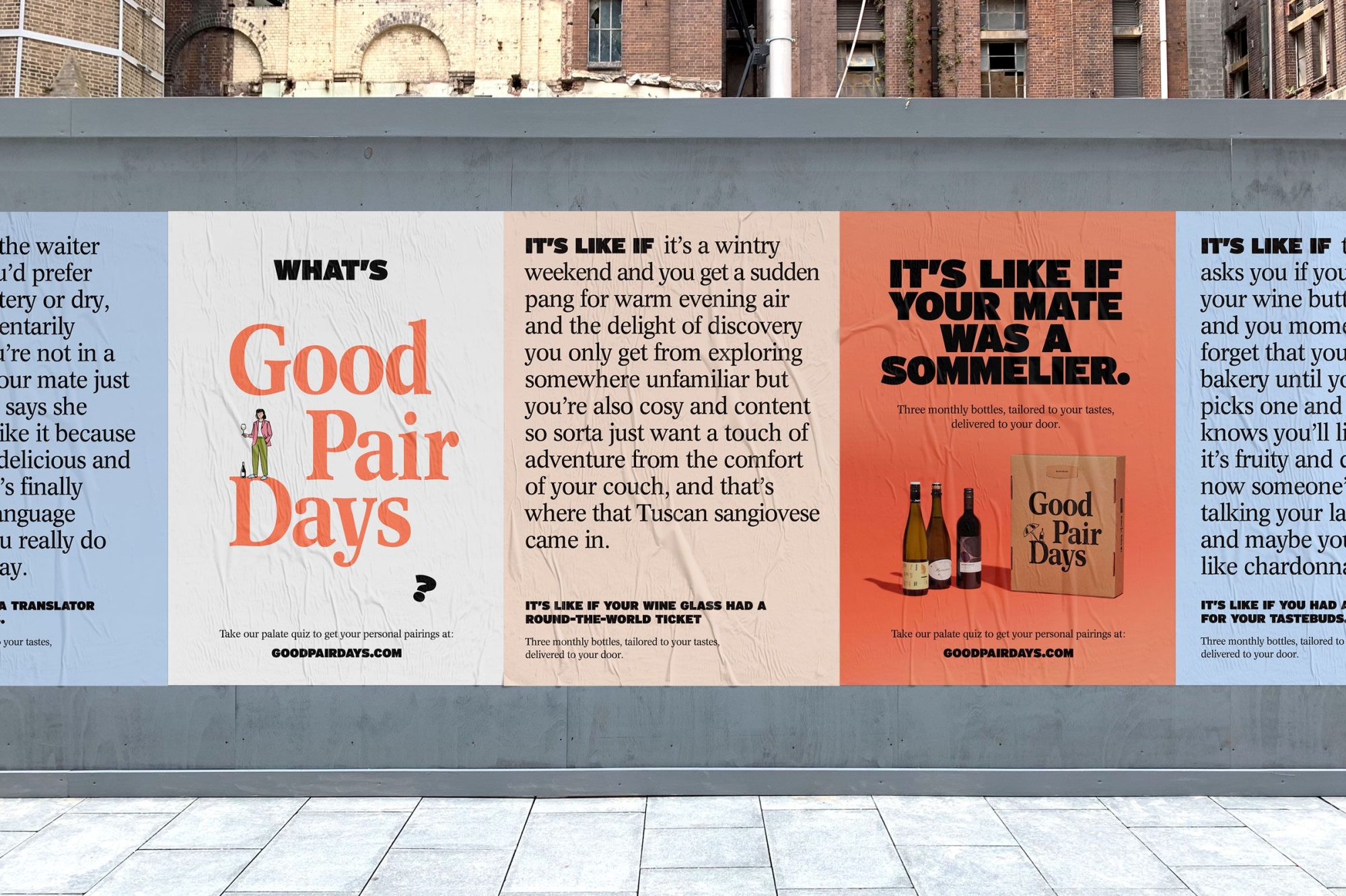
Partnering with copywriter Cat Wall, we workshopped a new name. They needed something surprisingly delightful. Something exciting and inviting. A name that truly reflected their mission to invite everyone to explore and enjoy wine. A name like Good Pair Days.
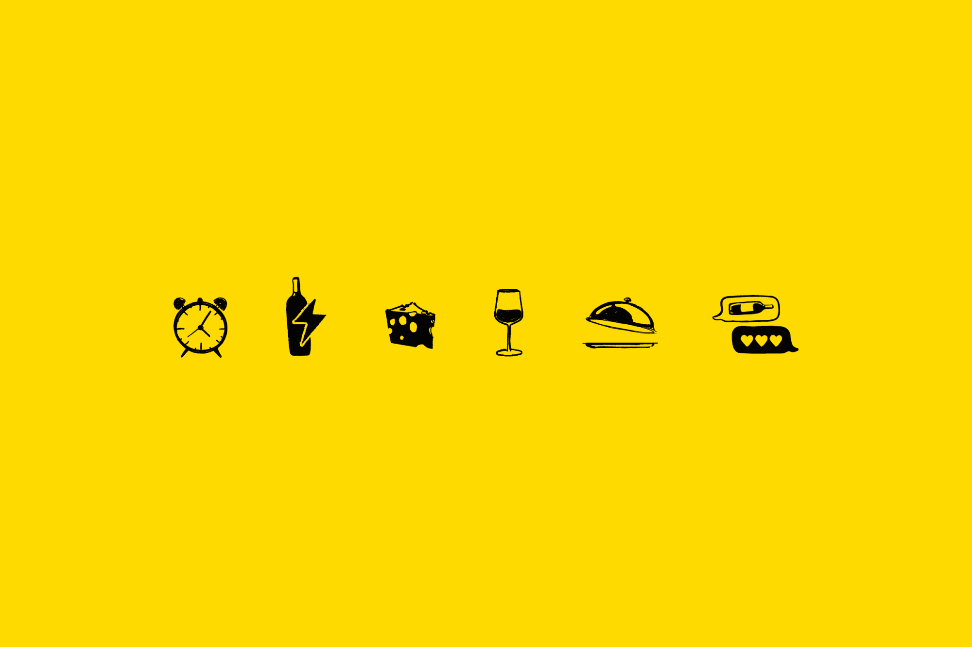
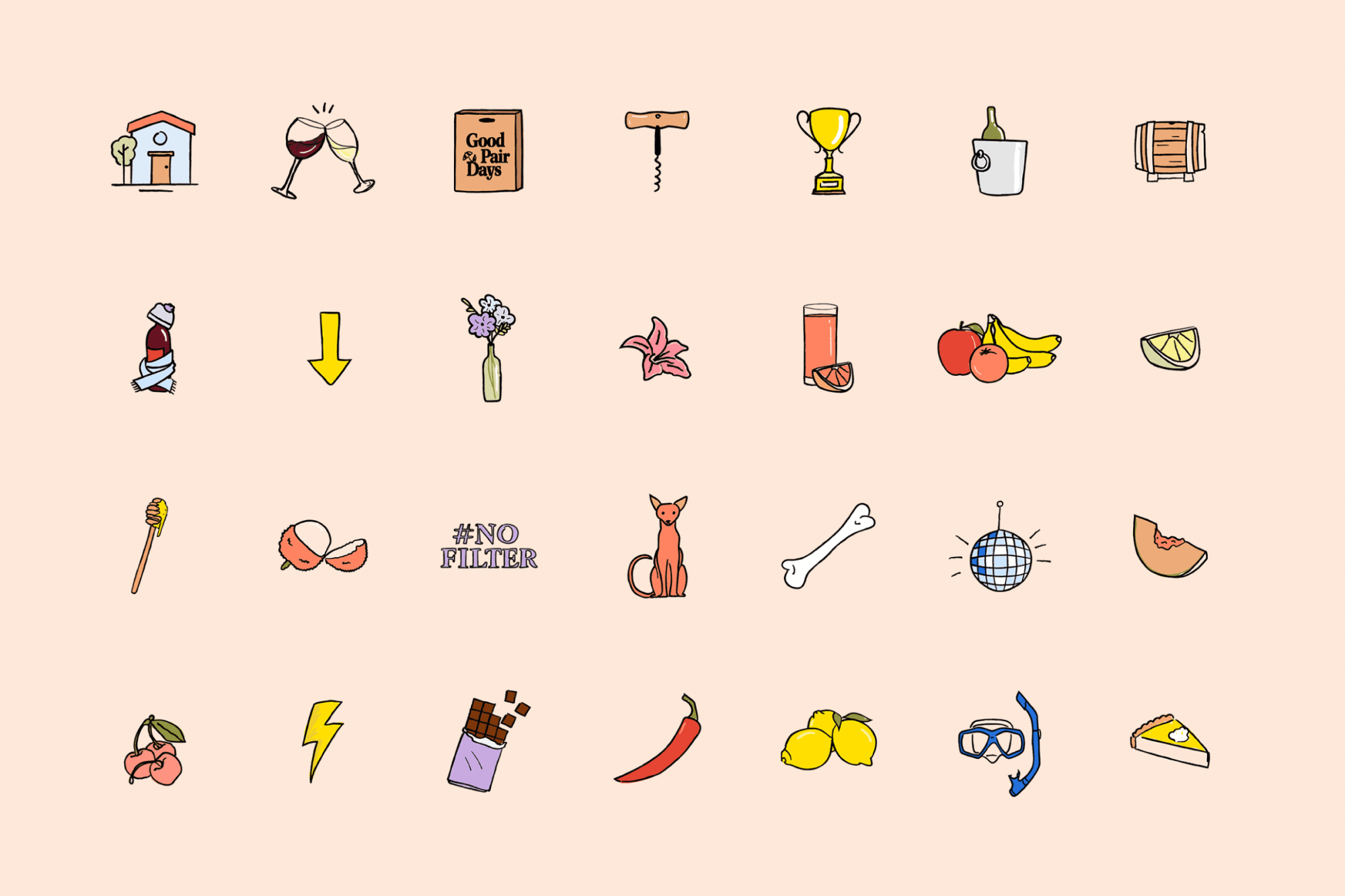
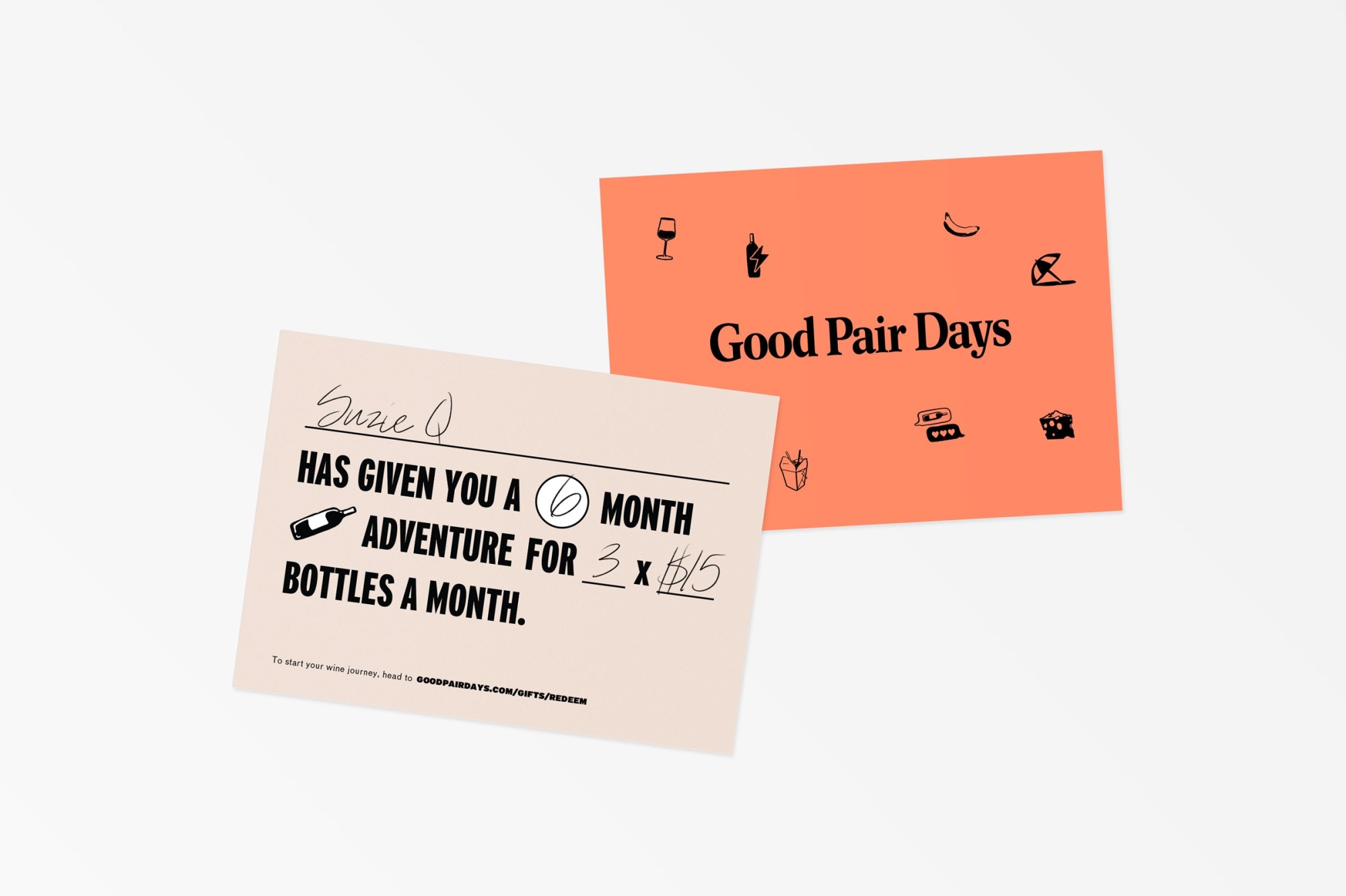
The brand overhaul came next. Focused on that Good Pair Days feeling, we developed a comprehensive identity system that worked seamlessly across both physical and digital. We created a logomark, illustration system, supporting icons, ownable colour palette, bold typefaces and tone of voice that would elevate the brand across campaigns, website, app, packaging and sweet member swag.
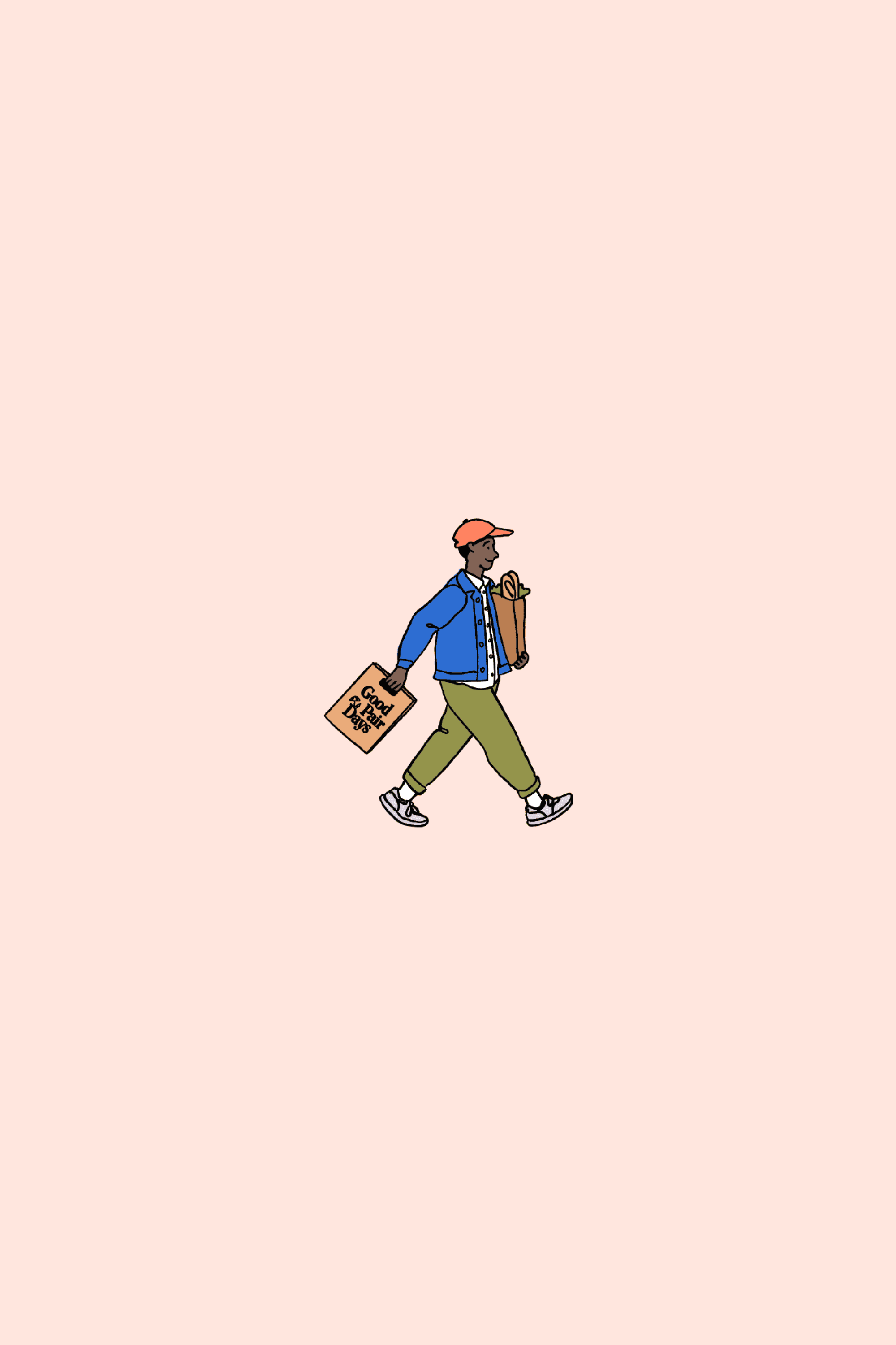
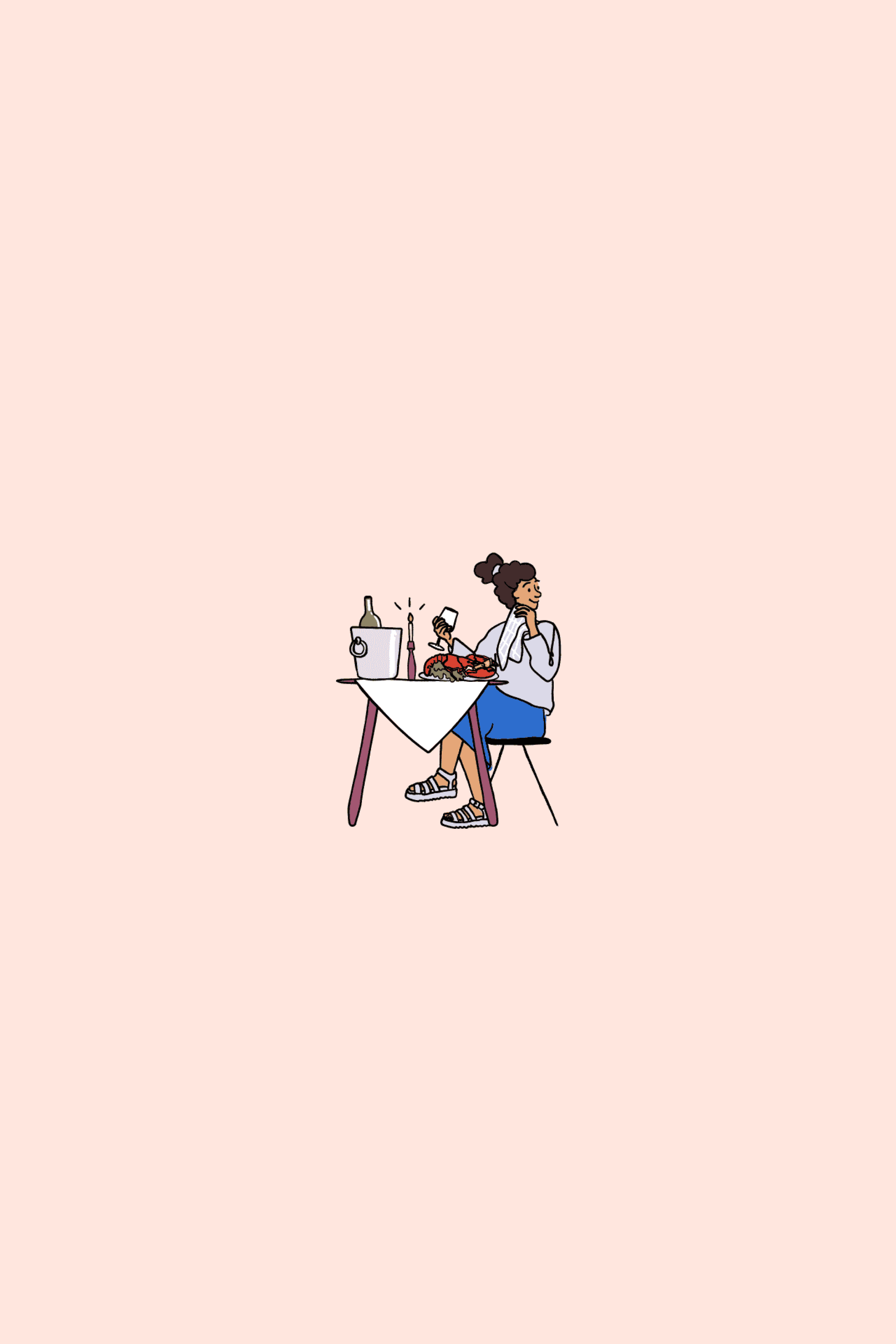
Giving a digital company a human touch
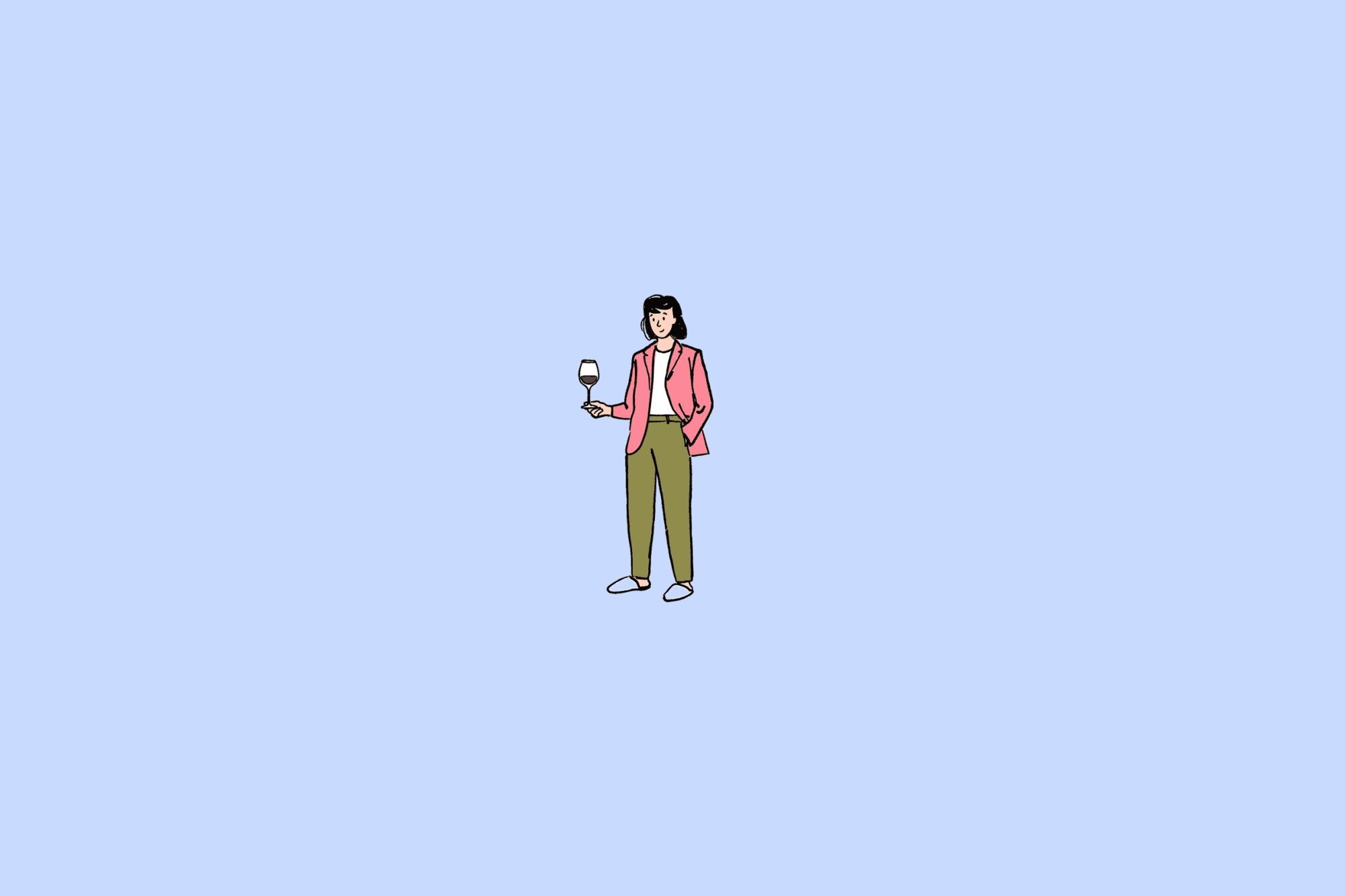
The visual identity needed to effectively represent the brand’s digital nature without losing the human touch of their exceptional customer service and product experience. We created a series of diverse and energetic illustrated characters to guide the customer through the online and offline experience.
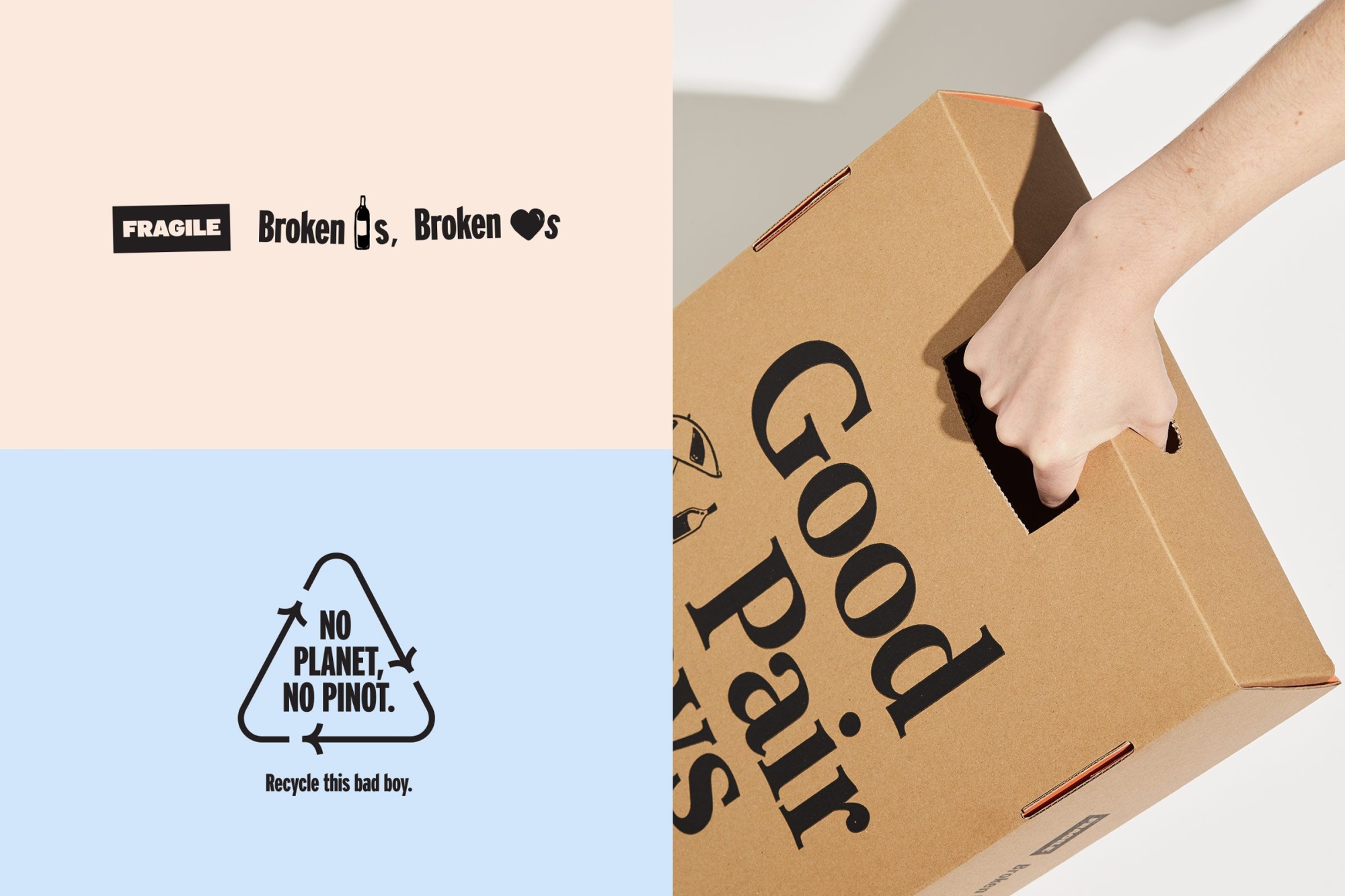
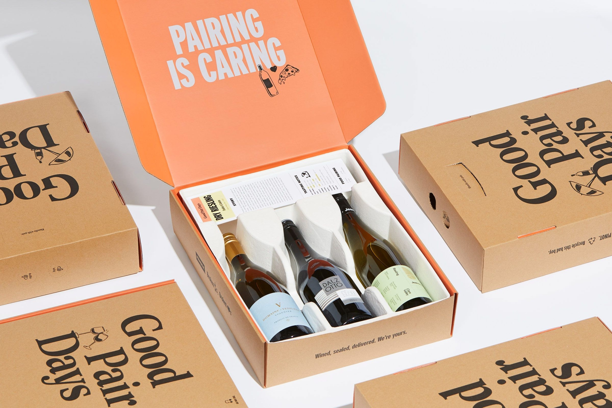
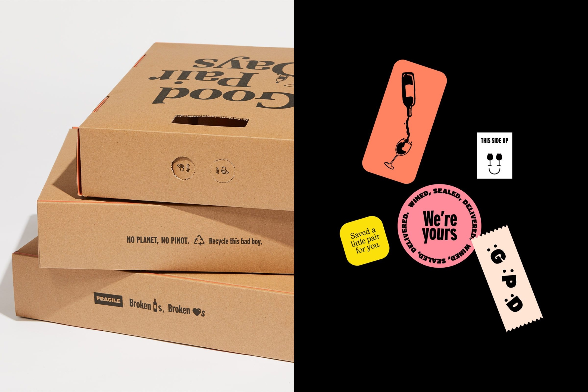
Wined, sealed, delivered
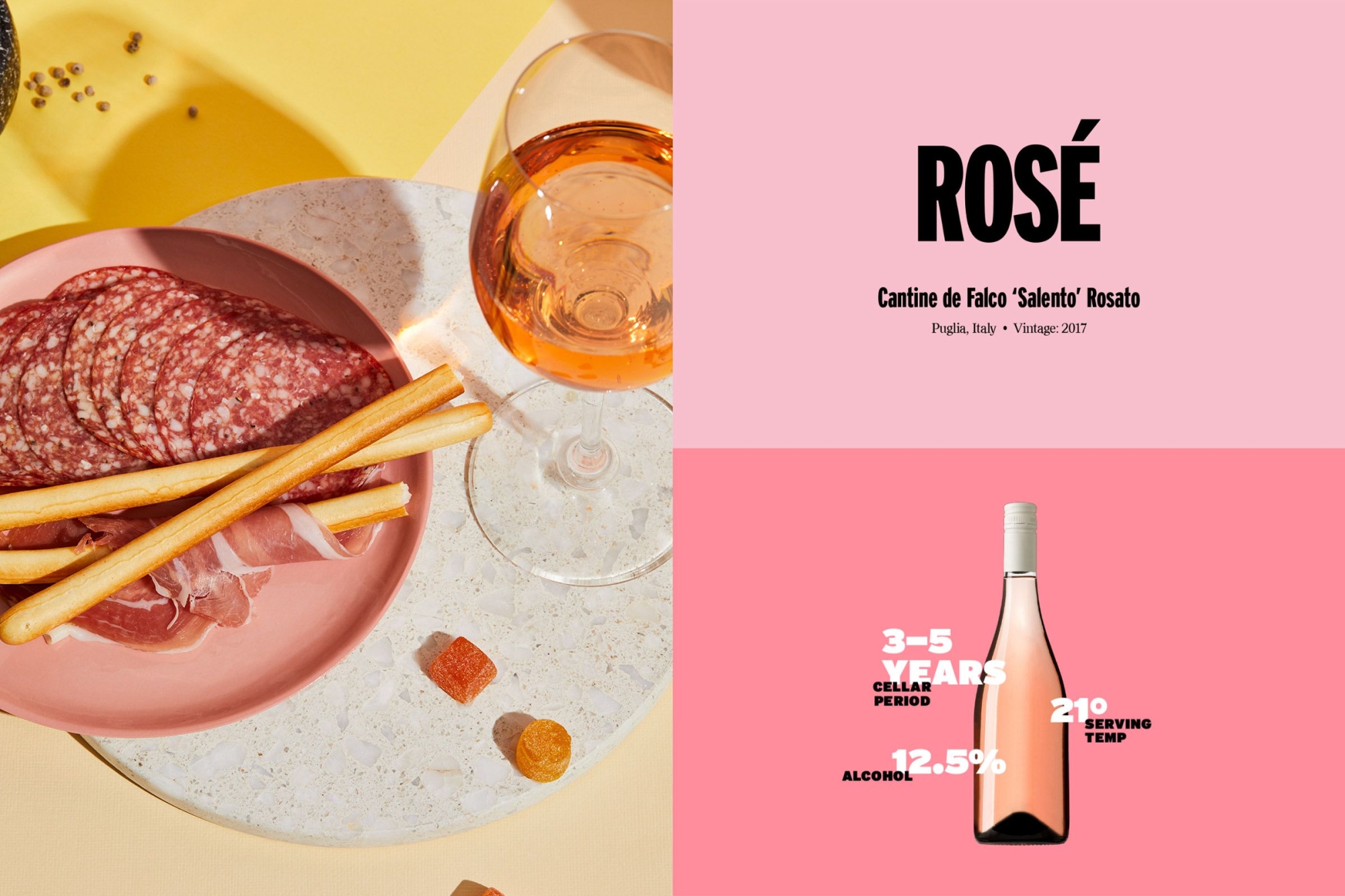
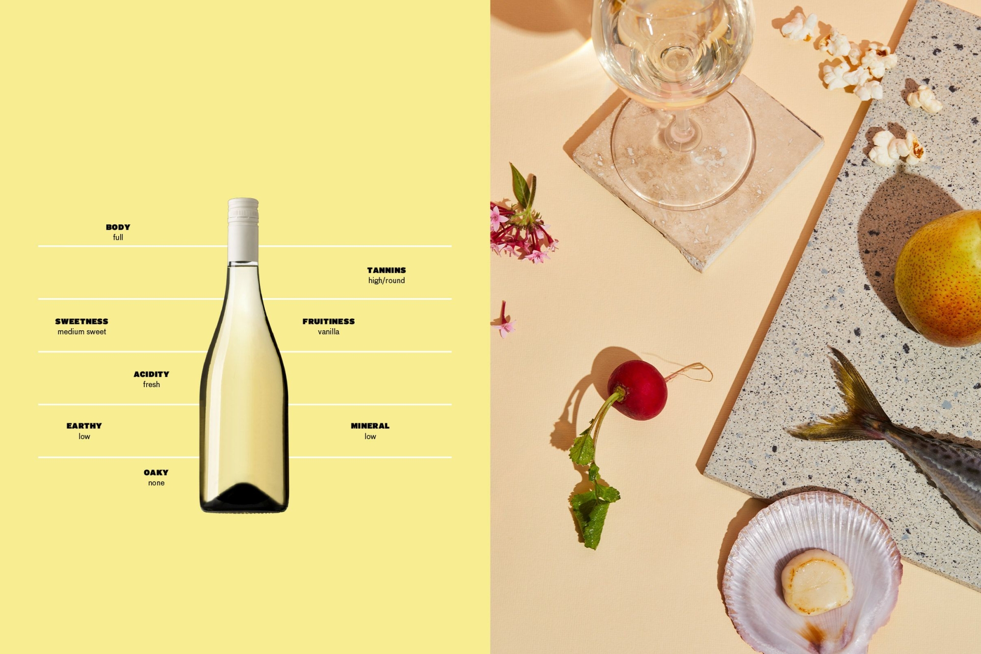
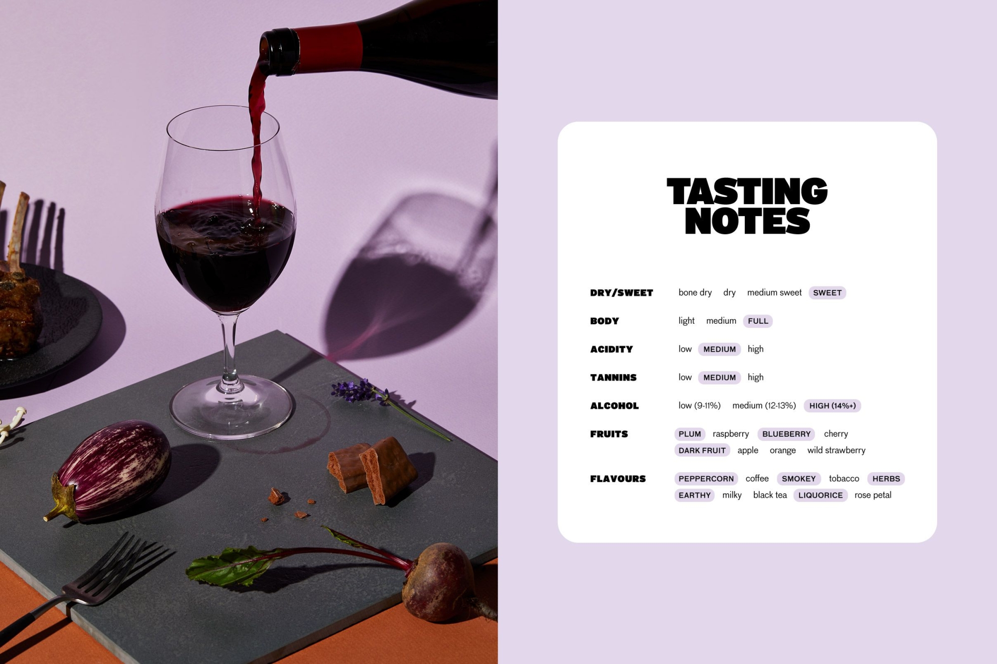
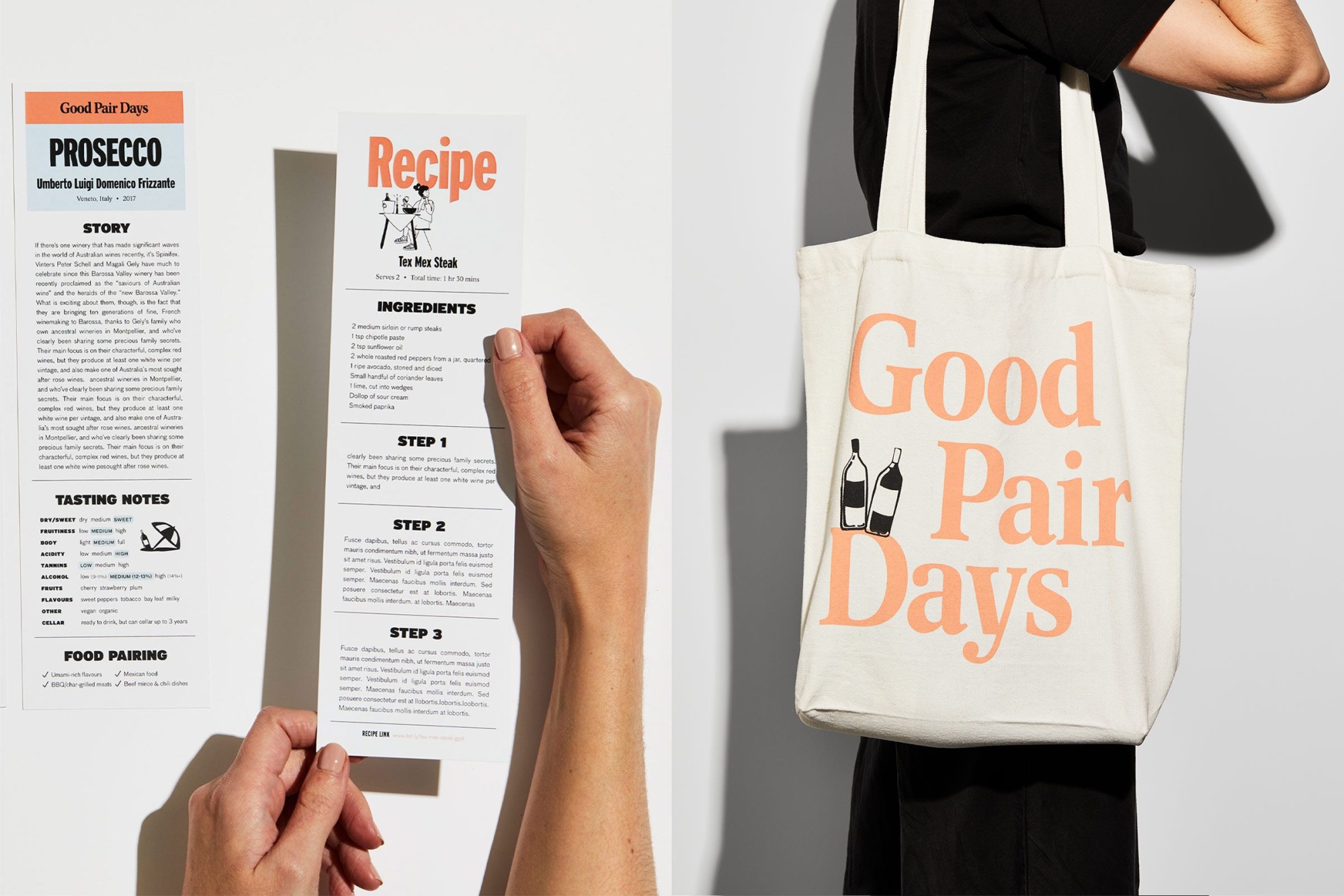
Much like the brand, we wanted the unboxing experience to be unexpectedly and utterly delightful. From a single-bottle box to a 12-bottle case, the entire packaging suite is littered with quirky, bold brand messaging. We redesigned tasting note cards, welcome booklets and tote bags to make the discovery and education experience even more exciting for our audience.
The client also used the rebrand as an opportunity to go greener, asking us to find innovative ways to remove single-use plastic. By designing a built-in handle and an insert made from biodegradable moulded pulp, we were able to make the product packaging 100% recyclable. After all… no planet, no pinot.
Reimagining the online wine retail experience
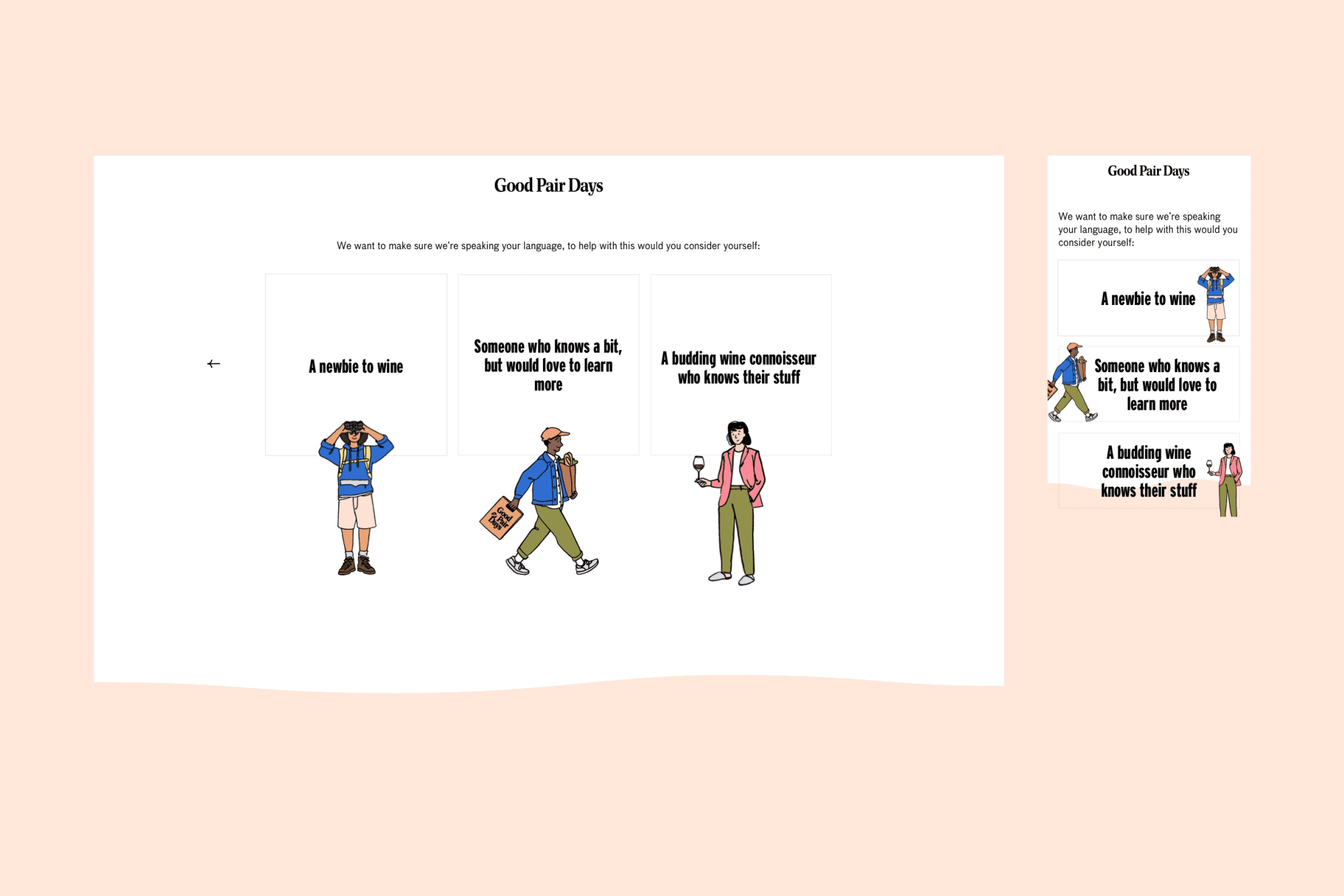
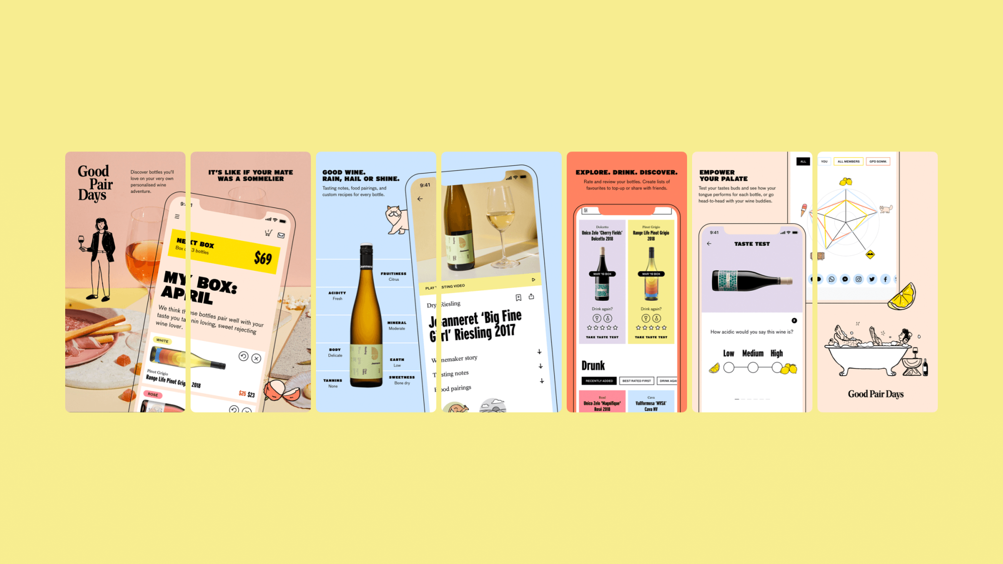
When you’re rebranding a digital-first company, the online experience is key. The member section of the website guides the user through a Netflix-style experience to explore, rate and discover wines from around the world. Built mobile-first to reflect the digital consumption habits of the audience, it’s a seamless commerce and wine education experience, regardless of device.
We introduced a My Box tray, accessible from any screen, so users can see and configure their upcoming box and are always aware of what they’re getting and what they’re being charged. We changed the wine exploration experience, breaking it up into digestible collections and, in turn, simplifying the decision-making process. We added a simple UI touch — differentiating bottles and grape types with white, red, rose or sparkling colour highlights — to provide wine newbies with an easily identifiable indicator.
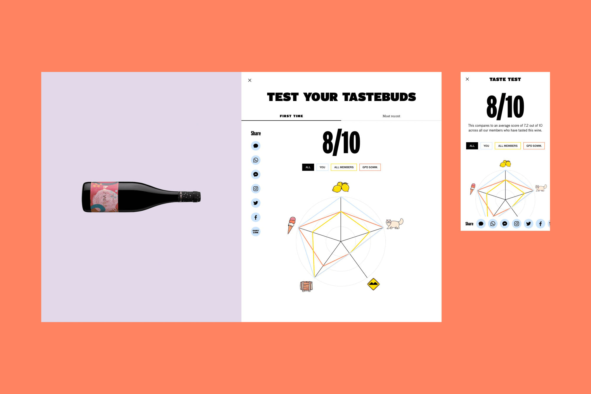
We also stepped up the gamification of the brand by restructuring the membership rewards system into an easy-to-understand pathway. By allowing users to see all locked levels and rewards, we were able to increase their incentive to engage and interact with the brand and product to get the reward they want. Further to this, the introduction of a comparison chart in the taste-testing process allows users to better understand their performance next to their previous results, other members and Good Pair Days sommeliers, adding some fun to the educational aspect.
Alongside the website, the Good Pair Days team also entrusted us with designing their first app — a visually punchy consolidation of the online experience with a bunch of exciting app-only offerings.
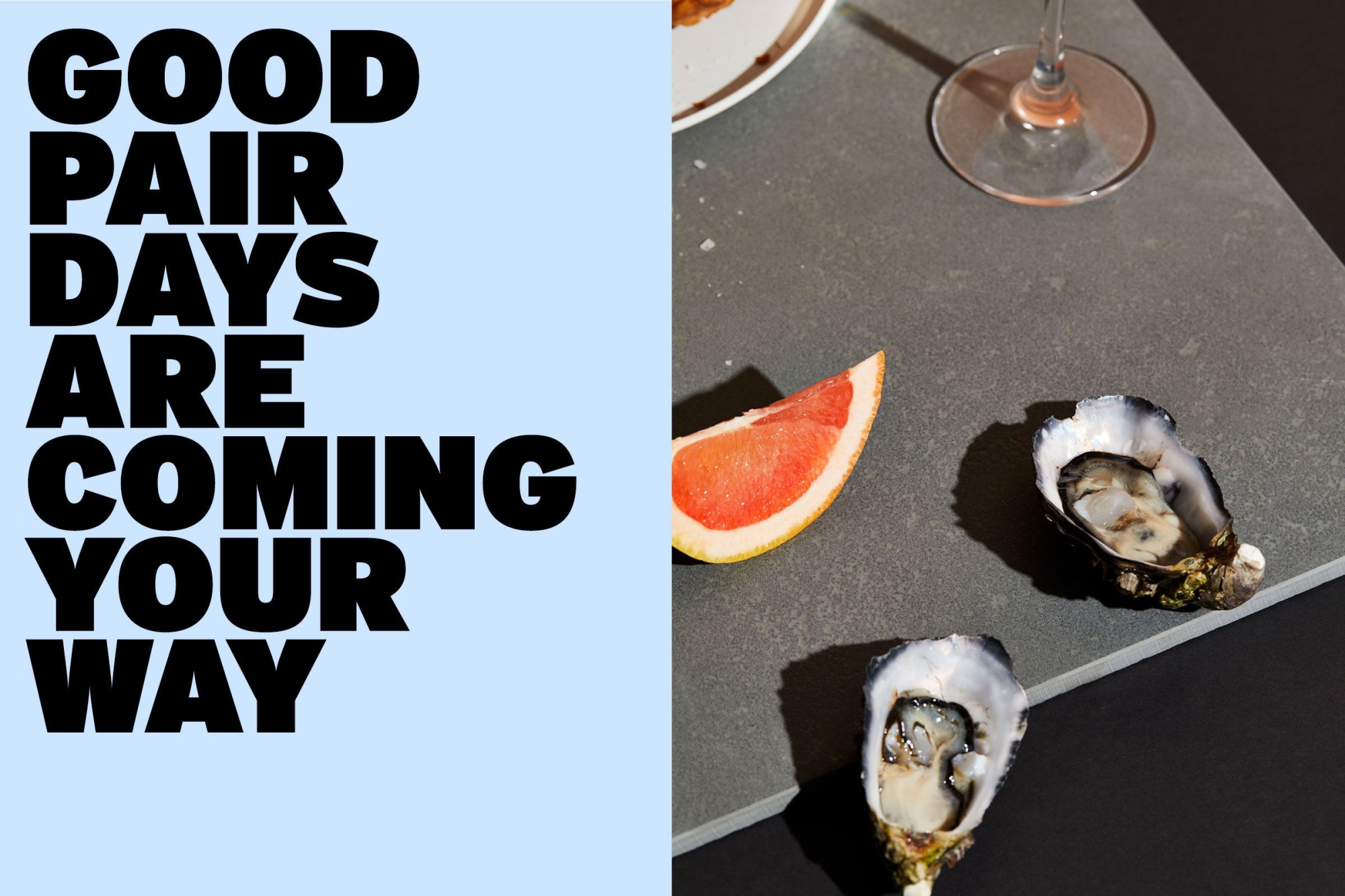
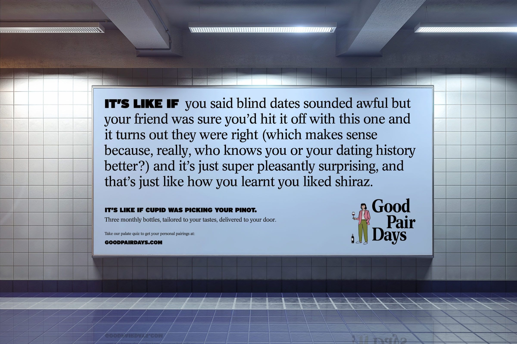
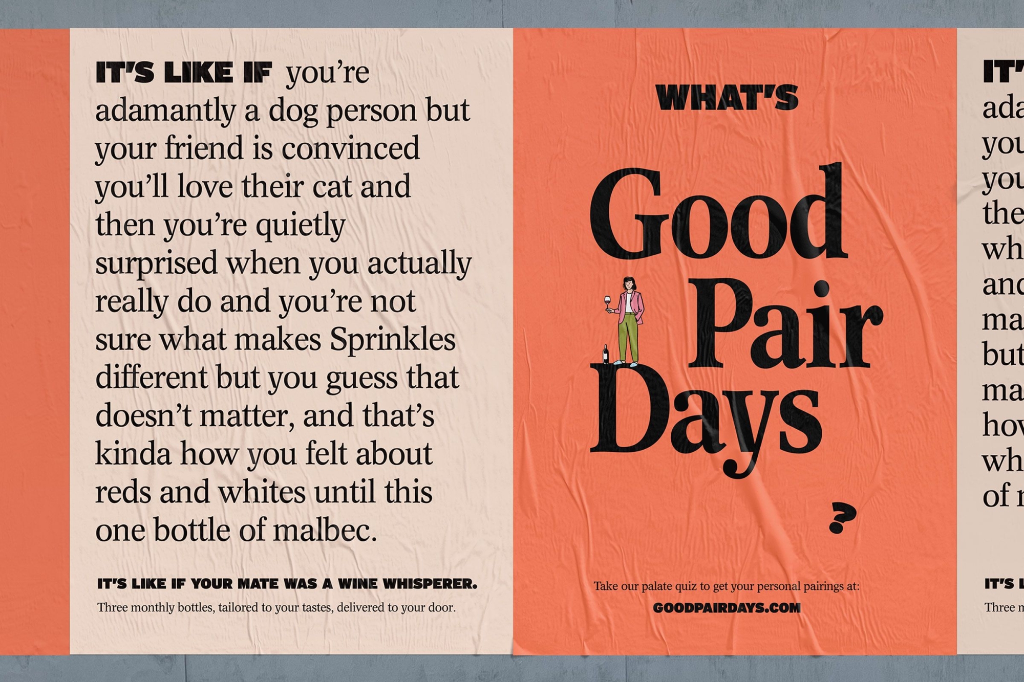
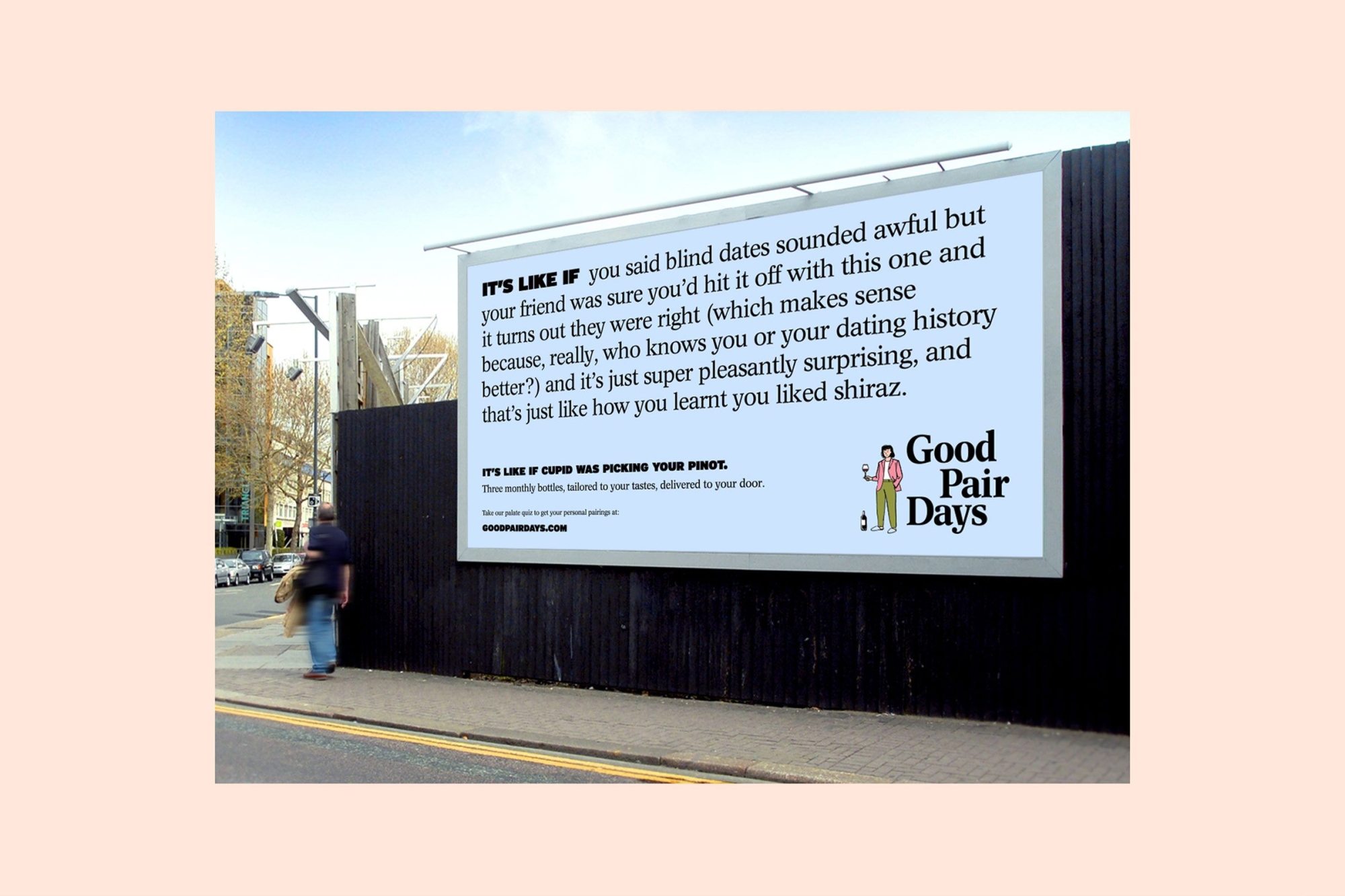
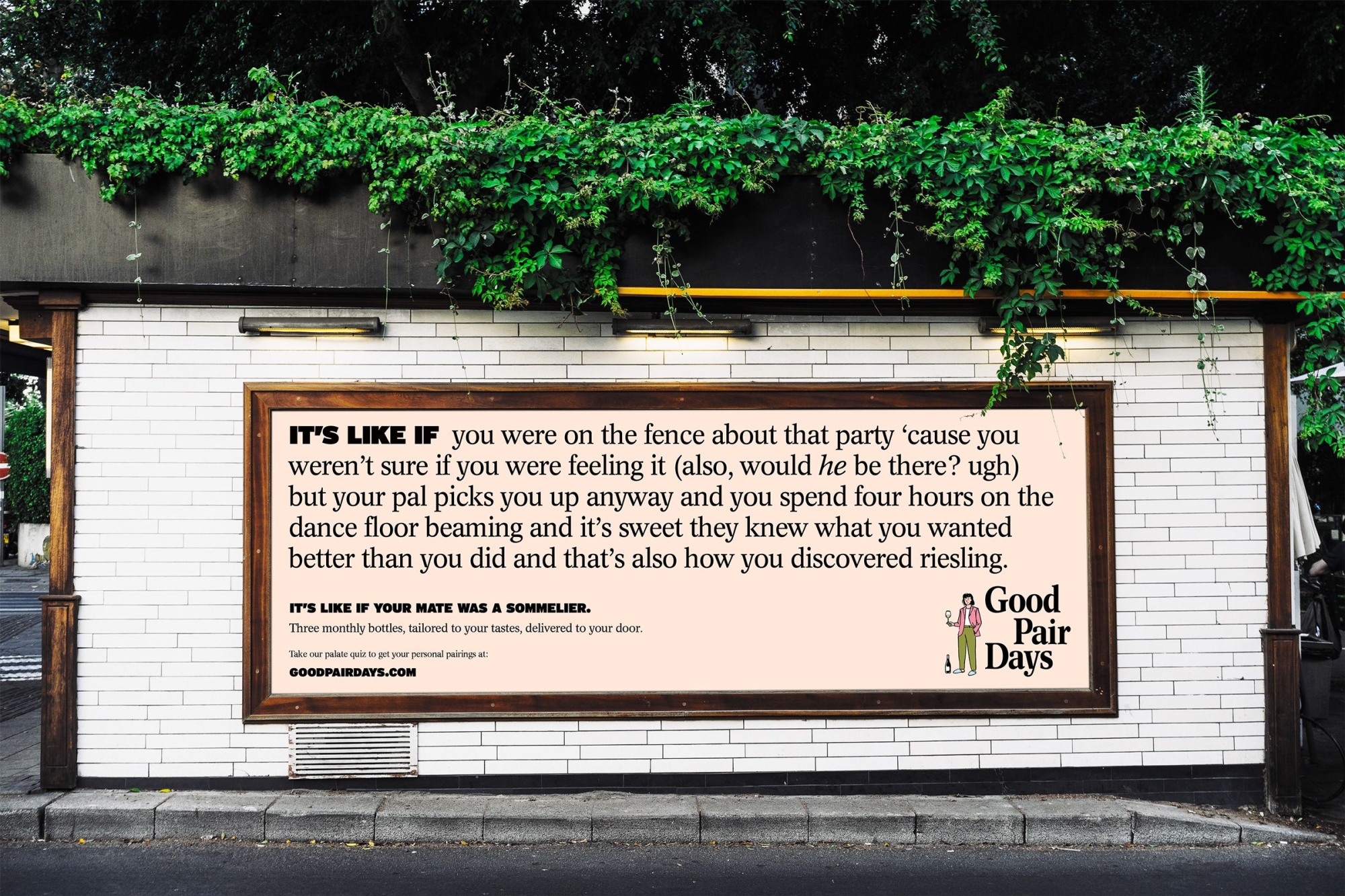
Offline advertising for an online brand
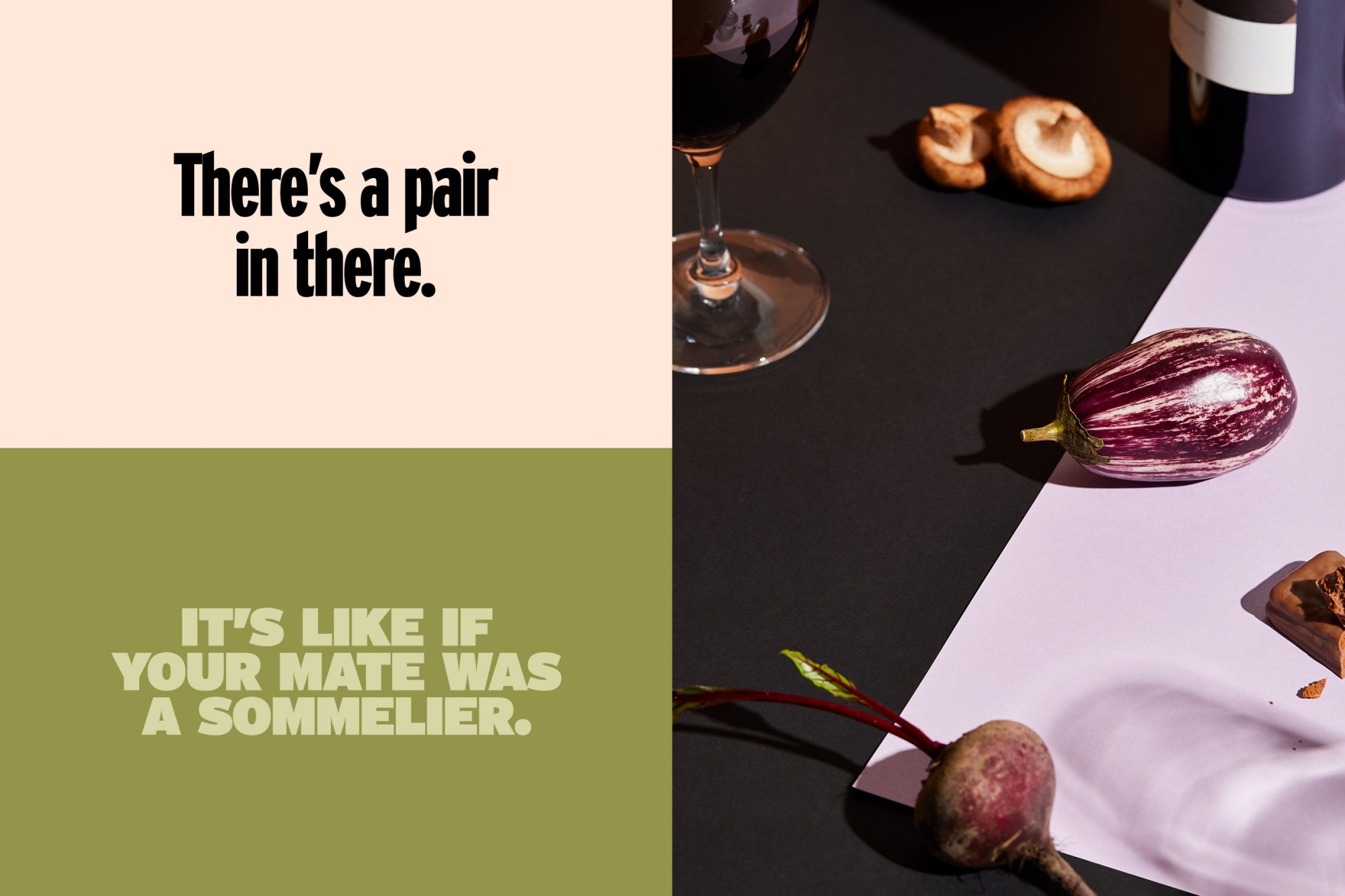
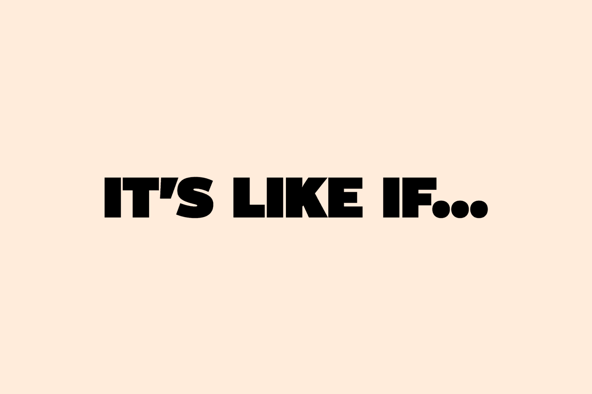
The “It’s like if…” campaign needed to be captivating to an out-of-home audience and adaptable to a digital and social campaign that funneled all the way from top level to customer conversion. We rolled out a suite of outdoor ads and a collection of digital animations that not only launched the new brand into the world but showcased each of the new brand assets we’d worked on.

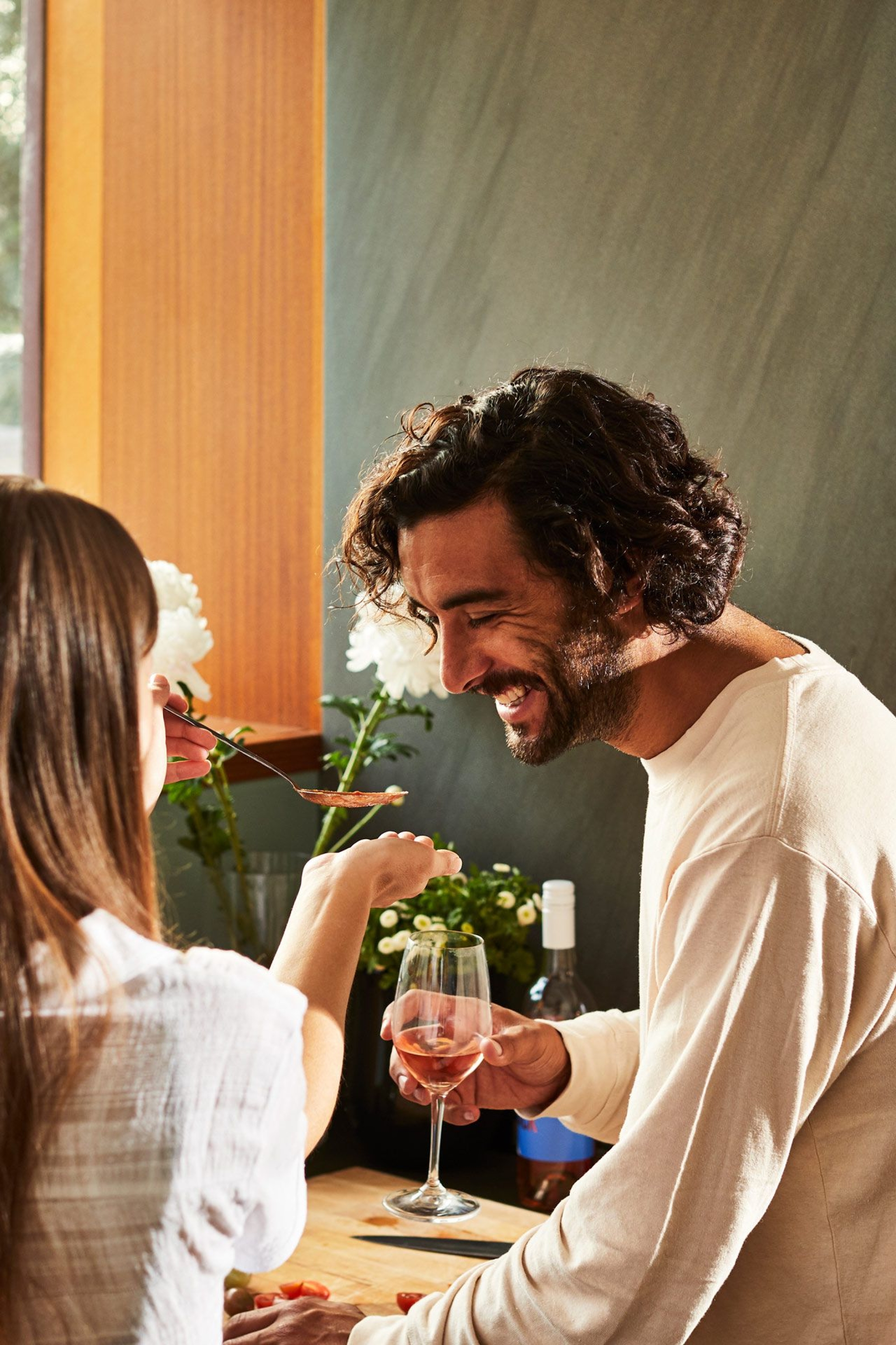
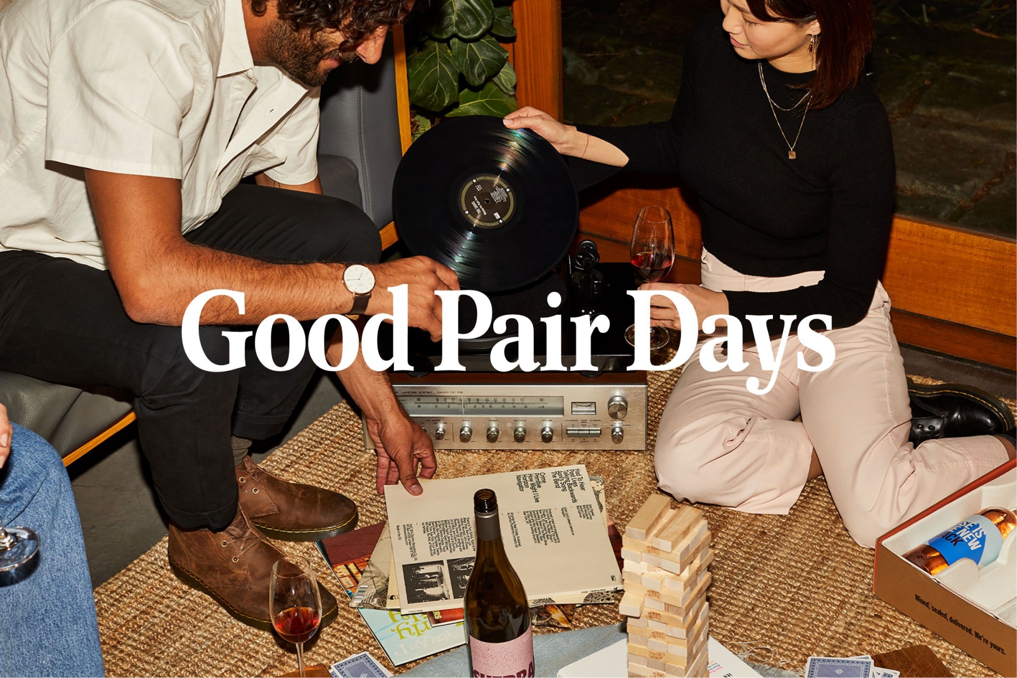
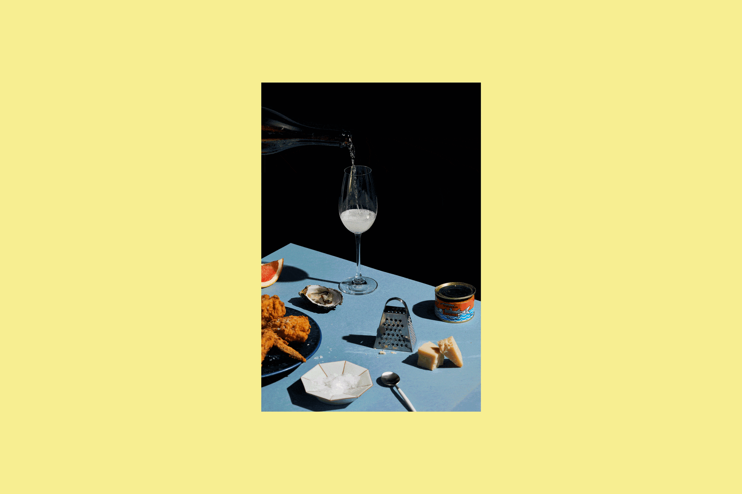
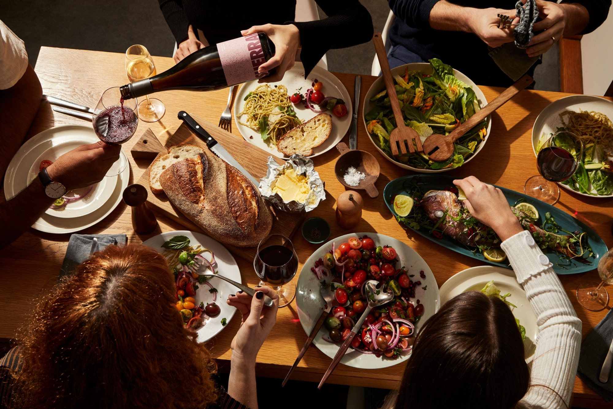
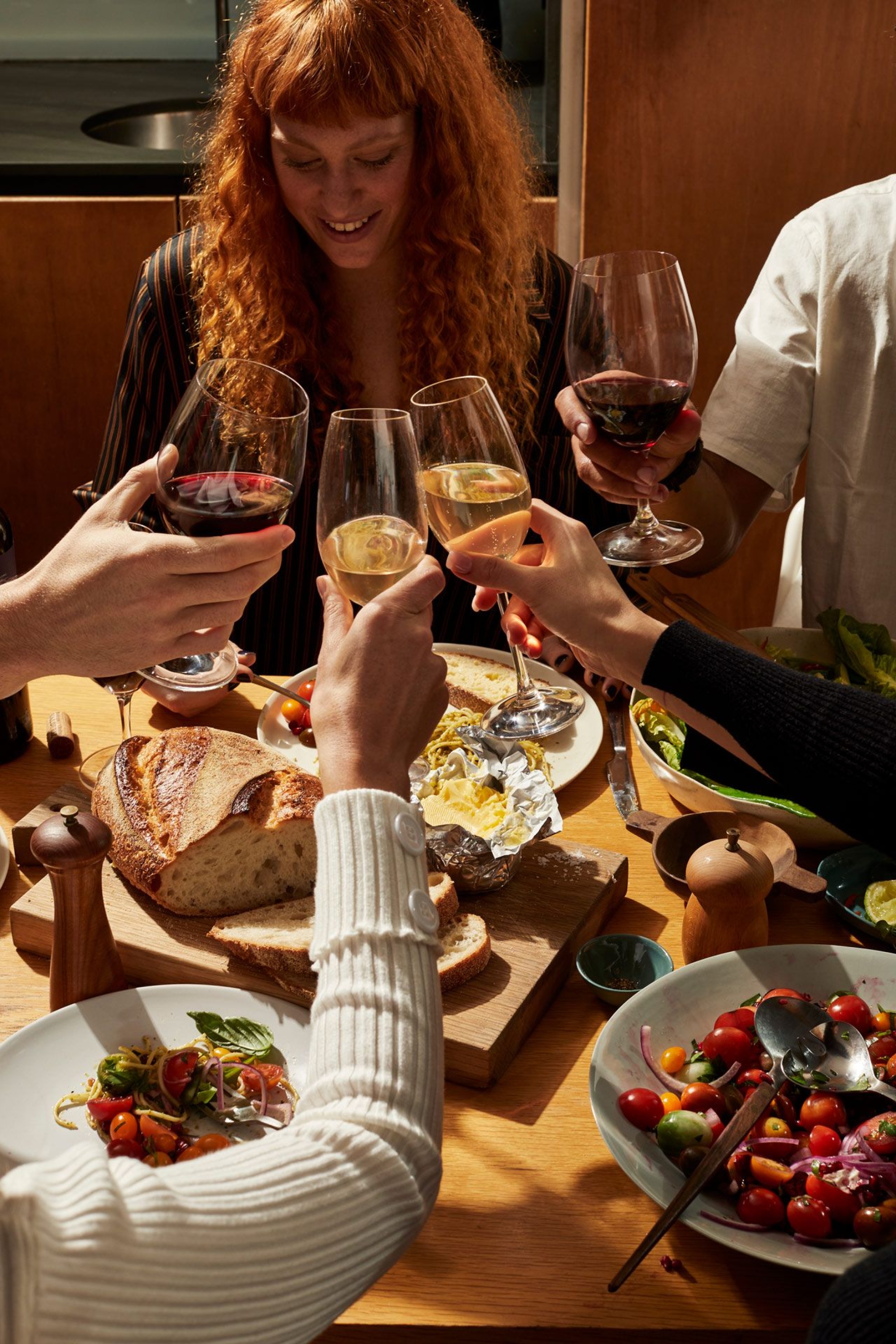
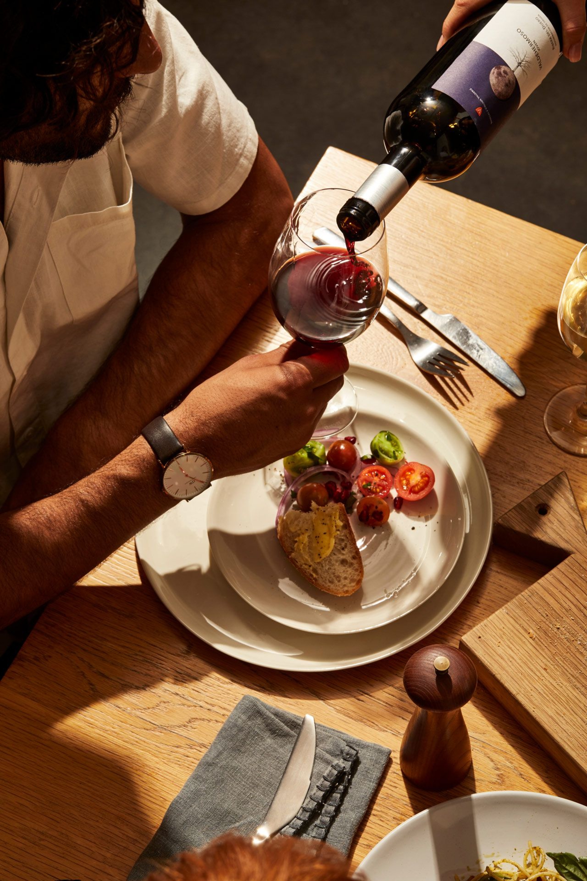
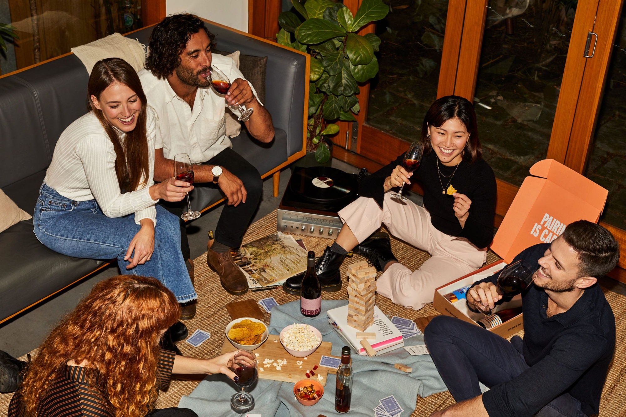
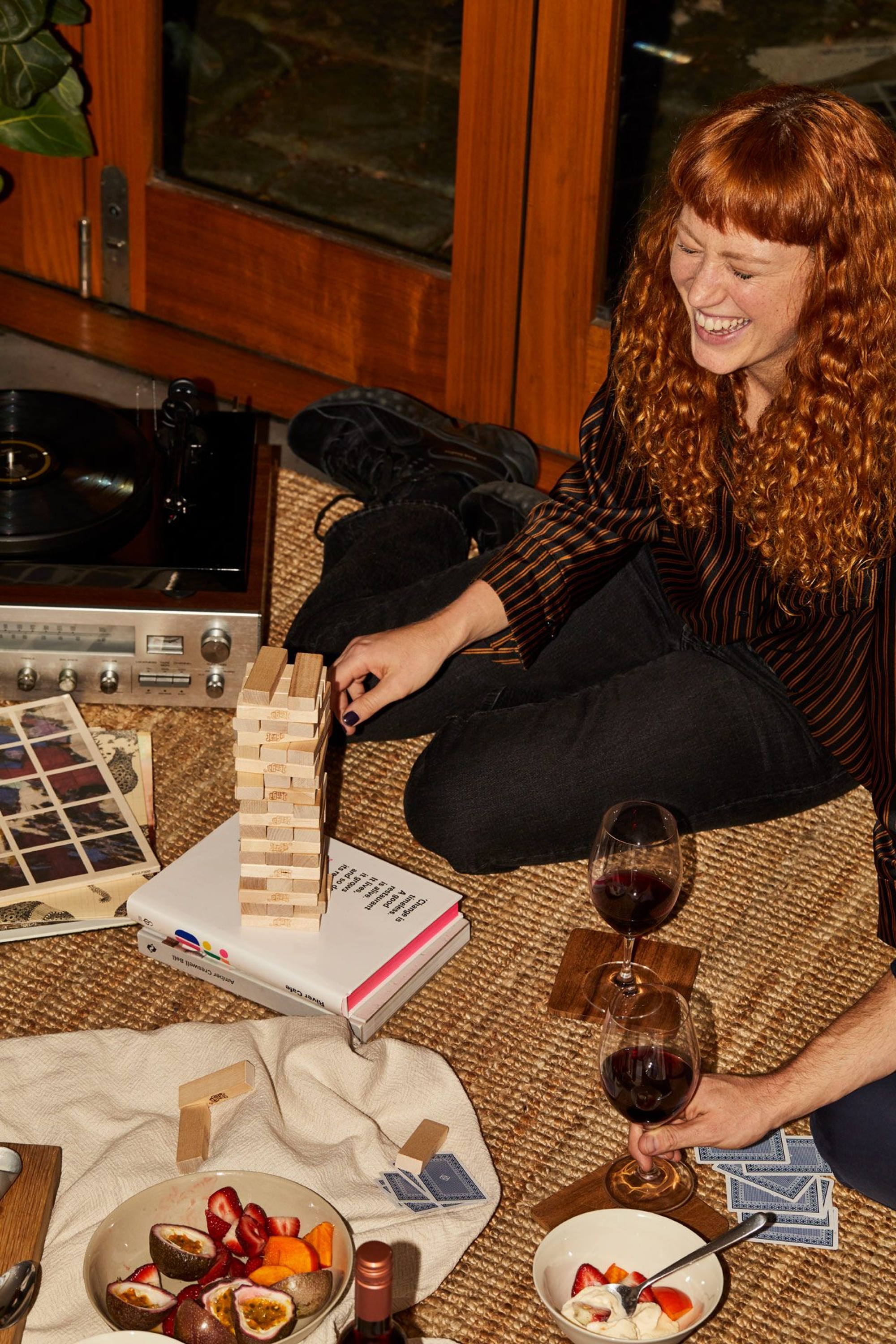
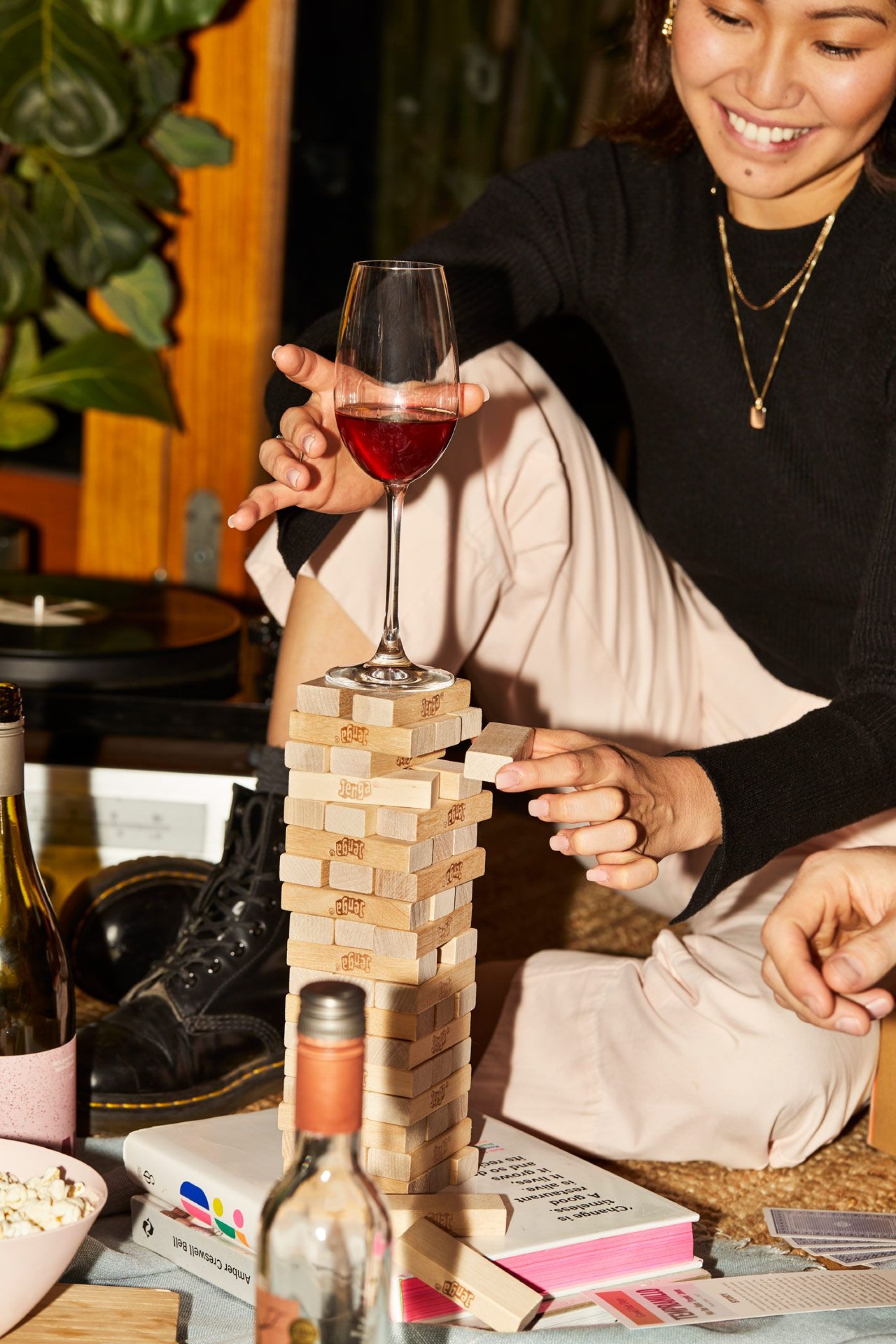
A vibrant visual suite of friends, wine and good times
Teaming up once again with dynamic duo Benito Martin (Sam I Am) and Jessica Johnson, we put together both a stylised product shoot and a lifestyle shoot that encapsulated the Good Pair Days experience — friends, wine, good times. This gave us a visually dynamic suite of images that could be used across web, communications, social and advertising in the year following the launch.
And the end result?
The Good Pair Days mission is to open up the world of wine discovery to everyone — from newbies to aficionados — in a joyful and inclusive way. The client’s willingness to trust us and take a chance on something different — the idea at the core of their company — meant we could deliver a bold, full-bodied rebrand with top notes of excitement that increased both the salience of the brand and their customers’ loyalty to it.
Collaborators
- Photography • Benito Martin
- Photography • Jonathan May
- Stylist • Jessica Johnson
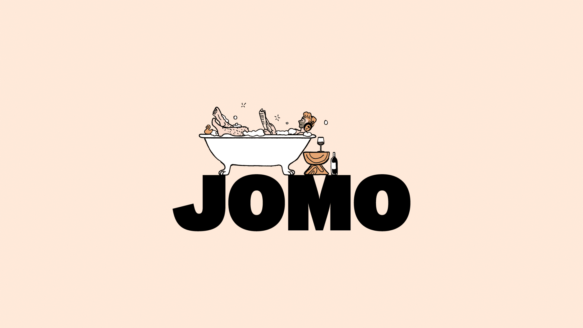
Wholesome
A whole new way to do some good.