With a mission to cut through the noise of the industry and encourage consumers to only buy the products they need (for the benefit of both their skin and the environment), KraveBeauty is a skincare brand that really cares. They approached us in need of a full rebrand that would reflect their no-BS, educational ethos in an approachable and inviting way.
- Verbal Identity •
- Visual Identity •
- Brand writing •
- Packaging design •
- Structural packaging design •
- Art direction •
- Photography •
- Icon system •
- Website design & build •
- Campaign creative
Awards


Featured In
What's all this then?
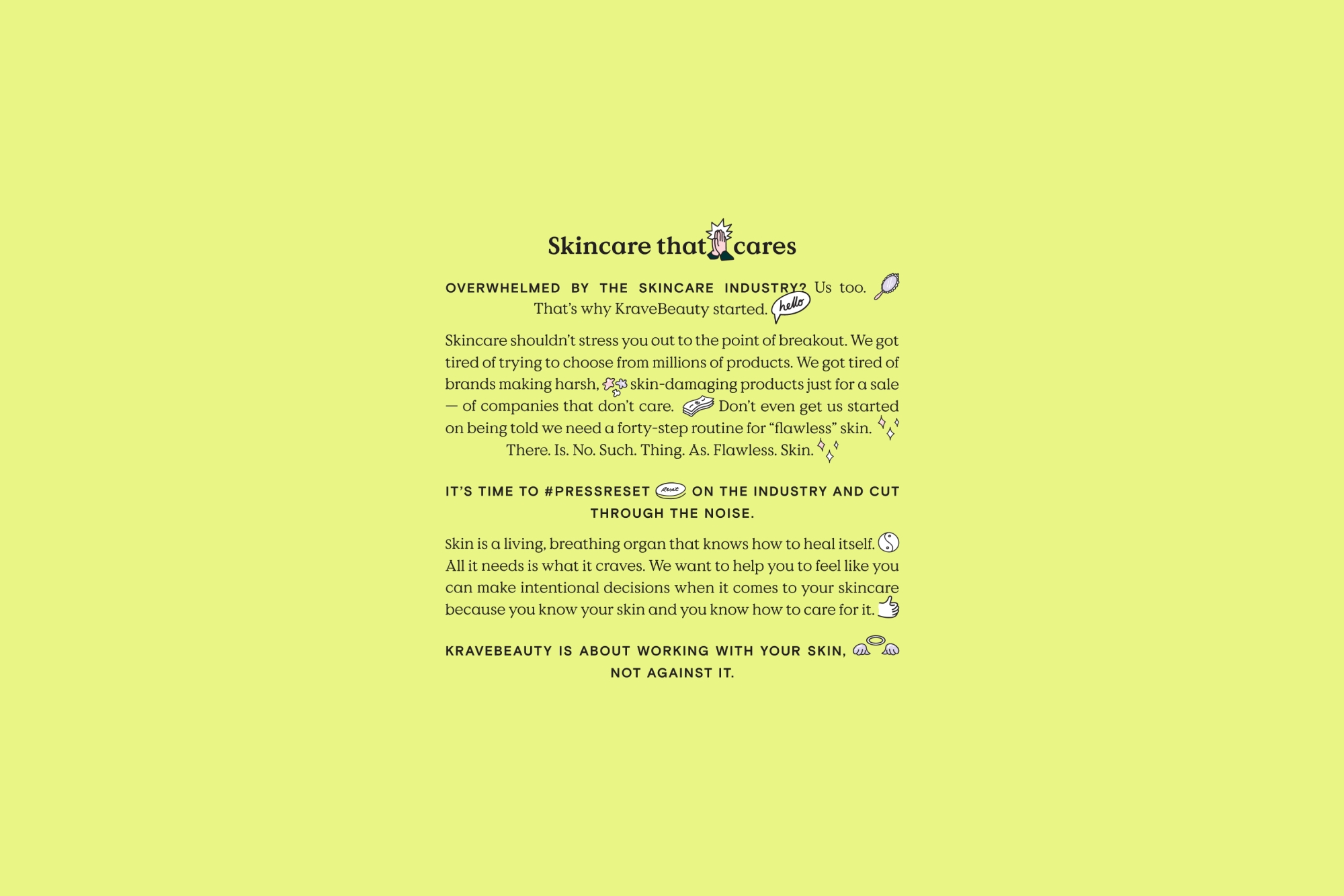
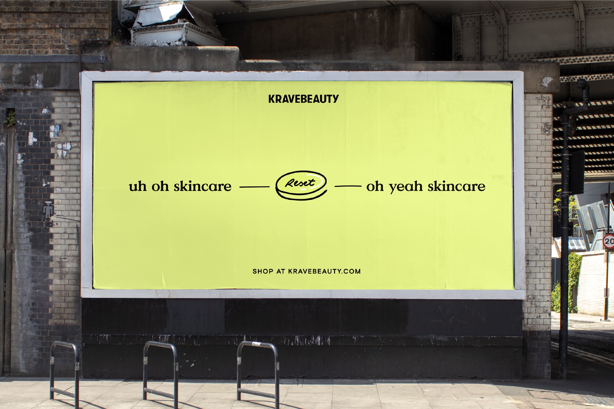
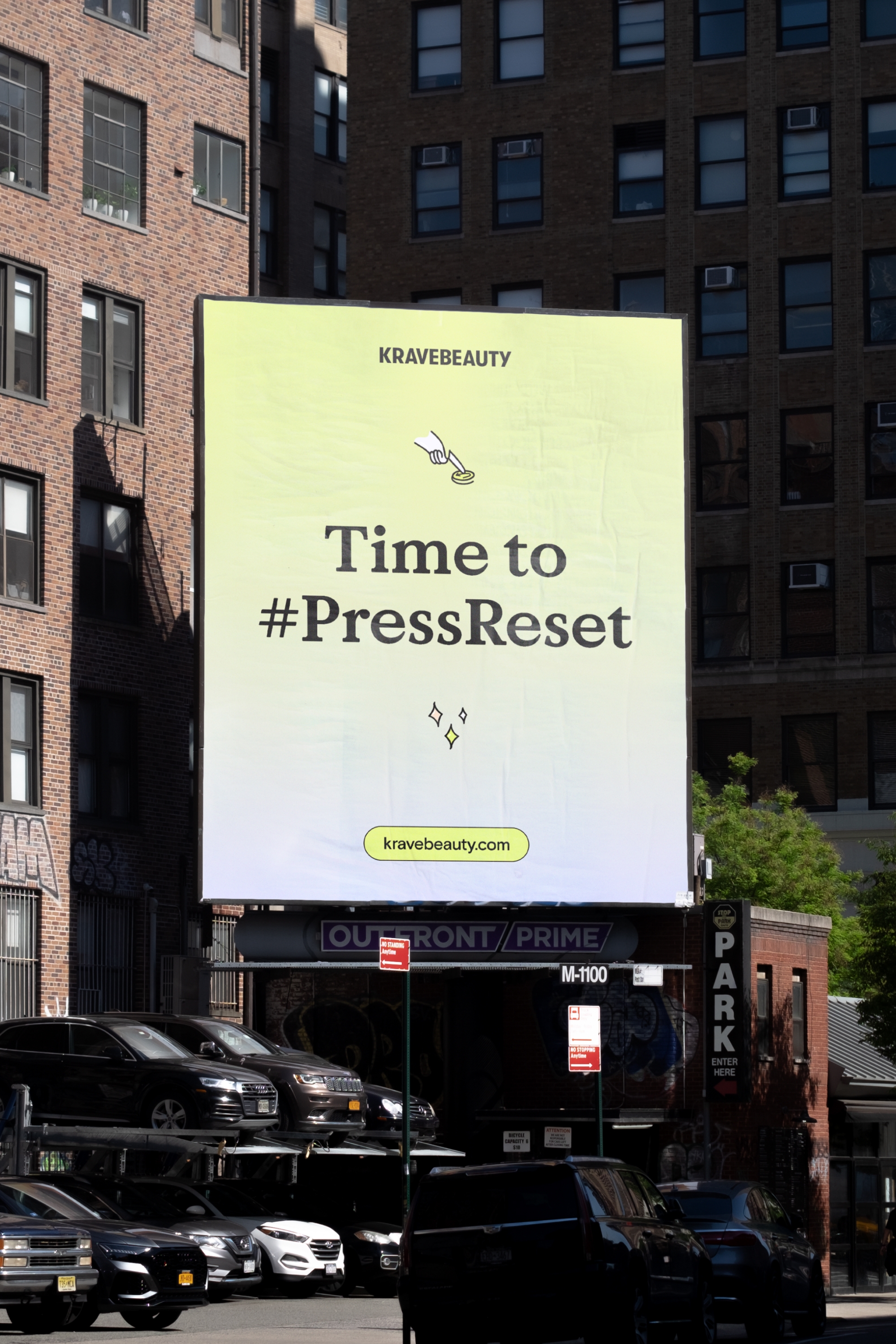
Founded in 2017 by skincare aficionado Liah Yoo, KraveBeauty is for anyone who finds themselves overwhelmed by the skincare space. The brand cuts through the noise of endless products, conflicting advice and multi-step routines, encouraging people to “press reset” and practice intentional skincare. With a focus on simple and engaging education pieces, they help people to understand exactly what their skin needs and how to treat it, without trying to sell them any unnecessary products in the process.
Any insights?
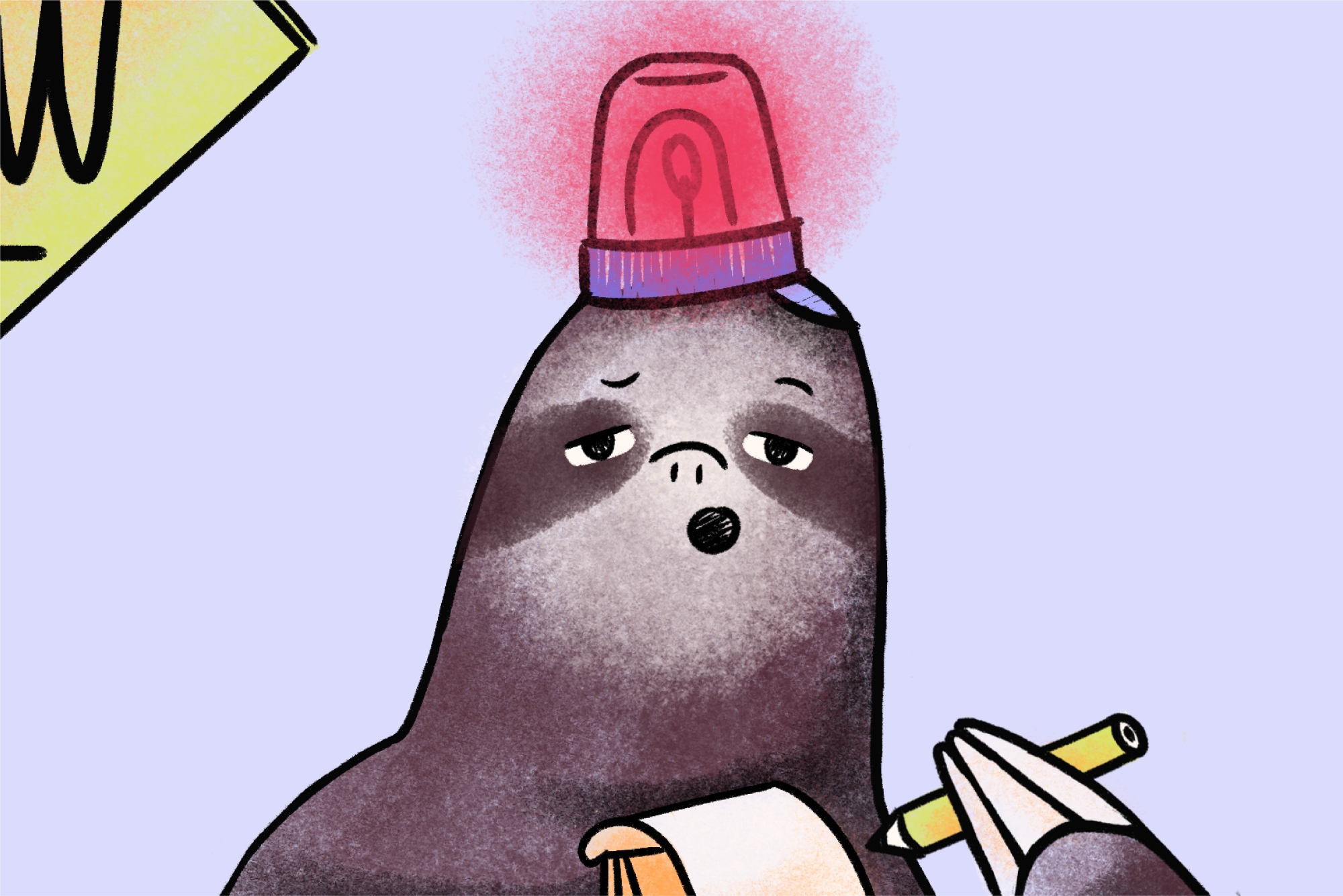
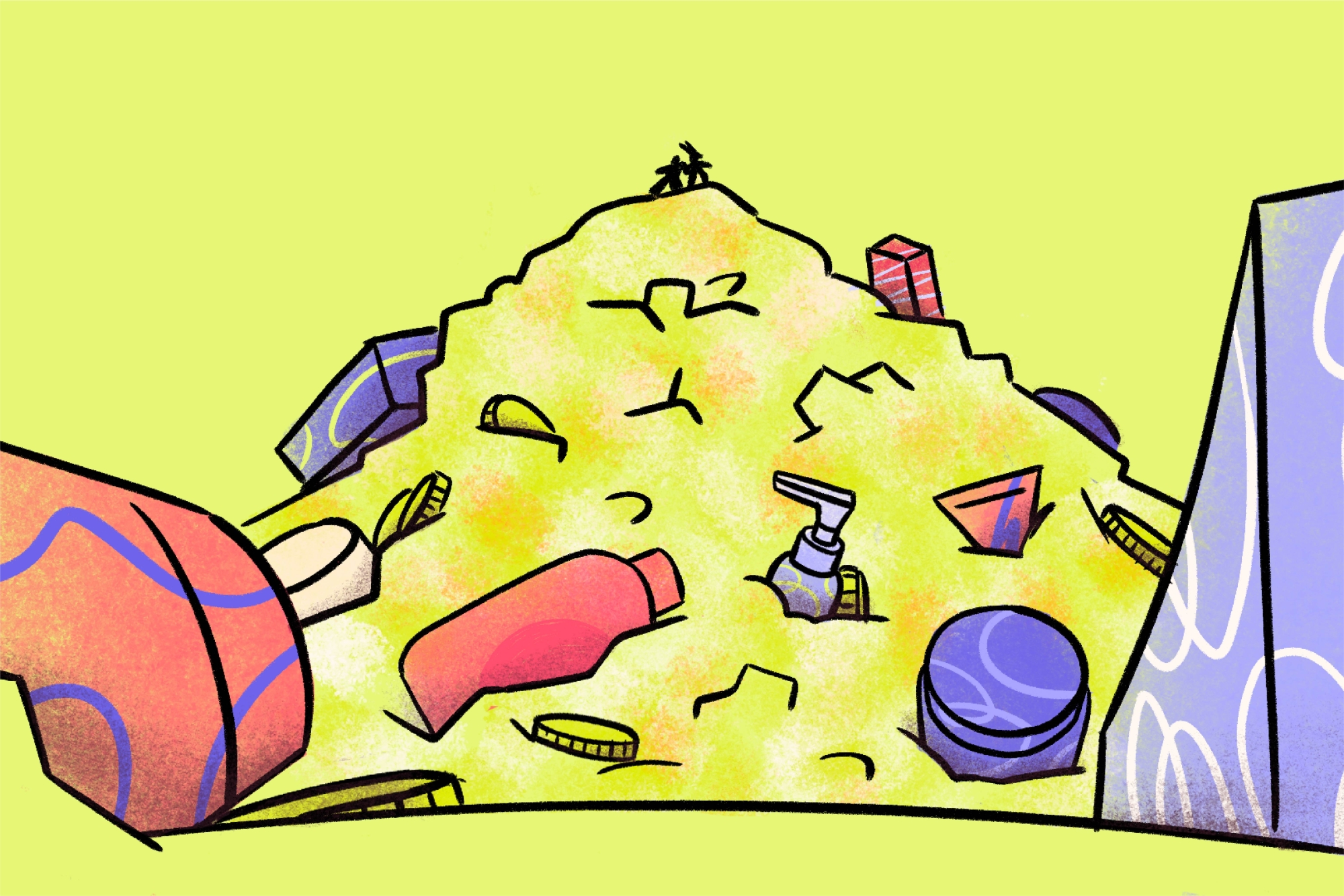
Over the following years, the team began to see that the oversaturation of the skincare industry wasn’t just a problem for people, but also the planet. In 2019, there were more than 3,000 skincare products launched in the US alone and the global cosmetics industry produces 120 billion units of packaging annually. The industry is creating more products than our skin or the earth can handle and it’s doing significant harm to both.
KraveBeauty came to us in need of a full rebrand that not only communicated their continuing ambition to press reset on the skincare industry but also brought their brand in line with their updated sustainability mission.
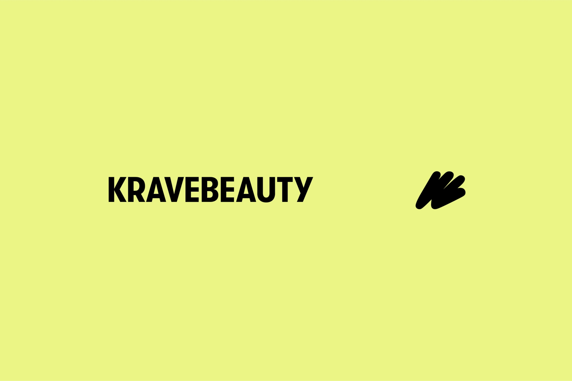
A new mark
While most design processes start with scribbles on paper, in this instance, they extend into the finalised identity. Based on the “KB” initials, the logomark (or “scribble”) is a distinctly simple yet memorable shape that’s great at all sizes. It flexes to form multiple shapes and graphic uses, with each one representing the way the brand cuts through the noise while also giving a literal nod to a squeeze of skin cleanser cutting through dirt. The logo’s soft edges sit comfortably in contrast with the confident, condensed sans of the KraveBeauty wordmark.
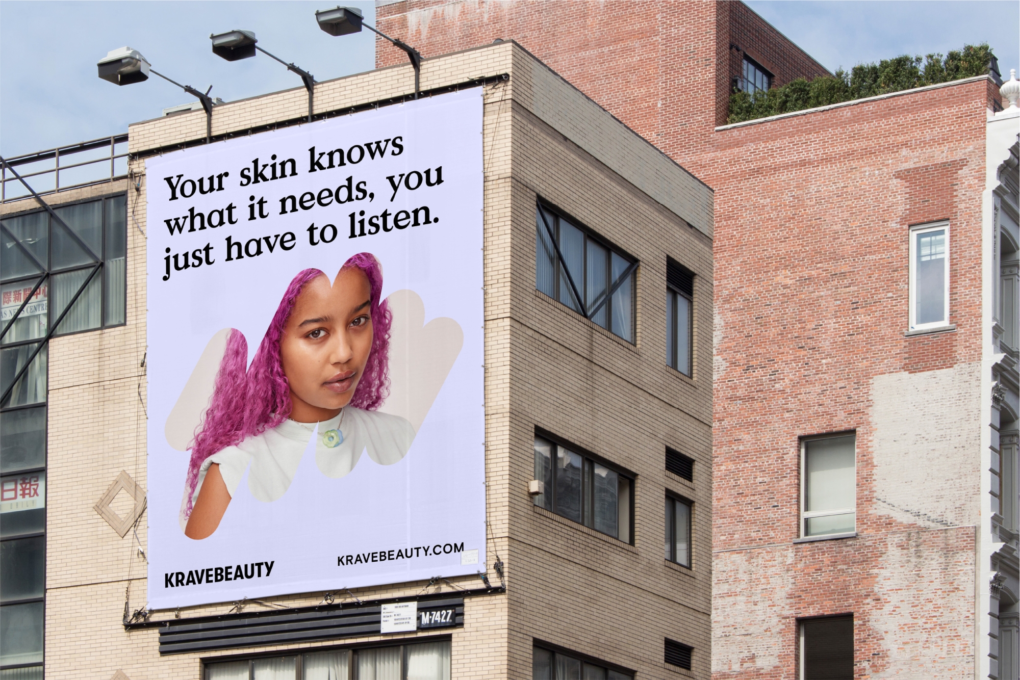
Words with warmth
We decided on two typefaces for the rebrand — Value Serif brings a warmth and character to hero headlines, while Basis Grotesque does the heavy lifting for body copy and accents in all-caps when required. Working with copywriter Cat Wall, we developed a tone of voice and suite of brand and product messaging that cuts through the jargon of the industry and reflects the brand’s approachable yet no-BS attitude. The copy in combination with our chosen fonts feels friendly and invitational, keeping KraveBeauty accessible to everyone.
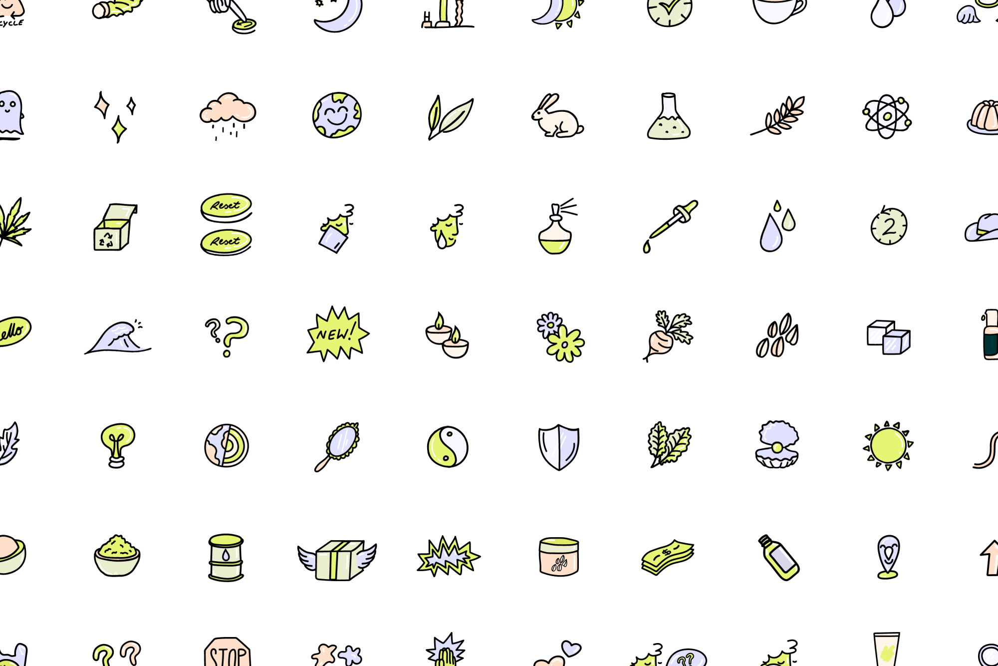
Icons to suit
In addition to a flexible “scribble” system, we also developed an extensive suite of illustrated icons. They’re hand-drawn and approachable, emphasising the human touch of the brand and helping to differentiate it from the cold and clinical tropes of the beauty industry. They not only serve a functional purpose but provide a fun way to break up design or add character to longer pieces of educational copy.
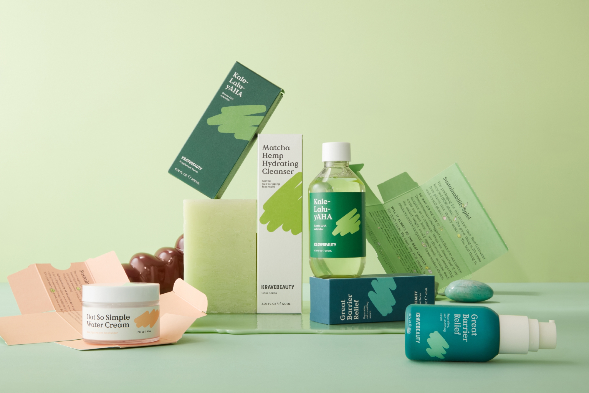
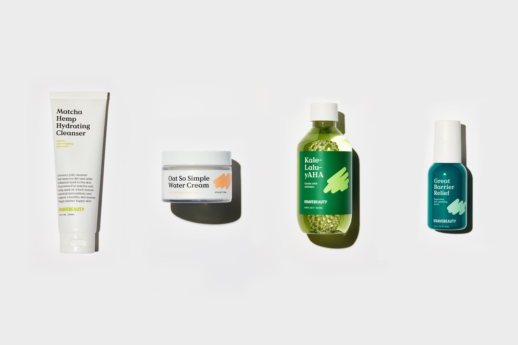
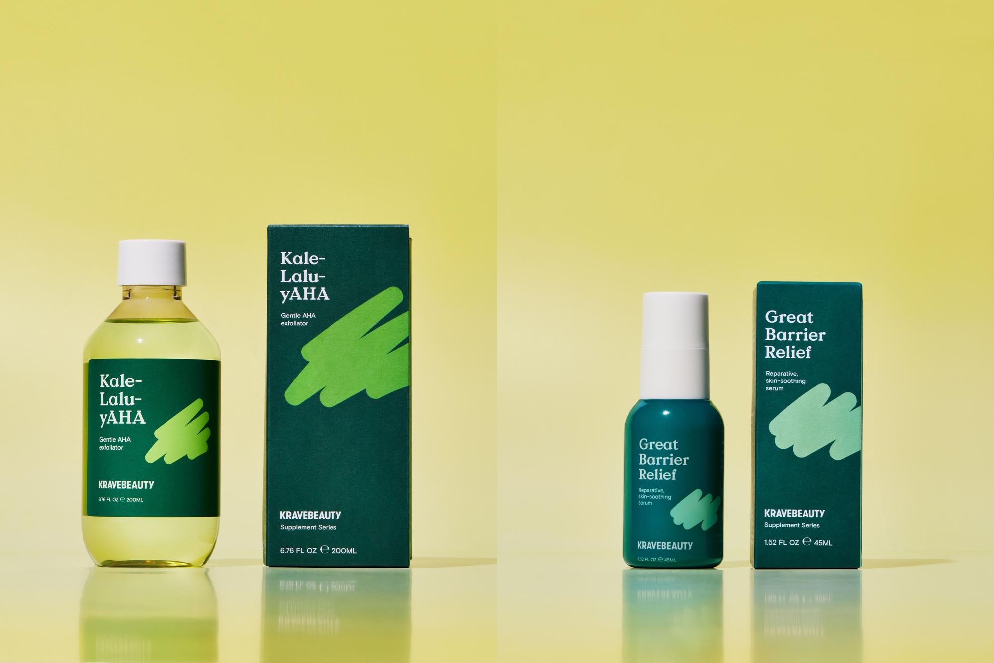
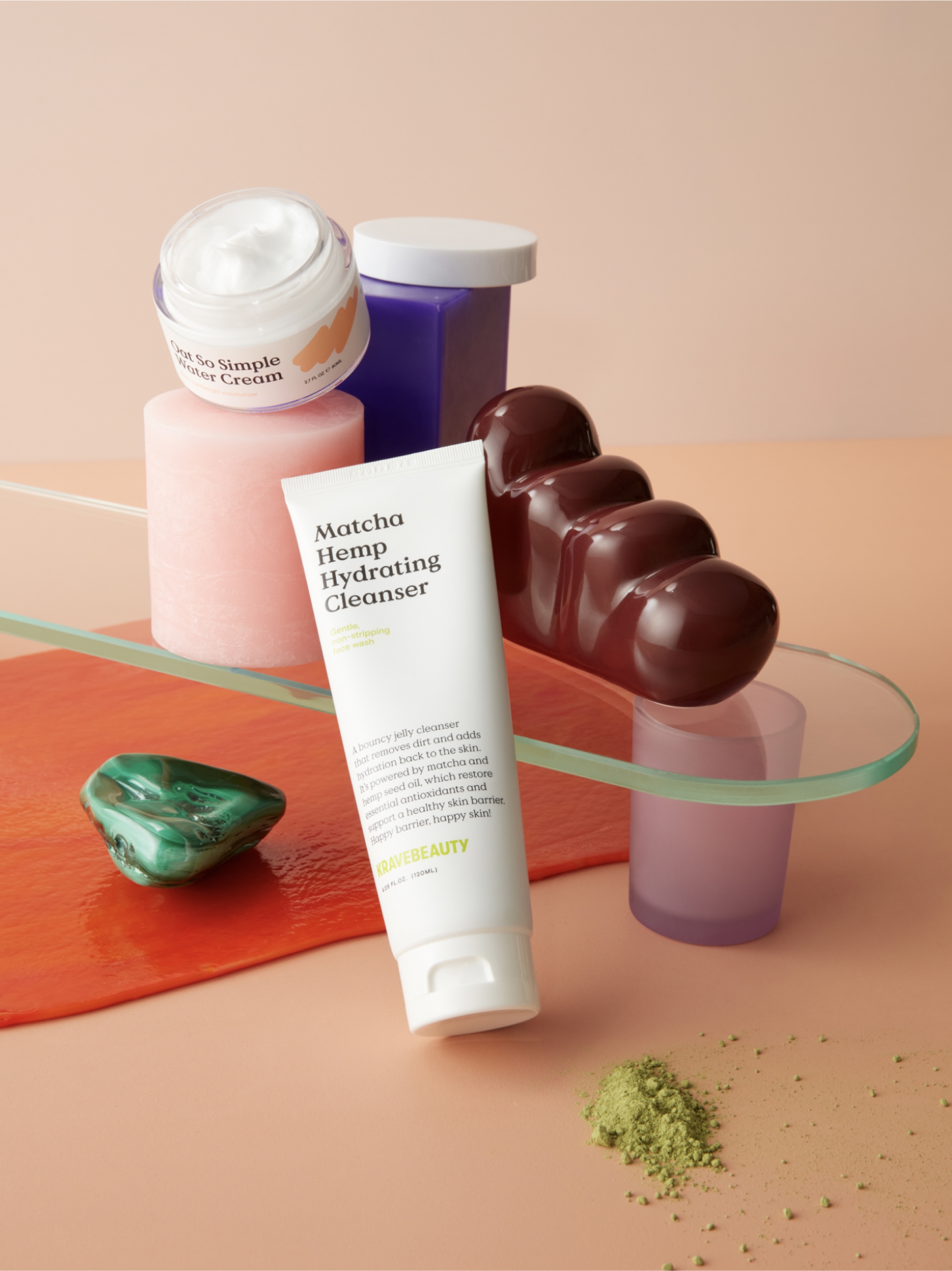
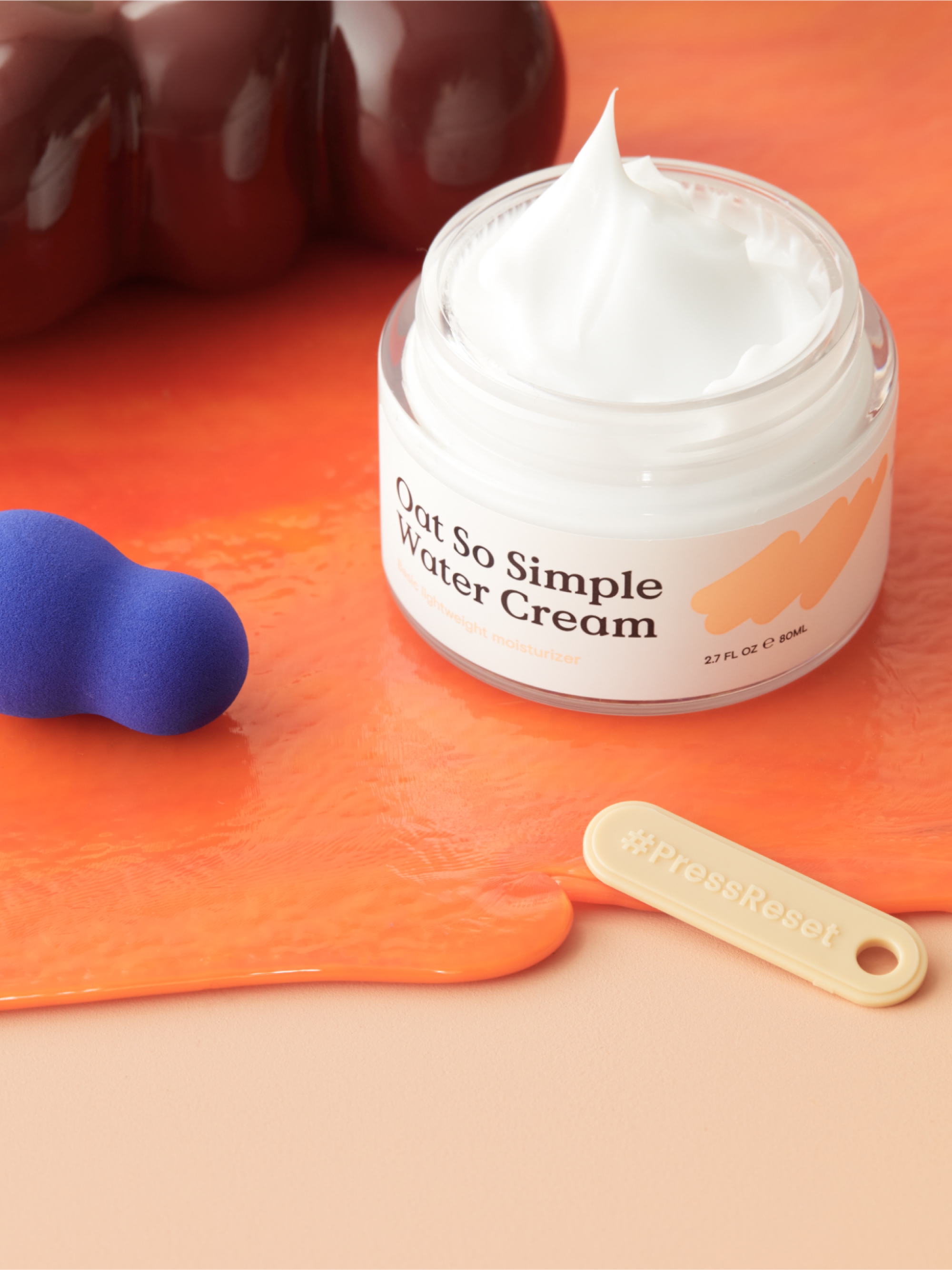
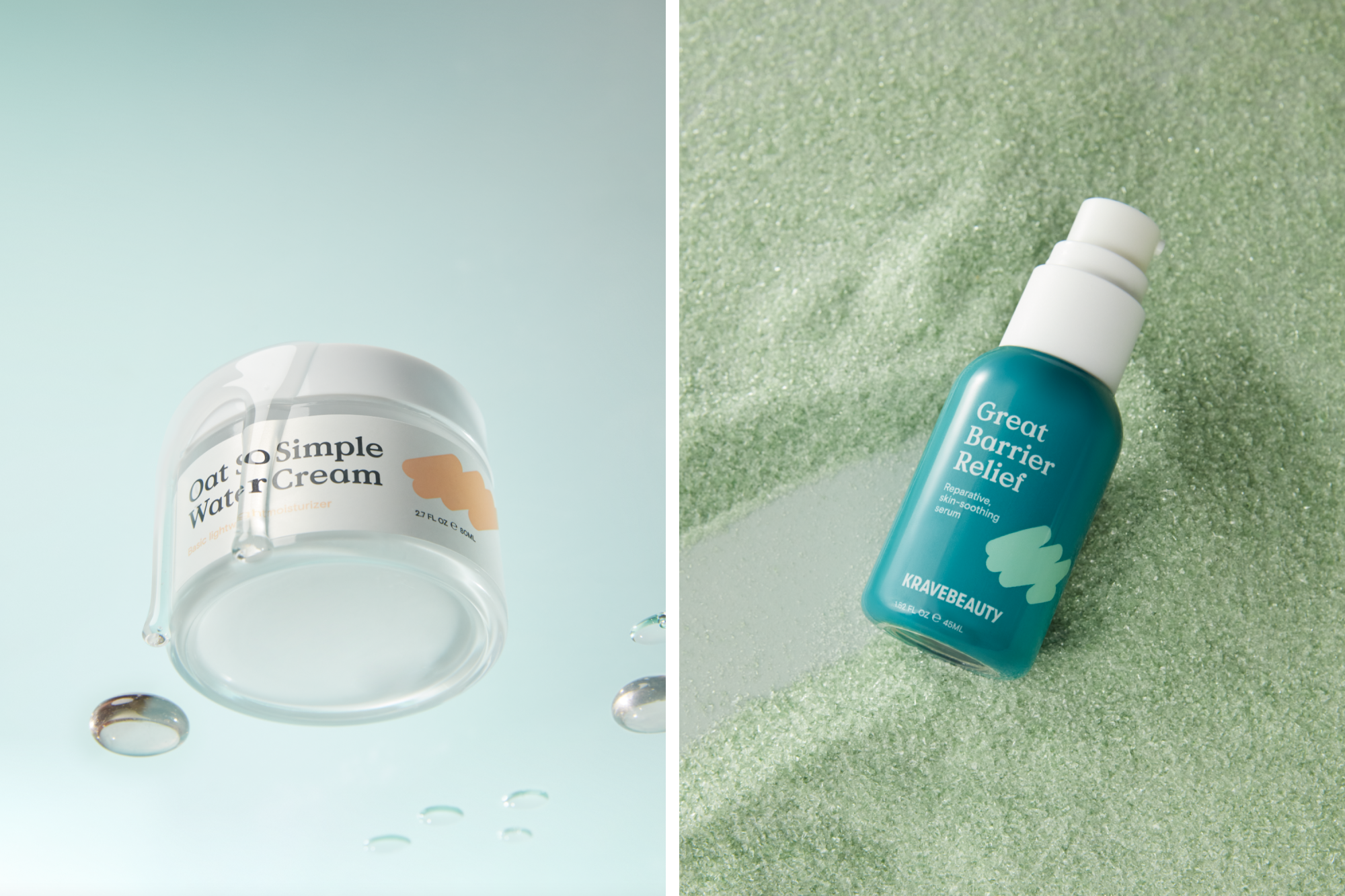
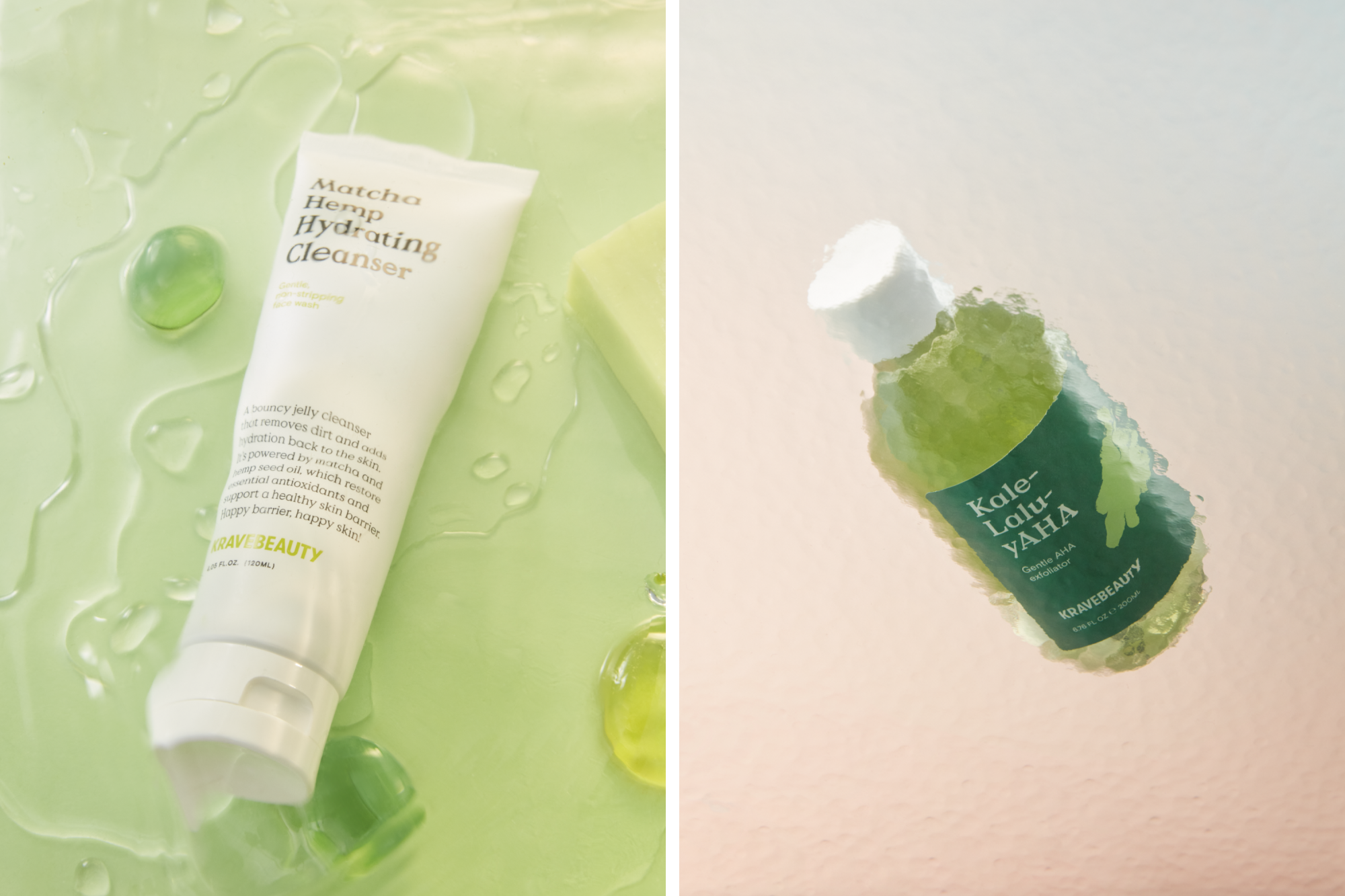
A sustainable approach to packaging
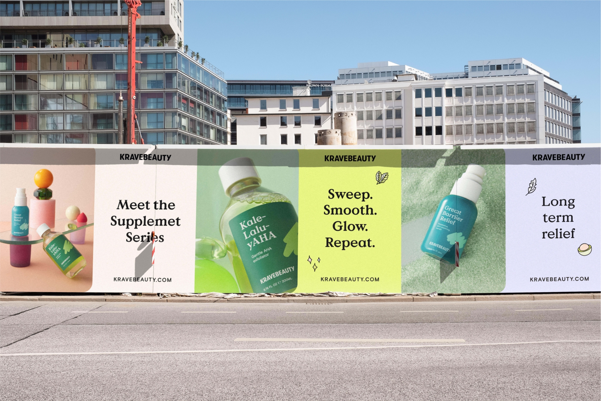
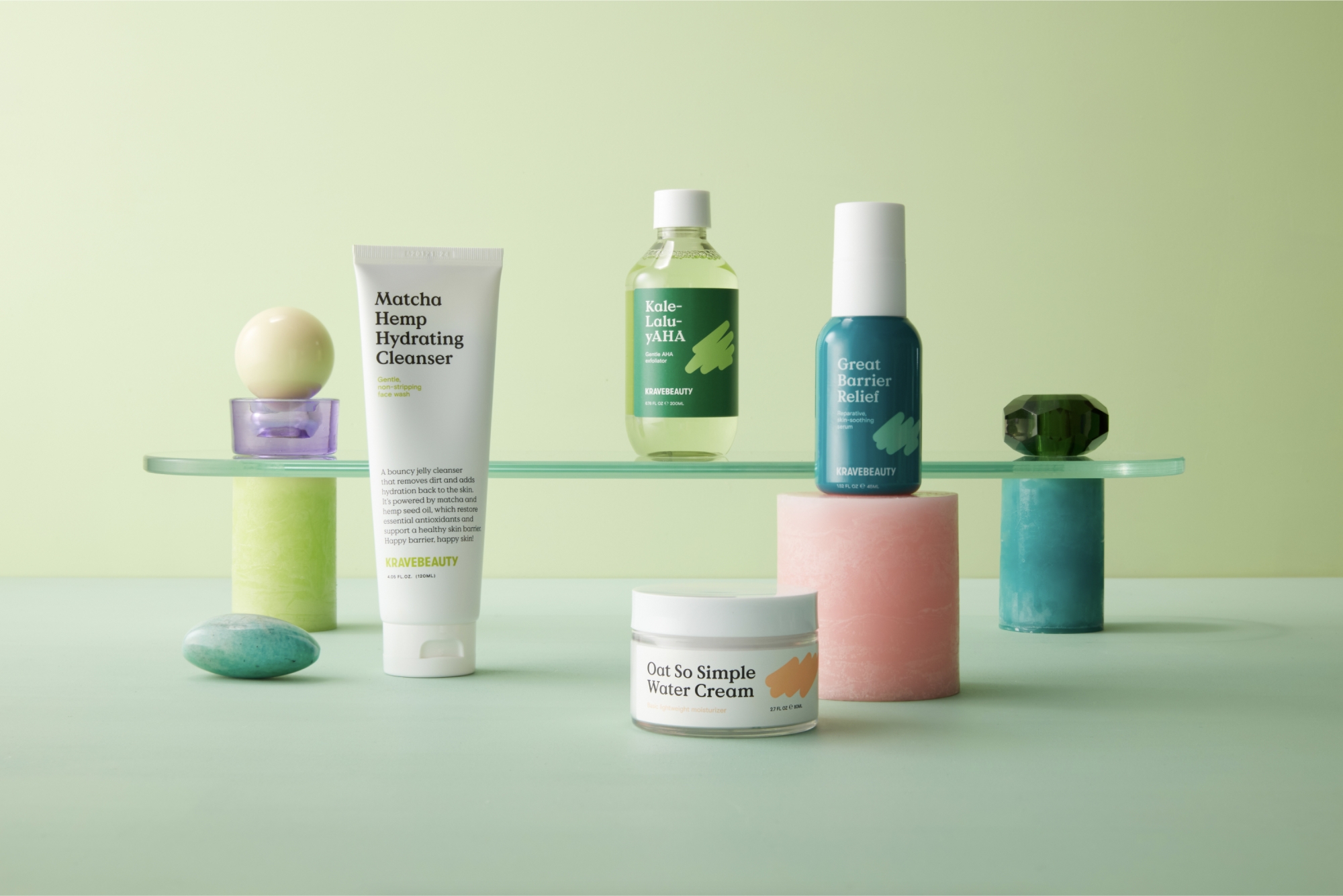
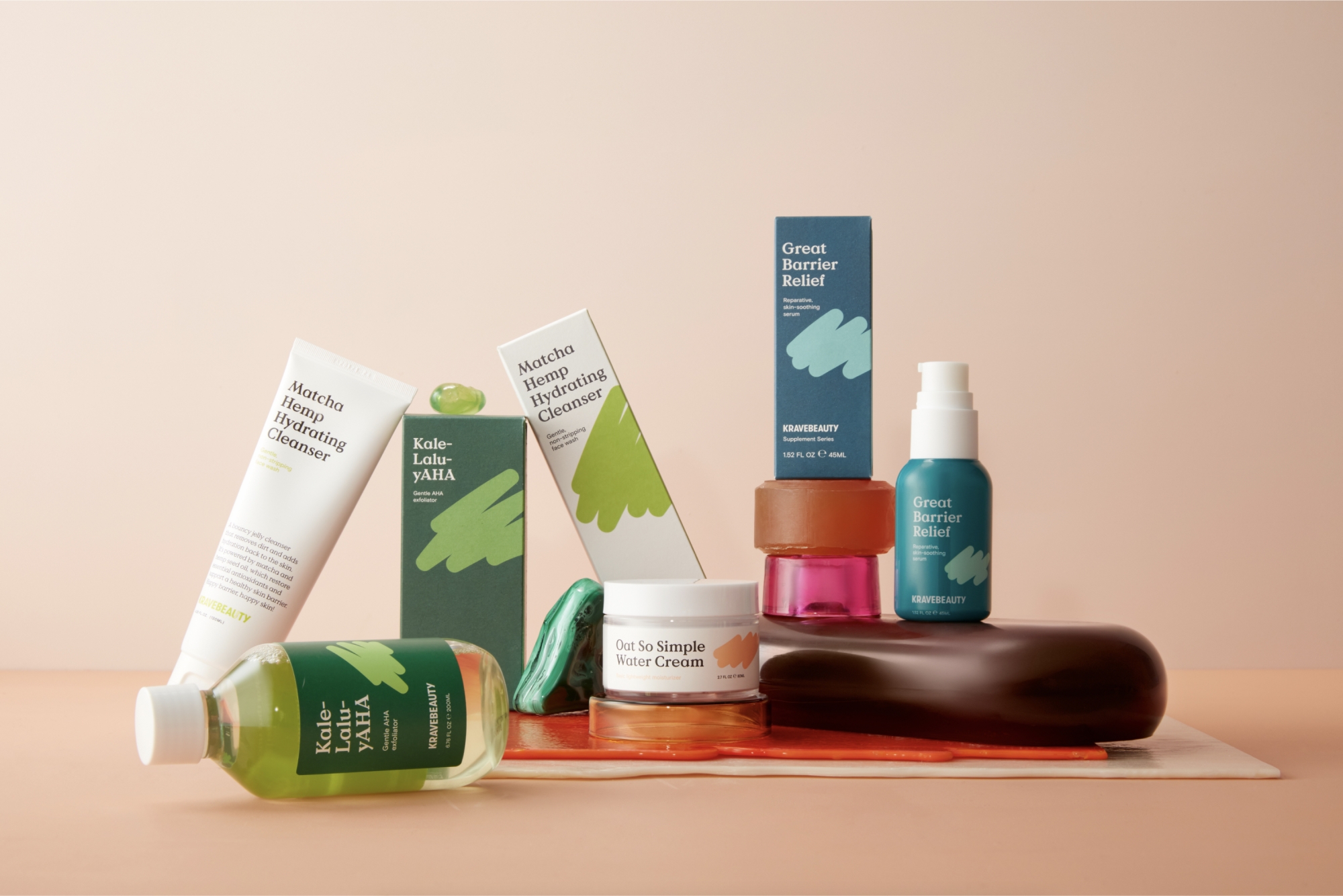
Given KraveBeauty had come to us with a swathe of sustainability goals in mind, new packaging solutions were a key component to the rebrand. The design system is simple and clean, much like the products they house. While each product has its own hero colour, the core range of products (a moisturiser and cleanser) are set on a white background and the supplement range (a serum and AHA exfoliator) are set on colour, to help customers easily differentiate between the two. For every product, bold typography highlights its name, purpose and key benefits.
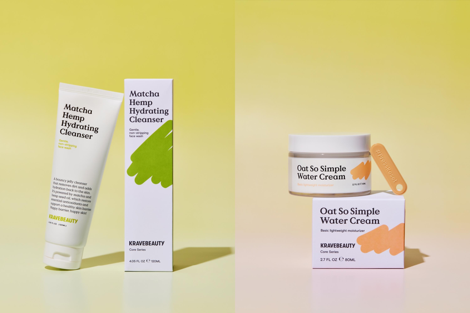
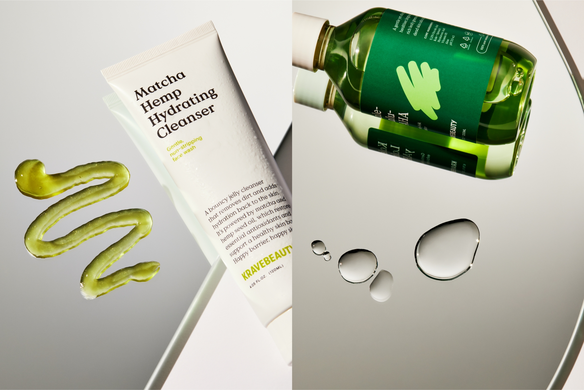
A matcha made in heaven
We worked with Think Packaging to create a structural concept tied to the idea of cutting through the noise. Each box has a tear strip and, once torn, opens to reveal a sustainability spiel that speaks to each item’s sustainability credentials and the best way to dispose of its packaging. To really highlight the brand’s commitment to the environment, you’ll notice that each product also has its own unique KB scribble except for Matcha Hemp Hydrating Cleanser. It became apparent during the design process that its inclusion on this particular product would reduce its recyclability, so a conscious decision was made to only feature it on the outer box.
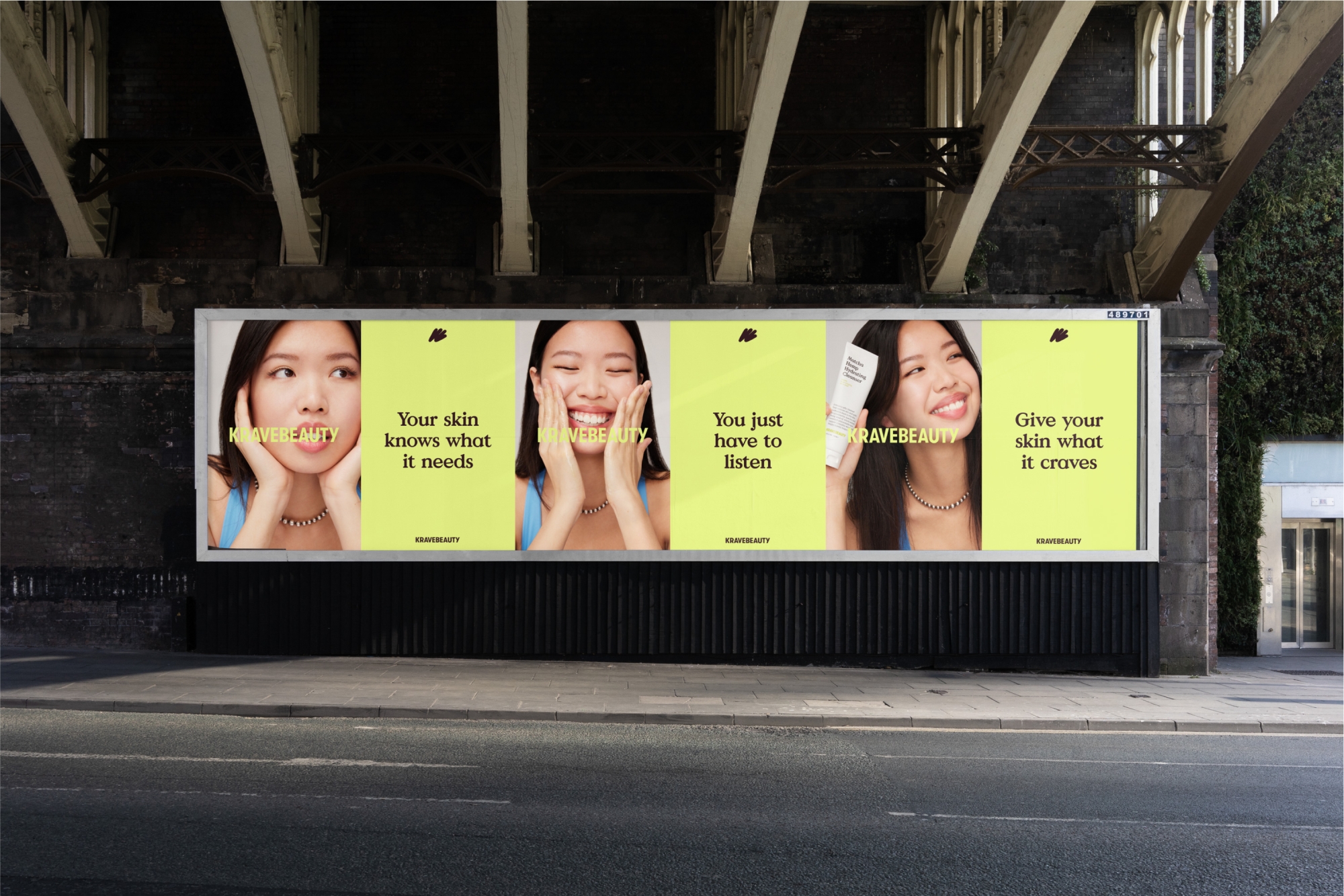
Good clean fun on set
With the new designs in place, it was time to bring them to life. With Roze Hooij taking the reins on styling and Anna Pogossova and Benito Martin on the lenses, we helped to direct a tactile shoot that showcases the bright, optimistic nature of the rebrand. Keeping the shots intentionally minimal and clean, the simple use of colourful sculptural elements cuts through to create texture and give the client a suite of fun and vibrant images they could use across the brand.
Taking intentional skincare digital
From the wireframes through to completion, we wanted to create an online experience that reflected the brand — easy to navigate, educational, approachable — and would help them move to a subscription model. The modular system, bolstered by blocks of colour and thin strokes, creates clear and intentional sections across the site. It’s visually vibrant and clean while also feeling calm — a stark contrast to the noise and loudness of other skincare brands.
Slow down skincare
Bringing the sustainability page in line with KraveBeauty’s updated ethos was a key focus of the redesign. The brand wanted to be transparent about sustainability being an ongoing journey — to show their customers the steps they had taken to-date and those they have committed to act on, as well as their product recycling guides and inclusivity pledge. While the simple, approachable design of the rest of the website thoroughly serves its purpose here, we also helped to break up the density of information with fun, interactive moments such as the sustainability quiz.
Shop simply
Like the packaging, the shop page is separated into core and supplement ranges to help simplify the decision-making process for the user. It’s supported by clear, concise yet engaging copy that explains each product’s function, benefits and ingredients, as well as a how-to “skinstruction” video guide, product pairing recommendations and, of course, recycling and disposal information.
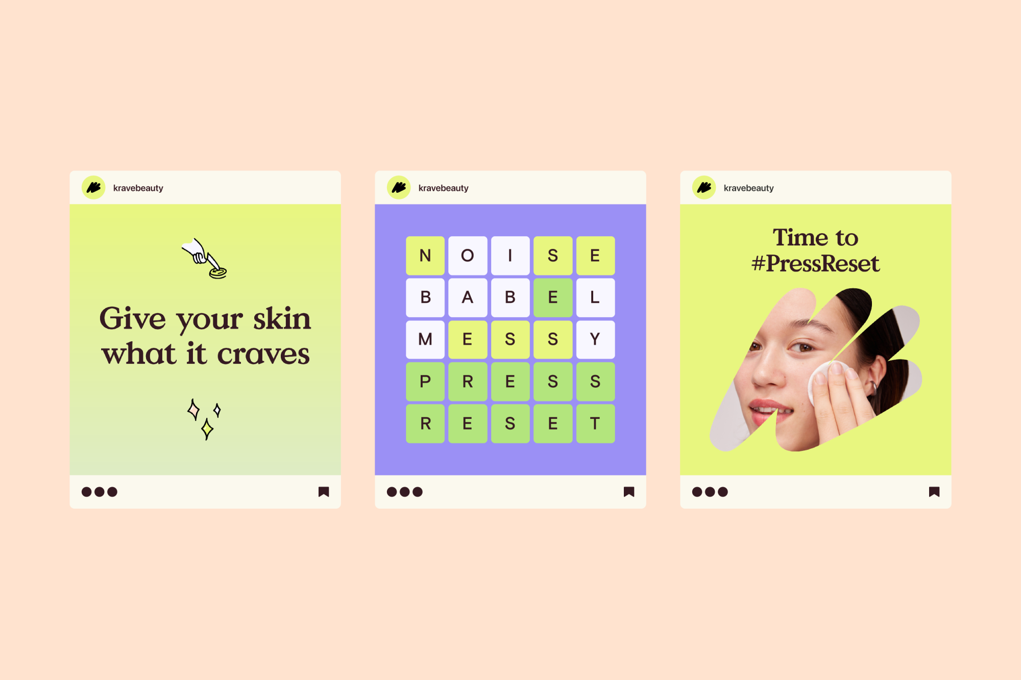
Visual unity for the online community
Brand’s talk a lot about their customers being a community, but KraveBeauty really sets a new benchmark. A seamless translation of the identity to social was crucial to the rebrand’s success and it’s where the tone of voice and flexibility of its graphic components shine. The warm and invitational personality of the brand creates a space where the KraveBeauty community engage and thrive.
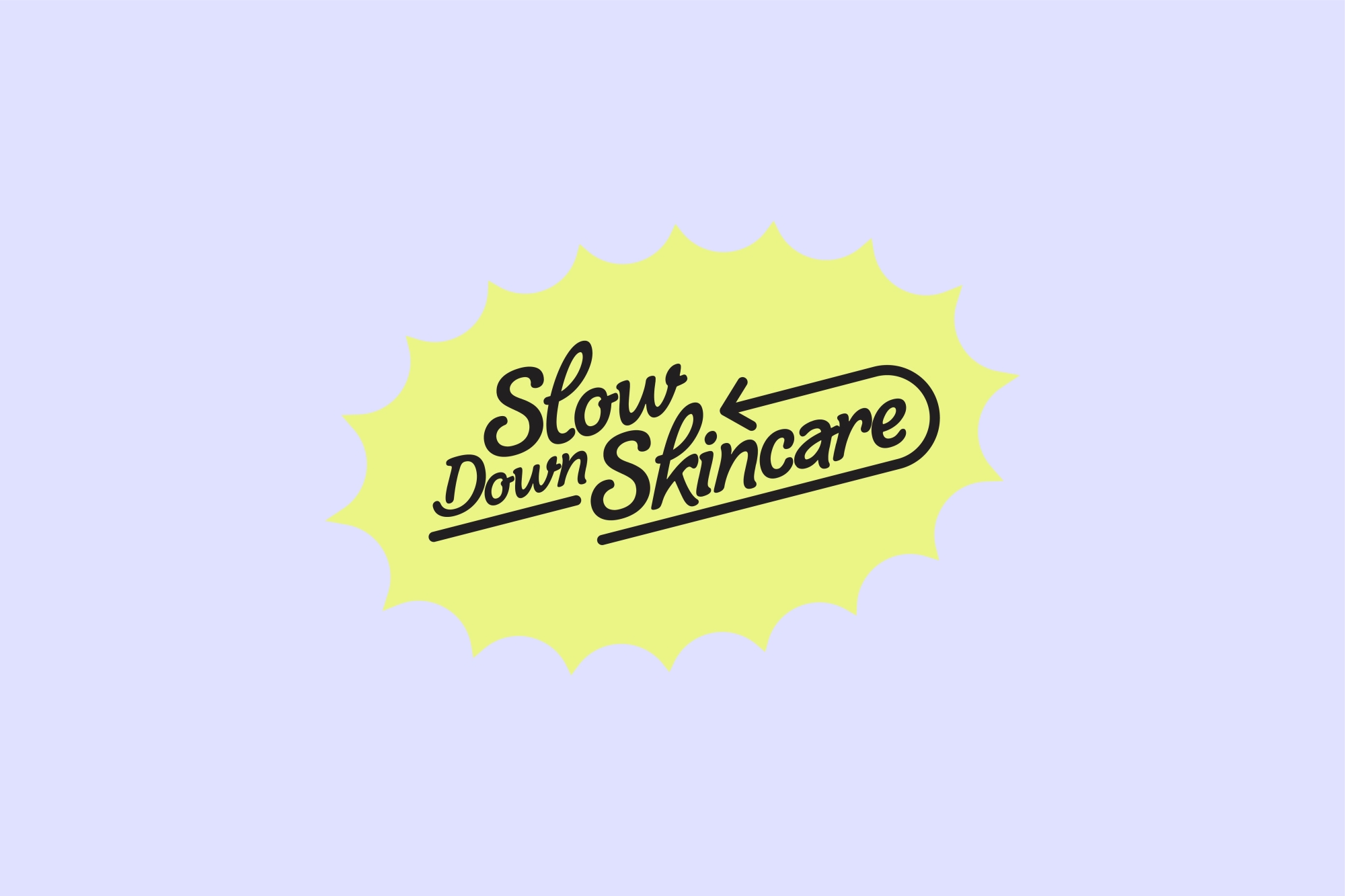
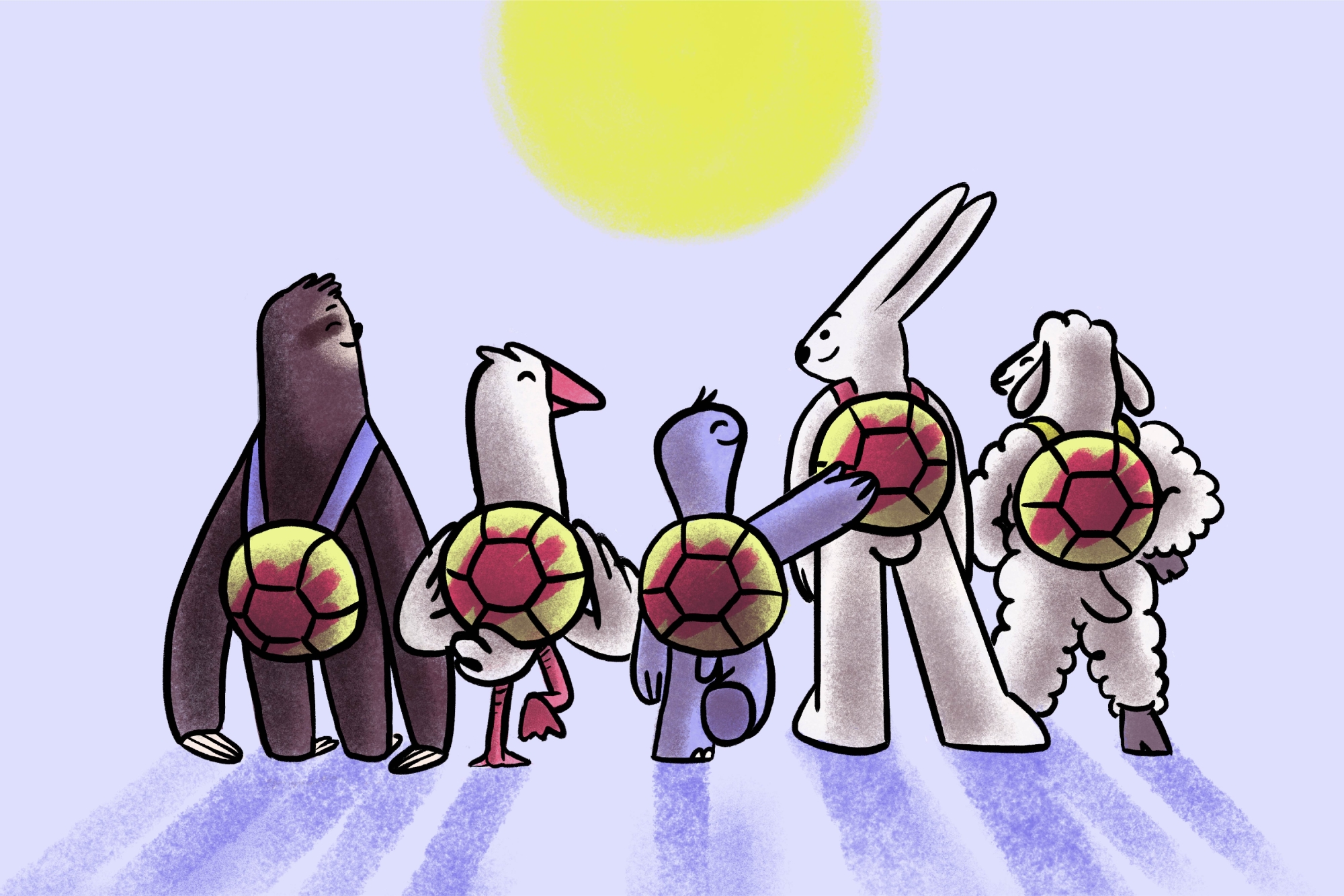
Slow Down Skincare Initiative 2022
In honour of Earth Day this year, we helped KraveBeauty relaunch their Slow Down Skincare initiative to encourage the skincare industry to redefine their pace of growth, for the betterment of our skin and the planet.
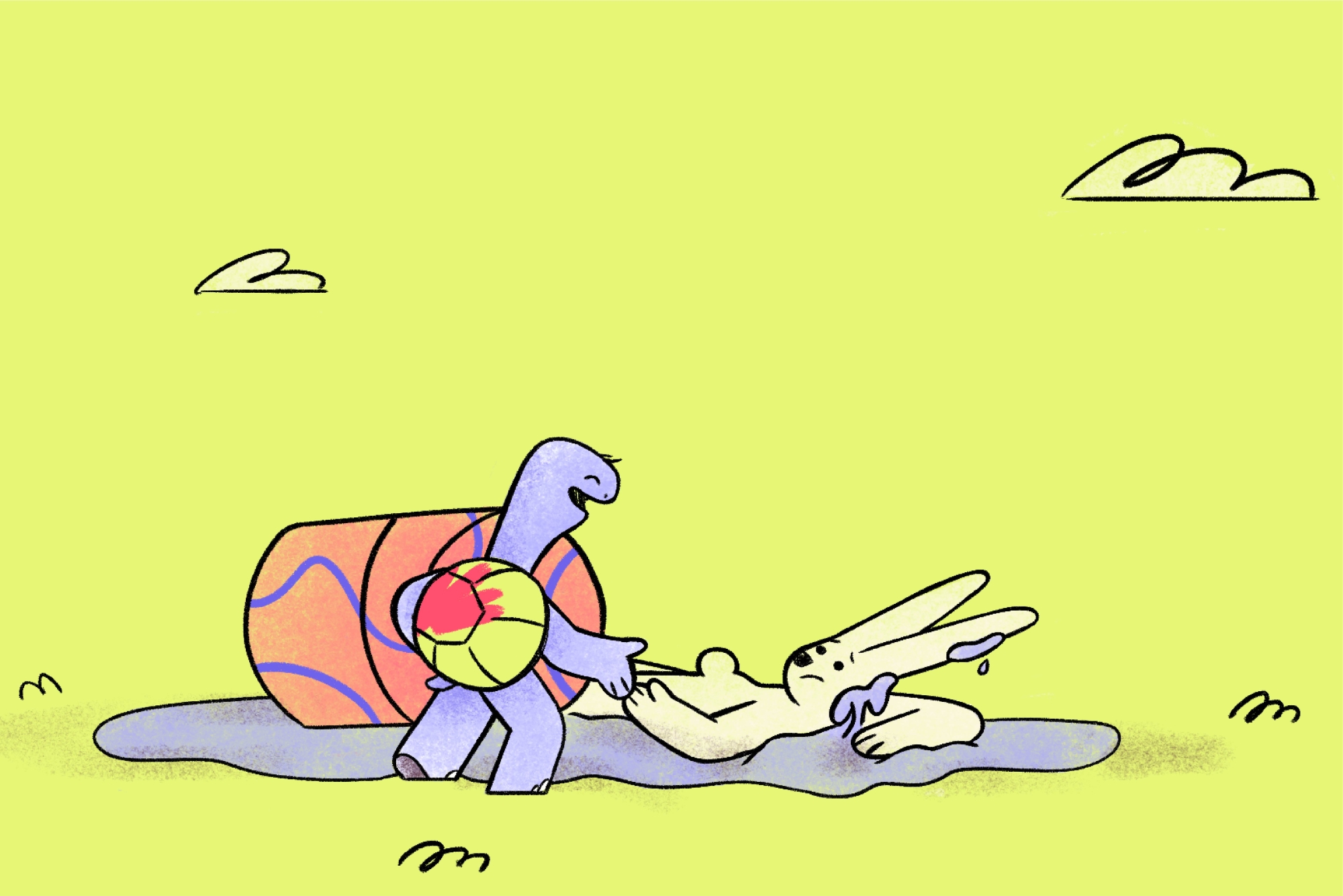
We worked with copywriter Amy Scott and NiceShit Studio to produce an animated reimagining of the old fable 'The Tortoise and the Hare'. We developed an accompanying poem where the moral of the tale is similar, slow and steady can win the race.
And the end result?
In an industry built on “buy buy buy” and “more more more”, KraveBeauty truly cuts through the noise and now it’s reflected at every touchpoint of the brand. With a visual and verbal identity that’s both vibrantly clean and welcomingly warm, they’ll continue to press reset on the skincare industry, encouraging even more people to slow down, educate themselves and only buy the products they need — for the betterment of their skin and the earth.
Collaborators
- Brand Writer • Cat Wall
- Photography • Anna Pogossova
- Photography • Benito Martin
- Stylist • Roze Hooij
- Packaging Solution • Think Packaging
- Animation • Niceshit
Nala
Building a brand that’s worn to be wild