While the traditional art world is notoriously elitist, exclusive and expensive, The Other Art Fair prides itself on being the opposite. The goal of each fair is to change the way we see, experience and purchase art, making it accessible and giving emerging artists a place to shine. They needed a bold rebrand that would both encapsulate their rejection of the ordinary and help them on their mission to reframe art into something that welcomes and excites everybody.
- Brand strategy •
- Verbal Identity •
- Visual Identity
Awards


Featured In
What's all this then?
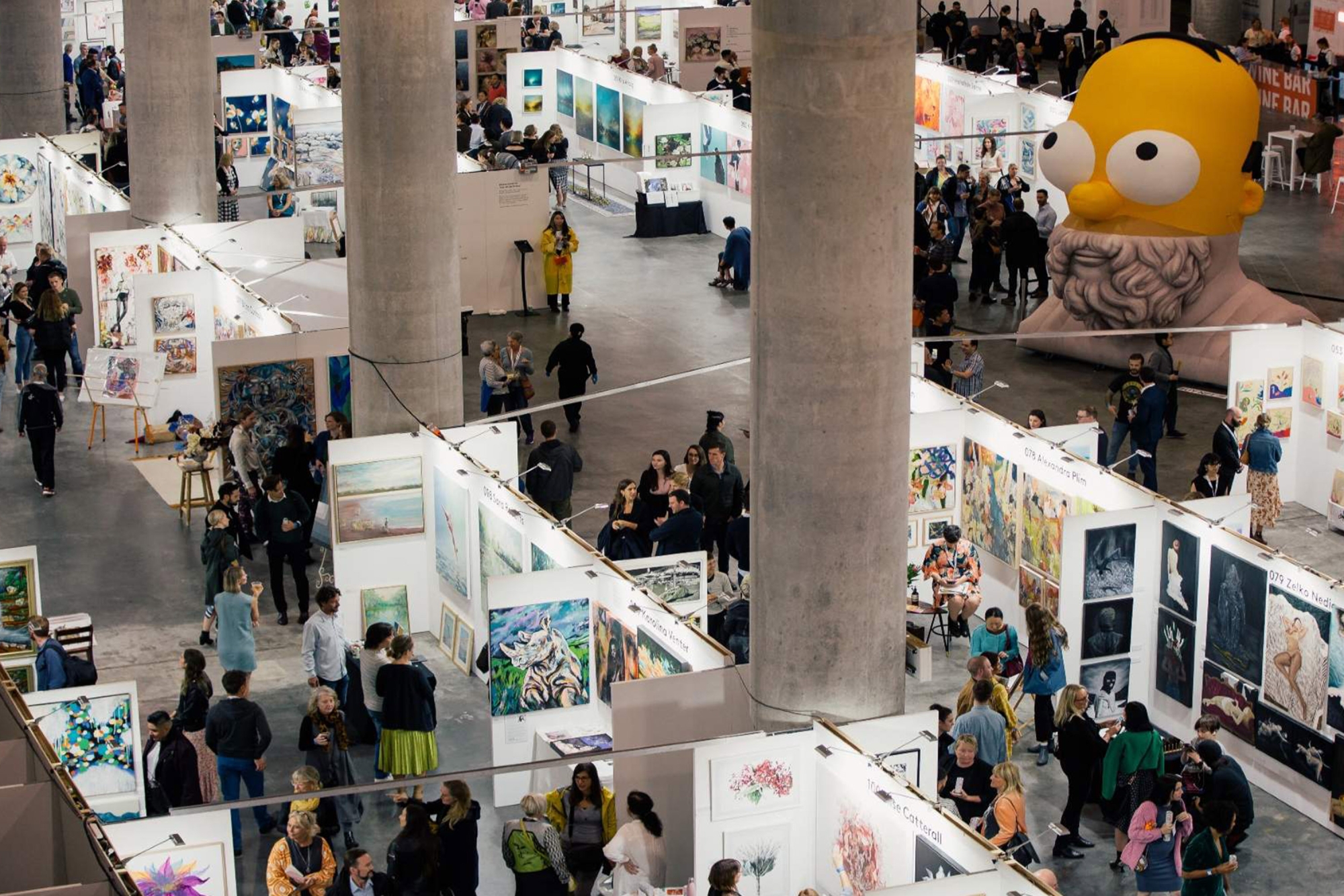
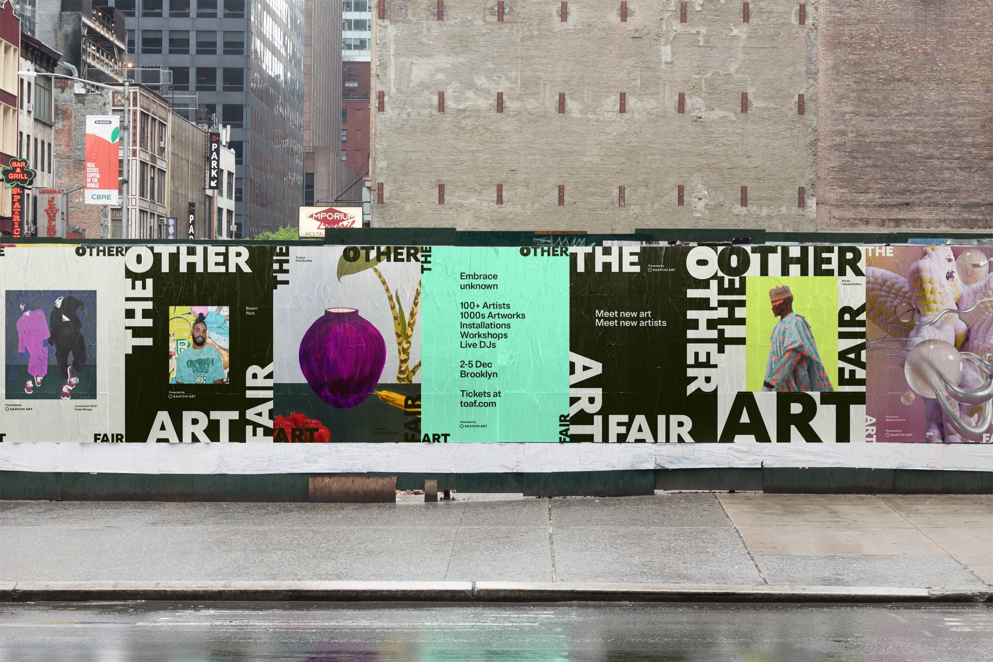
The Other Art Fair (TOAF) is a collection of creative thinkers, game changers and pleasure seekers who seek to lift up emerging artists and create unforgettable experiences. Taking place in cities like Brooklyn, LA, London, Sydney and Toronto, each fair is a bid to shake up the art world and make it widely accessible. They pride themselves on giving independent artists a place to showcase and sell their pieces, and providing uniquely immersive experiences for everyone who attends.
Any Insights?
The art world is traditionally stuffy, elitist and inaccessible. It’s a typically white-walled space where many are made to feel as though they don’t belong because they either don’t “understand” the art or can’t afford it. With the belief that everybody deserves to enjoy art, TOAF emerged as a response to this problem, creating an event that makes art feel approachable, welcoming and exciting for all.
And what seems to be the problem?
While their fairs were already taking place across the world with great success, TOAF had reached a place where their visual and verbal identity didn’t reflect their boundary-pushing position. It was too safe, too sensible and didn’t exude the rebellious energy that their events did. They came to us in search of a strategy and identity that would echo the rejection of ordinary that sits at their core.
So how'd you go about it?
Alongside the team at Untangld, we kicked things off with strategy, landing on the brand idea of “Never Normal”, which would go on to inform every touchpoint of the identity, starting with tone of voice. In collaboration with TONE Agency and copywriter Cat Wall, we developed a verbal identity that’s confident, intriguing and just the right amount of witty, pushing TOAF beyond the ordinary and expected from the art world.
To get the visual side of things underway, we asked ourselves, what if the brand itself was art? This would allow us to hero the artists and work that the fair was giving a voice to and make each iteration of the visual identity a unique and creative expression. Taking visual cues from anti-trend behaviour, we explored how we could re-frame TOAF the way they were reframing the art world.
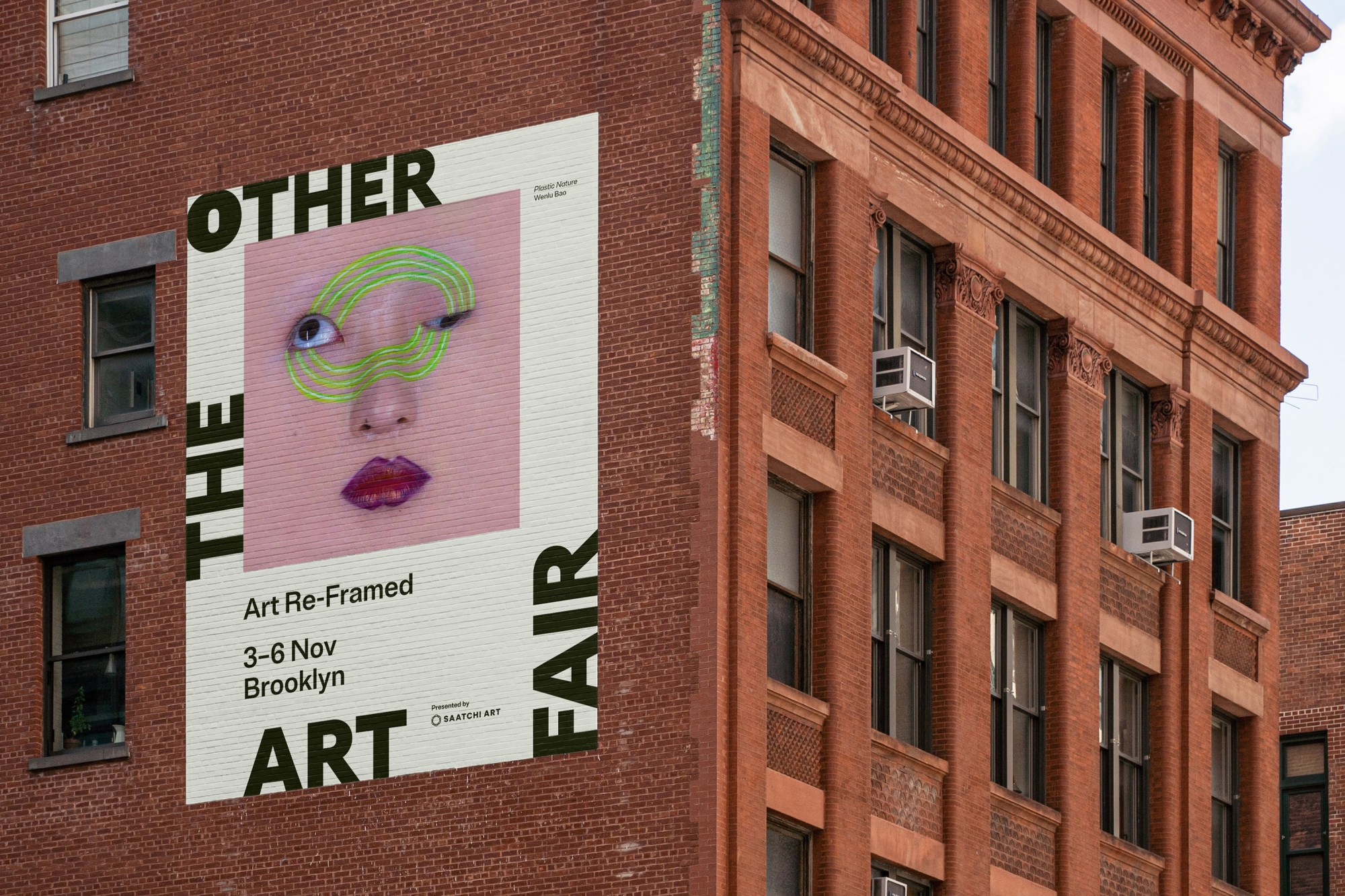
A boundary-pushing framing device
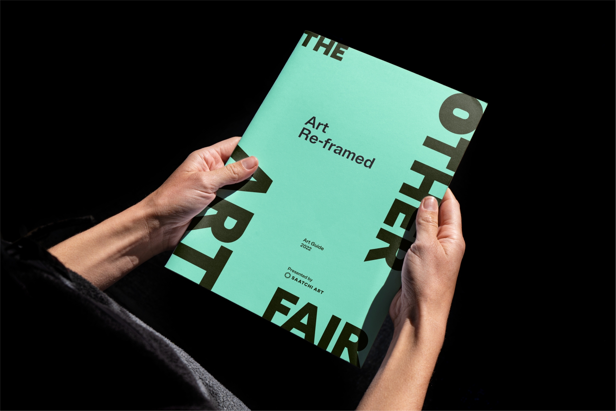
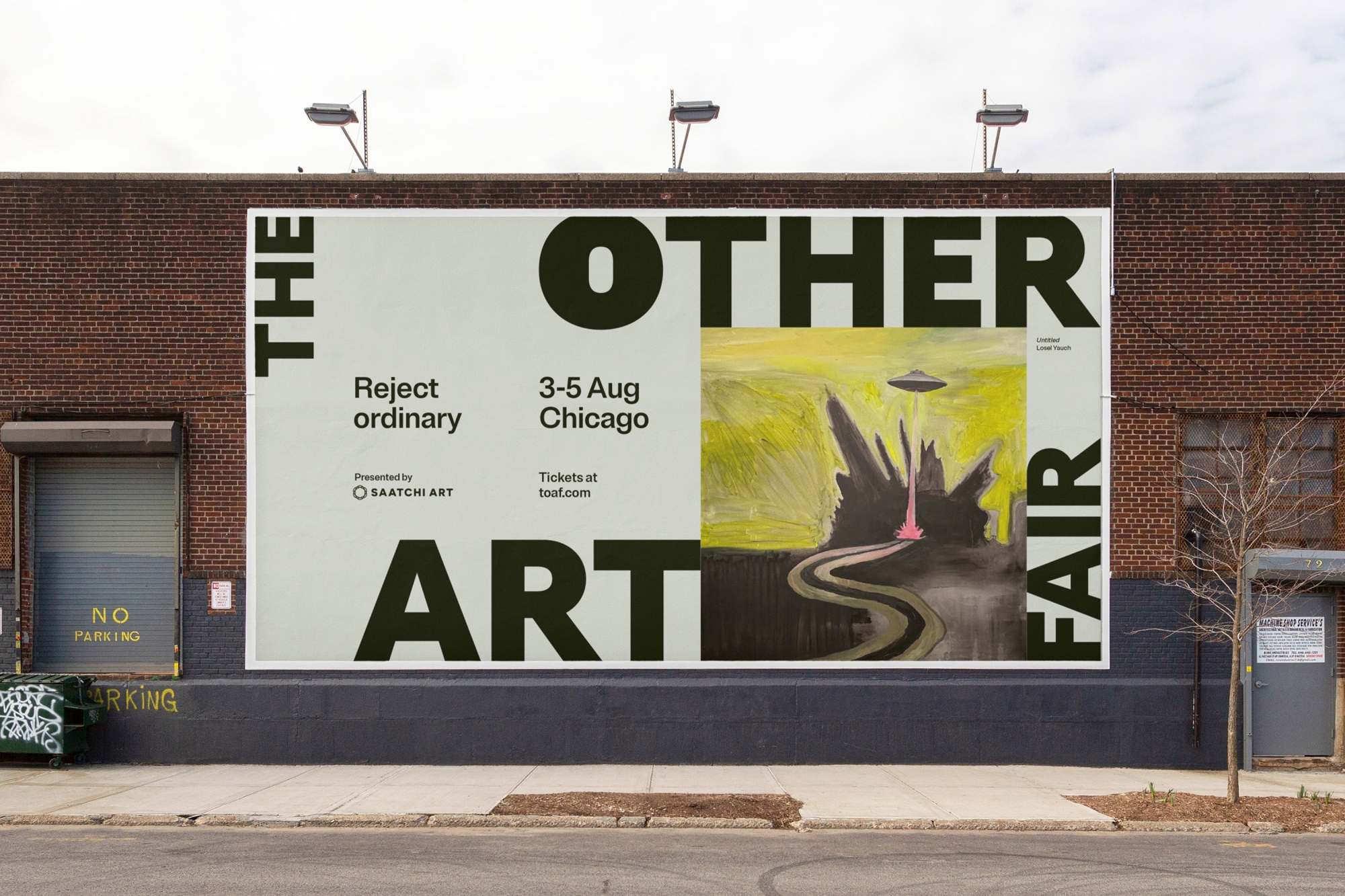
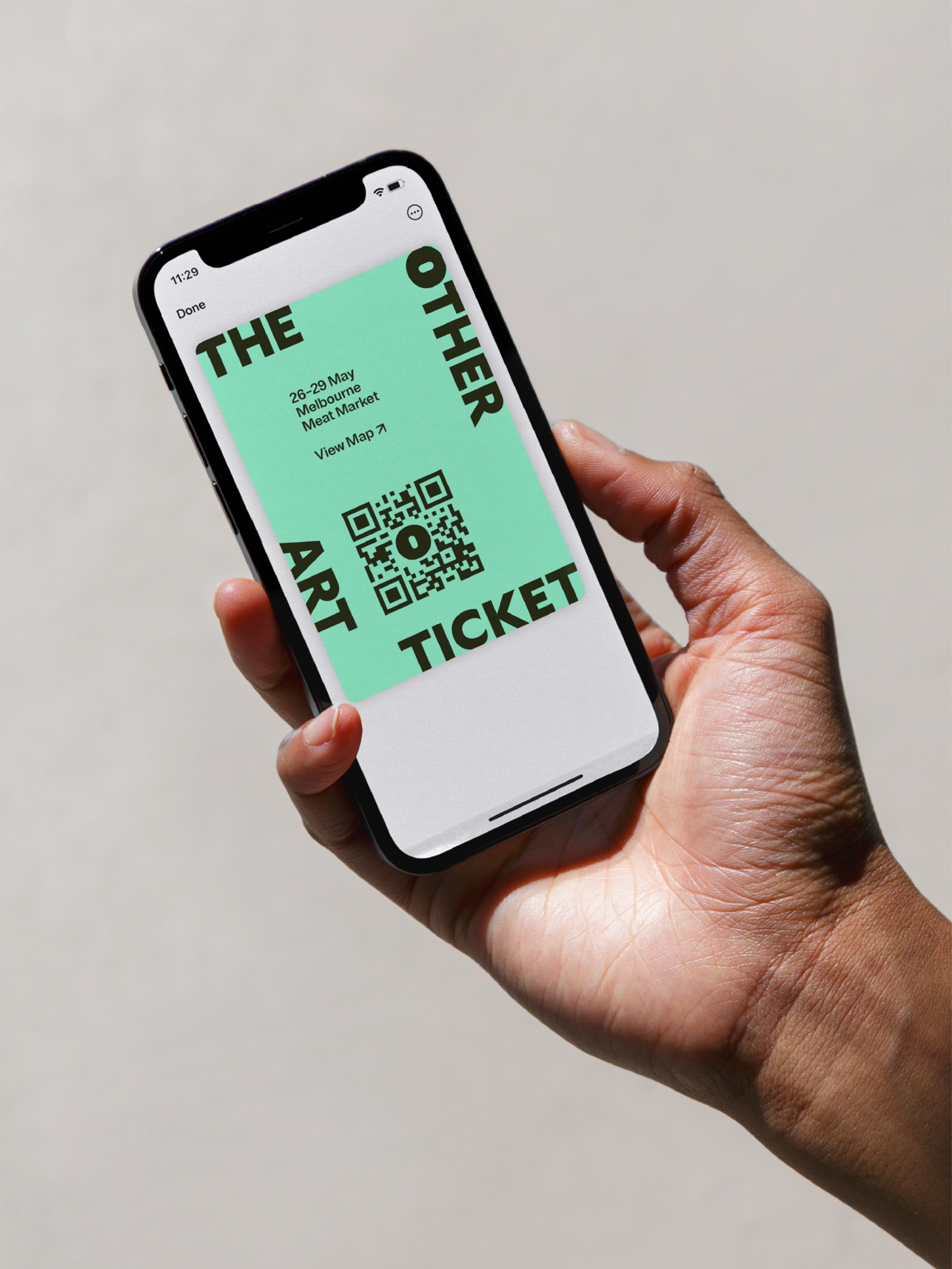
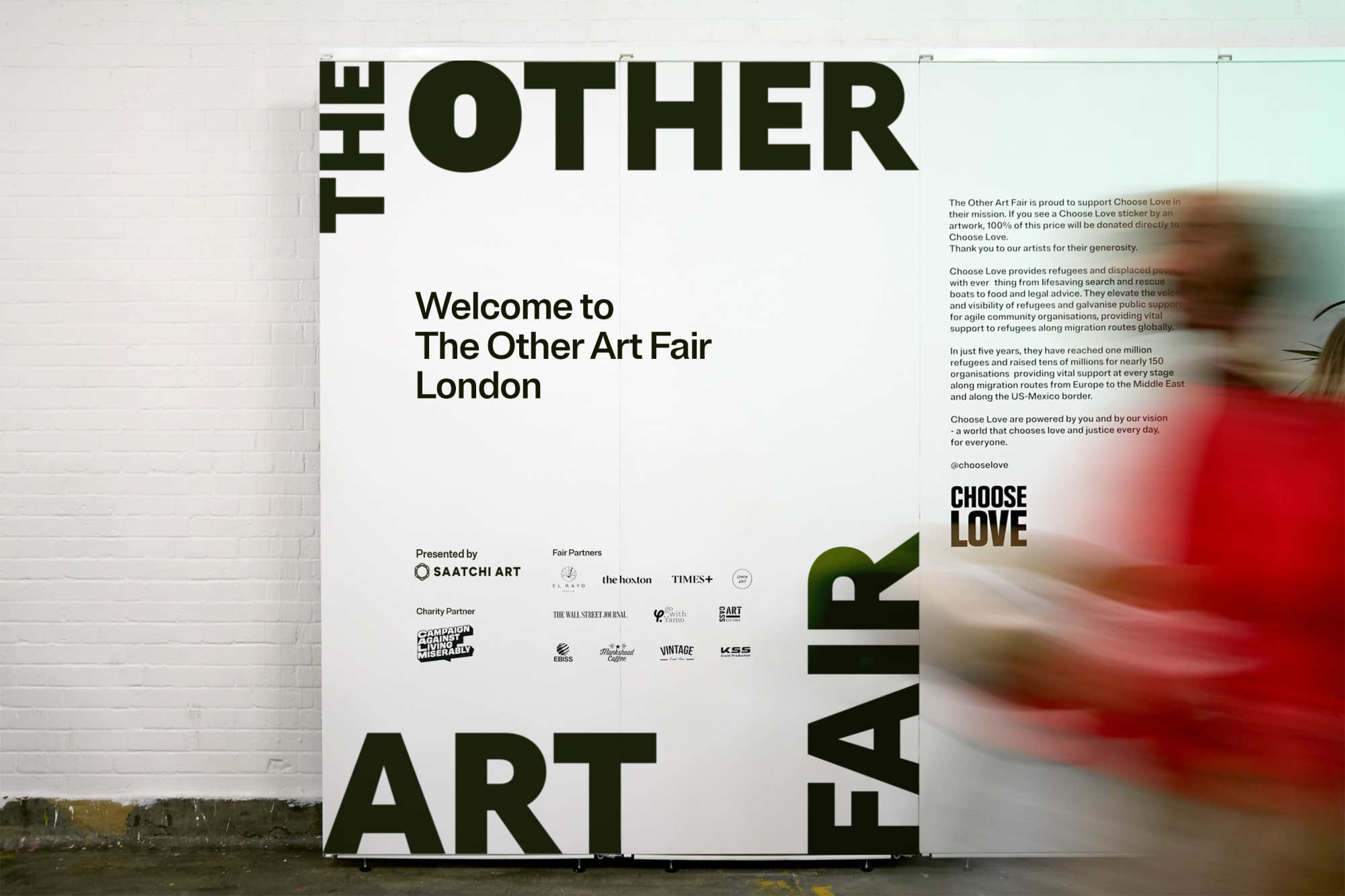
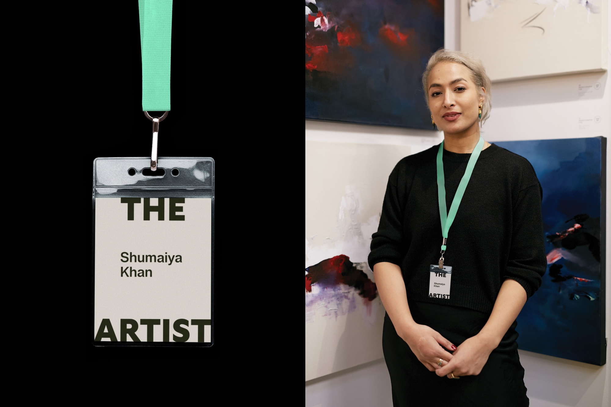
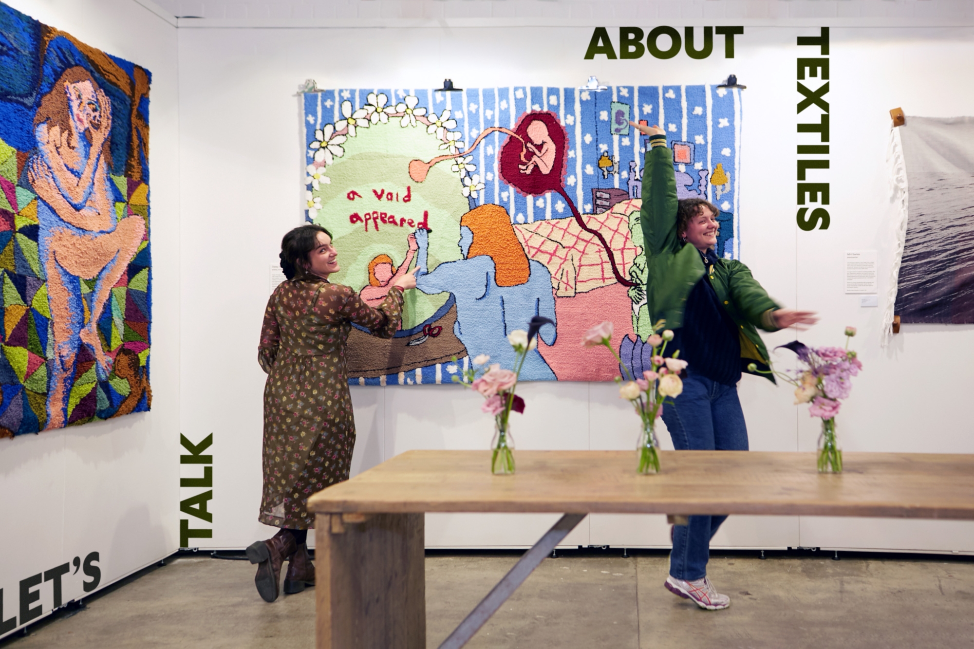
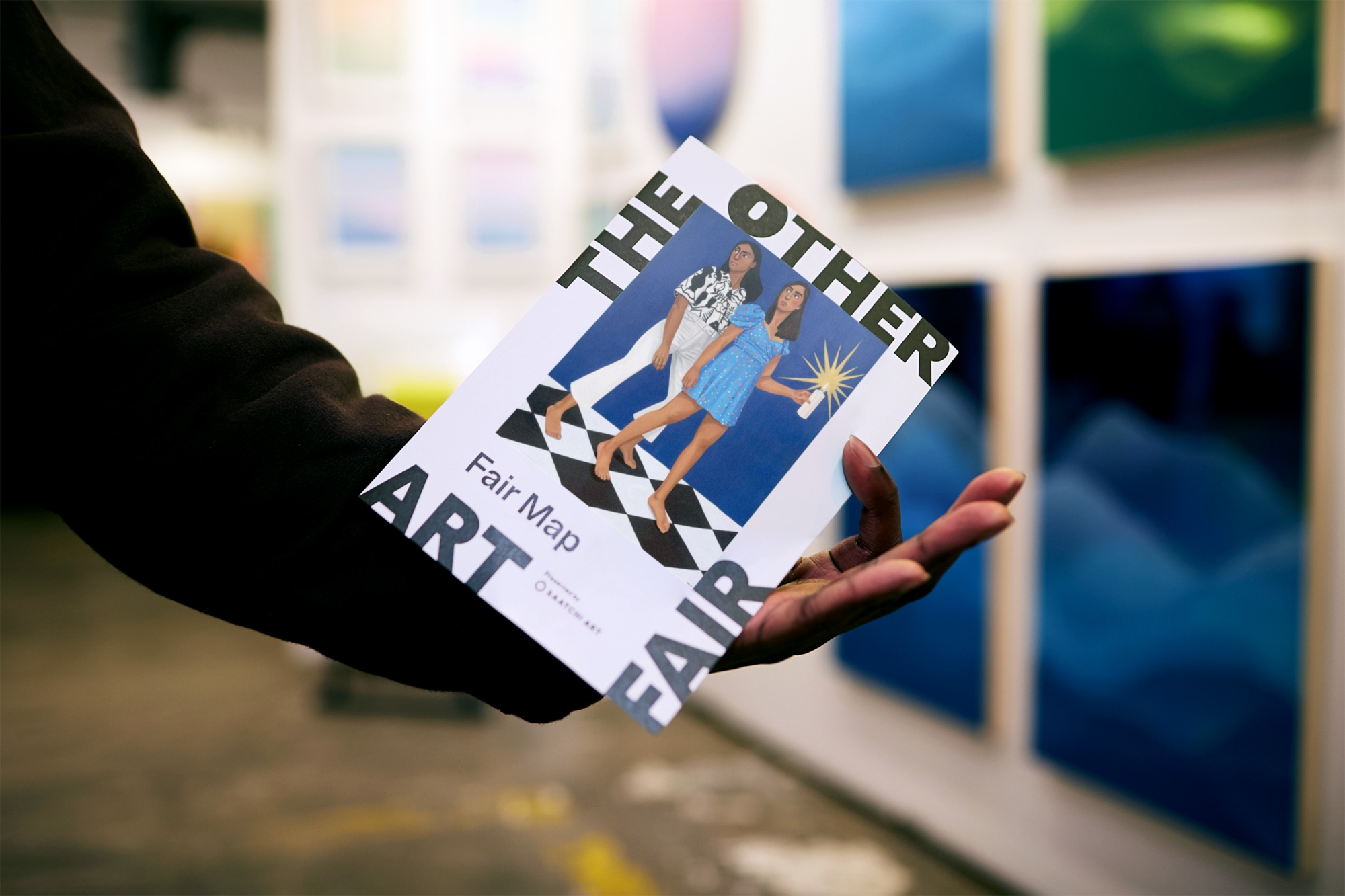
Challenging the tradition of a logo sitting in a corner, TOAF’s is a literal and figurative frame that flexes to suit its context. It moves, shifts and scales to fit any application, redefining and reshaping its contents in an infinite number of ways, the same way art is created in infinite materials, styles and subjects.
In line with TOAF’s rejection of the ordinary, the design system is also led by the logo. The way it’s applied means each brand touchpoint celebrates the in-frame image, rather than the brand, bringing the focus back to what really matters. Each application is unique, expressive and never boring, and it’s a system that quickly builds recognition and will last the test of time.
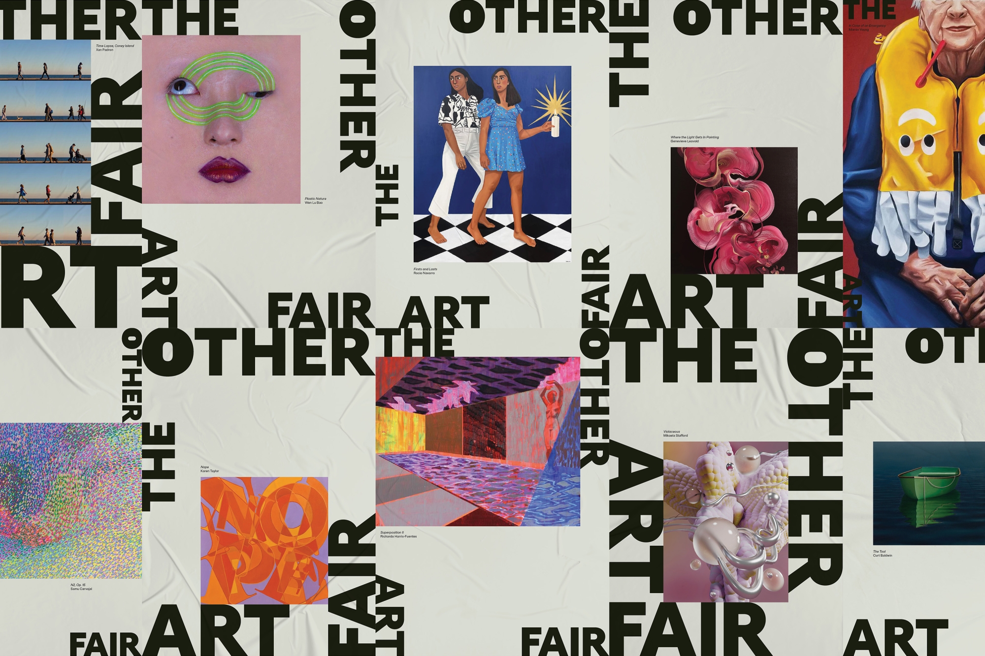
A palette that lets the art do the talking
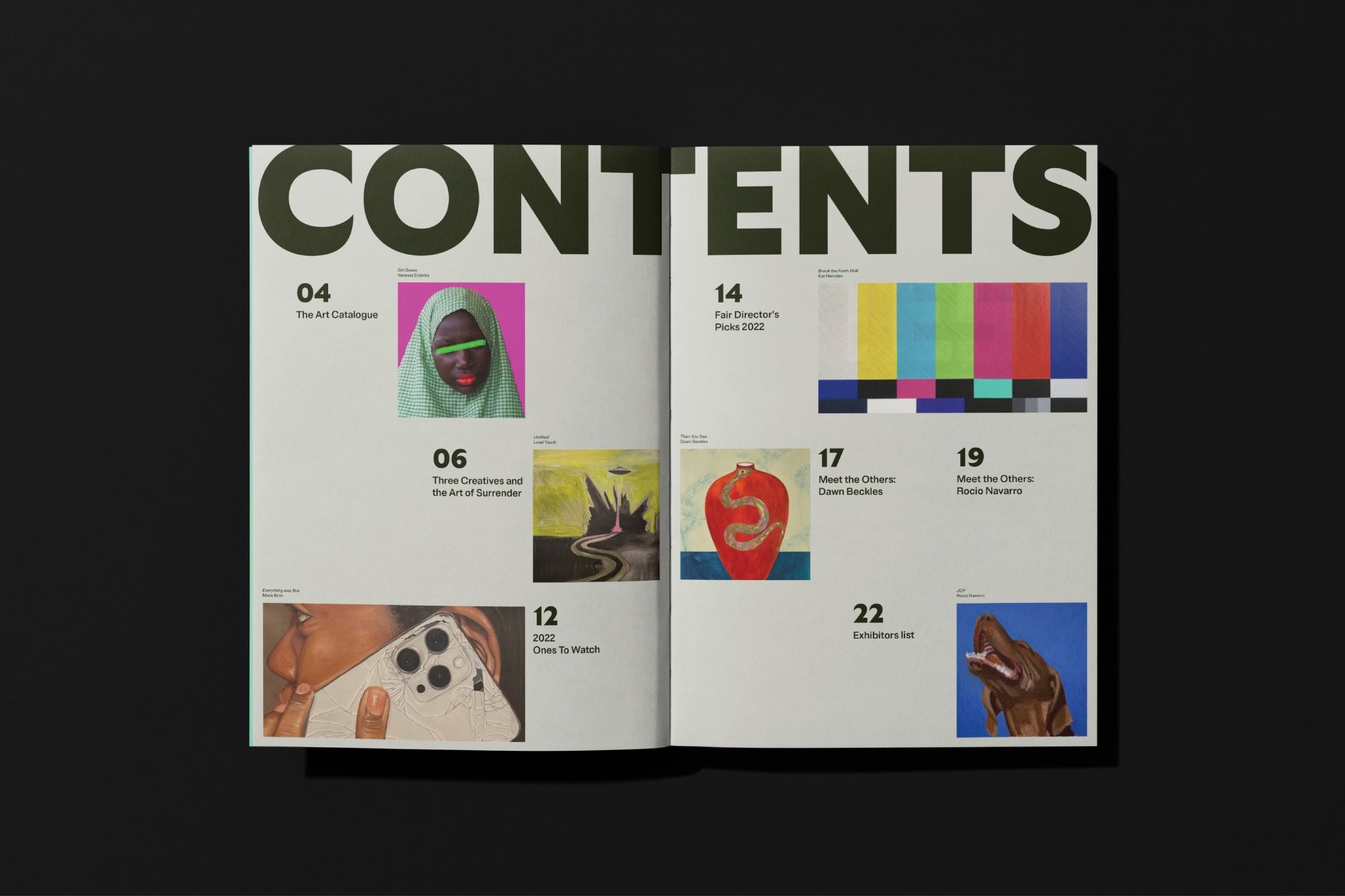
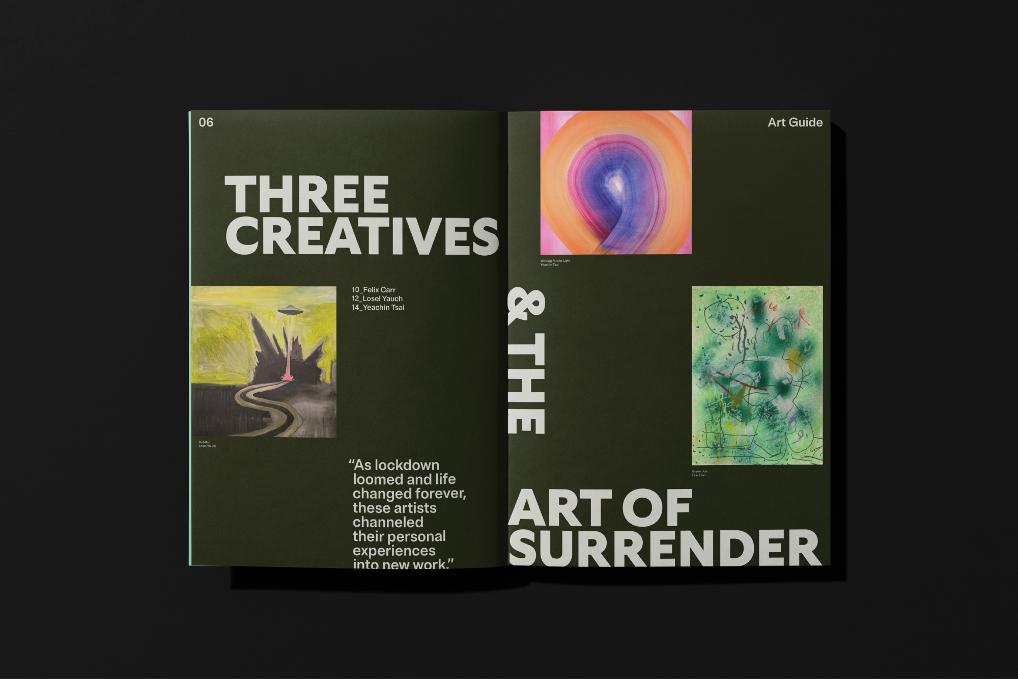
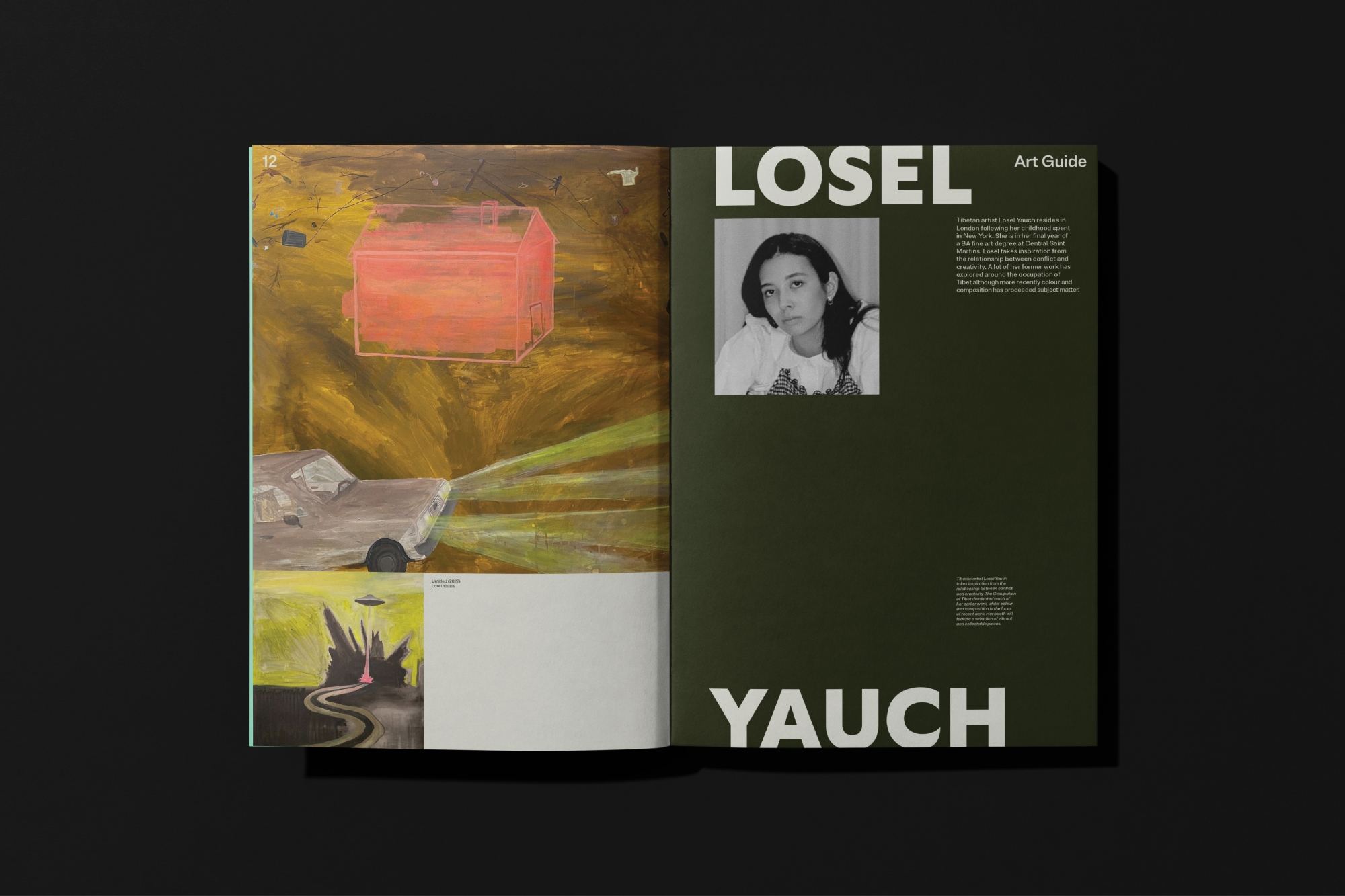
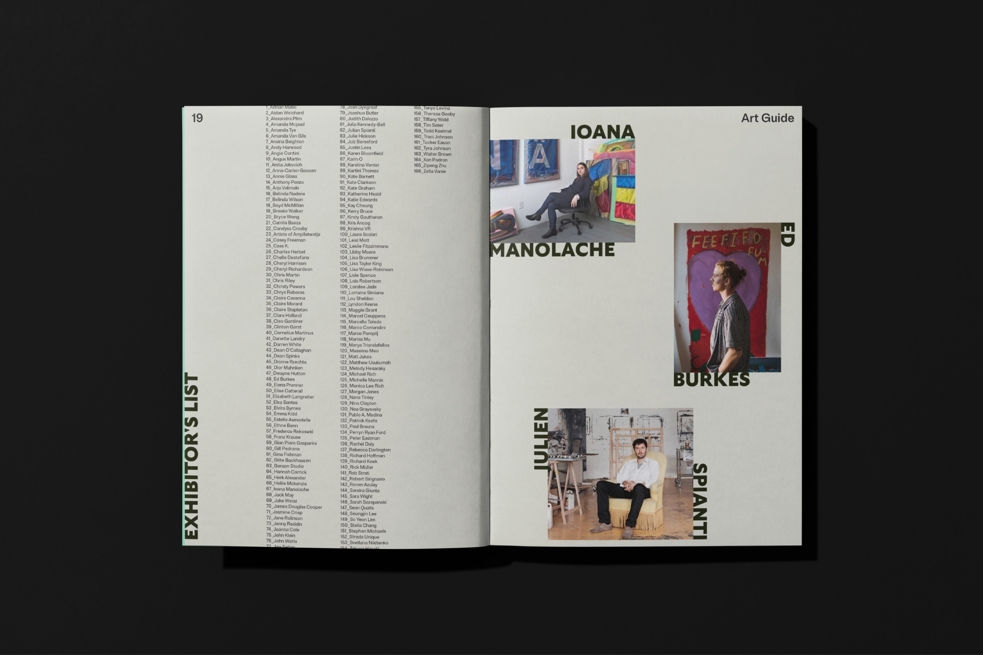
When it came to colour, we kept it simple. Tweaking the hero green from the previous identity to be more ownable, the palette is straightforward but striking. Within the brand system, each colour is used as a solid block background and assigned to a specific category of assets. The green-grey provides a neutral base that allows the colours and vibrancy of artwork to shine, green-black is used for artist information and headshots, and other-green highlights event-specific content and promotional materials. All in all, the updated palette is digitally-optimised, confident and signals a distinct brand transformation for TOAF.
The expressive type of art fair
The design system uses two typefaces. As well as being behind our wordmark, Gt Ultra is used as the accent typeface. It has a humanist flare, dancing between a sans and serif, fusing calligraphy and construction. The versatile typographic system combines centuries-old serif type with the dynamism of modern sans, challenging modern typographic expectations. Brut Grotesque is its hard-working counterpart, utilised across the brand for heading and body copy. Its unassuming, indistinct qualities allow the accent font to stand out and, together, they create a modern and accessible aesthetic with a tinge of rebellion.
Creating a uniquely replicable system
As a global brand with teams across the world, it was important that the design not only worked for international audiences but was also simple for each team to roll out. While balancing an easy-to-use design system with a strong foundational concept is always a challenge, we managed to successfully take a simple idea and turn it into something flexible and translatable to infinite pieces of communication, making the brand an ever-changing artwork in itself.
And the end result?
TOAF was built on a rejection of the ordinary. When the art world as we knew it went one way, they went the other, daring to deviate on the premise that art isn’t confined to convention or rule, so how we enjoy it shouldn’t be either. Their mission is to keep reframing art and how we perceive, experience and purchase it, in new and ever-changing ways and now they have a bold and adaptable brand identity behind them that does exactly that.
Collaborators
- Brand Strategy • Untangld
- Brand Writer • TONE Agency
- Brand Writer • Cat Wall
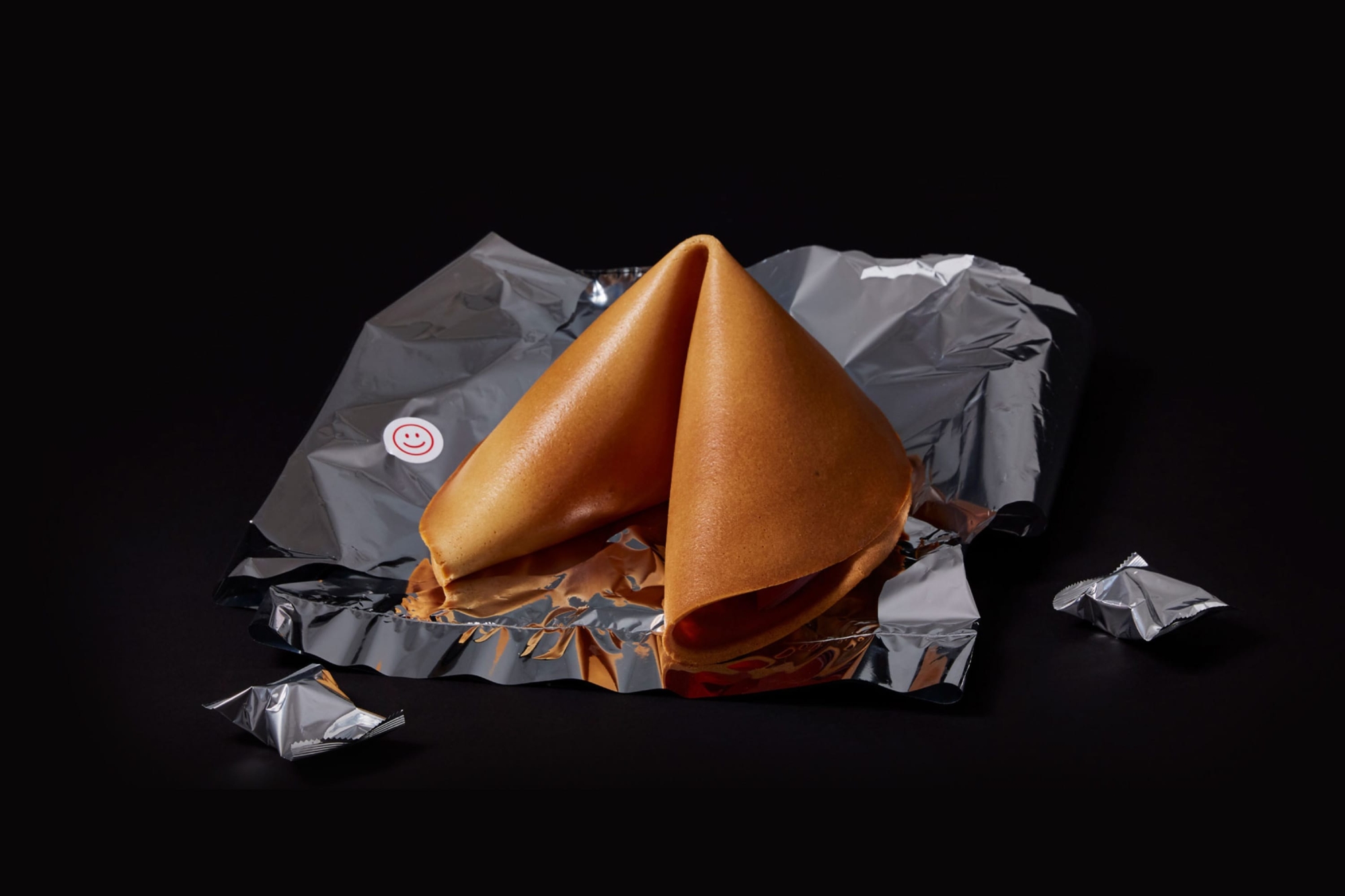
Our (Very Very) Large Fortune Cookie
A gigantically sweet gift for our clients.