What happens when you combine the integrity of editorial publications with one of Australia’s leading online mens’ health clinics? You get the rebrand we rallied up for Mosh. With an increase in their competitor market, we needed to position them as category leaders — authoritative but approachable, educational but comforting. They were challenging deliverables but well worth the effort for a brand that delivers help to men facing health challenges.
- Visual Identity •
- Brand writing •
- Packaging design •
- Structural packaging design •
- Art direction •
- Photography •
- Illustration •
- Icon system •
- Website design
Awards


Featured In
What’s all this then?
Mosh is one of Australia’s leading online mens’ health clinics. Based in Sydney’s Bondi, they provide men with virtual consultations led by healthcare experts on issues such as sexual health and hair loss. Ahead of expanding their offering to skincare and mental health in 2020, they approached us for a brand refresh.
Any insights?
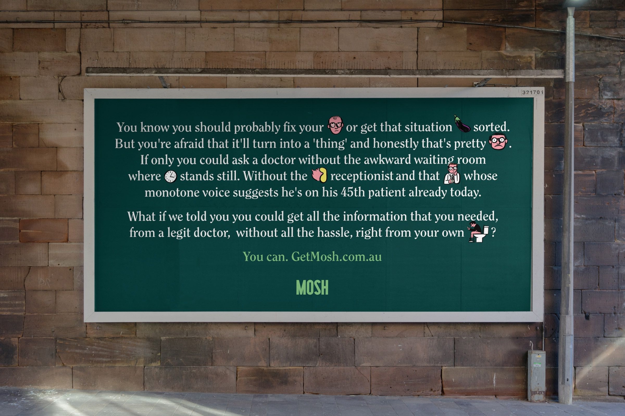
Mosh found in their research that people, men especially, take comfort from editorial publications — they have inherent trust, integrity and authority. Given the brand deals with sensitive subject matters for men (who often need a little extra encouragement to seek health help anyway), building trust and being informative without feeling belittling was key.

And what seems to be the problem?
Since Mosh started three years ago, there has been an increase in competitor companies entering the market. The rebrand needed to position them as leaders in the category. It needed to feel grounded and relatable — nothing salesy or exploitative — and let its audience know that it’s okay to ask for help.
So how’d you go about it?
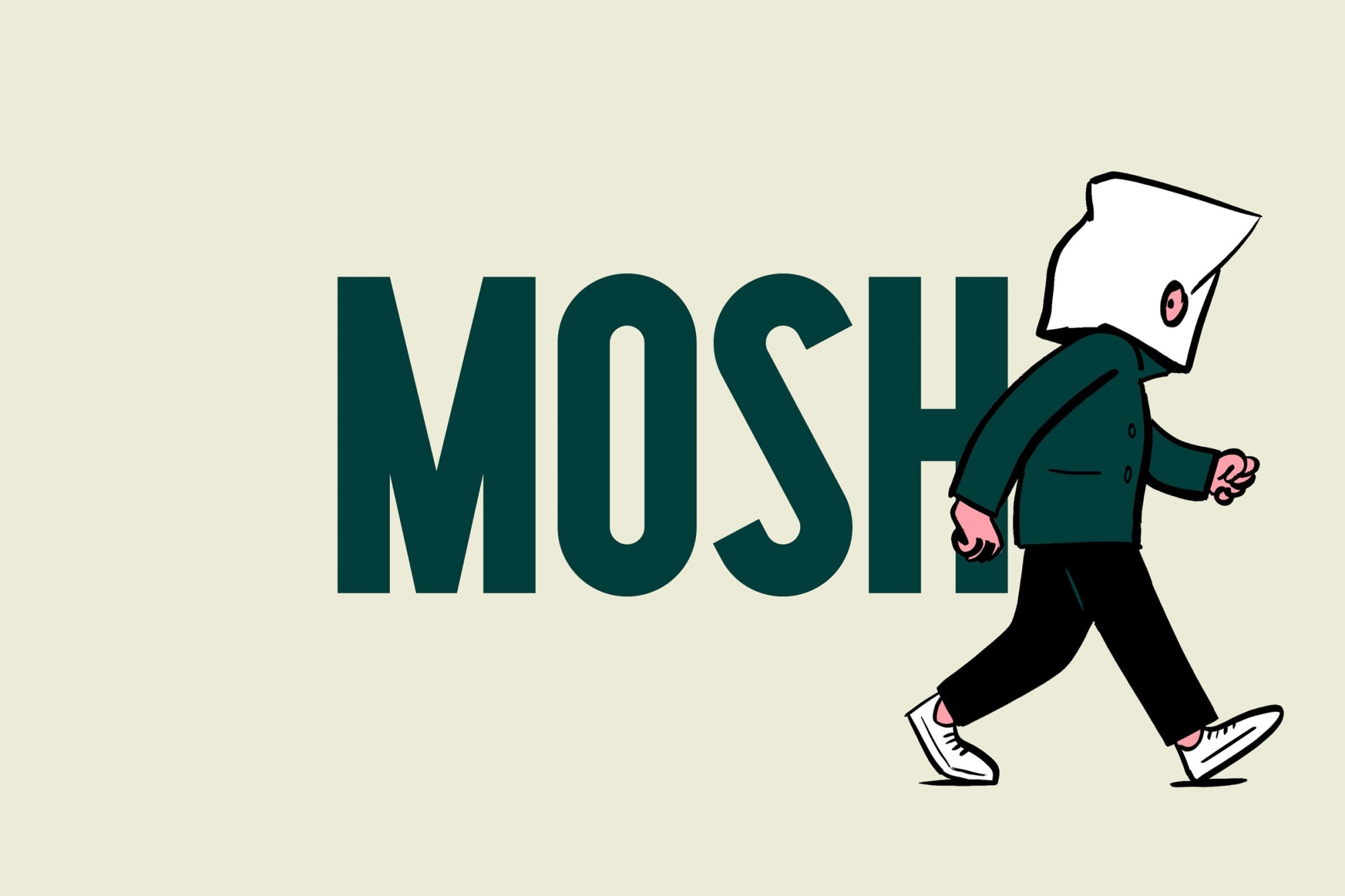
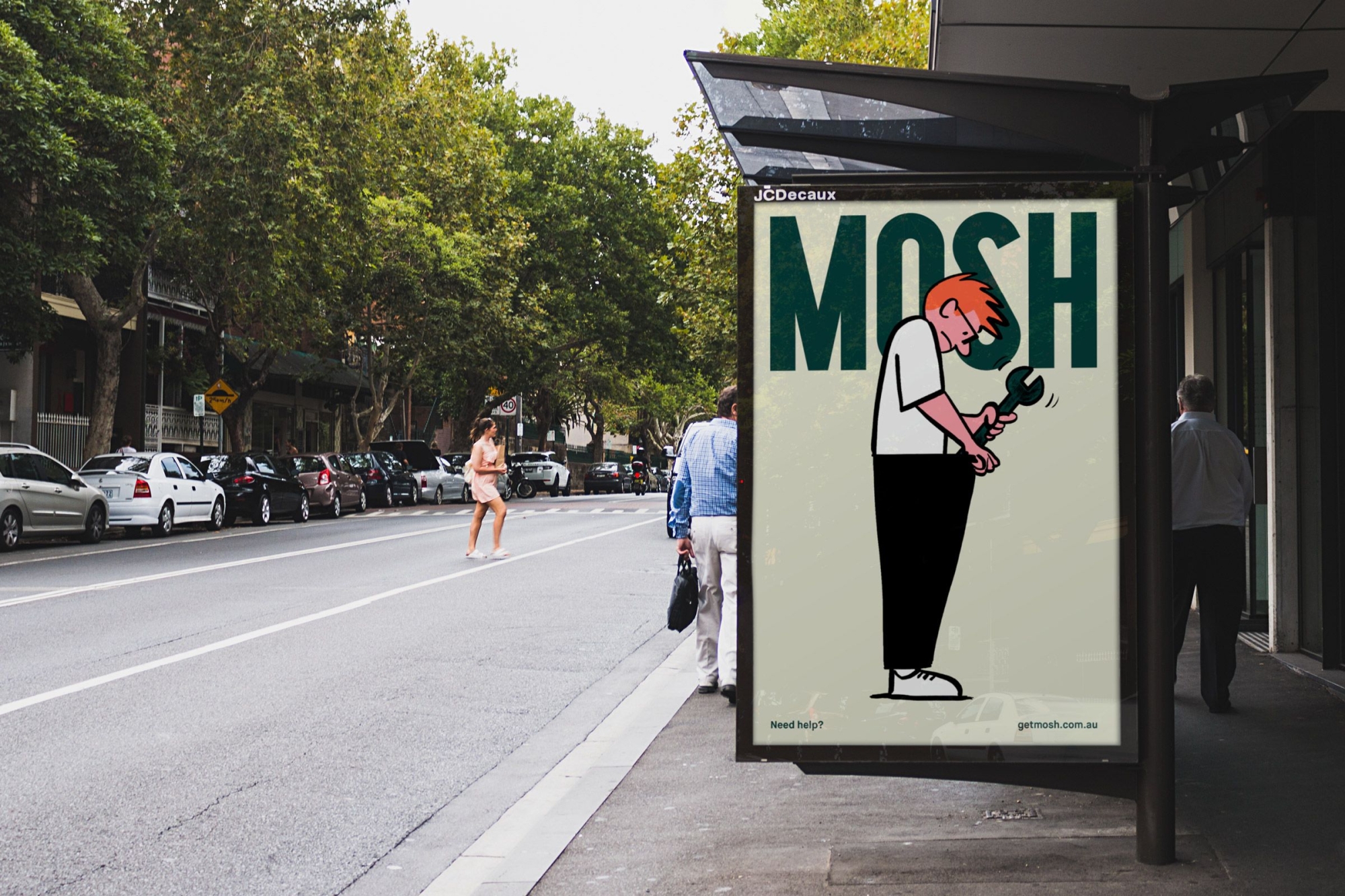
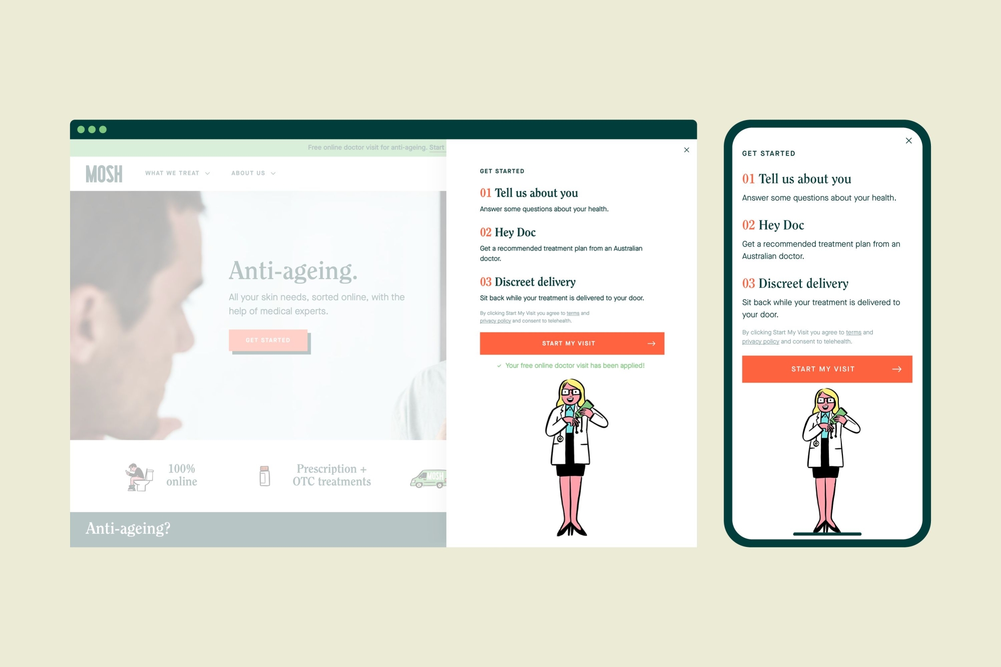
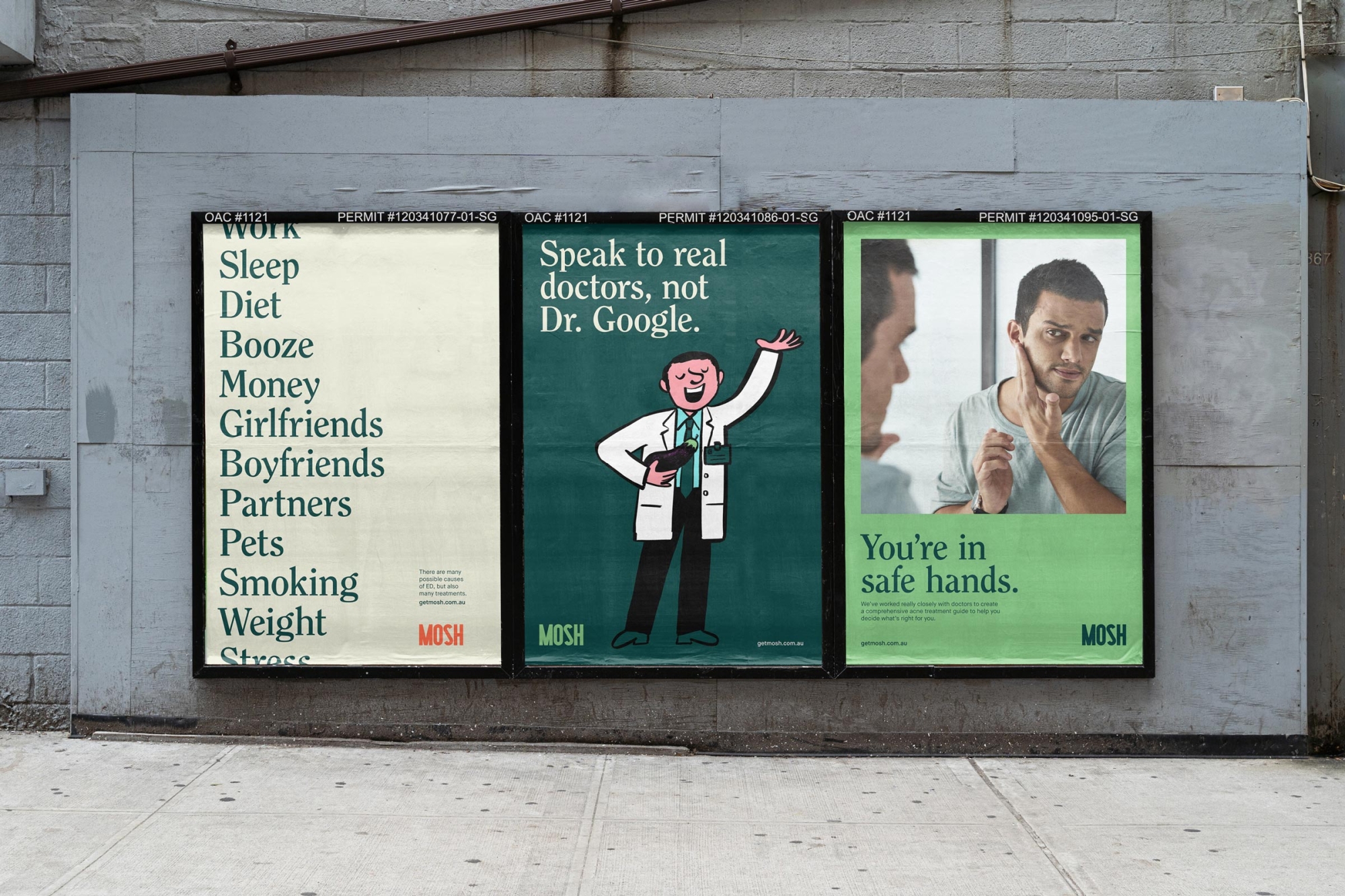
The direction we took with the logo was inspired by old printing press lettering reminiscent of a masthead you might find on a magazine — building on the sense of editorial authority and integrity we knew to be comforting to our audience. Set in all caps, it’s strong and unique, making it ownable in a cluttered health market.
Creating comfort with cartoons
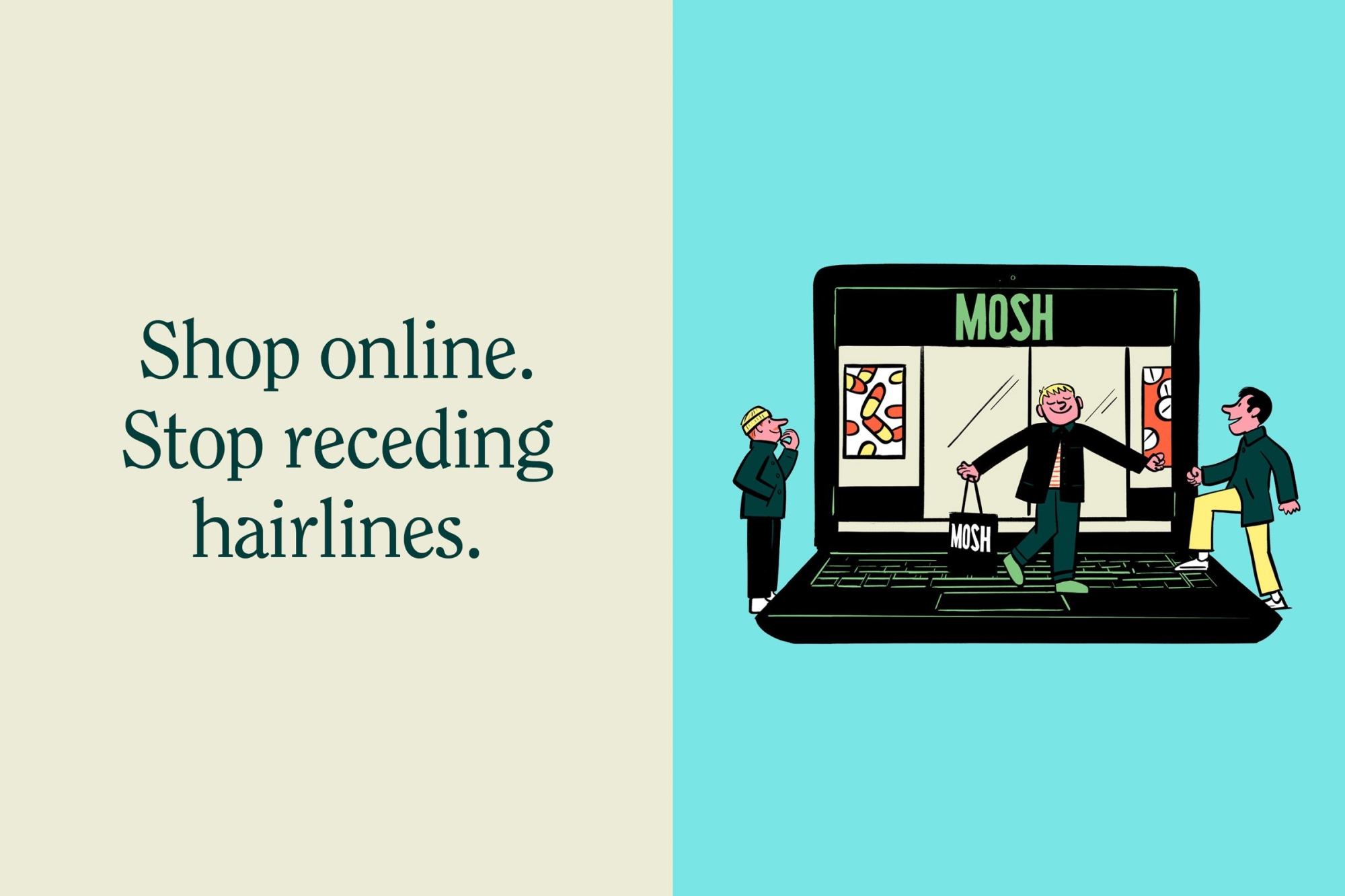
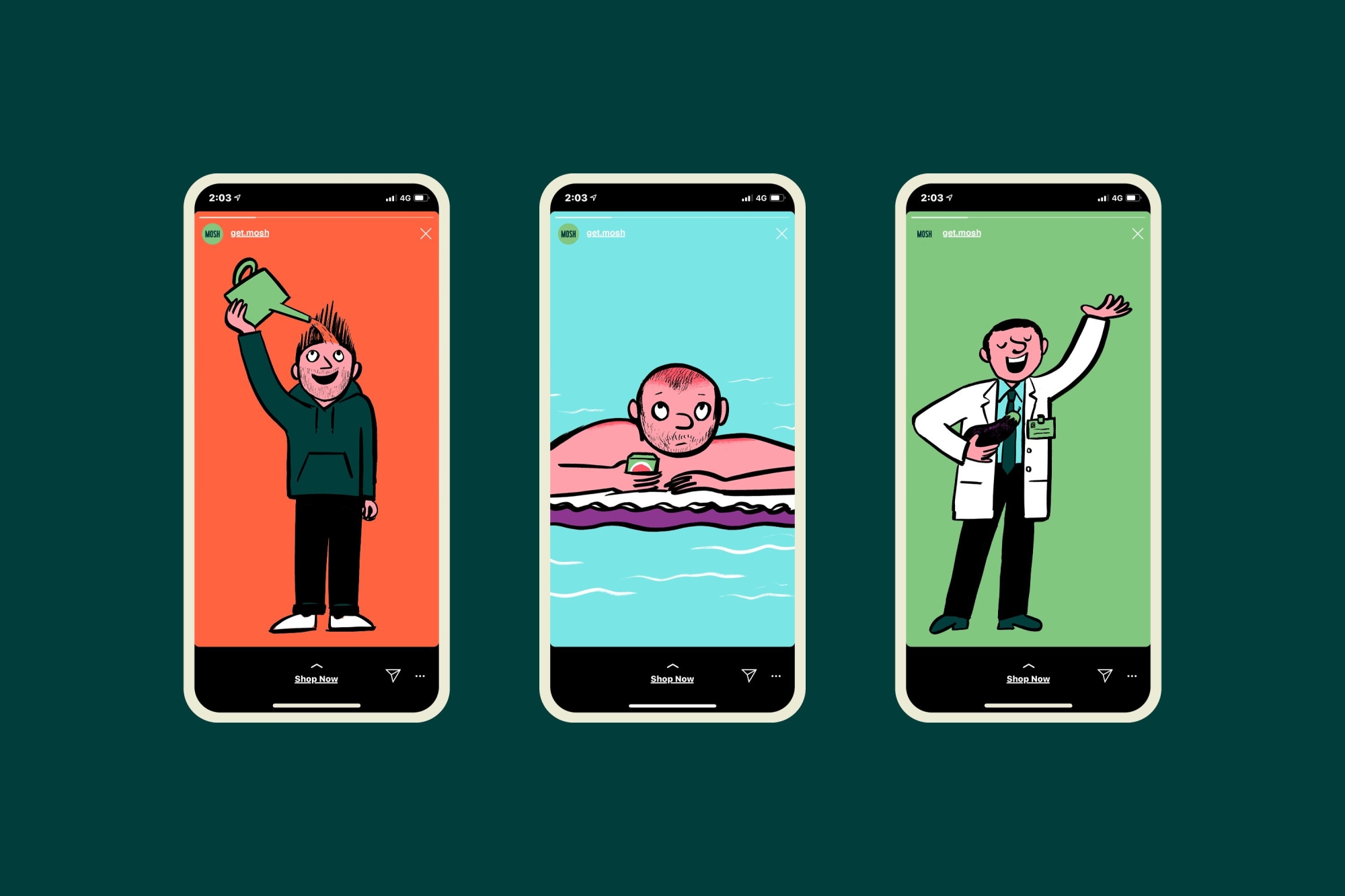
Illustration allowed us to inject relatability in a humorous, comforting way. We wanted a style that felt intellectual yet witty, which would allow us to convey the sensitive, sometimes awkward, health issues men face with an informative softness. Taking cues from The New York Times Magazine and The New Yorker, we worked with illustrator Mark Long to depict these issues. These ranged from sunburn in balding spots to more conceptual scenes like dracula applying anti-age cream. Each illustration had an element of storytelling and discovery.
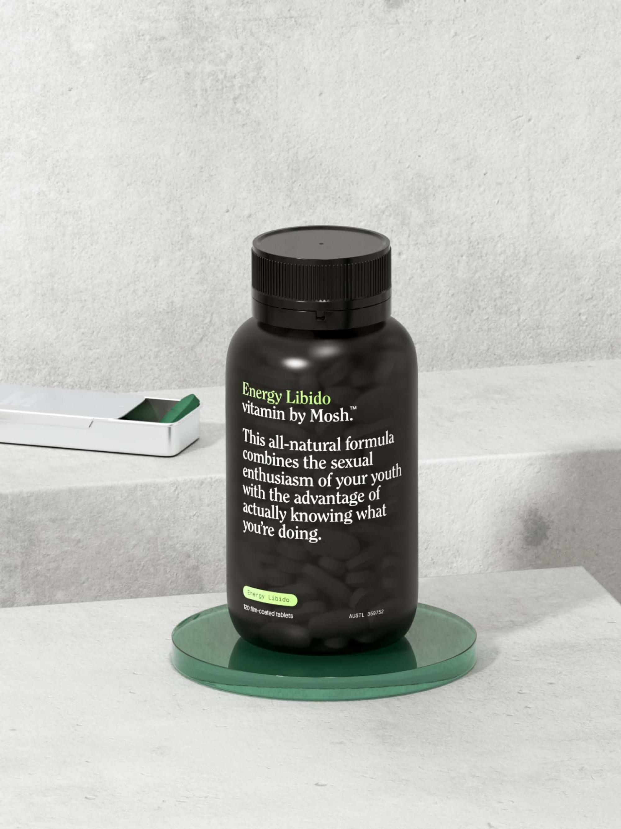
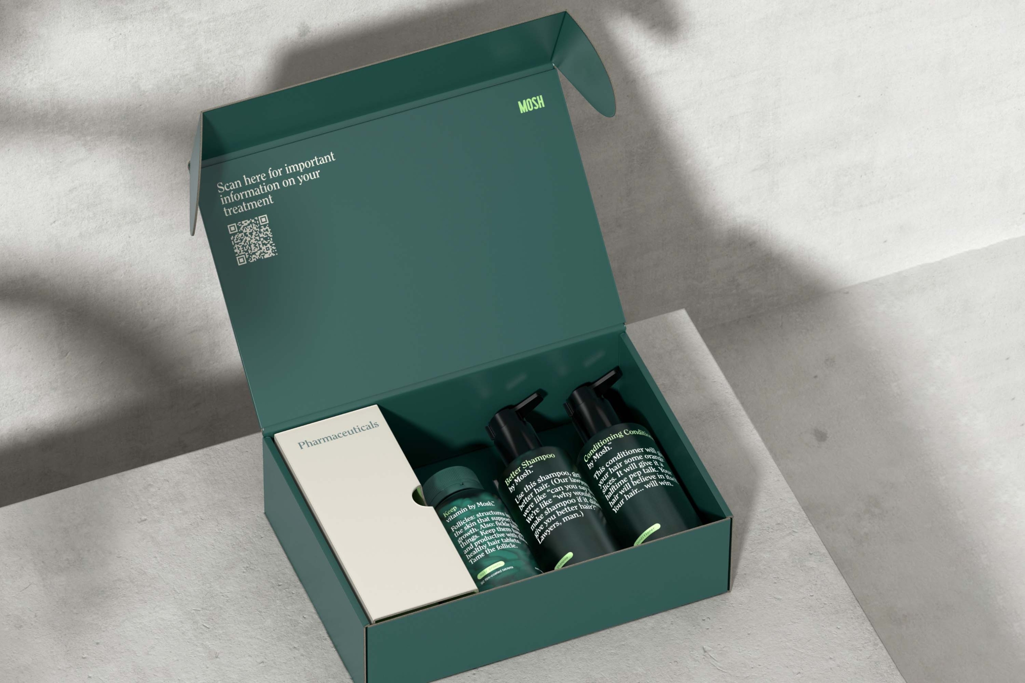
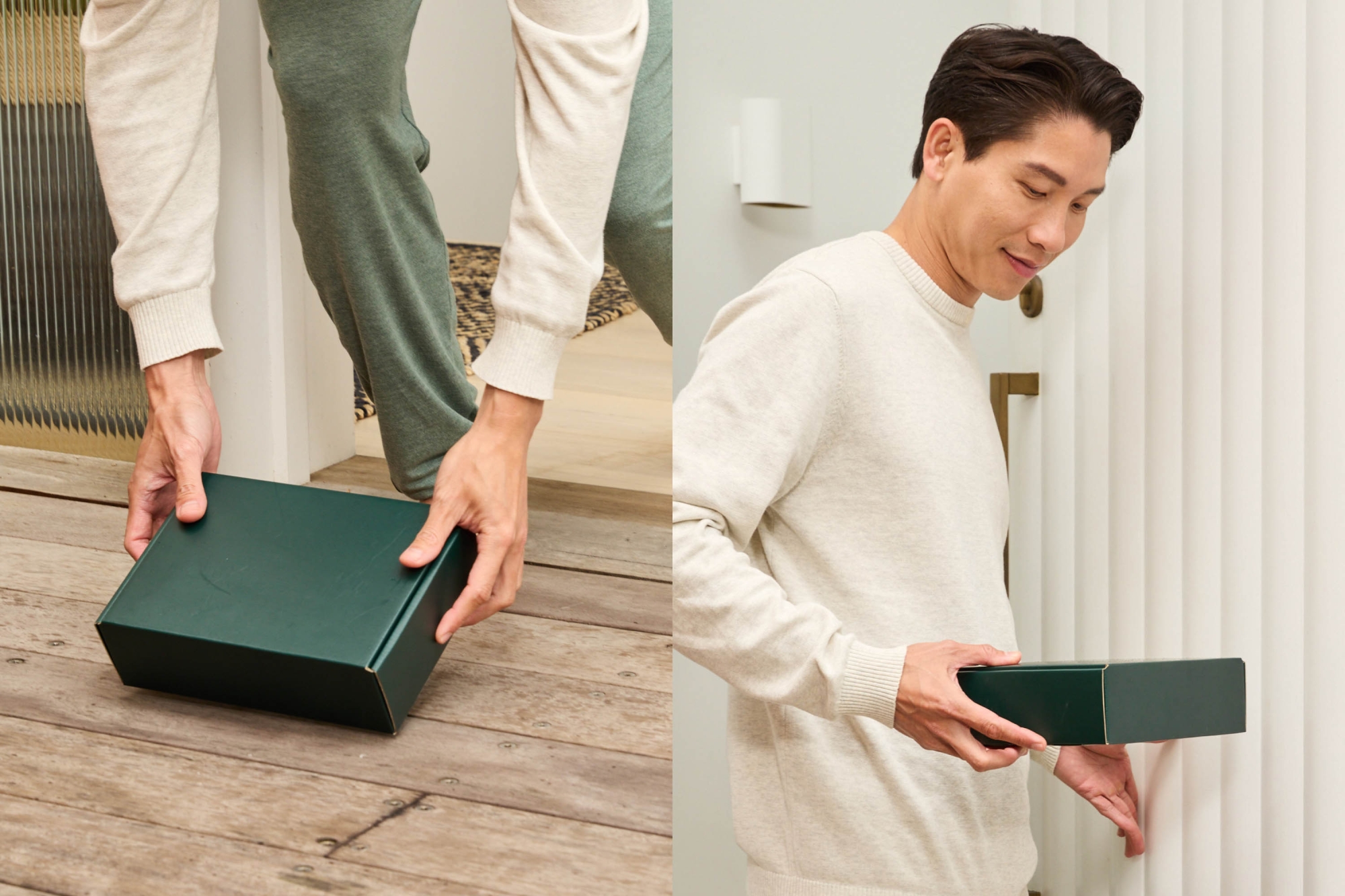
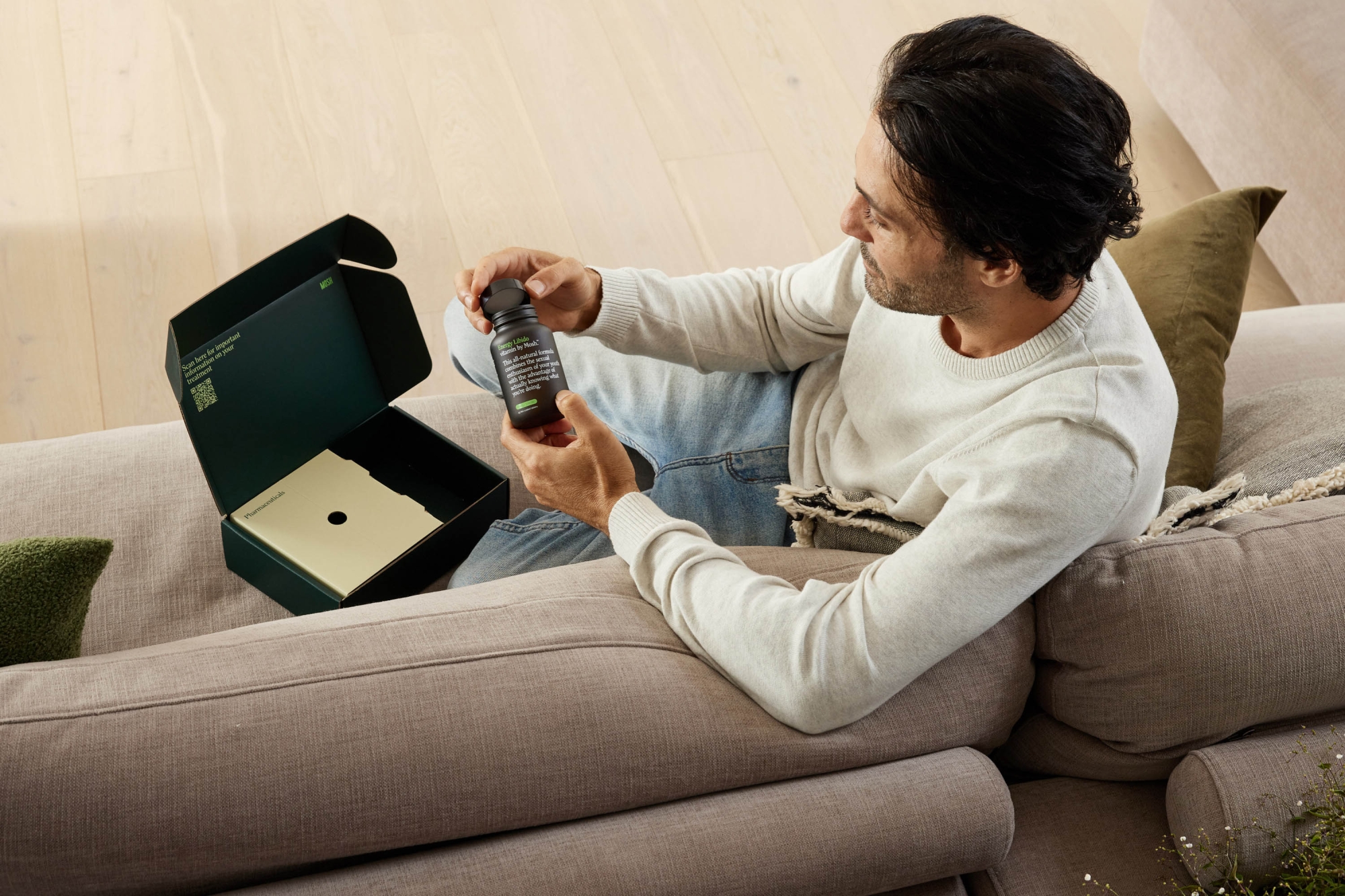
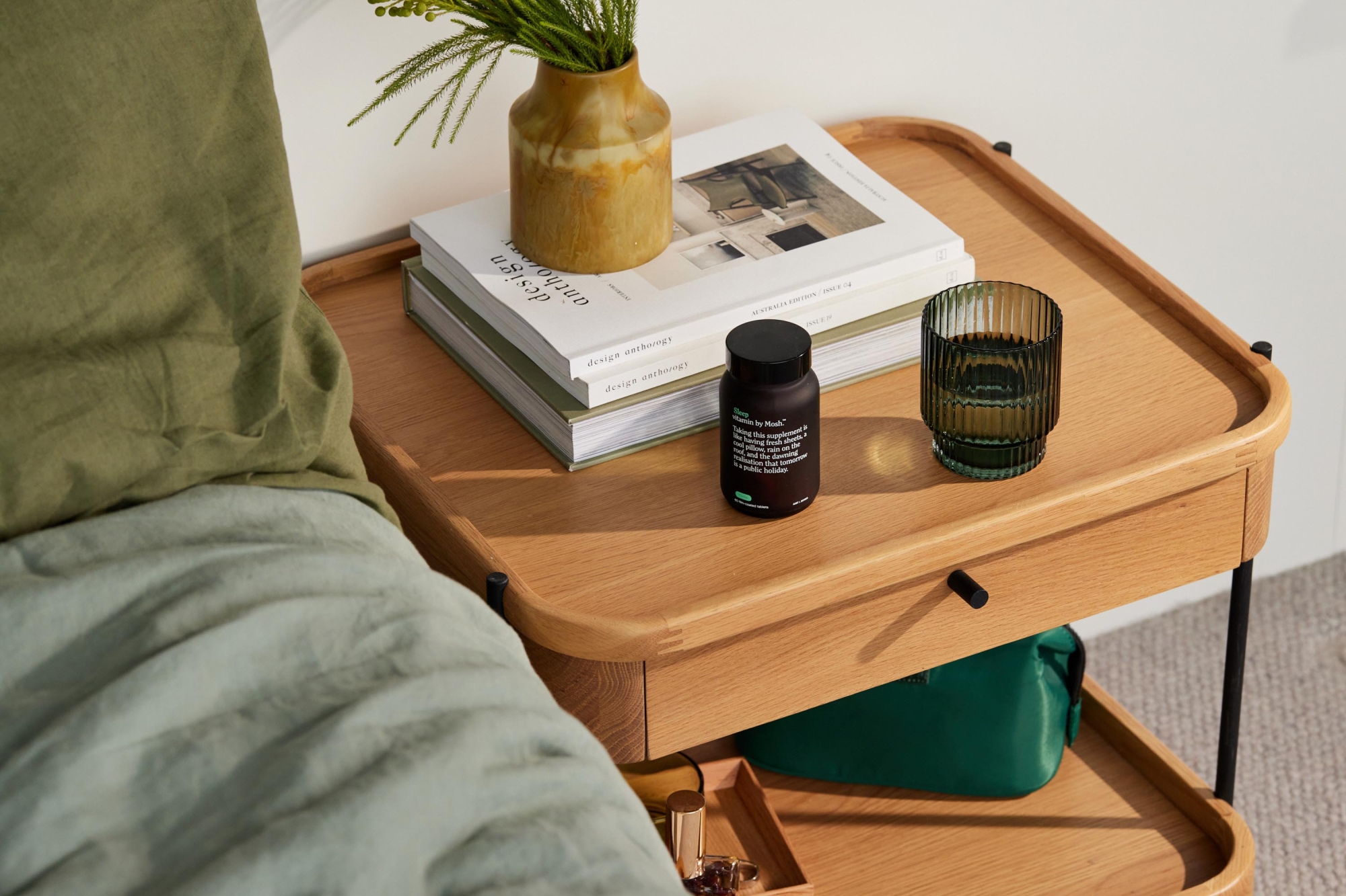
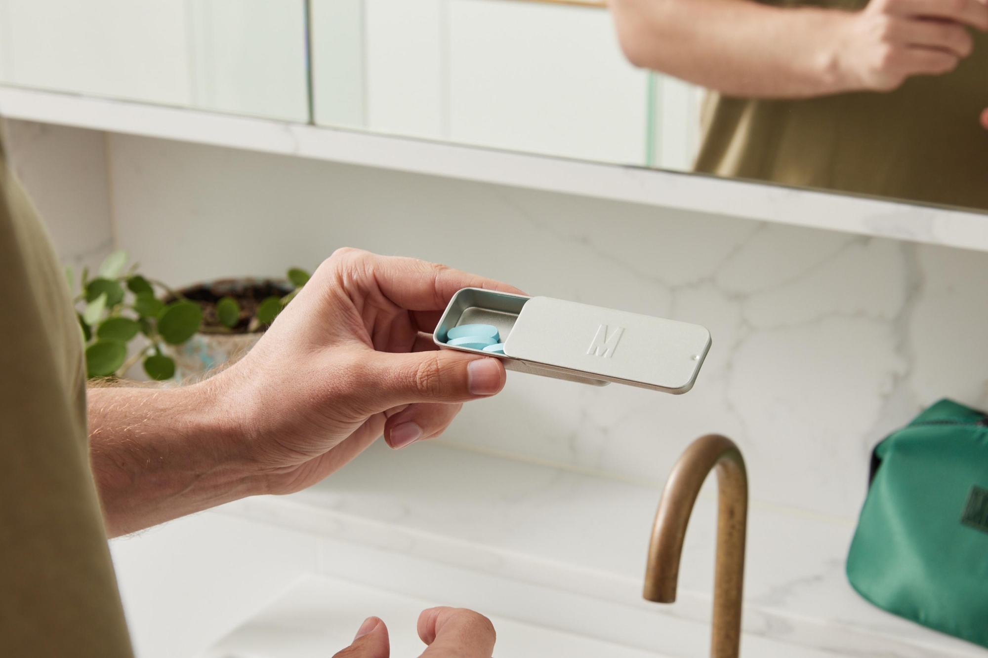
The whole package
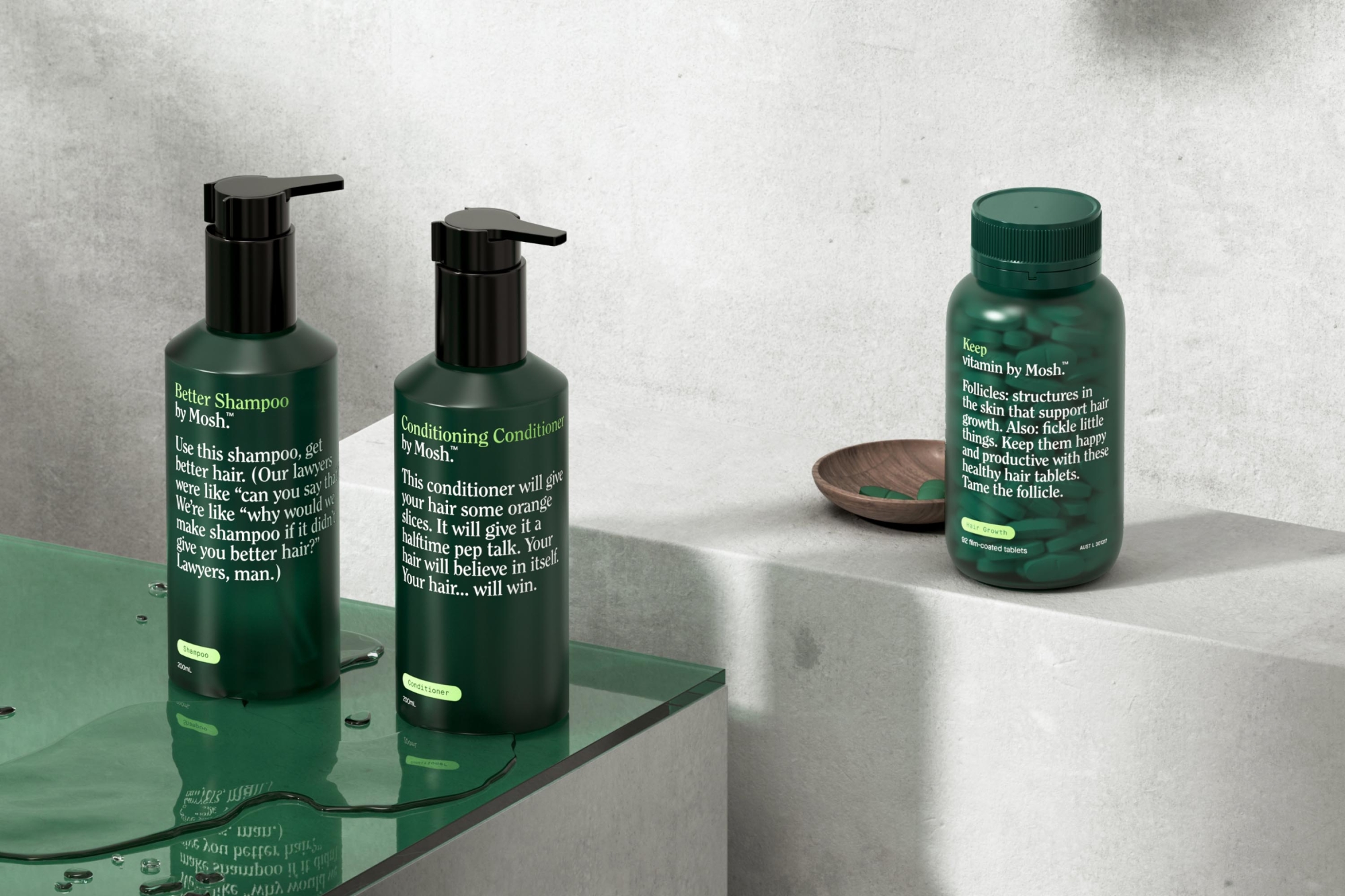
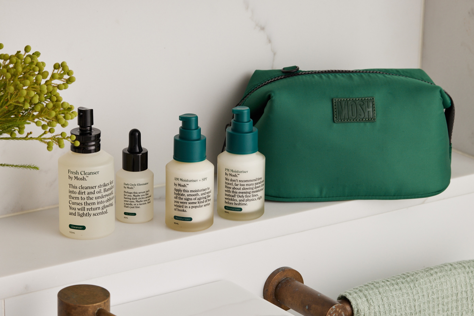
Instilling that sense of comfort carried over into the packaging. Visually, it’s a stripped back version of the brand — a trustworthy and premium product that looks sleek in any home environment. Verbally, the names of the products are positive and benefit-led. They feel reassuring and reaffirming. The mailer brings back some of the humour, lined with a stream-of-consciousness that delivers a sweet brand moment and reminds the customer that Mosh is giving them one less thing to worry about.

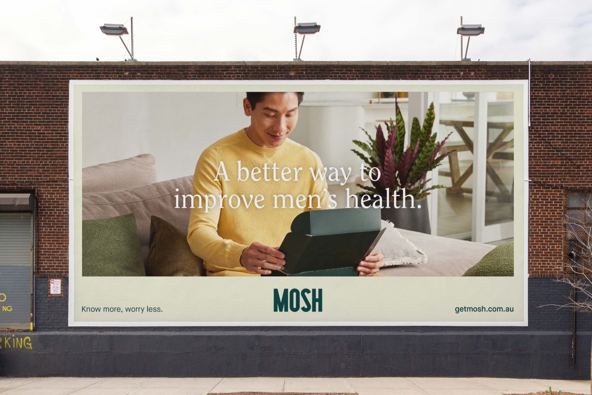
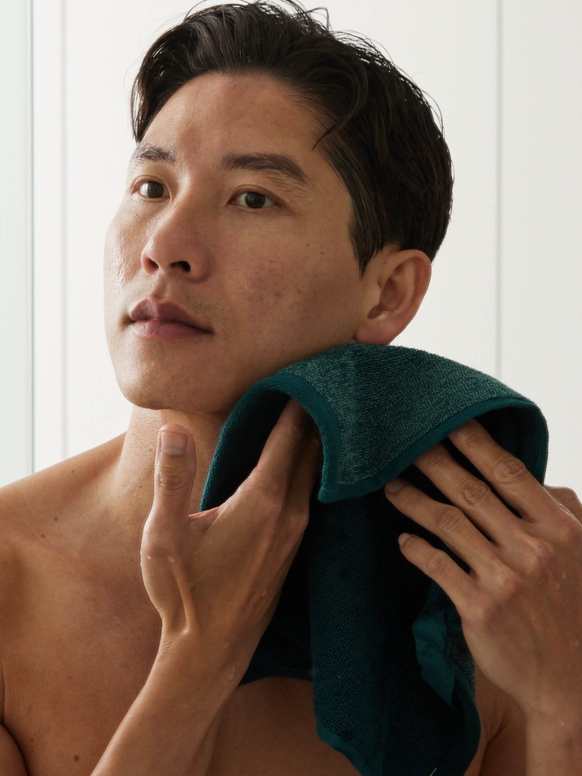
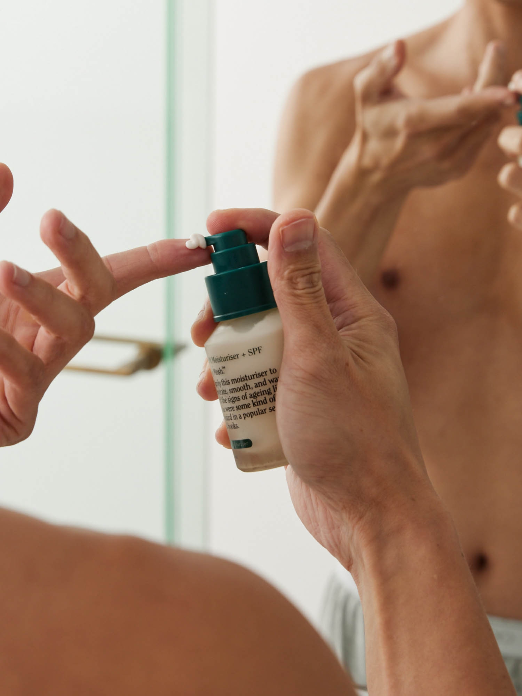
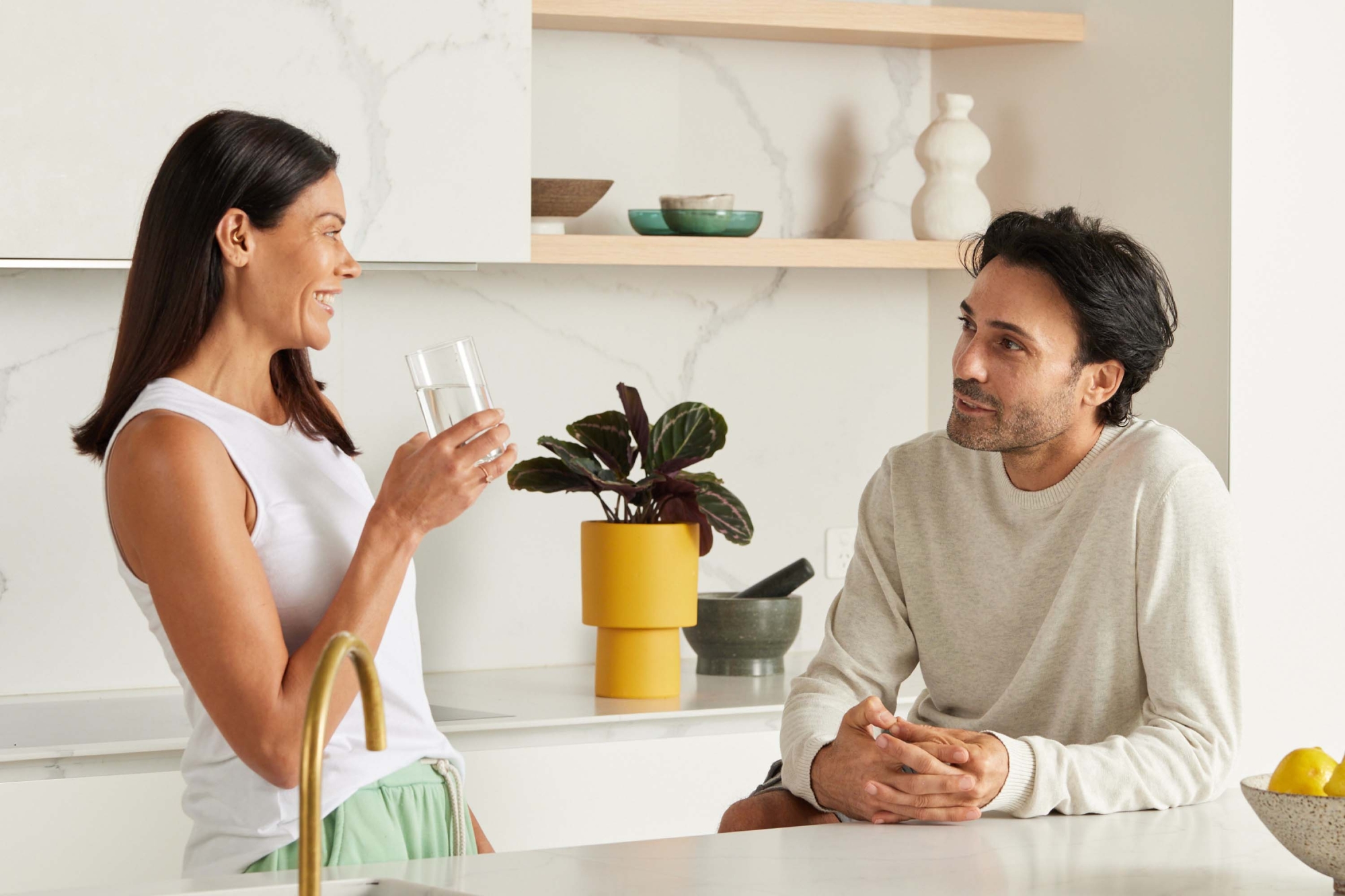
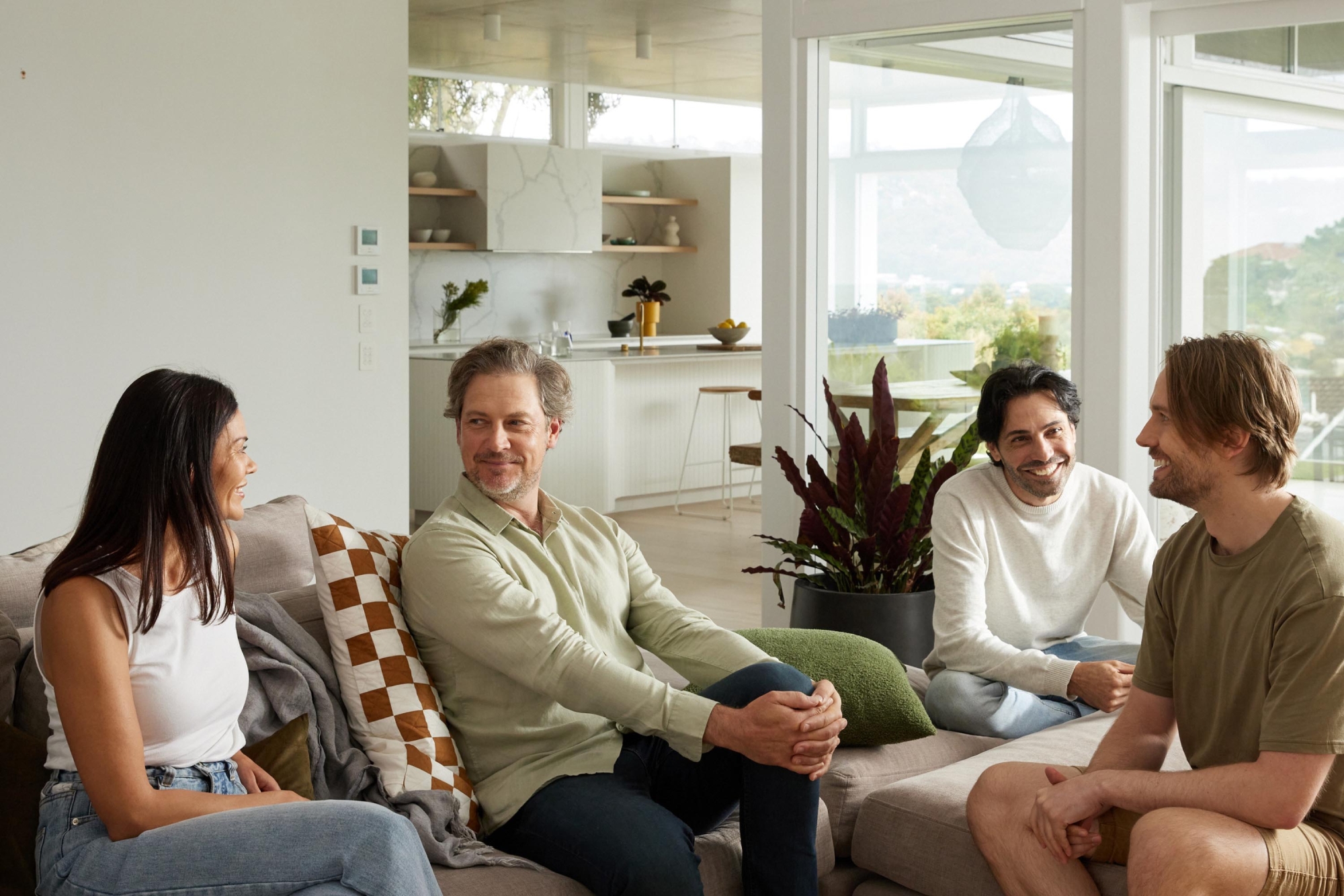
Photos to feel at-home with the brand
We worked with photographer Benito Martin to produce the lifestyle imagery, capturing real-life moments within the home that felt relatable and attainable. No Vogue Living sets here. From the bedroom to the bathroom, we art directed a suite of down-to-earth images that perfectly illustrate how and when you might need Mosh, and how the brand could easily slip into your lifestyle.
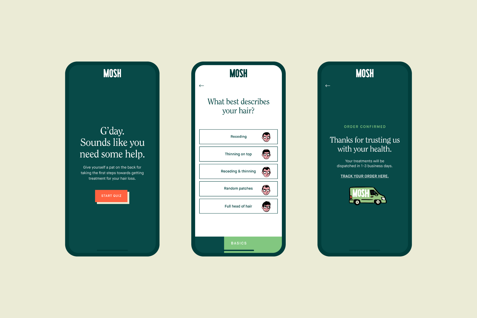
Fun to navigate, easy to understand
Taking a modular approach, the site reiterates Mosh as an educational and reliable resource for men’s health information and care, with the illustrations lending a hand in making it more digestible. Dotted with easter eggs that allow the user to choose the information they want, it reaffirms the brand’s underlying premise that knowledge is power and their health is in their hands.
And the end result?
The team behind Mosh are transparent, friendly and informed but, most importantly, empathetic. They’ve been through it and now they want to assist others who are going through the same things. They’re character traits that we endeavoured to embed in every touchpoint of the Mosh experience and the immediate uplift in sales they’ve seen is testament to just how much their customers value that.
Collaborators
- Photography • Benito Martin
- Illustration • Mark Long
The Other Art Fair
Reframing the way we experience art